Be Careful Bears, This Advance Is Beginning To Broaden

Summary
- Few stocks participating in a stock market advance is a classic sign of market weakness, but evidence suggests this is not occurring at this time.
- The concept of a broad or narrow stock market recognizes that indexes hide the true performance of individual stocks. What's happening "inside" markets is important.
- Comparisons between capitalization-weighted and equal-weighted S&P 500 indices and large-cap stocks versus small stocks show no significant divergence.
sitox
One of the important and classic signs of stock market weakness is when few stocks participate in the advance. The major indexes carry to new highs only because a few, large stocks are making highs. Their large capitalization gives them disproportionate weighting in the average calculation. The rest of the stocks, which are languishing and not participating, have minimal effect.
Some say this is occurring in today's market but the evidence doesn't support it and we think many are overly bearish on the market when they shouldn't be.
The concept of a “broad” or “narrow” stock market
The concept of a "broad" or "narrow" stock market goes back more than 100 years. It's recognition that the stock market is really a market of many stocks and not just one thing. Looking at only a market index hides this truth.
When we want to know what the "stock market" is doing, we usually look at what a large cap market index is doing. The S&P 500 and the NASDAQ 100 are classic examples. They are price averages of many stocks, each weighted by its capitalization. The Dow Jones 30 is different. It's a simple price average where higher priced stocks have greater weight. But no index gives a complete picture of the market.
For one, they don't tell us what's going on with all the other stocks, not in the average. But they also don’t even tell us what's happening to the individual stocks that go into the index itself.
For example, let's say the Dow Jones 30 is up 1%. This could be because all 30 stocks are up 1%, but it could also be because one stock is up 30% and the other 29 stocks are unchanged. The latter would be a narrow market, the former would be a broad market since all thirty stocks are participating. The index itself doesn't indicate which.
History has shown that a broad market is a sign of strength and endurance. Narrow markets are a sign of weakness, or a market running out of steam. A narrow market often occurs right before a market decline.
Is the current market going up only because a few, large, technology stocks are advancing?
It’s widely believed that the S&P 500 and the NASDAQ 100 are going up today because seven to ten large technology stocks are advancing, while not many others are participating. If true, this would be a very narrow market indeed. But is it true?
The simple answer is, it isn’t. I have contributed to this misconception by writing an article that said it was, but after digging into the numbers I want to correct that error here.
How to determine if a market advance is "broad" or "narrow"
The measurement of market "breadth" is usually done using the advance-decline line. The classic way is to look for divergences - seeing if the major indexes are advancing, while the A-D line isn't. A visual look at the current A-D line doesn't show any divergence. But there are even better ways to determine breadth in our opinion.
One way is by comparing the relative performance of the S&P 500, which is a capitalization weighted average, against an equal weighted S&P 500. How this comparison measures "breadth" is easy to understand.
Currently, seven of the largest technology stocks account for 25% of the weighting of the S&P 500. If these were the only stocks moving up, you would see the capitalization weighted S&P 500 significantly outperform an equal weight S&P 500, since these same seven stocks only account for 1.4% of the unweighted index.
Let's see how these two metrics compare. Using the SPY and RSP as proxies for these two S&P 500 indices, the chart below compares their relative performance since December 31st, 2021, which was the start of last year’s bear market.

Comparing S&P 500 with an equal weighted S&P 500 (Sentiment King)
The correlation of these two indexes is very close (meaning, they look the same). Over the last year and a half, the returns are almost identical. The difference in performance would have to stand out visually to be important, and nothing really does. In fact, the equal weighted index outperformed the S&P 500 off the October low, and the weighted index just now seems to have caught up.
Another way to measure "broad" or "narrow" markets is by comparing the performance of the large, capitalized stocks to small stocks to see if both are participating in the advance? We do this by comparing the S&P 500 with the Russell 2000. The Russell 2000 is an index of 2,000 small stocks. These stocks are so small that the total capitalization of all 2,000 stocks is just 25% of the seven largest stocks in the S&P 500.
We use SPY as a proxy for the S&P 500 and IWM as proxy for the Russell 2000.
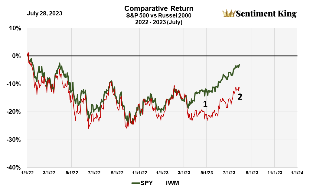
S&P 500 compared to Russell 2000 (Sentiment King)
This chart is interesting because there is strong visual correlation between the two indices (the curves look the same) up until the beginning of March, then they diverge.
There is no doubt there is divergence between the two indices, but the difference occurred mainly between mid-March and the end of May. Since then, the curves have been marching upward somewhat together. These two distinct periods are highlighted by the numbers 1 and 2.
This small difference in the two curves since March is in the acceptable band, and in our opinion, it doesn't indicate any significant market weakness.
Conclusion
The idea that this market is moving higher only because of a few, heavily capitalized technology stocks is not true. Evidence supports the idea that this advance is somewhat normal, neither too narrow nor exceedingly broad.
This doesn't mean, however, that the market can't go down at some point. It just means that the internal market weakness that many think might indicate a market decline, is not there at this time.
But, as the chart shows, we are approaching key points in the Russell 2000 that we believe are critical. We want to see the Russell 2000 exceed the high made last August, which would occur if the index gained another 2%.
We'll follow up to see how this situation looks in about a month.
This article was written by

Analyst’s Disclosure: I/we have no stock, option or similar derivative position in any of the companies mentioned, and no plans to initiate any such positions within the next 72 hours. I wrote this article myself, and it expresses my own opinions. I am not receiving compensation for it (other than from Seeking Alpha). I have no business relationship with any company whose stock is mentioned in this article.
Seeking Alpha's Disclosure: Past performance is no guarantee of future results. No recommendation or advice is being given as to whether any investment is suitable for a particular investor. Any views or opinions expressed above may not reflect those of Seeking Alpha as a whole. Seeking Alpha is not a licensed securities dealer, broker or US investment adviser or investment bank. Our analysts are third party authors that include both professional investors and individual investors who may not be licensed or certified by any institute or regulatory body.
Recommended For You
Comments (3)

