Painfully Accurate: The 10YR3M Recession Indicator

Summary
- The 10YR3M spread is one of the most reliable leading indicators of business cycle recessions.
- Capitalizing on the recessionary forecast from this reliable indicator can be challenging.
- The power of a business cycle framework requires a long time horizon with the ability to embrace short-term randomness.
- Looking for more investing ideas like this one? Get them exclusively at EPB Macro Research. Learn More »
ZargonDesign
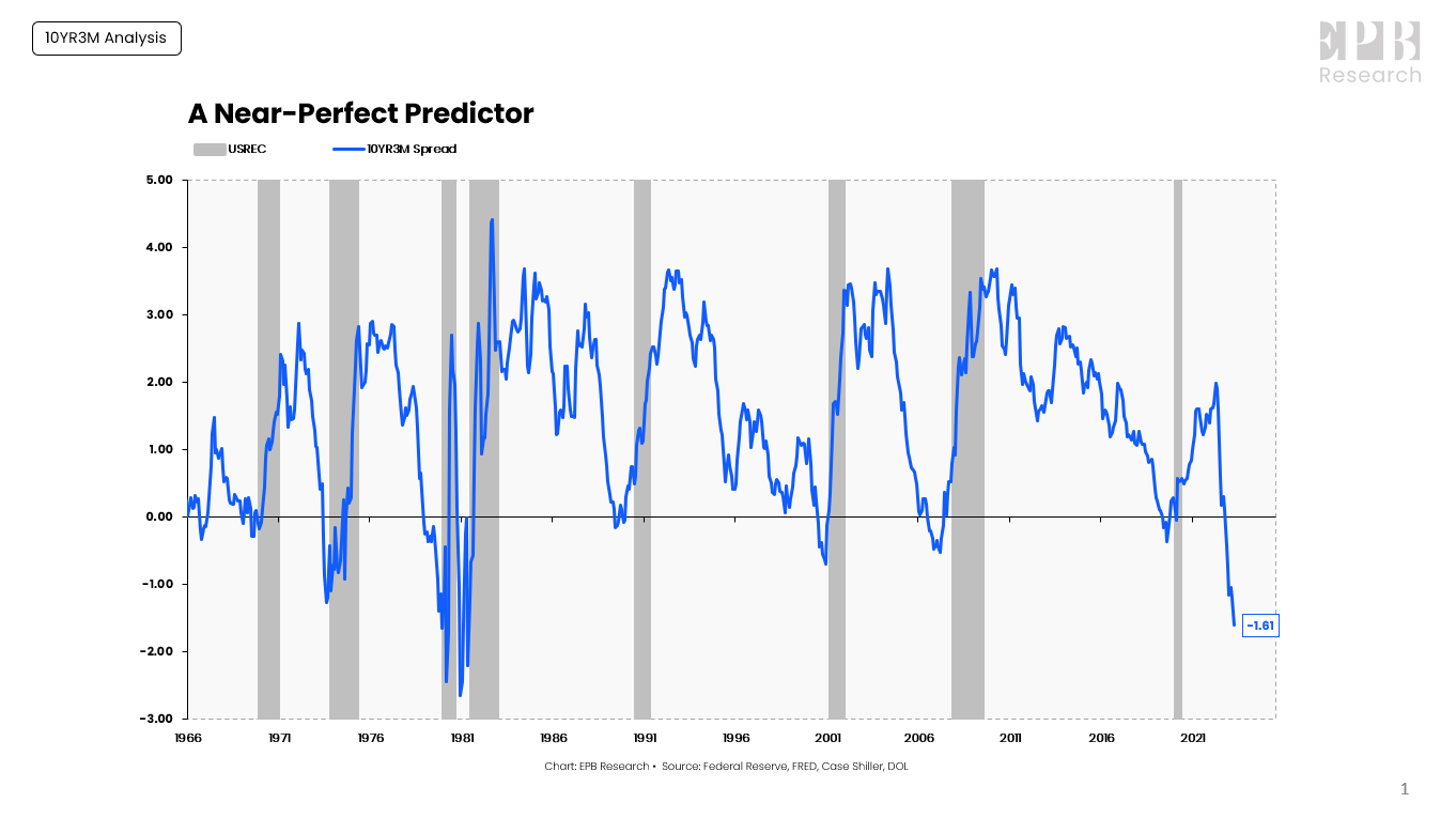
The spread between the 10YR Treasury Rate and the 3-Month Treasury rate, often referred to as the 10YR3M spread, is one of the most reliable leading indicators of business cycle recessions.
The 10YR3M spread has inverted or before every recession since the late 1960s with virtually zero false signals, particularly in the last five decades. The only modern false signal occurred in late 1966.
Today’s yield curve inversion is historic in terms of depth, only rivaling the double 1980 recession.
Federal Reserve, FRED, DOL, Case-Shiller
While the 10YR3M spread has a near-perfect forecasting record, capitalizing on the information can require a painful amount of patience and discipline.
In this post, we’ll review the painfully accurate 10YR3M recession indicator and highlight the wide distribution of outcomes for recession timing, stock market performance, and labor market data after receiving this critical economic signal.
Recession Timing
When the 10YR3M spread turns negative, you can be sure a recession looms in the future.
How far in the future?
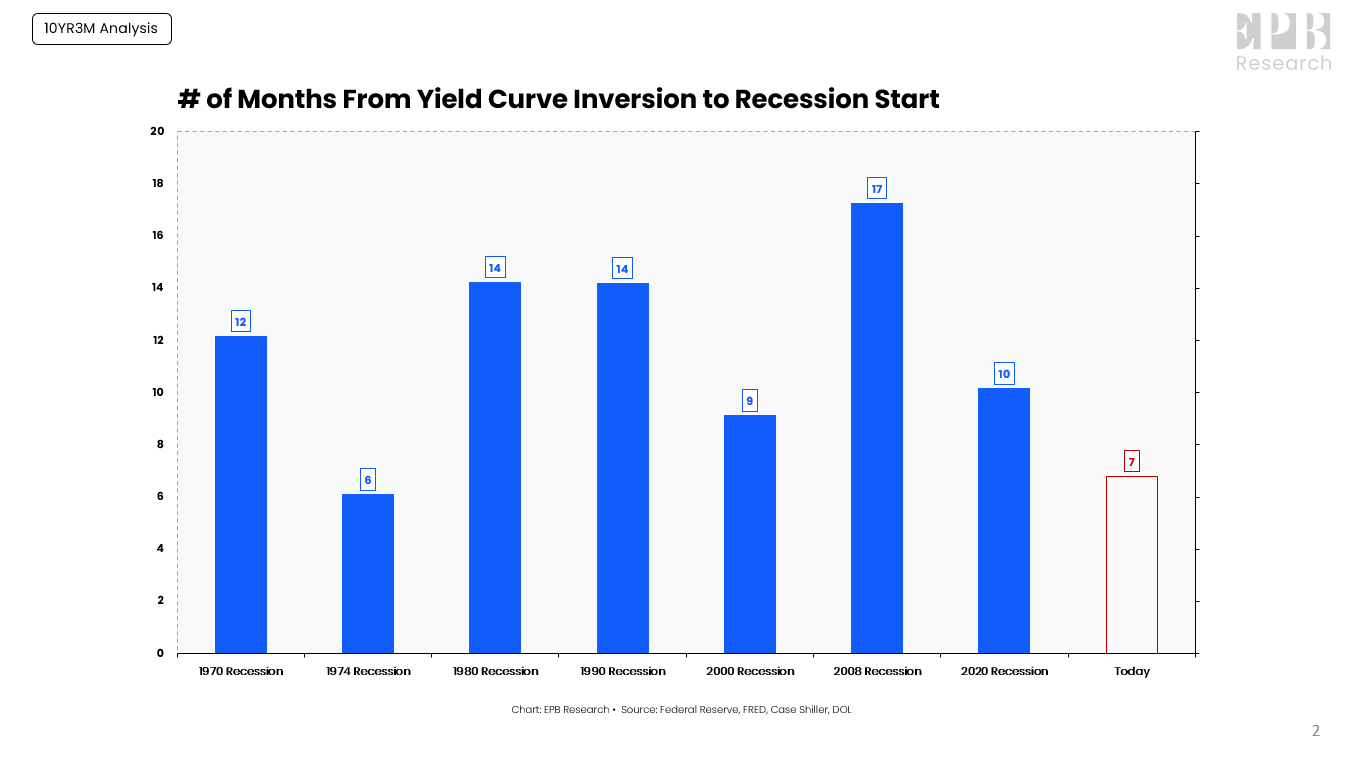
Whenever we ask these business cycle-related questions, the standard answer is to use the mean or average of the historical range of outcomes. On average, a recession begins about 12 months after the 10YR3M curve inverts.
The average can help guide expectations, but the actual range of outcomes is quite wide, with only a 6-month lead time before the 1974 recession and a 17-month lead time ahead of the 2008 recession.
Federal Reserve, FRED, DOL, Case-Shiller
So today’s lag of 7-months is slightly less than the average outcome but within the historical range of outcomes.
Will this cycle be 7-months, 12-months, or 15-months? Narrowing the range of historical outcomes is a quest set out to be accomplished by all market forecasters, with limited success due to the inherent randomness embedded in markets and complex economic cycles.
Stock Market Performance
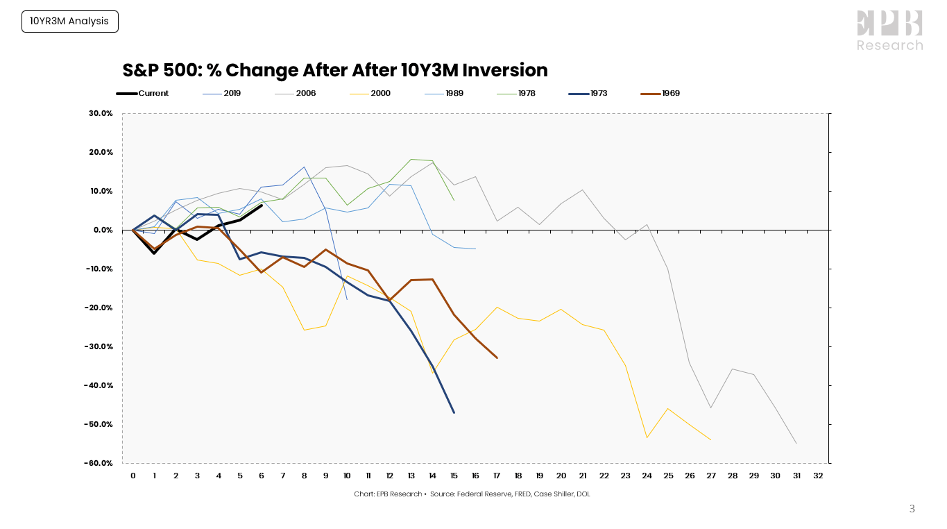
What about the stock market?
The same problem plagues investors because the final outcome is clear, but the path to get there can be quite different, often with no logical explanation.
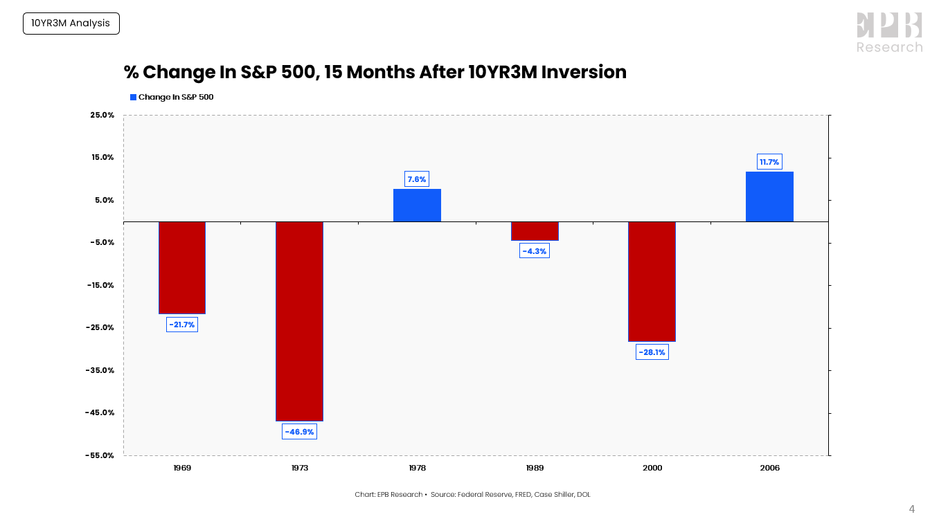
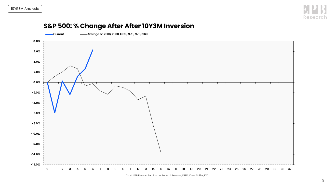
This chart shows the performance of the S&P 500 after the 10YR3M curve inverts, with the bottom axis showing the number of months after the initial inversion.
Federal Reserve, FRED, DOL, Case-Shiller
After the 10YR3M curve inverts, the stock market almost always declines in the following 2-3 years, with a mean and median decline of roughly 14% over 15 months.
Sometimes, like in the 2000s recession, the stock market starts to decline immediately after the initial inversion, never moving higher, and sometimes, like ahead of the 2008 recession, the market can rally another 20% in the following 12-months before collapsing in the ultimate recession.
To highlight the distribution of outcomes, 15-months after the 10YR3M curve inverted, the S&P 500 was down 47% at most and was up 12% at best, a 59% gap in performance.
Federal Reserve, FRED, DOL, Case-Shiller
The average outcome is negative, and the modal outcome is negative, but randomness exists.
As mentioned, on average, the S&P 500 declines roughly 14% and bottoms about 15 months after the yield curve inverts.
Federal Reserve, FRED, DOL, Case-Shiller
Today’s S&P 500 performance is far superior to the average, but if we look at the two extreme cases ahead of the 1974 and 2008 recession, we can again see just how wide the range of outcomes can be.

Federal Reserve, FRED, DOL, Case-Shiller
The ending point for the 1974 and 2008 recessions was similar, a cumulative decline of roughly 50% after the 10YR3M curve inverted, but one decline started around month five, while the other started around month 26.
Labor Market Data
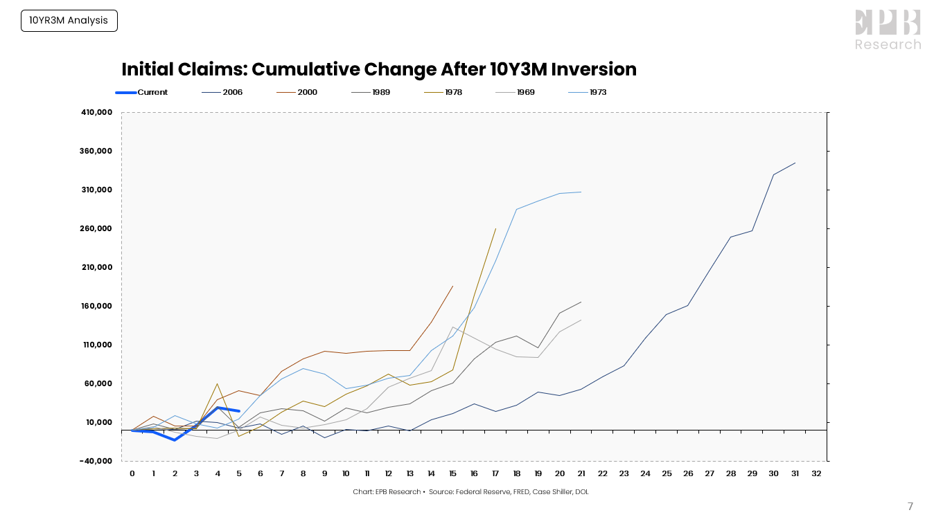
After the 10YR3M curve inverts, it’s just a matter of time before the labor market cracks and initial jobless claims explode higher.
The same difficulty arises when trying to narrow the distribution of outcomes down to the perfect monthly prediction.
Federal Reserve, FRED, DOL, Case-Shiller
The rise in initial jobless claims today is on par with the average trajectory post 10YR3M yield curve inversion.

Federal Reserve, FRED, DOL, Case-Shiller
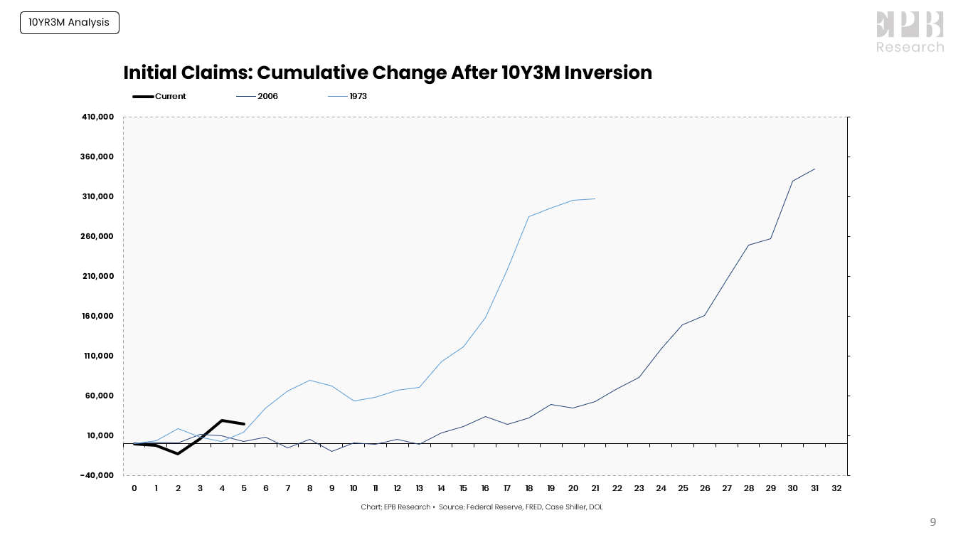
But, just like the stock market example, there are the 1974 and 2008 cases, which took two totally different paths to end up with the same outcome.
The 1974 recession had many similarities to today’s economic cycle due to the inflationary dynamics. If we follow that path, jobless claims are set to explode higher in the imminent future.
Federal Reserve, FRED, DOL, Case-Shiller
The 2008 analog would have a much longer lead time before a clear collapse in the labor market.
Summary
The 10YR3M spread is one of the most reliable leading indicators of business cycle recessions. Capitalizing on the recessionary forecast from this reliable indicator can be challenging without a longer-term view because the distribution of historical outcomes can be wider.
Narrowing the distribution of outcomes and guessing whether this cycle will follow the average or take a more unique path is a tricky proposition because of the randomness of markets, massive revisions to closely watched economic data, and subjective decisions by Central Banks and Political entities more broadly.
When using leading indicators or a business cycle framework, the benefits and predictive power is greatly diminished without the ability to embrace a bit of randomness for the bigger cyclical picture.
Premium Weekly Updates
Each week, I publish video updates on the most important economic trends with actionable trade ideas.
Every week you receive a quick but comprehensive video update (3-5 min) with a full chartbook to digest the latest macro events and what they mean for asset prices.
All the best,
Eric
This article was written by

Eric Basmajian is an economic cycle analyst and the Founder of EPB Macro Research, an economics-based research firm focusing on inflection points in economic growth and the impact on asset prices.
Prior to EPB Macro Research, Eric worked on the buy-side of the financial sector as an analyst at Panorama Partners, a quantitative hedge fund specializing in equity derivatives.
Eric holds a Bachelor’s degree in economics from New York University.
EPB Macro Research offers premium economic cycle research on Seeking Alpha.
Analyst’s Disclosure: I/we have no stock, option or similar derivative position in any of the companies mentioned, and no plans to initiate any such positions within the next 72 hours. I wrote this article myself, and it expresses my own opinions. I am not receiving compensation for it. I have no business relationship with any company whose stock is mentioned in this article.
Seeking Alpha's Disclosure: Past performance is no guarantee of future results. No recommendation or advice is being given as to whether any investment is suitable for a particular investor. Any views or opinions expressed above may not reflect those of Seeking Alpha as a whole. Seeking Alpha is not a licensed securities dealer, broker or US investment adviser or investment bank. Our analysts are third party authors that include both professional investors and individual investors who may not be licensed or certified by any institute or regulatory body.