The Search For An All-Weather Portfolio

Summary
- All-Weather portfolios are composed of a small number of funds that collectively provide decent performance in bull markets and minimize downside risk in bear markets, with no management required.
- A number of designs for AWPs have been proposed over the years, but there is relatively little research systematically comparing them on a risk-adjusted basis.
- We compare a variety of the best-known AWPs over a 17-year test period. The results turn out to be tightly clustered, with greater reward usually accompanied by greater risk.
- We then present an AWP which we arrived at through a process of trial-and-error. No asset classes other than stocks and bonds are involved, but the combination of funds may be surprising to some.
- Nevertheless, we believe our results are in line with the insights of Modern Portfolio Theory.

Patcharapong Sriwichai/iStock via Getty Images
Co-Authored with Total Return Investor
For many small investors, especially those with little interest in following “the market”, the ideal investment portfolio would be one which produced consistently good results without requiring any significant attention or management. Probably, it would be implemented through a small handful of ETFs or mutual funds. Ideally, its value would increase at a steady and respectable pace in good times, would avoid serious damage in bear markets, and would do so without requiring any buying or selling on the part of their owner. Such accounts are often called “All Weather” (or somewhat more derisively, “Lazy”) portfolios.
Simple Two-Component All-Weather Portfolio
Of course, no portfolio of stocks and other financial assets can achieve the ideal of consistently above-average returns with no downturns. Cash under the mattress never has a downturn (setting aside theft or inflation) but produces zero return. The stock market can produce spectacular returns, but with the accompanying risk of horrifying drawdowns.
But what about a portfolio that tries to balance the two? Let’s approximate and say that the stock market returns on average 10% per year, loses 35% in the years of the worst bear markets, and gains 35% in the most exuberant bull markets. So suppose we make our portfolio half mattress cash and half stocks. In an average year, our combined portfolio will gain 5%; in the worst of bear markets, it will lose 17.5%; and in the best of bull markets it will gain 17.5%. Already we’ve eliminated half the deepest valleys in our portfolio, and we’ve still earned 5% on average. If that’s acceptable to you, congratulations: you’ve found your All-Weather Portfolio.
Of course, it’s not a very good AWP. You’d like to keep more of the bull market gains and avoid more of the bear market losses. And surely there’s some asset that provides some return while avoiding losses, say an insured savings account, or a short-term Treasury bill. Without doing any more imaginary math, it’s easy to see that by substituting an insured savings account or short-term Treasury bill for cash, the return of the portfolio will average a little better than 5%, catch a little more of the peaks and avoid more deep valleys. Progress.
But the Compound Average Growth Rate/total return of these two very simple AWPs will probably be unacceptably low for many investors. So, thinking first in terms of a simple two-component portfolio, what designs other than stocks + cash have portfolio managers and theorists suggested for a two-factor AWP?
Historically, the most famous proposal for an AWP has been the “60/40” portfolio - i.e., 60% stocks, 40% bonds. It’s unclear just who was the first to advocate the 60/40; it’s often referred to as “traditional” or “classic.” It is sometimes attributed to Nobel Prize winner Harry Markowitz and his classic 1952 article “Portfolio Selection,” but that article is entirely technical, and contains no such recommendation. Markowitz himself says that at the time the article was written he personally held a 50/50 portfolio. So the identity of the 60/40 originator remains shrouded in the mists of history. There is no question, however, that it’s an intuitive, simple portfolio that’s frequently suggested as an AWP.
And 60/40 is not bad for a start. Exact figures vary, depending on the time frame and the funds used as proxies for “stocks” and “bonds”, but for the period 2006-2023 (we’ll explain the reason for specifying that time period later), we’re using VTI (the Vanguard Total Stock Market ETF) and VFITX (the Vanguard Intermediate Treasury Fund.) Many formulations of the 60/40 call for intermediate-term Treasury ETFs such as IEF or VGIT, but these ETFs do not go back as far as our test period, so we turn to Vanguard’s intermediate Treasury mutual fund with an earlier inception date (2001.) PortfolioVisualizer.com gives us the following results.
CAGR | Best Year | Worst Year | Maximum Drawdown | Sharpe Ratio | |
VTI | 9.26% | 33.45% | -36.98% | -50.84% | 0.56 |
VFITX | 3.25% | 13.32% | -10.43% | -14.24% | 0.49 |
60/40 | 7.38% | 20.92% | -16.86% | -27.94% | 0.69 |
Or, in graphical form,
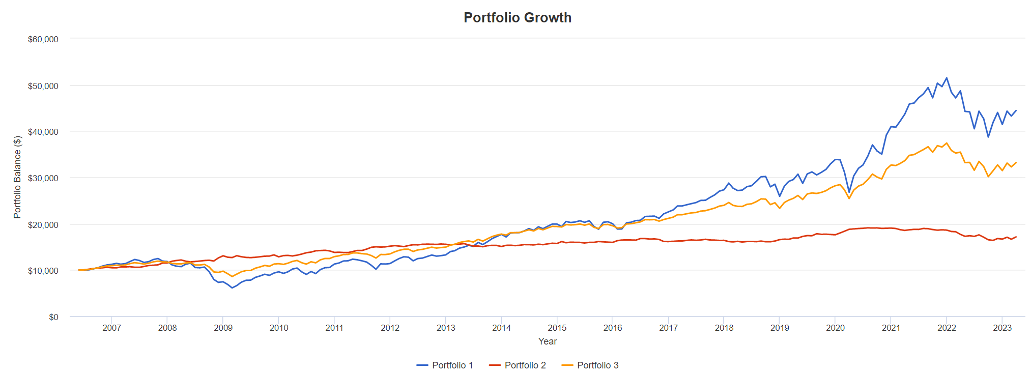
PortfolioVisualizer
The blue line is a portfolio of pure VTI, the red line is pure VFITX, and the yellow line is the 60/40 portfolio. Intuitively, the yellow line is a reasonable compromise between the riskiness of a pure stock portfolio, with its potential for a 50% downturn, and a pure bond portfolio, with only about one-third the downside risk. The 60/40 captures almost 80% of the return of VTI, but with only about 60% of the drawdown risk, which seems like a good bargain.
The last column in the table above – particularly useful for our purposes -- is the Sharpe ratio, called by its inventor William Sharpe the “reward to variability ratio.” It is calculated by dividing the return of an investment (over and above what could be earned by a risk-free Treasury bond) by its standard deviation (roughly, the degree of its tendency to fluctuate over time). It is actually a way to reduce the numbers in the other columns of our table to a single handy figure. Return is expressed as CAGR, the Compound Average Growth Rate. Susceptibility to fluctuation is reflected by the numbers for Worst Year and Maximum Drawdown. What we are after, in evaluating risk/reward tradeoffs, is either higher returns (the numerator of the Sharpe ratio) or less susceptibility to drawdowns (the denominator), or ideally both. In other words, the Sharpe ratio tells us how much reward a portfolio has gotten in return for the downside risk it has historically taken. In this case, it says that the reward-to-risk ratio of 60/40 has been better than either component in isolation.
Some investors may find the risk-reward tradeoff of 60/40 stocks/bonds attractive, but several other percentage allocations have been suggested. Warren Buffett once commented, when asked how he would set up an AWP (he didn’t use the term) for his wife in the event of his death, that he would put 90% in VTI, and 10% in a short-term bond fund (such as SHY, the iShares 1-3 year Treasury ETF). The financial writer Scott Burns has proposed the “Couch Potato” portfolio, 50% stocks and 50% bonds (TIPS, in some versions). TD Ameritrade presents a graph which implies that a 33/67 portfolio is optimal. So, since stock/bond AWPs can be easily imagined for every proportion of stocks to bonds, let’s just go ahead and expand our table to cover a representative range of allocations.
VTI/ VFITX Proportion | CAGR | Best Year | Worst Year | Maximum Drawdown | Sharpe Ratio |
100/0 | 9.26% | 33.45% | -36.98% | -50.84% | 0.56 |
90/10 | 8.87% | 29.80% | -31.95% | -45.47% | 0.59 |
75/25 | 8.18% | 24.57% | -24.40% | -36.98% | 0.63 |
67/33 | 7.77% | 22.62% | -20.38% | -32.23% | 0.66 |
60/40 | 7.38% | 20.92% | -16.86% | -27.94% | 0.69 |
50/50 | 6.79% | 18.48% | -14.97% | -21.60% | 0.73 |
40/60 | 6.16% | 16.04% | -14.06% | -16.67% | 0.78 |
33/67 | 5.70% | 14.33% | -13.43% | -15.72% | 0.81 |
25/75 | 5.14% | 12.38% | -12,70% | -14.63% | 0.83 |
10/90 | 4.03% | 9.52% | -11.34% | -13.45% | 0.71 |
0/100 | 3.25% | 13.32% | -10.43% | -14.24% | 0.49 |
For many investors, particularly those who are retired or “conservative”, the extremes in this table are probably unacceptable. The top two and bottom three rows have worst-year declines larger than their best-year advances. A retiree who wants to avoid a drawdown as large as the -20% which conventionally defines a bear market would actually want to opt for something at the 50/50 level or below. (Vanguard's well-regarded VTINX, the end-stage retirement income portfolio in its Target-Date series, holds its allocation at roughly 30/70.) A more aggressive investor might feel that he should get at least the 7.38% that 60/40 offers, even if it involves taking on a little more risk. The Sharpe ratio doesn’t proclaim any particular allocation right or wrong – some investors are more risk-averse than others, and that’s their call to make – but it does show us where the “sweet spot” seems to be. The message clearly seems to be that the best risk/return trade-off lies between the extremes.
All-Weather Portfolios with More Than Two Components
But an obvious question arises: Is it possible to attain better return than any of these simple two-asset portfolios provide, without increasing risk? Actually, dozens of AWPs have been proposed, and are catalogued in detail on the sites PortfolioCharts.com, LazyPortfolioETF.com, and OptimizedPortfolio.com. Let’s briefly look at some of the most famous.
Two of the well-known AWPs with more than two components expand their universe by including commodities and allocating specifically to long-dated Treasury bonds. The first of these, historically, was Harry Browne’s Permanent Portfolio (first propounded in the 1980s.) The Permanent Portfolio has a simple, symmetrical structure: 25% allocated to each of stocks, gold, long-dated Treasury bonds, and cash. It is thus easily implemented in the well-known ETFs VTI, GLD (SPDR Gold Shares), TLT (iShares 20+ year Treasury ETF), and whatever vehicle one chooses to utilize for cash. (PortfolioVisualizer allows the use of an imaginary vehicle called CASHX, which tracks the one-month Treasury bill. ETFs such as SHV and BIL, with a three-month time frame, come closer to being pure cash, but don’t go back to the beginning of our chosen test period).
Ray Dalio’s All-Weather Portfolio (at least, the version suggested in his interview with Tony Robbins) is similar to the Browne Permanent Portfolio by virtue of including gold and long-dated Treasuries. It also includes intermediate-term Treasuries and commodities in addition to gold. It can be constructed with an allocation of 30% SPY (which Dalio specifies, rather than VTI), 40% TLT, 15% IEF (iShares 7-10 year Treasury ETF), 7.5% GLD, and 7.5% DBC (Invesco Commodity Index Tracking ETF). As above, we substitute VFITX for IEF in our calculations.
Depending on one’s favored allocation from the sweet spot in the simple stock-bond portfolios, the Browne and Dalio portfolios represent no major improvement.
CAGR | Best Year | Worst Year | Maximum Drawdown | Sharpe Ratio | |
Browne | 6.13% | 16.19% | -12.43% | -13.93% | 0.71 |
Dalio | 6.56% | 18.19% | -18.12% | -20.42% | 0.71 |
60/40 | 7.38% | 20.92% | -16.86% | -27.94% | 0.69 |
50/50 | 6.79% | 18.48% | -14.97% | -21.60% | 0.73 |
40/60 | 6.16% | 16.04% | -14.06% | -16.67% | 0.78 |
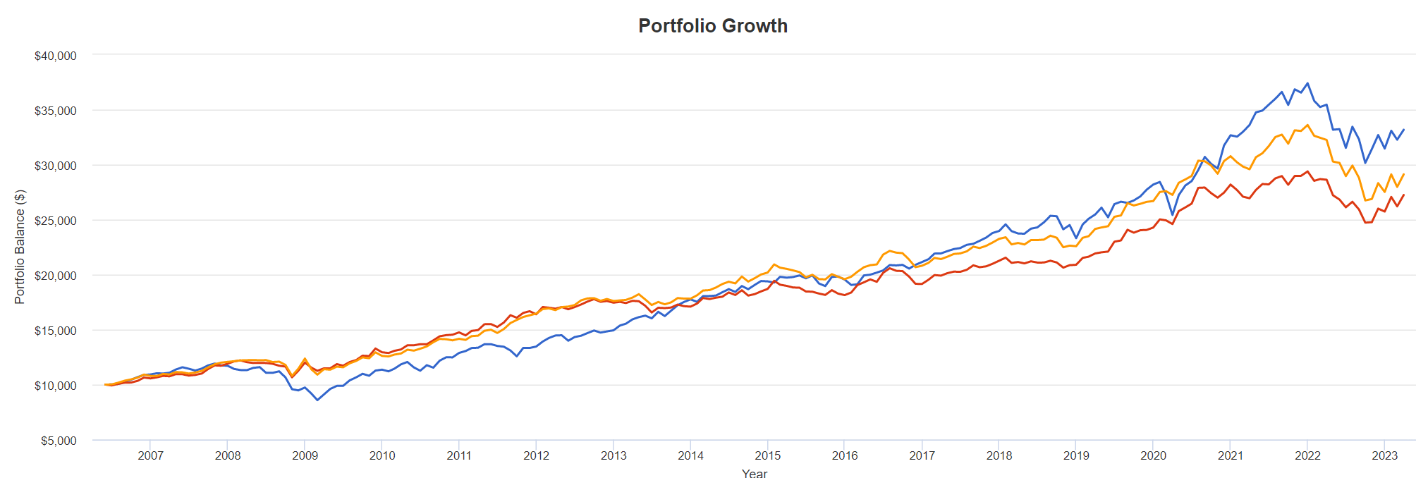
Here it is in graphical form. The blue line is 60/40, the red line is Browne, and the yellow line is Dalio.
PortfolioVisualizer
It is a close race. Depending on your favored metric, 60/40 has the best CAGR and best year. But it also has the worst year and largest maximum drawdown. Browne has the least bad worst year, and the least maximum drawdown. Every portfolio has something to say for it. At this point in our survey, it seems, you pays your money and you takes your choice. There is only a tiny 0.02 difference in Sharpe ratio between Browne, Dalio, and 60/40.
Another kind of adjustment to the simple stock-bond model appears in the AWPs attributed to David Swenson of Yale, and portfolios suggested by Bogleheads bloggers. These portfolios include a global component in stocks and bonds. The Swenson portfolio can be replicated with
30% VTI (Vanguard Total Stock Market ETF), 15% VXUS (Vanguard Total International Stock Index), 5% VWO (Vanguard Emerging Markets Stock Index ETF), 15% IEF (iShares 7-10 year Treasury ETF), 15% TIP (iShares TIPS Bond ETF), and 20% VNQ (Vanguard Real Estate Index ETF).
Again we substitute VFITX for IEF, and VGTSX (the Vanguard Total International Stock mutual fund) for VXUS to have funds with inception dates early enough to cover our entire test period.
It should be noted that as Chief Investment Officer at Yale, Swenson was also able to participate in private equity transactions not available to the general public. The “Swenson” portfolio is simply an attempt to approximate Swenson’s general investment strategy in publicly traded securities.
A somewhat similar but less complex alternative with global exposure is the Bogleheads 3 portfolio, from the forum named in honor of Vanguard founder Jack Bogle.
60% VTI (Vanguard Total Stock Market ETF), 20% VEA (Vanguard Developed Markets Index, VGTSX substituted), and 20% BND (Vanguard Total Bond Market ETF, AGG substituted)
PortfolioVisualizer gives us the following results.
CAGR | Best Year | Worst Year | Maximum Drawdown | Sharpe Ratio | |
Swenson | 6.40% | 25.09% | -25.73% | 40.98% | 0.48 |
Bogleheads | 7.26% | 25.28% | -29.43% | -42.77% | 0.52 |
60/40 | 7.38% | 20.92% | -16.86% | -27.94% | 0.69 |
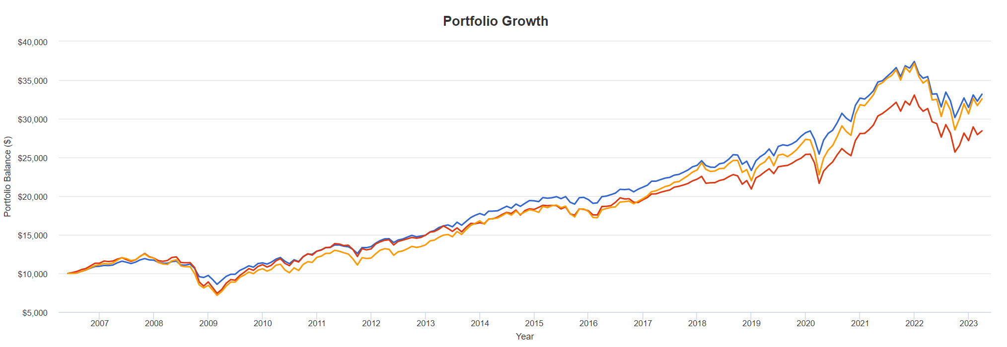
In graphical form, where Blue = Swenson, Red = Bogleheads, and Yellow = 60/40:
PortfolioVisualizer
Once again, we have the same tight pattern, with all alternatives relatively closely bunched. But neither Swenson or Bogleheads have a drawdown or Sharpe reward/risk ratio competitive with 60/40.
There are many other alternatives we could consider. Many involve familiar “factors” such as size, value, quality, momentum, etc., and there are now funds designed to track these factors. But many of these portfolios still exhibit relatively weak CAGR, or relatively elevated drawdowns, resulting in a mediocre Sharpe ratio. Other portfolios look promising at first glance, but the inception dates vary anywhere from 1975 to 2016. When normalized to our test period, which includes several severe economic shocks, the results generally turn out to be less exciting. Still another problem is that because some of the factor funds are relatively recent, looking at them over a fair comparison period requires the use of data sources that are not straightforwardly available to the average amateur investor. Can any portfolio do significantly better than the examples we’ve seen so far, over the same time period? We believe we’ve found some possible strategies for improvement.
A Better All-Weather Portfolio - "Julia"
A common feature of the portfolios that have been presented to this point is the heavy role of broad stock ETFs like VTI. While their employment certainly promotes the goal of portfolio simplicity, the sheer range of more focused ETFs (and even other, more exotic possibilities) deserves exploration. The selection for small investors has never been better. There is much from which to choose between the extremes of broad market funds and individual companies.
In light of this, we have spent considerable time backtesting all manner of funds, including even some closed-end buy-write option funds. We believe that our search has uncovered a distinctly superior alternative, although we would certainly welcome reader suggestions regarding back-testable ETF alternatives which we might be overlooking.
Our AWP is called “Julia.” That is an acronym for “JUst Leave It Alone.” Julia is now up and running as TRI's personal portfolio. It [Julia’s preferred gender pronoun] is tailored for the situation in which he and his wife currently find themselves. Specifically, they are retirees in their late 70s. They have secure sources for a monthly retirement income on which they live comfortably. They want an AWP that will be quite stable, even at the potential sacrifice of some return. However, they also want a portfolio that will protect their current purchasing power against inflation, that will provide a reservoir for funding major emergencies, and, finally, that will fund bequests for their heirs. While we think Julia would also make an excellent AWP for a broader audience – certainly better than the well-known AWPs considered above – the final decision in portfolio selection will always contain an irreducibly subjective element.
Without further ado, here are Julia's components:
16% QQQ (Invesco NASDAQ 100 ETF), 16% VIG (Vanguard Dividend Appreciation ETF), 6% XLP (Consumer Staples Sector SPDR ETF), 6% XLU (Utility Sector SPDR ETF), 6% XLP (Healthcare Sector SPDR ETF), 17.5% TLT (iShares 20+ Year Treasury Bond ETF), 17.5% AGG (iShares Core US Aggregate Bond ETF), 5% TIP (iShares TIPS Bond ETF), 5% SHY (iShares 1-3 Year Treasury Bond ETF), and 5% SNOXX (Schwab Treasury Obligations Money Fund).
With this many components (10), is Julia still a simple portfolio? Perhaps that number tests the limits of simplicity (though some portfolios on the AWP sites involve even more). But remember Julia's guiding principle – “just leave it alone.” Julia, like all AWPs, requires no active management. Once up and running, it can be successfully overseen even by a person with diminished cognitive ability (assuming basic legal competence) or by a spouse or other family member with utterly no interest in the markets.
The Proof is in the Backtesting
“Proof” is too strong a term. As always, “past performance does not guarantee future results.” Nothing in investing guarantees future results, but a past record of successful performance over a long and diverse period is the best available evidence.
We now backtest Julia against the various alternatives we have considered. The testing covers a span of almost 17 years, a diverse period that captures the final phases of two market cycles plus the subsequent plunges of the Global Financial Crisis and the still-ongoing 2022 market difficulties, not to mention the black swan pandemic plunge and recovery.
All the tested portfolios are rebalanced annually (a requirement over which TRI is still dithering, as it runs contrary to the principle of just leaving things alone). The testing extends from June, 2006 through March, 2023. The starting date is neither cherry picked nor arbitrary. It is dictated by VIG, an essential component of Julia. VIG originated just prior to June, 2006, and is the oldest passively indexed dividend appreciation ETF available. If there were a way to push the testing back further without altering Julia's essential character, we would employ it.
A word of caution regarding backtesting consistency is warranted. While there is nothing sacred about any reasonably long test period, it is crucial that, when comparing two or more portfolios, the tests span the same periods. For instance, if we set the starting date for our test to a relatively benign period such as 2011 to the present, 60/40’s Sharpe ratio jumps from 0.64 to 0.82! Comparing, say, Julia from 2006 to the present against a portfolio beginning in 2011 would be comparing apples and oranges.
In effect, then, most discussions of AWPs take place in a vacuum, each occupying its own page on the website that catalogs them. The focus is usually on the construction of the proposed portfolio, and why it should do well going forward. When all is said and done, however, there is seldom a straightforward backtest of two or more AWPs with one another. A backtest may be provided for a single portfolio in isolation, but since different AWPs are built out of different funds with different inception dates, the tests wind up covering different periods, and systematic comparisons are seldom made. This is the gap we have tried to fill in this article. In summary, then, here again are the normalized results for the AWPs we have presented.
CAGR | Best Year | Worst Year | Maximum Drawdown | Sharpe Ratio | |
100% VTI | 9.26% | 33.45% | -36.98% | -50.84% | 0.56 |
60/40 | 7.38% | 20.92% | -16.86% | -27.94% | 0.69 |
50/50 | 6.79% | 18.48% | -14.97% | -21.60% | 0.73 |
40/60 | 6.16% | 16.04% | -14.06% | -16.67% | 0.78 |
Browne | 6.13% | 16.19% | -12.43% | -15.85% | 0.71 |
Dalio | 6.56% | 18.19% | -18.12% | -20.42% | 0.71 |
Swenson | 6.40% | 25.09% | -25.73% | -40.98% | 0.48 |
Bogleheads | 7.26% | 25.28% | -29.43% | -42.77% | 0.52 |
Julia | 7.91% | 20.04% | -15.34% | -18.95% | 0.90 |
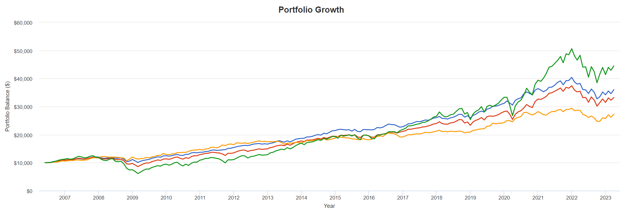
And here is a partial graphical representation.
PortfolioVisualizer
The order of finish here is VTI (green), Julia (blue), 60/40 (red), and Browne (yellow.) Of course, Julia doesn’t beat out pure VTI, which is not really an AWP; but it does have the best CAGR of all the true AWPs, and is competitive for best worst year and least maximum drawdown. The Sharpe ratio sums it up: of all the AWPs considered, Julia offers by far the best ratio of reward to downside risk.
We also want to add a word about the methodology of the various AWP sites referenced above. Usually these are organized like a catalog, with one page per portfolio. There is a wealth of information, and often these sites will provide a list of the funds needed to construct the AWP. There may even be PortfolioVisualizer statistics and a graph. But what one practically never sees is a comparison table of the sort we have just presented. The main reason seems to be that the individual portfolios are not normalized to a simple scale of time (say, years and months), so that apples-to-apples comparisons of the various AWPs can be easily made. We humbly suggest that this is the next frontier for discussion of AWPs. Ideally, such comparisons would also take pains, as we have, to indicate precisely what data sources are being used when comparisons are extended back beyond the inception date of the initial constituent funds.
The Evolution of Julia
Now that we’ve given evidence for Julia's outperformance against a sample of the better-known AWP alternatives, allow us to offer some thoughts on how and why things turn out this way.
Julia's stock side consists of the dividend appreciation fund VIG, the tech-heavy QQQ, and a cluster of three defensively oriented SPDR sector ETFs. No broad stock ETFs will be found in Julia, nor is there any attempt to isolate “factors” such as growth vs. value, large cap vs. small cap, etc. We arrived at this final lineup gradually, after much trial-and-error. Here are the three most significant successful changes we made en route. (A chronicle of all the false moves would be far too long for publication.)
Julia's initial broad market representative, VTI, was gradually whittled from 50% down to nothing. First came the swap of 18% of VTI in favor of 6% each for the defensive sector funds--XLP, XLU, and XLV. That move left Julia's CAGR largely unchanged but dramatically reduced the maximum drawdown from 22.5% to 18.9%, improving the Sharpe ratio from 0.72 to 0.79. Again, a higher Sharpe ratio can result from either increased return or better downside protection.
Next came a further reduction of VTI by splitting it in half – leaving 16% in VTI and allocating 16% to VIG, the dividend appreciation ETF. That move left both the CAGR and Sharpe ratio essentially unchanged, but further reduced max drawdown from 19.0% to 17.7%, incrementally more risk-adjusted progress.
Finally came the big breakthrough. After experimenting with several tech-sensitive possibilities (such as the Columbia Seligman Technology CEF STK), we wound up swapping the remaining 16% VTI for 16% QQQ. With this change, CAGR jumped from 6.99% to 7.91%, and the Sharpe ratio increased from 0.81 to 0.90. While this swap gave up almost all the improvement in max drawdown accomplished by the previous move from 32% VTI into 16% VTI / 16% VIG, we judge that to be a price worth paying for the very significant improvements to both CAGR and Sharpe.
Or, to put the steps in tabular form:
| Julia Equity Allocation | CAGR | Best Year | Worst Year | Maximum Drawdown | Sharpe Ratio |
50% VTI | 6.99% | 19.98% | -18.22% | -22.48% | 0.72 |
| 32% VTI 6% XLP, 6% XLU, 6% XLV | 7.03% | 18.89% | -14.80% | -18.97% | 0.79 |
| 16% VTI, 16% VIG 6% XLP, 6% XLU, 6% XLV | 6.95% | 18.72% | -13.24% | -17.72% | 0.81 |
| 16% VIG, 16% QQQ 6% XLP, 6% XLU, 6% XLV | 7.91% | 20.04% | -15.34% | -18.95% | 0.90 |
So what explains these risk-adjusted improvements?
A fundamental lesson of Modern Portfolio Theory is to build one’s portfolio around assets whose fluctuations in value are as uncorrelated with one another as possible, so that total portfolio value fluctuates downward as little as possible in different circumstances. In the case of AWPs, this is normally accomplished by owning a handful of ETFs from different asset classes: foreign and domestic stocks, bonds of different durations, perhaps some natural resources, commodities and real estate. Julia takes this approach a step further by also pursuing minimal covariance within the stock component.
Here is how MPT applies specifically to the stock segment of Julia. QQQ and VIG tend to counterbalance each other. After all, the tech and other growth stocks in QQQ are often young companies that pay no dividend, whereas VIG selects dividend growers, which are often established companies in mature and stable industries. Their correlation to each other is lower (0.84) than the correlation of either to VTI (QQQ, 0.92; VIG. 0.97). The correlations of the three sector funds among themselves are lower still, while their collective correlation to VTI is a low (at least for stock funds) 0.78. All this means that when something is zigging, something else may well be zagging, which is the key to minimizing drawdown.
And none of this reduced correlation on the stock side touches upon the usual lack of correlation between stocks and bonds, of which Julia contains 45%. That noncorrelation vanished during 2022, making it a painful but worthy test for Julia's acceptability as an AWP. Even during the worst year ever for bond performance, Julia still stayed below the -20% bear market drawdown threshold. So far, the normal order between stocks and bonds seems finally to be reappearing in 2023.
Final Thoughts
In conclusion, it is important to remember that Modern Portfolio Theory’s mandate to build a portfolio out of elements with low covariance doesn’t restrict the search for such elements to the intuitive, familiar, or academically preferred. Different asset classes, in different economic circumstances, suggest combinations that might produce the kind of low covariance that we want, but sometimes the offset between elements is something we never would have dreamt of (e.g., the improvement which adding QQQ to Julia produced.) Many famous recipes and popular foods are the result of kitchen accidents, where no one intended to put two seemingly incompatible ingredients together, but they turned out to be a culinary success. The search for an All-Weather Portfolio will also probably involve some unlikely combinations, and we should be looking for and welcoming the unexpected.
Craig Lehman and Total Return Investor are retired philosophy professors with an interest in portfolio theory. Both have published independently on Seeking Alpha.
This article was written by

Analyst’s Disclosure: I/we have a beneficial long position in the shares of ALL STOCKS IN "JULIA" either through stock ownership, options, or other derivatives. I wrote this article myself, and it expresses my own opinions. I am not receiving compensation for it (other than from Seeking Alpha). I have no business relationship with any company whose stock is mentioned in this article.
Seeking Alpha's Disclosure: Past performance is no guarantee of future results. No recommendation or advice is being given as to whether any investment is suitable for a particular investor. Any views or opinions expressed above may not reflect those of Seeking Alpha as a whole. Seeking Alpha is not a licensed securities dealer, broker or US investment adviser or investment bank. Our analysts are third party authors that include both professional investors and individual investors who may not be licensed or certified by any institute or regulatory body.