Nokia revamps iconic logo in strategy shift away from phone business
- Nokia (NYSE:NOK) is changing its brand identity for the first time in six decades as it transforms from a legacy phone player to a business technology company.
- The revamp, which includes a brand new logo, is part of the Finnish telecom equipment maker's focus on aggressive growth and "to be in businesses where we can see global leadership."
- The decision comes with the aim of stopping people from associating the brand with its phones, since Nokia (NOK) discontinued making mobile phones almost a decade ago.

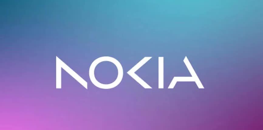
- The logo is no longer blue. It now reflects a range of colors, with five different shapes forming the word 'NOKIA', and has been designed as a "symbol of collaboration."
- "We had very good 21% growth last year in enterprise, which is currently about 8% of our sales, (or) €2B roughly," CEO Pekka Lundmark declared. "We want to take that to double digits as quickly as possible." Dig into Nokia's Q4 earnings report here.