- News
- City News
- ahmedabad News
- It's official: IIM Ahmedabad upholds controversial logo design
It's official: IIM Ahmedabad upholds controversial logo design
ARTICLES

It's official: IIM Ahmedabad upholds controversial logo design The skill gap is widening in India. Be a cut above with an eMasters degree programme from IIT Kanpur Gujarat: The team of forensic expert collected samples after Morbi bridge collapsed All victims retrieved in Morbi Bridge Collapse, no one missing: Sources

IIM Ahmedabad
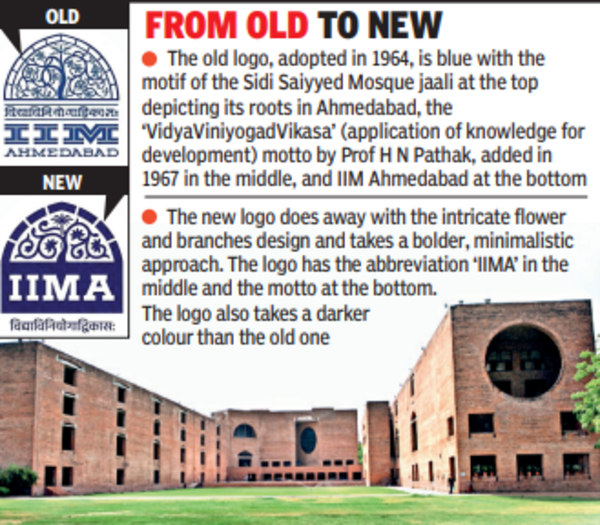
AHMEDABAD: IIM Ahmedabad (IIMA) unveiled its new visual identity on Thursday as part of its future plans with a focus on expanding its global footprint. While the colour rendition and fonts have been modified, the logo retains the Sanskrit verse 'Vidya Viniyogad Vikasa' as its motto. The premier B-school's decision to deviate sharply from its six-decade-old identity had caused much uproar among the IIMA fraternity in India and abroad and spurred several emails and petitions.
The authorities, however, on Thursday announced that they have officially adopted the new logo design that has also been used on the institute's redesigned website launched the same day.

Prof Errol D'Souza, the director of the institute, said that the refreshed logo would take forward the legacy of the B-school while also underlining its international aspirations. He said that the Sanskrit inscription has been retained, whereas the representation of Sidi Saiyyed jaali is made "bold and clear... for the global audience to pick up." Talking to TOI about what transpired between April and November as no apparent change has been made to the logo design, Prof D'Souza said that more feedback was invited and wider consultation was carried out by the Board of Governors (BoG) following apprehensions raised.
"I think the decision was taken keeping in mind the vision of the institute and its increasing global footprint," he said, adding that the board members consulted faculty members and "listened to all sorts of voices" before approving the design.
The statement of BoG, issued by IIMA, mentioned that the refreshed logo aims to convey "a more vivid and vibrant brand identity while retaining all the elements of the existing IIMA logo that evoke and channel trust, authenticity and legacy by emphasizing a strong connection to Indian culture." The alumni and some of the faculty members had raised concerns about the design in April. "The apprehensions remain. The old logo is from our times at IIMA and has been its most distinct visual identity. The new one doesn't reflect that heritage for me," said Dr Bhushan Punani, executive secretary of Blind People's Association (BPA) and an alumnus of the institute.
The logo had attracted criticism because of the premier B-school's reported decision to drop the Sanskrit motto and the non-involvement of faculty members in the decision-making process.
Another alumnus, who did not wish to be named, said that the new logo "looks like a QR code." The alumni said that not much consultation has been carried out by the team that is in a hurry to push the new design in the name of digital communication. "Maybe it will grow on you with time, maybe not. The point is that amid the new IIMs, the IIMA logo stood proud with its strong association to the society that took shape. Would it be possible for any new institution to represent a historic monument through its logo? I think not," said the alumnus.
The authorities, however, on Thursday announced that they have officially adopted the new logo design that has also been used on the institute's redesigned website launched the same day.
Prof Errol D'Souza, the director of the institute, said that the refreshed logo would take forward the legacy of the B-school while also underlining its international aspirations. He said that the Sanskrit inscription has been retained, whereas the representation of Sidi Saiyyed jaali is made "bold and clear... for the global audience to pick up." Talking to TOI about what transpired between April and November as no apparent change has been made to the logo design, Prof D'Souza said that more feedback was invited and wider consultation was carried out by the Board of Governors (BoG) following apprehensions raised.
"I think the decision was taken keeping in mind the vision of the institute and its increasing global footprint," he said, adding that the board members consulted faculty members and "listened to all sorts of voices" before approving the design.
The statement of BoG, issued by IIMA, mentioned that the refreshed logo aims to convey "a more vivid and vibrant brand identity while retaining all the elements of the existing IIMA logo that evoke and channel trust, authenticity and legacy by emphasizing a strong connection to Indian culture." The alumni and some of the faculty members had raised concerns about the design in April. "The apprehensions remain. The old logo is from our times at IIMA and has been its most distinct visual identity. The new one doesn't reflect that heritage for me," said Dr Bhushan Punani, executive secretary of Blind People's Association (BPA) and an alumnus of the institute.
The logo had attracted criticism because of the premier B-school's reported decision to drop the Sanskrit motto and the non-involvement of faculty members in the decision-making process.
Another alumnus, who did not wish to be named, said that the new logo "looks like a QR code." The alumni said that not much consultation has been carried out by the team that is in a hurry to push the new design in the name of digital communication. "Maybe it will grow on you with time, maybe not. The point is that amid the new IIMs, the IIMA logo stood proud with its strong association to the society that took shape. Would it be possible for any new institution to represent a historic monument through its logo? I think not," said the alumnus.
FOLLOW US ON SOCIAL MEDIA
FacebookTwitterInstagramKOO APPYOUTUBE
Start a Conversation
end of article


FOLLOW US ON
Popular Categories
Hot on the Web
Top Trends
Coronavirus in India LiveRussia Ukraine WarAssembly Byelections 2022 LivePakistan vs South Africa Live ScoreImran Khan NewsVirat KohliDelhi PollutionGopalganj BypollAndheri East Bypoll 2022Chennai RainsMunugode Bypolls 2022Delhi School NewsGujarat Assembly Election 2022India Covid CasesMokama Bypoll 2022Red Fort Attack CaseCryptocurrency Price in IndiaHoroscope Today
Trending Topics
Gautam SinghEsha KansaraKarishma TannaShah Rukh KhanHrithik RoshanHansika MotwaniZodiac SignBigg Boss Tamil ContestantsBest Romantic PlacesPankaj TripathiFarah Khan HomeHimanshi KhuranasWildlife Resorts In RajasthanPriyanka ChopraBest Spa In EuropeSunny LeoneVivo Y55sLaptops under 30000WiFi RoutersTablets under 15000
Living and entertainment
Copyright © 2022 Bennett, Coleman & Co. Ltd. All rights reserved. For reprint rights: Times Syndication Service