A Look At The S&P 500 And SPLG

A dashboard with metrics of value, quality and momentum in all sectors.
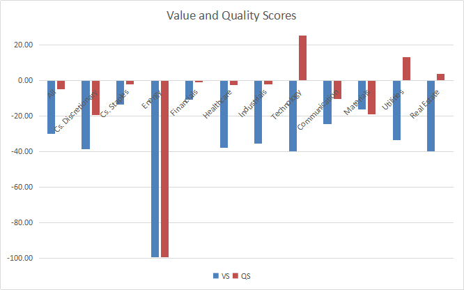
Value and quality scores relative to historical averages.
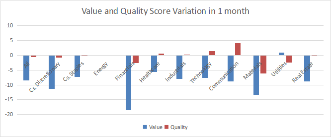
Evolution since last month.
SPLG: A Cheap S&P 500 ETF
This article reports sector metrics in the S&P 500 index. It is also a dashboard of all ETFs tracking this index. Among them, the SPDR Portfolio S&P 500 ETF (SPLG) is less popular than the SPDR S&P 500 Trust ETF (SPY). However, it has a lower expense ratio (0.03% vs. 0.09%) and a lower share price, offering more flexibility to individual investors. Like SPY, SPLG pays quarterly dividends. The fund was launched in November 2005, and it has about $7,500 million of assets under management and an average trading volume of about 3 million shares/day as of writing this (current data are here). All the metrics below are calculated on SPLG holdings.
Shortcut
If you are used to this dashboard series or if you are short of time, you can skip the first paragraphs and go to the charts. Reading everything once is necessary if you want to use the metrics for stock picking purposes.
Our Base Metrics
We calculate the median value of five fundamental ratios in every sector: Earnings Yield ("EY"), Sales Yield ("SY"), Free Cash Flow Yield ("FY"), Return on Equity ("ROE"), Gross Margin ("GM"). All are calculated on trailing 12 months. For all these ratios, higher is better and negative is bad. EY, SY and FY are medians of the inverse of Price/Earnings, Price/Sales and Price/Free Cash Flow. They are better for statistical studies than price-to-something ratios, which are unusable when the “something” is close to zero or negative (for example, companies with negative earnings). We also calculate two momentum metrics for each group: the median monthly return (RetM) and the median annual return (RetY). We use medians rather than averages because a median splits a set in a good half and a bad half.
Value and Quality Scores
We calculate historical baselines for all metrics. They are noted respectively EYh, SYh, FYh, ROEh, GMh, and they are calculated as the averages on a lookback period of 11 years. For example, the value of EYh for technology in the table below is the 11-year average of the median Earnings Yield of S&P 500 tech companies.
We define the Value Score (VS) as the average difference in % between the three valuation ratios (EY, SY, FY) and their baselines (EYh, SYh, FYh). The same way, the Quality Score QS is the average difference between the two quality ratios (ROE, GM) and their baselines (ROEh, GMh). The formulas are below.
VS =100*((EY-EYh)/EYh+(SY-SYh)/SYh+(FY-FYh)/FYh)/3
QS =100*((ROE-ROEh)/ROEh+(GM-GMh)/GMh)/2
The scores are in percentage points. VS may be interpreted as the percentage of undervaluation or overvaluation relative to the baseline. A positive score points to undervaluation, a negative one to overvaluation (positive is good, negative is bad). This interpretation must be taken with caution: the baseline is an arbitrary reference, not a supposed fair value. The formula assumes that the three valuation metrics are of equal importance, except in energy and utilities, where the Free Cash Flow Yield is ignored to avoid some inconsistencies. A floor of -100 is set for VS and QS when the calculation goes below this value. It may happen when metrics in a sector are very bad.
Current data
The next table shows the metrics and scores as of last week’s closing. Columns stand for all the data defined above.
VS | QS | EY | SY | FY | ROE | GM | EYh | SYh | FYh | ROEh | GMh | RetM | RetY | |
All | -29.93 | -4.72 | 0.0319 | 0.3399 | 0.0257 | 12.38 | 47.24 | 0.0479 | 0.5117 | 0.0333 | 14.38 | 45.19 | 12.23% | 7.94% |
Cs. Discretionary | -38.61 | -19.43 | 0.0180 | 0.4682 | 0.0311 | 13.84 | 34.07 | 0.0499 | 0.7617 | 0.0359 | 20.23 | 36.74 | 11.53% | 6.53% |
Cs. Staples | -13.57 | -2.16 | 0.0377 | 0.3987 | 0.0276 | 22.21 | 40.36 | 0.0478 | 0.5556 | 0.0254 | 22.63 | 41.37 | 8.01% | 13.91% |
Energy | -100.00 | -100.00 | -20.2084 | 0.7663 | -0.0030 | -12.14 | 29.56 | 0.0273 | 0.5494 | -0.0208 | 6.15 | 42.43 | 36.81% | -32.33% |
Financials | -10.71 | -0.85 | 0.0623 | 0.4459 | 0.0672 | 8.85 | 76.03 | 0.0644 | 0.5214 | 0.0785 | 9.72 | 70.93 | 17.31% | -6.13% |
Healthcare | -37.88 | -2.41 | 0.0263 | 0.2114 | 0.0257 | 15.33 | 62.49 | 0.0420 | 0.3428 | 0.0414 | 16.27 | 61.91 | 6.19% | 14.16% |
Industrials | -35.58 | -1.93 | 0.0311 | 0.3700 | 0.0253 | 18.58 | 36.84 | 0.0506 | 0.6602 | 0.0334 | 19.42 | 36.67 | 13.20% | 18.13% |
Technology | -39.65 | 29.24 | 0.0292 | 0.1633 | 0.0257 | 28.49 | 65.60 | 0.0425 | 0.3229 | 0.0416 | 18.76 | 61.52 | 15.06% | 25.81% |
Communication | -24.48 | -10.17 | 0.0362 | 0.4311 | 0.0356 | 12.97 | 54.40 | 0.0509 | 0.5827 | 0.0437 | 16.05 | 55.01 | 16.67% | 4.73% |
Materials | -16.09 | -19.10 | 0.0301 | 0.4564 | 0.0318 | 10.35 | 34.21 | 0.0453 | 0.6896 | 0.0267 | 16.00 | 35.22 | 13.88% | 16.38% |
Utilities | -33.51 | 13.09 | 0.0444 | 0.3510 | -0.0663 | 10.31 | 45.40 | 0.0561 | 0.6520 | -0.0421 | 9.78 | 37.59 | 0.67% | -1.81% |
Real Estate | -39.66 | 3.88 | 0.0217 | 0.1177 | -0.0017 | 5.76 | 65.72 | 0.0195 | 0.1286 | 0.0078 | 5.37 | 65.38 | 16.57% | -12.90% |
Score charts
The next chart plots the Value and Quality Scores by sector (higher is better).
Score variation since last month.
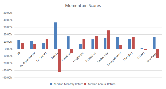
The next chart plots momentum data.
Interpretation
A hypothetical S&P 500 “median” company is overvalued by 29.9% relative to average valuation metrics since 2009. The quality score is 4.7% below the baseline. We can translate median yields in their inverse ratios:
Price/Earnings: 31.35 - Price/Sales: 2.94 - Price/Free Cash Flow: 38.91
Since last month, the three ratios have deteriorated significantly due to price action. SPLG went up by 9.7% in November.
Consumer staples, financials, and materials are the less overvalued sectors (10% to 20%). Other sectors except energy are overvalued by 20-40%. Technology and utilities may partly justify it by a good quality score. Valuation and quality metrics in Energy have been out of the charts for a long time, in a bad way. The median earnings yield (EY) and return on equity (ROE) of S&P 500 energy companies are far below zero. It means most of them are unprofitable.
The S&P 500 has gained about 15% in 12 months, but the momentum measured in median return is about 8% and the equal-weight average is 8.7% (measured on RSP). It confirms what we already know: the capital-weighted index is skewed by Big Tech companies. Technology has the best 12-month momentum measured in median return (above 25%), followed by industrials and materials. Energy, real estate and utilities are in negative territory. Despite an impressive rally in November, energy is still the worst one by far (-32%).
We use the table above to calculate value and quality scores. It may also be used in a stock-picking process to check how companies stand among their peers. For example, the EY column tells that a large consumer staples company with an Earnings Yield above 0.0377 (or price/earnings below 26.52) is in the better half of the sector regarding this metric. A Dashboard List is sent every month to Quantitative Risk & Value subscribers, with the most profitable companies standing in the better half among their peers regarding the three valuation metrics at the same time.
Quantitative Risk & Value (QRV) provides you with a realistic quantitative approach of market risk and sector-oriented value. Get started with a two-week free trial and see how QRV can improve your investing decisions.
Disclosure: I/we have no positions in any stocks mentioned, and no plans to initiate any positions within the next 72 hours. I wrote this article myself, and it expresses my own opinions. I am not receiving compensation for it (other than from Seeking Alpha). I have no business relationship with any company whose stock is mentioned in this article.
Additional disclosure: I am long in various S&P 500 stocks.
