It's time to talk about worst case scenarios.
After all, the prime minister's decision to lock England down was taken because, as he put it, "the virus is spreading even faster than the reasonable worst case scenario of our scientific advisers".
In other words, the reason England is back in lockdown - a decision of enormous consequence for tens of millions of people - ultimately comes down to a dataset.
In one sense this is hardly unfamiliar; after all, COVID is both a public health episode and a data episode. Only by understanding the numbers about how the disease spreads can we understand the risks it poses and the best course of action to respond to it.
Yet here's the strange thing: as far as I can tell, the the latest published "reasonable worst case scenario" in October - dates back to May.
It seems as if members of SAGE, the scientific advisory group which draws up these things and advise the PM on them, don't seem to know what the RWC (the Reasonable Worst Case scenario - let's call it by its initials from now on) actually is.

Now, before we go down this wormhole, it's perhaps worth emphasising that I'm not trying to make a point about whether this lockdown is or isn't the right thing to do.
What I am suggesting is that when decisions of this magnitude are taken it is somewhat perverse to predicate them on a piece of analysis which you have never shared with people.
Yes, there are strong arguments for keeping scary pieces of risk management scenarios private if there is a chance they will foment panic or unrest. But surely that argument is flipped on its head the moment the scenario itself becomes the justification for policy action.
In the world of economics, for instance, the Bank of England would sunder its credibility overnight were it to decide to print hundreds of millions of pounds (as it did this week) and then to say it was on the basis of analysis which it couldn't share with the public.
After all, the best way to ensure the public will go along with lockdown is to ensure they understand why it is being done, on what basis, and can grasp for themselves what changes in the data might prefigure a change of course.
While there are sometimes arguments for suppressing scary data, they are often outweighed by the argument for transparency - if, that is, your goal is to try to maximise compliance and trust.
Unfortunately this government seems to be doing something else: by turns suppressing the scary data, then occasionally giving the public a glimpse of it without providing full access, before declaring that data is the very basis for the policy moves it is taken. Data, in this case, is being used not to inform but to intimidate.
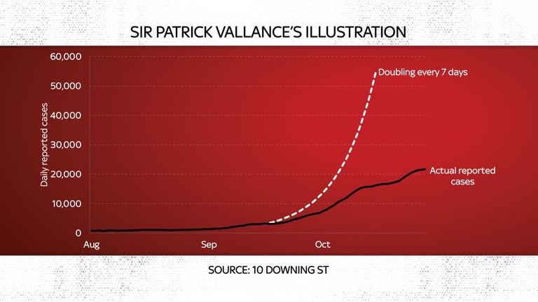
Which brings us back to that reasonable worst case scenario. There is a chance when you hear those words and try to conjure up a scary chart your mind might turn to the one presented by Sir Patrick Vallance, the chief scientific adviser, back in September.
You remember the one: it showed how, left uncontrolled, COVID-19 daily cases could double every seven days, rising to 50,000 a day by mid October. Now, when Sir Patrick presented this chart he was very clear that it was an illustration, so when the topic of worst case scenarios recently came up I assumed that didn't mean Sir Patrick's chart.
But then last week I saw Sir Jeremy Farrar, a senior SAGE member and director of the Wellcome Trust, say on Twitter: "21st Sept CSA & CMO advised that UK could face 50,000 Covid cases by mid-Oct & 200 deaths/day by mid-Nov. These based on SAGE 'Reasonable Worst Case Scenario".
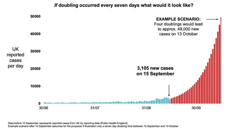
So: if that is indeed the worst case scenario, have we surpassed it? Well, if you look at actual daily reported cases, the short and definitive answer is no. Daily cases, which were what Sir Patrick was referring to, never grew at the rate laid out in his chart and remain barely half the 50k figure he warned of.
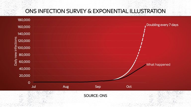
True: as some, including Sir Jeremy have pointed out, there are other measures of infection around the country that do indeed hit or exceed 50,000. For instance the ONS infection survey now shows more than 50,000 daily cases in England alone.
However, this is a very different measure of the disease's prevalence than the one Sir Patrick was referring to: he was talking about daily reported cases, which are simply the number of positive test results; the figure produced by the ONS survey is always considerably bigger because it also estimates the number of people who have the disease but have not been tested.
That might sound like nit-picking until you consider that back in September, when Sir Patrick issued his warning, the ONS survey suggested the number of people infected with the virus was more than double the reported case numbers in that chart.
Had this ONS measure grown in line with Sir Patrick's projection we would have hit 160,000 cases in mid October - not 50,000. And we are still a fair way short of that.
In other words: if this were the RWC then the evidence suggests we are still a long way off it.
It's worth saying though, on the flip side, Sir Patrick's illustration for daily deaths (200 a day by November) looks like being fulfilled - and this is both concerning but also a little odd, given it seems inconsistent with the other part of his illustration.
After all, were reported cases really at 50,000 a day one would expect deaths to be far, far higher - perhaps closer to 1,000 a day. Alas, since journalists were never allowed to ask questions to the chief scientific adviser when he outlined these numbers, the disparity has never been fully explained.
In a sense, this rather underlines why a lack of transparency and a routine publication of these scenarios is so problematic. These somewhat enigmatic announcements leave the country guessing: how much weight to put on these numbers? Are we doing better or worse than them?
In practice the answer is: we aren't doing well and cases are rising faster than anyone would like, but it's not altogether clear this illustration actually helped.
Anyway, contrary to Sir Jeremy Farrar's assertion, it seems that the reasonable worst case scenario produced by SAGE is in fact very different to this illustration. We know as much not because it has been published by the government (even after they used it to justify their lockdown decision) but because versions of it have been leaked to the press.
The BBC had a copy a month or so back and just a few days ago the Spectator published the full thing.
Produced in July, the leaked RWC is both alarming and also somewhat bizarre. Recall that when the Spanish Influenza hit a century or so ago, the second wave was actually worse than the first wave.
Yet the SAGE RWC, while certainly concerning, suggests that deaths would peak at a lower level than in the spring. Bad, certainly, but is this really the worst case?
It also implies a big increase in case growth, but that this would not begin until November.
This is a little peculiar for a few reasons (all of which you can probably guess): September and October are when schools and universities return, a moment that invariably ushers in more infections, and people also tend to spend more time indoors in these months than in the summer, raising the risk of transmission among groups.
Image: RWC infections
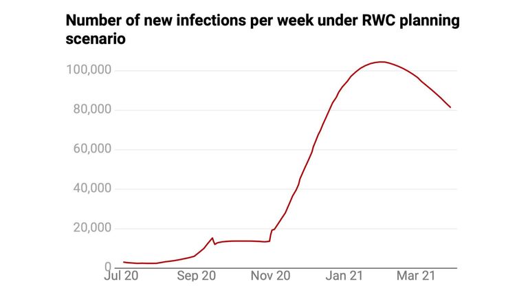
Yet the RWC says that cases could remain essentially flat in October, because "social contacts are reduced that reduce R to approximately 1, keeping infection levels steady until the end of October".
That implies that SAGE expected more restrictions to be introduced in the autumn. It's also possible that they had faith in the test and trace infrastructure to keep the spread down.
Perhaps it's a combination of both. Alas, because the RWC has never been published and its authors have not had a chance to explain it, we simply don't know.
Whatever the explanation, the upshot is that this flat profile for COVID growth throughout September and October means that while Sir Patrick Vallance's illustration looks incredibly pessimistic, the RWC looks very optimistic.
Because cases did indeed start to rise in September and October, they are now about four times higher than the RWC would imply, and are rising at a steeper rate than in the RWC.
This, one presumes, was the basis for the lockdown decision - though, again, no-one will explain this in public since the RWC itself isn't supposed to be public.
Though look at the RWC from another perspective and it no longer looks quite as implausible. Indeed, if one brings forward the projected increase in deaths from late November to early October, it doesn't look that far off the recent increase in deaths across the UK - though the data in the past couple of days might change that.
Still: average it all out and it might not be that, as per the PM, the virus is spreading faster than the RWC, but that it's simply spreading _earlier_ than the RWC projected - but at more or less the same pace. We shall see.
Either way, none of this changes the fact that the virus is indeed spreading and Number 10 has decided something needs to be done.
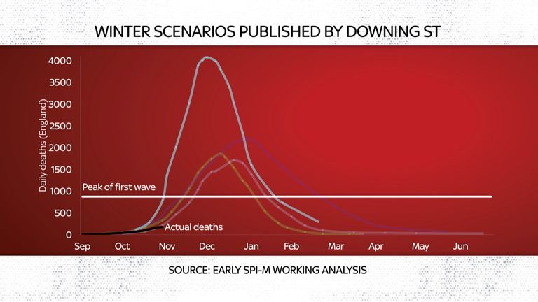
However, even at the briefing over the lockdown decision on Saturday, the fixation with secrecy remained. Sir Patrick produced a new set of charts, including one with various potential projections for daily deaths, one of which implied that by the turn of the year we could be seeing 4,000 deaths a day in England, well over four times the height we saw in the spring. This is deeply disturbing.

Alas, having shown this scary chart, Sir Patrick neither explained the sourcing nor provided detail on how much weight SAGE put on this scary number. As it happens, the same chart was separately leaked to the BBC, along with the key, which showed that the scariest of all those scary projections came from epidemiologists at Cambridge.
A little detective work reveals, too, that it is actually somewhat out of date, and that more recent projections from the same lab suggest the pace of deaths will not climb anywhere near as fast. In fact, deaths are not climbing as fast as any of the projections in the scary chart from Sir Patrick.
Does this actually undermine the basis on which the government is locking down the country? One hopes and presumes not, but it is difficult to judge, given how much secrecy there is over these numbers. Ideally the RWC would be produced and discussed. We would be given a sense of where case growth needed to be before those restrictions were loosened.
As it is, the government instead dispenses arbitrary pieces of guidance to political reporters: maybe it'll all come down to the R number, maybe down to deaths numbers, maybe there will be a pause for Christmas or maybe not. One hardly knows where one stands.
It is no wonder that in many parts of the press there has been the most almighty backlash. Newspapers have been picking apart the charts in the Downing Street presentations, asking whether they have been presented in a way that makes them look scarier than the reality they supposedly depict. The Statistics Authority has now intervened (not for the first time) with its own warning - that these numbers need to be produced clearly and the sourcing needs to be obvious.
Having spent the past nine months closely observing the data, it is plain that we have a problem in this country: cases are rising sharply - though the growth is broadly in line with the rest of Europe. I can't help but think if the government and its advisers had simply been a bit more transparent with the data they are basing their decisions on - a little clearer about the sensitivities and the levels of doubt - then they could have built more trust even with those who oppose lockdown.
These decisions, after all, are judgements. But they are judgements based not on tablets of stone but sometimes equivocal statistical series.
Unfortunately, there is little evidence in Whitehall of enthusiasm for data transparency.
Instead, one gets the impression data is to be used as a tool, to be hoarded and only to be publicly released if it is unavoidable. Consider a story we broke on Sky News last week.
We uncovered data showing that care home cases of COVID-19 had leapt sharply higher in Leeds - such that they are now significantly higher than in the spring peak.
It turns out these are data the NHS has for every part of the UK, but it has chosen not to release them. Is what's happened in Leeds's care homes replicated across the country? Is history repeating itself and are we facing a second surge of cases among the elderly and infirm?
The short answer is we don't know, because the NHS refuses to release the relevant data.
Only in the coming weeks will we find out, when the ONS releases figures on deaths in care homes.
This is disturbing in all sorts of ways. Transparency builds trust. Trust will help improve the effectiveness of whatever policy response the government is imposing.
Yet the government seems to have little interest in transparency. It should be said that this is not the case in every country. Other nations produce far more data, far more openly, on COVID and its treatment than the UK.
Indeed, many of the countries with the most transparent data - places like Hong Kong, Taiwan and Singapore - have also dealt with the virus most successfully.
The UK steadfastly refuses. And I'm afraid this is evidence of a deeper problem: that Whitehall may talk a good game on open data but it rarely actually delivers. It promises transparency but its instincts are to hoard and jealously guard numbers. This is not healthy.