Debt restructuring scheme may soften blow of Covid-19 on books of PSBs

Except for a few, most PSBs face major challenges in raising capital from the market, given the low premium

Topics
debt restructuring scheme | public sector banks | Indian Banks

Abhijit lele  |  Mumbai 

The debt restructuring scheme is expected to soften the blow of the Covid-19 pandemic on books of public sector banks (PSBs). With years of capital infusion, consolidation and enhancement in monitoring risk management, PSBs are relatively better placed to face challenges.

Yet, some of them are likely to need some capital support from the government, in order to absorb shocks, meet regulatory norms, and support business growth. Except for a few, most PSBs face major challenges in raising capital from the market, given the low premium. The governm­ent’s ...

First Published: Wed, September 16 2020. 06:10 IST
RECOMMENDED FOR YOU

Debt restructuring scheme may soften blow of Covid-19 on books of PSBs

Sennheiser Momentum Wireless 3 Review

Sennheiser Momentum Wireless 3 Review

Dhriti Datta   |  18 Dec 2019
  • PROS
  • Seamless connectivity
  • Intuitive auto on/off and pause/play features
  • Brilliant microphone quality
  • CONS
  • Weighty lows throw off the balance
  • Underwhelming soundstage
  • Lacklustre battery life

Verdict

Sennheiser’s third iteration of their wireless headphones lineup - the Sennheiser Momentum Wireless 3 are quite feature-laden. Users are treated with features such as Active Noise Cancellation, USB Type-C charging, adjustable EQ, high-end codec support and Bluetooth 5.0. However, some features including an IP rating and touch controls are missing, which are present in cans costing significantly less. Here, at the Digit test labs, we’ve always been fans of Sennheiser’s audiophile-grade sound profile, however, with the Momentum Wireless 3, the overall sound profile is much weightier in the lows which hampers the mids and the overall balance of sound. Fortunately, this can be tweaked to quite a degree on the adjustable EQ. The Sennheiser Momentum Wireless 3 are priced exorbitantly at Rs 34,990 and unfortunately, there are more than a couple misses that makes these cans hard to recommend for us.

BUY Sennheiser Momentum Wireless 3
Price 34990

Sennheiser Momentum Wireless 3 detailed review

Something that the Sennheiser Momentum Wireless 3 makes abundantly evident is that they are, without a doubt, a luxurious pair of wireless headphones. The opulence is obvious since they are priced at Rs 34,990 which is considerably higher than the wireless headphones offerings from Jabra and Sony, and cost a tad bit more than the Bose NC 700. At first glance, the Sennheiser Momentum Wireless 3 look robust and classy, maybe a bit too bulky. If you’re familiar with Sennheiser’s offerings and their well-defined sound profile, you will expect the same greatness from these as you slip them on. Let’s see if they matched up to those lofty expectations.

Build and design

The Sennheiser Momentum Wireless 3 comes bundled in a stout, cylindrical case with a coarse cloth material that looks and feels sufficiently premium. However, most other brands, at this price point, include a hard case which provides a greater sense of security, more than a cloth carrying case can ever offer. However, the top and bottom of the carrying case do have some sturdy reinforcements that reestablish some confidence in its robustness.

Within the box, you get a USB-C charging cable, a Type-C to USB A converter and a cable for passive usage. There’s a little elastic enclosure for users to neatly tuck away these cables. 

Now coming to the headphones itself, Sennheiser has sourced genuine leather for the headband and memory foam entrapped in sheepskin leather for the ear cups. Long, matte stainless steel arms extend down the ear cups from the headband which possess a slick sliding mechanism to get the right fit. Sennheiser has allowed enough customisation in terms of fit, so these should fit even larger than usual heads. The cups fold inwards which aids in portability and ensures that the carrying case can be as compact as possible. However, they do not fold down flat, so if you’re accustomed to dangling your headphones around your neck, the absence of earcups that rotate full 90-degrees may hamper your neck movement and let’s be frank - it ends up looking ridiculous. 

At first glance, the leather padding on the headband seemed like it may be lacking and may cause a hotspot on the top of our head after a few hours of listening. However, the padding was more than ample and no discomfort was felt, even during extended listening sessions. The cans are rather robust too. We tugged the ear cups apart pretty hard but there were no signs of creeks or squeaks. The clamping force is adequate but not restrictive. Sennheiser really struck the perfect balance in this regard. The cushiony memory foam envelops the ears organically and even at 303 gms, these cans feel rather lightweight, which is a testament to the design engineering at Sennheiser. 

The cans are extremely similar to the previous two iterations in terms of design, however, what has been overhauled in the button layout on the right ear cup. Rubberised, matte material has been utilised, thereby ditching the plastic material used in the previous versions. The Momentum Wireless 3 also entirely does away with the power button and opts for a more seamless approach (more on that later). The right ear cup also features the USB-C port, an LED light for battery indications and a 3.5mm jack for wired listening sessions. 

Overall, we quite liked the retro-inspired design of these over-ear, closed back headphones. We got the all-black version for our review but a new ‘sandy white’ finish will be available soon. However, we’d prefer it if Sennheiser attempted to make them less bulky and more elegant-looking much like Bose’s newest offering - the NC 700. Also note, these aren’t the most stable headphones. While the weight is certainly not felt due to the streamlined design during normal usage, if you wear these cans while gymming or running, they may feel slightly clumsy and prone to easily slipping off. You’d be better off using these headphones at the desk or during commute - be it trains, cabs or airplanes. 

Features

Let’s first mention the features we sorely missed in these exorbitant pair of wireless headphones. Namely, an IP rating for sweat/ water resistance and touch controls. These are quite commonplace in wireless headphones sporting a price tag similar or lesser than these and we were slightly miffed that they were cast aside. Alright, now let’s get into the features the Sennheiser Momentum Wireless 3 do offer. And, they’re quite a few, some of which we possibly value more than water resistance and touch controls. 

Firstly, following the noise cancellation trend, the Sennheiser Momentum Wireless 3 sports Active Noise Cancellation with three different modes - Max, Anti Wind, and Anti Pressure. Now, you can choose to see these as Maximum noise cancellation, medium noise cancellation and minimum noise cancellation respectively. While it is fundamentally this, there are some additional nuances which can be gauged by the names of these modes. Max is quite iterative - the maximum level of ANC is applied to block as much as these cans are capable of. Anti Wind tones down the level of noise cancellation while still paying attention to cancelling out distractions such as wind and rail tracks. Lastly, Anti Pressure is the least intensive mode which attempts to provide a decent level of noise cancellation but without the restrictive feeling usually associated with ANC headphones. This is the most breathable and less-congested mode, which many might prefer, especially if they work in quiet environments and aren’t fans of the pressure ANC headphones exert on the ears and auditory canal. 

The Momentum Wireless 3 features Bluetooth 5.0 which provides seamless connectivity. While there are zero lags and skips in tracks and the wireless range is quite expansive, the cans go a step further by instantaneously connecting to paired devices. The headphones, as mentioned above, have ditched the power button. These employ the simple action of folding in the ear cups to turn off and unfolding the cups to power on. This worked every single time we tried it. Additionally, once you have completed the simple pairing process, merely opening the headphones and putting them on results in the headphones connecting to an already-paired device (with Bluetooth on) and resuming music in a matter of seconds. Pushing a button to power on headphones, waiting for them to pair and playing music manually feels archaic after experiencing these. The cans are also capable of connecting to two devices at the same time with Bluetooth 5.0.

The cans also incorporate an auto pause/play feature where taking the headphones off or simply pulling one earcup away from your ear will pause the music/content until you put them back again. This feature was a tad finicky in our experience and worked well about 70 per cent of the time. However, sometimes it failed to register that the headphones were taken off, while other times it false-registered them being put on even when they were on the table.

The Sennheiser accompanying app - Smart Control - features an adjustable EQ which allows users to customise the sound profile as per their liking. The presence of this is a plus in our books since many brands have given this feature the miss, which is disappointing. The app also lets you control ANC manually as well as Transparent Hearing which lets you listening to your surroundings by amplifying the sounds around you using the mics present in the cans. Transparent Hearing works well but can sometimes fail to amplify the sounds enough. We often had to reduce the volume to about 40 per cent from our usual 60 per cent in order to actually hear our surroundings with Transparent Hearing turned on. Seems quite counterintuitive.

We were glad to see that the Momentum Wireless 3 offers support for codecs such as aptX and AAC. They even have aptX LL (Low Latency) which is a blessing during gaming and streaming content online. The latency is extremely low due to the codec and there’s absolutely no noticeable delay below the picture and sound. Other features include Voice Assistant access, hands-free Alexa support, Tile Bluetooth tracker integration and a 17-hour long battery life. The 17-hour battery life is quite disappointing since competitors such as the Sony WH-1000XM3 offer as much as 34 hours, which is double the battery life at more than 10K price cut.

Controls

A total of four rubberised buttons are present on the right ear cup as well as an additional toggleable button. Firstly, the toggleable button can be pushed up to turn ANC off, pushed down once to switch ANC on and pushed down again to turn on Transparent Hearing mode. The second push doesn’t lock the button into position but is simply a spring-loaded switch. Due to this, pushing the button upwards, counterintuitively, turns OFF ANC instead of turning it on. We’d much prefer a three-level toggleable button without the spring mechanism that allowed us to quickly go back to ANC mode from Transparent Hearing mode by simply pushing upwards. In this complicated setup, we often ended up pushing the toggle upwards which turns ANC off and then nudge it down again, which seems to add a few seconds to operations instead of ideally shaving them off. The actual way to quickly go to ANC on mode from Transparent Hearing is bu pushing the button down, which frankly makes no sense, but if you can grudgingly learn this counterintuitive action, it should work fine for you.

The three buttons in the middle control playback of music or any content you’re watching. The middle button can pause or play music with one push. Pressing the middle button twice takes you to the previous track while tapping it thrice consecutively brings you back to the previous track. All the playback controls worked pretty seamlessly, however, the buttons need to be more distinct, especially from each other, since we often had to feel around the back of the right ear cup for quite a while before realising which button we had our thumb on.

For calls, pressing the button in the centre once answers the call, pressing it again ends the call and holding the button for a second rejects the call. When in a call, holding down the Volume - (volume minus) button for two seconds mutes the call, while holding either volume button unmutes it. The button on the very bottom activates your phone’s voice assistant with one tap and holding it down for 5 seconds puts the cans into pairing mode. Lastly, pressing the middle button for two seconds relays how much battery is remaining in the headphones.

Performance

Sennheiser audio products are customarily lauded for their balanced sound profile that delight audiophiles, even the consumer-grade ones. This is apparent since our Zero1 award winner for the best true wireless IEM in 2019 went to the Sennheiser Momentum True Wireless whose sound profile managed to capture the intricacies and nuances across frequencies. However, the Sennheiser Momentum Wireless 3 surprised, no, disappointed us with its warm sound profile that was brought down due to the overbearing weightiness in the lows. The bass response is also slightly above what we would have preferred and have come to expect from Sennheiser products.

In Another One Bites the Dust by Queen, the bass response is punchy and accurate, however, its heaviness disrupted the overall clarity of Mercury’s piercing vocals. If you’re someone who enjoys heavy bass response, you will not find this jarring in any manner, however, for us these were a bit above our target mark for what we read as pleasant bass response. The low frequencies are extremely weighted on the headphones and tracks such as I’ll Keep Coming by Low Roar clearly enunciate that the heavy-weighted lows can end up sounding quite muddled, thereby disrupting the overall balance of the track. 

The mids, on the other hand, are well-balanced and almost neutral which leads to accurate reproduction of lead instruments and vocals. Unfortunately, the hefty lows cause some auditory masking in the mids leading to vocals sounding a tiny bit veiled and pushed back into the mix. Popular Monster by Falling in Reverse falls prey to auditory masking quite discernibly. The vocals, which are somewhere along the lines of upper mids, stay clear and crisp, however, the lead guitar tends to be pushed to the background and the fine details are eaten up by the overindulgent weighty lows. 

Where these cans truly shine is upper mids and the highs which balanced and accurate reproduction. They have the signature Sennheiser drop off in part of the highs which can be jarring to human ears. So without sounding sharp at all, the detail and brightness is kept intact in high frequency vocals and instruments. To get an idea of this detailed representation, you can listen to Josh Kiszka’s striking high-frequency vocals in Safari Song by Greta Van Fleet.

Imaging on these cans is stellar. All the instruments are positioned accurately and the left and right channel separation is precise as well. Soundstage, however,  was a bit of a miss for us. It is expansive enough to be satisfactory, but for the price you’re paying and also owing to these being large over-ear headphones, it feels a bit too cramped in comparison. Immersiveness takes a hit because of this in tracks such as Hotel California by The Eagles. The soundstage is decently wide but barely has any height at all. 

The Momentum Wireless 3 are an extremely loud pair of headphones with enough drive and enthusiasm even at a baffling 30 per cent volume. We usually listen to headphones at 60 per cent since that’s where we often find enough drive to get us swaying with the music, but with these 40 per cent was more than sufficient to have us tapping along to the boomy beats. 

Coming to Active Noise Cancellation performance, we found the Sennheiser Momentum Wireless 3 to be lacklustre, especially when compared to ANC monsters at similar or lower price point such as the Bose NC 700 and Sony WH-1000XM3. Even the Jabra Elite 85H surpasses the Momentum Wireless 3 when it comes to ANC performance, which is disappointing. Nevertheless, the performance isn’t what you’d call bad per se, it's just that there are other options on the market which are much more capable in this regard.

The ANC does relatively well when it comes to drowning out constant sounds, especially in the mids and highs - such as office chatter, train tracks and more. However, its performance at muting low-frequency sounds such as the AC rumble, airplane background sounds and even typing of mechanical keyboards is not as competent as other contenders. Occasionally, even train track sounds made it through when we were listening to music at 50 per cent volume or below. There’s an ANC mode for ‘Anti Pressure’. Pressure is commonly felt is multiple ANC-enabled headsets, however, we could feel very slight pressure even on Max ANC mode.

Battery life is another gripe we have with these headphones. It is substantially underwhelming at a mere 17 hours when some competitors are capable of over 30 hours! Additionally, we also struggled to get the quoted 17 hours of juice out of these headphones. With ANC on and volume levels at about 40-50 per cent, we managed to squeeze out about 15 and a quarter hours from the Momentum Wireless 3. Fortunately, they have bundled a wire for passive usage should these cans die out on you during long, international flights or train/bus commute across cities.

Overall, the ANC performance and battery life left us wanting much more from these exorbitantly-priced wireless headphones. The microphone quality, however, is exceptional, as is usually the case with Sennheiser products, and we’re glad it's still the same with the Momentum Wireless 3. The warm-sound profile is suited for pop, hip hop, EDM and rap. But rock, metal, classical genres and vocal-centric tracks suffer due to the heavy lows and muddled bass response, which makes these not-so-balanced Sennheisers hard to recommend for us, when it comes to sound quality.

Bottomline

The Sennheiser Momentum Wireless 3 are a decent pair of headphones which stand out due to their retro design, comfortable fit and intuitive features such as auto on/off and auto pause/play. The sound profile leans towards being warm and the lows are quite weighted. The bass response is also a bit too boomy for us which veils some details in the mids and vocals. The highs, however, are reproduced quite exquisitely. The premium price tag calls for perfection and while the ANC is certainly decent, it doesn’t compare to competitors from Bose and Sony in the slightest. Battery life is also lacklustre at merely 17 hours, according to the company. Therefore, if you take calls on your wireless headphones frequently and prefer a pronounced bass response, these headphones will suit you well. If you like a more balanced sound profile, you might want to give the Sennheiser Momentum Wireless 3 a skip.

Sennheiser Momentum Wireless 3 Key Specs, Price and Launch Date

Price: ₹34990
Release Date: 10 Dec 2019
Variant: None
Market Status: Launched

Key Specs

  • Playback Time Playback Time
    17 hrs
  • Frequency Range Frequency Range
    6Hz - 22kHz
  • Channels Channels
    NA
  • Dimensions Dimensions
    NA
logo
Dhriti Datta

Perpetually sporting a death stare, this one can be seen tinkering around with her smartphone which she holds more dear than life itself and stuffing her face with copious amounts of bacon.

Advertisements

Trending Articles

Latest Reviews

view all
Advertisements

Sennheiser Momentum Wireless 3

Price : ₹34990

Sennheiser Momentum Wireless 3

Price : ₹34990

Digit caters to the largest community of tech buyers, users and enthusiasts in India. The all new Digit in continues the legacy of Thinkdigit.com as one of the largest portals in India committed to technology users and buyers. Digit is also one of the most trusted names when it comes to technology reviews and buying advice and is home to the Digit Test Lab, India's most proficient center for testing and reviewing technology products.

We are about leadership-the 9.9 kind! Building a leading media company out of India.And,grooming new leaders for this promising industry.

DMCA.com Protection Status

Debt restructuring scheme may soften blow of Covid-19 on books of PSBs

Some People Are Bad-Mouthing Film Industry, Our Culture Being Defamed: Sanjay Raut

Some People Are Bad-Mouthing Film Industry, Our Culture Being Defamed: Sanjay Raut

"Some people are bad-mouthing film industry. It's not only the industry but also our culture-tradition that is being defamed," Sanjay Raut said.

Some People Are Bad-Mouthing Film Industry, Our Culture Being Defamed: Sanjay Raut

Sanjay Raut: They say there is a drug racket. Is it not in politics or any other sector? (File)

New Delhi:

Shiv Sena MP Sanjay Raut on Tuesday said that some people are "bad-mouthing" the film industry and asserted that it is the responsibility of the government to check the menace of drug packet.

"Some people are bad-mouthing film industry. It's not only the industry but also our culture-tradition that is being defamed. They say there is a drug racket. Is it not in politics or any other sector? It is the responsibility of government and people to stop it," Mr Raut told ANI.

Without naming BJP MP Ravi Kishan who had on Monday raised the issue of the use of drugs in the film industry, Samajwadi Party (SP) MP Jaya Bachchan on Tuesday stated that she was "ashamed that yesterday one of our members in the Lok Sabha, who is from the film industry, spoke against it".

"Just because there are some people, you cannot tarnish the image of the entire industry. I am ashamed that yesterday one of our members in the Lok Sabha, who is from the film industry, spoke against it. It is a shame," she said during the zero hour in Rajya Sabha.

She stated that people working in the entertainment industry are "flogged" by social media.

(Except for the headline, this story has not been edited by NDTV staff and is published from a syndicated feed.)

Debt restructuring scheme may soften blow of Covid-19 on books of PSBs

Google Pixel Review

Google Pixel Review

By Sameer Mitha | Updated May 22 2019
Google Pixel Review
DIGIT RATING
78 /100
  • design

    98

  • performance

    79

  • value for money

    59

  • features

    63

  • PROS
  • Great build and design
  • Sublime performance
  • Stellar camera (both, rear and front)
  • Google Assistant is interesting, if not perfect
  • CONS
  • Mono speaker
  • Expensive

Verdict

The Google Pixel is the closest Android gets to an iPhone-like experience, but it's not quite there yet. It's the best Android flagship today, but that's not enough to justify it's price. If you want to push Android to its limits, the OnePlus 3 is a more value-for-money purchase.

BUY Google Pixel
Buy now on amazon Out of Stock 22299
Buy now on flipkart Out of Stock 30499

Google Pixel detailed review

I have always been fascinated by the Nexus brand of smartphones from Google. They offered the smoothest Android experience, were well designed and made for very attractive products. My love for the Nexus-line has been well documented in my reviews over time, but just in case you missed those, here's more proof.


At the Pixel event in San Francisco, Google officially killed the Nexus brand, adding its smartphones to the Pixel line (for the uninitiated, Pixel was/is Google’s brand of unsuccessful Chromebooks). The hallmark of a Nexus devices was that they appealed to the geeks and were affordable. The Pixel phones have taken a different route. They are priced in the premium range, and with state-of-the-art hardware. But is this enough for Google to succeed in against the Apple's and Samsung's of the world?

Build and design

The back of the device is unique, with glass on top and metal at the bottom. If you hide the glass part of the phone its easy to mistake it for an iPhone. That’s probably why Google introduced the half glass back as I see no or very little utility to it. The metal body would clearly do a better job of heat distribution. The glass may help in better antenna performance, but then, the Pixel doesn't do any better than others either.

I love how light the Pixel is. It weighs a mere 143 grams, making it one of the lightest smartphones I’ve held recently. The weight distribution is good and it is a mere 8.5mm thick. Coupled with a 5-inch form factor, it is one of the best smartphones for single handed use. The fingerprint sensor on the back is easy to reach and responds fluidly.

My colleague, Prasid, wrote in his Pixel XL review, “I’m not particularly fond of the Pixel XL’s design, but I’m definitely not writing it off as a badly designed smartphone. It’s functional, but not eye-catching, something many want their smartphone to be. Also, if this is Google’s take on the phablet, then I can’t wait to find out how compact the Pixel is.” 

I think the Pixel is a fantastic phone as far as the build and design are concerned. It feels light, but not fragile,  it's meant for one handed use, and it fits in the palm of my hand with ease. Moreover, the rounded edges make it a tad more ergonomic, giving the iPhone 7 a run for its money in this department. The only downside to the phone is that it has a mono speaker. I have grown used to stereo speakers on a smartphone. Even the iPhone 7 has a stereo speaker setup. But, the mono speaker is loud enough (even louder than the Xperia XZ’s stereo setup) so I’m probably nit-picking here. 

Display & UI

The Pixel has a 1080p AMOLED display and it is gorgeous. At its brightest, it shows 709 lux, when tested with a luminance meter. It can also go down to 10 lux, which is quite good for those prone to using their phone in the darkness. As far as brightness, colour reproduction and overall display performance is concerned, there's really nothing to complain about.

Just like the Pixel XL, the touch response on the Pixel is great, and it feels premium. The contrast is top-notch, similar to the new iPhones. The Pixel’s display can feel a bit dull with adaptive brightness on and I found myself readjusting the brightness slider especially in outdoor conditions. The display is one of the best you can get today. It is easily one of the best 1080p displays available on a smartphone today.

Performance and UI

When it comes to the benchmark scores, there are some places where the Pixel performs better than the XL and some where the Pixel XL excels. Here is a look at the benchmark scores of the Pixel when compared to other flagship devices. It's clear that the iPhone 7 and iPhone 7 Plus are far ahead, which isn't a surprise. 


Create bar charts


Coming to everyday performance, the Pixel is smooth. Very smooth. There isn’t an app that didn’t open instantly, or any game that stuttered with performance and any app that crashed. From quickly opening the camera app with a double tap of the power button, to using Android 7’s muti-window capabilities, everything ran Pixel Perfect (pun intended). With everyday performance, I have no complaints with the Google Pixel. 

If there is one thing we’d like to talk about, though, it's how warm the smartphone gets. The Pixel can get quite hot. During 4K video recording the smartphone reached 46 degrees in about 10 minutes, while during gaming I managed to get the smartphone up to 41 degrees Celsius. The metal part of the phone dissipates the heat more, so that's where you'll feel most of it. While heat dissipation is good, these temperatures should ideally be lower on a smartphone. You won't feel much heat on the top part of the back, though. In the long run, heating may reduce the life of the hardware inside.

Coming to the UI, Google has a done a fantastic job. There are a few things here which I liked. For example, you can schedule the wallpaper to change every day if you like. You can get the Google assistant to call you Batman and the overall fluidity in animation just makes everything look pretty. 

Google Assistant is brilliant yet stupid. For example, I can ask it the most complex math question, ask for directions, set reminders, find movie reviews and more and it works brilliantly. But if I say, “OK Google, lock this phone” or “OK Google, lock the screen”, it refuses to do it ,which is a bummer. Another thing is if you are training the device to your voice, we recommend doing it in a slightly noisy environment. This makes it easier for the phone to recognise your voice amidst ambient noise. If you want to know how Google Assistant compares with Siri, you can click here and find out. 

Overall the performance is state-of-the-art and the UI is butter smooth, but it's still far from iPhone level smoothness. It's the closest Android has come to it, though.

Camera

Since the camera of the Pixel and the Pixel XL are the same I'd like to redirect you to the Pixel XL review to read about the camera performance.

Battery

On the PC Mark test, the smartphone lasted for 8 hours and 19 minutes, which is respectable, but not ideal. It's a whole hour more than the Xperia XZ and we can easily say that in real world usage the smartphone matches the battery life of the iPhone 7. As mentioned above, though, this isn’t the best. Phones like the OnePlus 3 can last longer.

Coming to real world performance, the device can last for one day of above average use, which is again good, but not ideal. Yes, I have seen better battery performance from devices such as the iPhone 6s Plus and One Plus 3, but the Pixel's battery life isn’t bad by todays smartphone battery life standards.

Bottom line

This is the sixty thousand rupee question, and the short answer is that the Pixel is definitely the best Android has to offer. It shows what a Google phone can be, but I don't see myself spending 50K+ on this device. Why? Because the OnePlus 3 is almost as good, and given it's price, it's well worth the camera. Sure, the Pixel has a droolworthy camera, but that's the only area where it's substantially ahead of the OnePlus 3, and the latter's pricing makes up for it. In fact, this is exactly what the Nexus 5 had going for it. It was priced well, and though it lacked a flagship-class camera, everything else made up for it.

If you're an Android enthusiast, and you want to push your phone to the limits, while assuring first day updates, the Pixel is indeed for you. However, so is the OnePlus 3. At Rs. 57,000, I want more than just a functional device. It seems the best of Android is still, only functional, and far from iPhone-level performance. The Pixel matches the iPhone camera, and even surpasses it at times, but overall, it's not in the same league as the iPhone 7. This, from an out-and-out Android fan. In fact, the Pixel is more of a threat to Android flagships, than it is to Apple's bread and butter. It does have a headphone jack, though.

Google Pixel Key Specs, Price and Launch Date

Price:
Release Date: 18 Oct 2016
Variant: 32GB , 128GB
Market Status: Launched

Key Specs

  • Screen Size Screen Size
    5" (1080 x 1920)
  • Camera Camera
    12 | 8 MP
  • Memory Memory
    32 GB & 128 GB/4 GB
  • Battery Battery
    2770 mAh

Related Reviews

Nokia 5.3 Review

Oppo Reno4 Pro Review

Asus ROG Phone 3 Review

OnePlus Nord Review

OnePlus 8 Pro Review

logo
Sameer Mitha

Sameer Mitha lives for gaming and technology is his muse. When he isn’t busy playing with gadgets or video games he delves into the world of fantasy novels.

Advertisements

Trending Articles

Latest Reviews

view all
Advertisements

Popular Reviews

View All

Google Pixel

Buy now on amazon 22299

Google Pixel

Buy now on amazon 22299

Digit caters to the largest community of tech buyers, users and enthusiasts in India. The all new Digit in continues the legacy of Thinkdigit.com as one of the largest portals in India committed to technology users and buyers. Digit is also one of the most trusted names when it comes to technology reviews and buying advice and is home to the Digit Test Lab, India's most proficient center for testing and reviewing technology products.

We are about leadership-the 9.9 kind! Building a leading media company out of India.And,grooming new leaders for this promising industry.

DMCA.com Protection Status

Debt restructuring scheme may soften blow of Covid-19 on books of PSBs

Samsung S5620 Monte - capacitive touch, 3.2MP, Wi-Fi & GPS, under Rs. 12,390 Review

Samsung S5620 Monte - capacitive touch, 3.2MP, Wi-Fi & GPS, under Rs. 12,390 Review

Vinod Yalburgi   |  29 Apr 2020
DIGIT RATING
80 /100
  • design

    80

  • performance

    70

  • value for money

    80

  • features

    80

User Rating : 4/5 Out of 1 Reviews
  • PROS
  • Trendy & portable, weighs hardly 92g
  • Wider 3-inch TFT capacitive touchscreen
  • User friendly interface with social networking integration
  • CONS
  • Lacks hardware keypad
  • Touchscreen interface is sluggish and unresponsive

Verdict

Samsung S5620 Monte promises to be a good mid-range multimedia phone with a decent camera and good music player at an affordable price.

BUY Samsung S5620 Monte - capacitive touch, 3.2MP, Wi-Fi & GPS, under Rs. 12,390
Price 12390

Samsung S5620 Monte - capacitive touch, 3.2MP, Wi-Fi & GPS, under Rs. 12,390 detailed review

The Samsung S5620 Monte is basically targeted at social networking segment with the budget conscious consumer in mind. It has a glossy black finish on the front panel with the 'select', 'call answer' and 'call disconnect' buttons placed at the bottom. Its aerodynamic design and well rounded golden-orange side panels add to the stylish design and glamour quotient of the mobile. Its TouchWiz UI and smart unlock feature add to the technological enhancements of the user interface. The S5620 Monte possesses a candy-bar design with an LCD screen supporting 16:9 aspect ratio, a 3.15-megapixel camera with advanced shooting modes such as Smile Shot, panoramic shot, and Face Detection. It has a microSD slot (upgradable upto 16GB) and all the basic connectivity options including Wi-Fi 802.11 b/g, Bluetooth and GPS. The volume controls are conveniently placed on one side panel and the microSD slot, 'camera' and 'lock' button on the other. The camera lens is placed at the top of the back panel to allow the user to take quick snapshots with ease.


Samsung S5620 Monte (front view)

It has a touchscreen design similar to the B5310 CorbyPro. However, it lacks the hardware keypad which is a major drawback. The touchscreen employs a user friendly interface with well organized menu icons. However, the touchscreen is not responsive and often lags during phone navigation. A novice, who has just got his hands on the touchscreen, might need time to get used to the touchscreen. It has a widget feature similar to the B5310 CorbyPro, with a sidebar containing useful widgets which can also be dragged and dropped onto the homescreen. Another notable feature is that it has a hot-swappable microSD slot accessible on the side panels unlike the CorbyPro.


Samsung S5620 Monte - 3.2MP camera
Samsung S5620 Monte - Capacitive touchscreen keypad

The Verdict:

The Samsung S5620 Monte is a distant cousin to Samsung CorbyPro and has many resemblances in terms of interface and features. However, it lacks the hardware keypad, but incorporates a capacitive touchscreen instead of the resistive unlike CorbyPro. It is a fairly average performer in the captured photo and video quality test. It is a decent performer in the loudspeaker test with a score of 8 on 10. It had consistent results throughout the signal reception and call clarity test. Hence, it fancies its chances as a good mid-end phone with a decent camera and good music player, at an affordable price.

Our Ratings:

Features

7.5

Ergonomics

9

Build Quality

8

Performance

7

Value for Money

8

Overall

8

Samsung S5620 Monte - capacitive touch, 3.2MP, Wi-Fi & GPS, under Rs. 12,390 Key Specs, Price and Launch Date

Price: ₹12390
Release Date: 31 May 2010
Market Status: Launched

Key Specs

  • Screen Size Screen Size
    NA
  • Camera Camera
    NA
  • Memory Memory
    NA
  • Battery Battery
    NA

Related Reviews

Nokia 5.3 Review

Oppo Reno4 Pro Review

Asus ROG Phone 3 Review

OnePlus Nord Review

OnePlus 8 Pro Review

logo
Vinod Yalburgi

Advertisements

Trending Articles

Latest Reviews

view all
Advertisements

Popular Reviews

View All

Samsung S5620 Monte - capacitive touch, 3.2MP, Wi-Fi & GPS, under Rs. 12,390

Price : ₹12390

Samsung S5620 Monte - capacitive touch, 3.2MP, Wi-Fi & GPS, under Rs. 12,390

Price : ₹12390

Digit caters to the largest community of tech buyers, users and enthusiasts in India. The all new Digit in continues the legacy of Thinkdigit.com as one of the largest portals in India committed to technology users and buyers. Digit is also one of the most trusted names when it comes to technology reviews and buying advice and is home to the Digit Test Lab, India's most proficient center for testing and reviewing technology products.

We are about leadership-the 9.9 kind! Building a leading media company out of India.And,grooming new leaders for this promising industry.

DMCA.com Protection Status

Debt restructuring scheme may soften blow of Covid-19 on books of PSBs

Lenovo Vibe Shot Review

Lenovo Vibe Shot Review

By Sameer Mitha | Updated May 22 2019
Lenovo Vibe Shot Review
DIGIT RATING
68 /100
  • design

    65

  • performance

    66

  • value for money

    60

  • features

    84

  • PROS
  • Good display
  • Easy to use camera controls
  • Good image quality
  • Decent battery life
  • CONS
  • Random crashes and stutters
  • Device feels fragile despite being well built

Verdict

If camera is of prime importance to you, then you can consider picking up the Lenovo Vibe Shot. But, if a better overall performing smartphone is what you are looking for, then there are better options available in the market.

BUY Lenovo Vibe Shot
Buy now on amazon Out of Stock 9900
Buy now on flipkart Out of Stock 10990

Lenovo Vibe Shot detailed review

Smartphone cameras of today are good, really good. In fact, they are so good that flagship smartphones have not only killed the point-and-shoot camera segment, even mid-range phones are showcasing the ability to do so. As much as I am proud of smartphones boasting of this ability, I have seen little sustenance here. Remember a little camera called the Samsung Galaxy K Zoom, or the Nokia 808 PureView, or the Lumia 1020? Remember how these cameras outdid themselves on a smartphone? Sure, you will argue that Samsung, LG and Apple have flagship smartphones with brilliant cameras and I wouldn’t disagree, but what I will say is that there is no sustenance, as far as these experimental smartphones with extremely good cameras are concerned.


Without moving away from the traditional form factor, today we have with us the Lenovo Vibe Shot. The specifications of the device on paper may seem standard, but what this smartphone does boast of is an exceptionally good camera. But, as an overall package, is it enough?

Build and Design
Kicking things off with the rear of the smartphone, it has characteristics similar to a point-and-shoot camera. Hold the device in landscape mode, and you have a grey strip on the top with the words “Lenovo Vibe” written at one end, and at the other end of this grey strip, the 16MP camera with triple-LED (dual-tone) flash. The back of the smartphone has glass, making it a fingerprint magnet that is difficult to grip on to. Coming to the front of the smartphone, we have the camera and the earpiece on the top (keeping the phone in portrait mode now), and below the display, we have the three standard capacitive buttons.

There is a red metal rim that surrounds the device giving it a slightly jazzy look. To the left of the phone we have the dual SIM tray, and a separate tray for the microSD card. The right of the device has the standard volume rocker and the power button. You also have a dedicated shutter button here as well. There is a small toggle next to the shutter button, to switch between the pro and auto modes of the camera.

The phone isn’t light at a weight of 145 grams, and feels well built. The glass on either side makes the device feel fragile – it might break if you drop it from your bed, for example.

From the design of the smartphone, it is clear that it was targeted at those looking for a sleek smartphone with prominence given to the camera. The only downside here is that the device attracts way too much of fingerprints for my liking.

UI
Moving to the UI of the Lenovo Vibe Shot, it runs on Android 5.1.1 Lollipop with Lenovo’s own skin overlaying it. Like the UI found on Xiaomi’s phones or the Honor 7 and even on iOS devices, there is no app drawer here. All the apps are on the home page, and you can club them into folders based on your preferences. 

Getting the most annoying feature out of the way, every time I unlock the device after a long time, I am prompted with a pocket protection popup, which prompts me to press the back and volume down button to use the device. It can get very annoying when you want to start using the smartphone to get work done, and get greeted with this pop-up.

Moving to the rest of the UI, it is standard, and is what you’d expect from such a device – a bunch of preloaded apps you may never use. There is, however, one thing that I like about the UI – the drop-down notification centre. You have access to more shortcuts here than you do on stock Android, and despite the number being high, it is neatly laid out and easy to work with. There is also a “Secure Zone” protection option in the settings for all you paranoid smartphone users.

The UI of the smartphone isn’t as smooth as, let's say, the UI of Honor 7. There are times when there are noticeable stutters and lags while navigating the device. There are other times when I have about 15 apps open in the background and the device runs fine, and there are times when there are not more than five apps open, and there is stutter. I have also encountered the random app crash, too. The UI isn’t perfect, and has a few random bugs.

Performance
Before we get into the raw performance of the smartphone, here is a look at the specifications. The Lenovo Vibe Shot has a 5-inch 1080p IPS display, Qualcomm MSM8939 Snapdragon 615 SoC, Adreno 405 GPU and 3GB of RAM. The rear has a 16MP camera, and the front has an 8MP camera. A 3000mAh battery powers the entire package. Here is a look at how the smartphone competes with other similar phones, in benchmark tests.

Lenovo Vibe Shot
Create bar charts


From the above scores, it is clear that the Lenovo Vibe Shot isn’t the most powerful phone when it comes to raw horsepower. There are some scores where it is close to the competition, whereas in other cases it lags far behind.

Moving on to the basic functionality of a smartphone – calling. There is one issue that I faced consistently – network. The last few phones that I tested recently, worked well within the parameters of my house – full network strength and good call quality. The Vibe Shot, despite having full network, would face call drops within 10 minutes into a call. There is no call that lasted beyond 10 minutes. Elsewhere, the connectivity was decent. I tried other phones thinking that the there is a connectivity issue in my house, but they worked fine. The other devices I used included the Nexus 5, iPhone 6, Honor 7 and the Nexus 6P. So, unless there is some mystical force at play, there are some network retention issues to consider here.

Coming to other everyday tasks like watching videos, listening to music, social networking, gaming and YouTube streaming, and the phone worked fine. You can have 20 apps open, and the device won't stutter. You can also have a few apps open, and be randomly greeted with a popup, which says that Google Play Services have stopped working. There are also random stutters and lags on the device.

Camera
Coming to the reason you will buy this smartphone – the camera. The Lenovo Vibe Shot’s camera produces images that are crisp, and black levels are really deep. Amateur photographers will be satisfied with the results that they get in auto mode, which is pretty good. For the professional inside you, there is the pro mode.

The Pro mode of the Lenovo Vibe Shot offers users a bunch of shooting options such as ISO, focus, exposure, white balance and more. The interface is simple, and accessing the controls before taking that perfect shot is convenient. Overall, the camera of the Vibe Shot is the only reason you will pick up this smartphone. You can take a look at an in-depth look at the features of the Lenovo Vibe Shot's camera here.


Lenovo VIbe shot camera samples


Battery
Coming to the battery life of the Lenovo Vibe Shot, it is good. In our continuous video playback test the device lasted for a little less than 8 hours, which is good. On an average day's use that involved calls, messaging and mails, some photography and video consumption, I was left with 30% charge left, close to the end of the day. That is not so bad.

Bottomline
Here is the million dollar question – should you consider picking up the Lenovo Vibe Shot? Well, if the camera is something that appeals to you and it will be your most-used feature, why not? But, for a budget of Rs. 25,000, you will possibly be looking for a better overall-performing smartphone. Then, we recommend you take a look at the Honor 7 and the OnePlus 2 before making your purchase decision.

Lenovo Vibe Shot Key Specs, Price and Launch Date

Price:
Release Date: 15 May 2017
Variant: 32GB
Market Status: Launched

Key Specs

  • Screen Size Screen Size
    5" (1080 x 1920)
  • Camera Camera
    16 | 8 MP
  • Memory Memory
    32 GB/3 GB
  • Battery Battery
    2900 mAh

Related Reviews

Nokia 5.3 Review

Oppo Reno4 Pro Review

Asus ROG Phone 3 Review

OnePlus Nord Review

OnePlus 8 Pro Review

logo
Sameer Mitha

Sameer Mitha lives for gaming and technology is his muse. When he isn’t busy playing with gadgets or video games he delves into the world of fantasy novels.

Advertisements

Trending Articles

Latest Reviews

view all
Advertisements

Popular Reviews

View All

Lenovo Vibe Shot

Buy now on amazon 9900

Lenovo Vibe Shot

Buy now on amazon 9900

Digit caters to the largest community of tech buyers, users and enthusiasts in India. The all new Digit in continues the legacy of Thinkdigit.com as one of the largest portals in India committed to technology users and buyers. Digit is also one of the most trusted names when it comes to technology reviews and buying advice and is home to the Digit Test Lab, India's most proficient center for testing and reviewing technology products.

We are about leadership-the 9.9 kind! Building a leading media company out of India.And,grooming new leaders for this promising industry.

DMCA.com Protection Status

Debt restructuring scheme may soften blow of Covid-19 on books of PSBs

Lenovo Yoga C640 Review

Lenovo Yoga C640 Review

Vignesh Giridharan   |  06 Mar 2020
DIGIT RATING
66 /100
  • design

    46

  • performance

    64

  • value for money

    65

  • features

    87

  • PROS
  • Bright, colourful display
  • Incredibly long battery life
  • Great build, clean design
  • CONS
  • Flat, uninspiring audio quality
  • Sub-par typing experience
  • Lazy touchpad demands mouse

Verdict

Despite its middling keyboard, lazy touchpad, sub-par audio, and heavy price tag, the Lenovo Yoga C640 emerges as a satisfactory choice for buyers who want a thin and light convertible laptop with good performance, bundled stylus, and a really long battery life.

BUY Lenovo Yoga C640
Buy now on amazon Available 80900

Lenovo Yoga C640 detailed review

When Lenovo launched its 40-series of laptops late last year, it confused us all with its updated naming scheme. The Yoga sub-brand, which had earlier stood for convertible touchscreen computing, suddenly represented premium computing. The Yoga S940 is one such example. The IdeaPad moniker, which had earlier stood for mid-range mainstream computing, suddenly included convertible models like the IdeaPad C340. Now, however, the Yoga sub-brand has returned to its convertible roots. Enter the Lenovo Yoga C640.

A mid-range convertible laptop at heart, the Lenovo Yoga C640 sits between the more economical IdeaPad C340 and the more expensive Yoga C740, while the Yoga C940 sits much higher up at the top of the line. The Yoga C640 comes in a single variant at a starting price of Rs 71,818 but can be customised to order with options to upgrade the CPU, screen, and storage. Like the IdeaPad C340, the Yoga C640 comes with a bundled stylus for the touchscreen panel. With that, let’s take a closer look at the rest of the package.

Performance

Our Yoga C640 review unit was equipped with an Intel Core i5-10210U CPU and 8GB of RAM. Storage was handled by a Samsung 512GB PCIe NVMe solid-state drive. On our standard benchmark tests, the review unit fared rather poorly even though we found its everyday performance very much up to the mark. On PCMark 8’s Accelerated Creative test, it bagged 3301 points, which sits below the Asus ZenBook Flip 14 and the Lenovo IdeaPad C340. It was the same case with 3DMark’s Fire Strike and Sky Diver as well. You can read our review of the Asus ZenBook Flip 14 here and the Lenovo IdeaPad C340 here.

Latest 10th Gen Core i5 CPU on this Lenovo convertible

On our everyday performance test, the review unit fared as well as I had expected. I was able to multitask on common applications such as Chrome, OneNote, Word, Excel, iTunes, File Explorer, and WhatsApp for PC across multiple virtual desktops without facing any signs of lag or stuttering. Even with the tab count rising above thirty on Chrome, the review unit responded with sufficient vigour. If anything, I saw a second’s pause when I hit Win + Tab to switch between virtual desktops. Even so, the review unit proved to be a good performer for everyday computing tasks. What impressed me the most was the laptop's ability to enter a state of 'connected sleep' when the lid was closed. The lock screen appeared as soon as I opened the lid back up with zero waiting, just like an Apple MacBook.

The C640's everyday performance is much better than its benchmark scores

It’s important to note that the Yoga C640 review unit suffered from the same software bug as the ThinkBook 14 that we reviewed last year, in which a background process titled ‘Lenovo.Modern.ImController.PluginHost.exe’ ran amok and caused frequent stutters in the window animation. You can read about how I worked around it here. The same workaround worked on the Yoga C640. If the bug persists across all modern Lenovo devices, then the company ought to pull up its socks and look into it.

The C640's graphical performance is much better than its benchmark scores

Having used it for nearly three whole weeks now, I feel it' safe to call the Lenovo Yoga C640 a good choice for users who want a convertible with enough power for everyday computing tasks. You should be able to use common applications such as Word, Excel, PowerPoint, and Outlook without any signs of lag or stuttering. You should also be able to use it for some light image editing even though it has no discrete graphics card on board. However, if you plan on running lightweight video games on your next purchase such as Doom and Metro: Last Light, consider a model like the HP Pavilion x360, which comes with an Nvidia GeForce MX250 graphics card with 2GB of dedicated video RAM.

Battery

Thanks to the latest Intel 10th Gen CPU, the Lenovo Yoga C640 is able to prove that it’s a modern connected device. In other words, it comes with excellent battery life. During one of our daily test runs, the review unit lost half its charge in about four hours, during which it was tasked with intense browsing on 80 per cent screen brightness and full keyboard backlight brightness. What’s more, there was music playing in the background through headphones on a YouTube window.

Despite the rather low benchmark score, you can expect 9 hours of battery life on a single charge

In subsequent runs with similar parameters (fewer apps), I noticed that the review unit lost about 10 per cent of its charge every one hour. Interestingly, turning off the keyboard backlight or reducing the screen brightness didn’t result in significantly large changes to the number of hours managed by the battery. Sadly, it scored rather poorly on our standard battery benchmark test. Its score was 3 hours, 41 minutes. It’s safe to say then, even if its benchmark score is low, that you can expect somewhere between nine and ten hours of battery life on a single charge from the Yoga C640, which is pretty good for a convertible laptop in this price bracket.

Display, Touch Performance, Audio, and IO

The Lenovo Yoga C640 comes with a 13.3-inch Full HD IPS touchscreen display that has a maximum brightness of 300 nits. The optional 400-nit panel costs an extra Rs 485 if you choose to build the laptop yourself on Lenovo India’s official website. The colours on the review unit’s screen were balanced without appearing oversaturated. However, text on the screen often became unreadable because of the reflection caused by the outer glass panel. If you’re in an office with bright overhead lights, you might find yourself tilting the display back and forth frequently. All things considered, it’s a panel that is fine for casual browsing, spreadsheet editing, and video watching.

Screen is bright and colourful but susceptible to glare

The Lenovo Yoga C640 comes bundled with an Active Pen stylus, which has a claimed 4,096 levels of pressure sensitivity. The touch response from the review unit’s screen was just right for tablet-mode tasks such as drawing and scribbling notes. If anything, I found the laptop’s tall aspect ratio a little inconvenient for portrait-mode use because there wasn’t enough page width for packing too many words in a sentence. The auto-rotate feature, too, was a bit slow to react. All things considered, the Yoga C640 is a decent tablet even though it’s a much better laptop.

Touch response is pretty good too

The Yoga C640 features two upward-firing speakers, each on either side of the keyboard. The sound from these speakers is at best flat and uninspiring. While it’s loud enough for a couple of short YouTube video clips inside a quiet bedroom, it’s no good for when you want to watch a TV show with your friends in a busy coffee shop. The Yoga C640 comes with the Dolby Atmos app pre-installed, which lets you choose from a list of preset surround sound settings and equaliser curves. You can even define your own output curves.

Top-firing speakers are a thorough disappointment

The Lenovo Yoga C640 comes with decent connectivity options. On the left side of its body, we see a proprietary round-pin power port, a USB-A 3.1 port, and a 3.5mm audio jack for headsets. On the right side, we see another USB-A 3.1 port and a USB-C port (with support for DisplayPort and Power Delivery). There’s also a short power button with decent feedback. As is the case with most modern Lenovos today, the Yoga C640 is equipped with a physical sliding shutter for added webcam privacy. This means you no longer need to stick a tiny bit of tape over the webcam to ensure complete privacy. The Yoga C640 also sports a fingerprint scanner below the keyboard with in-sensor authentication, which works swiftly with Windows Hello for sign-ins.

Ports on the left include a USB-A 3.1 port

Ports on the right include a USB-C with PD, while Lenovo's proprietary reset button is on the base panel

Physical slider for the webcam ensures peace of mind

Keyboard and Touchpad

The typing experience on the Yoga C640 is acceptable but not pleasurable. The keys are appropriately sized and well placed but lack softness and travel. As a result, they feel clunky and uncomfortable for long hours of typing. The backlighting has two stages of brightness control but the first stage is outright ineffective even in pitch darkness, effectively leaving you with an on/off switch. In summary, the keyboard on the Yoga C640 works fine for occasional emails but is no good for long documents.

The keyboard offers decent performance for short emails and documents but could have been better

Despite being a proper Windows 10-certified precision unit, the touchpad on the Yoga C640 fails to offer sufficient precision and linearity in pointer movement. What’s more, the touchpad surface is inexplicably sticky and resistive. This means you have to turn the sensitivity and cursor speed all the way up to max to have an average touchpad experience. On the plus side, multi-finger taps and gestures work well right out of the box, such as three-finger taps and four-finger swipes. In summary, you’re better off with a reliable mouse for long work sessions.

Despite being a precision unit, the touchpad has a strange resistive feeling to it

Build and Design

The Lenovo Yoga C640 features a compact 13-inch form factor with good build and a clean design. Its ‘sandblasted aluminium cover’ offers a good amount of structural strength and grip. The base panel, including the keyboard island, has a grippy, pleasant soft-touch finish that is similar to what is seen on the 15-inch Dell XPS. At 1.25kg, the Yoga C640 is quite lightweight too. What’s more, the laptop’s relatively compact power brick is designed to sit directly on the wall socket, thereby minimising cable clutter.

The Yoga C640 sure is a looker

Opening the lid of the laptop, which is thankfully a one-hand operation, reveals a 13.3-inch display with a glossy finish. The bezels on the side are quite slim though the same cannot be said of the bezels on the top and bottom. Though the Yoga C640 comes bundled with an Active Pen stylus, it does not have a storage silo on board. This means you’ll have to carry the stylus around with you on your person or in your bag. Even so, the Lenovo Yoga C640 is well built and designed for its price.

It's both well built and designed

Bottom Line

Compared to the more affordable IdeaPad C340, the Yoga C640 comes off as a more polished device with much better fit and finish. Thanks to its slightly smaller 13.3-inch display, it’s also more compact and lightweight. But more than anything else, it’s the freshest in the market. The Intel 10th Gen chip inside offers both performance and efficiency, which means you can easily expect over eight hours of unplugged performance. It can also play the role of a Windows tablet, even though it’s more comfortable playing that of a conventional thin and light laptop.

The Lenovo C640 is perhaps best known for its good battery life

Where the Lenovo Yoga C640 falls short is in everyday usability. Its keyboard and touchpad setup is not exactly comfortable, which means you might be able to work faster on say, a ThinkPad (which is generally known for its keyboard quality) or an Apple MacBook (which is generally known for its touchpad accuracy). To add to it, the Yoga C640 has a terrible set of speakers for video and audio playback. If these details, along with its rather steep price of Rs 78,590, don’t bother you, then the Lenovo Yoga C640 is a fine convertible laptop for everyday work and entertainment.

Lenovo Yoga C640 Key Specs, Price and Launch Date

Price:
Release Date: 28 Feb 2020
Variant: 8GB512MBRAM
Market Status: Launched

Key Specs

  • OS OS
    Windows 10 Home Single Language 64
  • Display Display
    13.3" (1920x1080)
  • Processor Processor
    Intel Core i5-10210U | NA
  • Memory Memory
    512 GB NA/8 GBGB DDR4

Related Reviews

Asus TUF Gaming A15 Review

Mi NoteBook 14 Horizon Edition Review

HP OMEN 15 2020 Review

Asus ROG Zephyrus G14 Review

HP Envy 15 Review

logo
Vignesh Giridharan

Progressively identifies more with the term ‘legacy device’ as time marches on.

Advertisements

Trending Articles

Latest Reviews

view all
Advertisements

Popular Reviews

View All

Lenovo Yoga C640

Lenovo Yoga C640

Digit caters to the largest community of tech buyers, users and enthusiasts in India. The all new Digit in continues the legacy of Thinkdigit.com as one of the largest portals in India committed to technology users and buyers. Digit is also one of the most trusted names when it comes to technology reviews and buying advice and is home to the Digit Test Lab, India's most proficient center for testing and reviewing technology products.

We are about leadership-the 9.9 kind! Building a leading media company out of India.And,grooming new leaders for this promising industry.

DMCA.com Protection Status

Debt restructuring scheme may soften blow of Covid-19 on books of PSBs

Coolpad Note 5 Review

Coolpad Note 5 Review

By Shrey Pacheco | Updated May 22 2019
Coolpad Note 5 Review
DIGIT RATING
70 /100
  • design

    69

  • performance

    62

  • value for money

    71

  • features

    80

User Rating : 2.3333333333333/5 Out of 3 Reviews
  • PROS
  • Battery Life
  • CONS
  • Disappointing performance
  • Sub-par camera
  • Sub-par touch performance

Verdict

The Coolpad Note 5 has more RAM than most of its peers, but it doesn't utilise it very well. The Xiaomi Redmi Note 3 and the LeEco Le 2 are faster smartphones, and even the Redmi 3S Prime offers better battery life.

BUY Coolpad Note 5
Buy now on amazon Available 8999

Coolpad Note 5 detailed review

The budget smartphone market is arguably the most competitive, with each manufacturer trying to better the other. With the Note 5, Coolpad is continuing the strategy it adopted with the Note 3 — offer the most amount of RAM for the least possible price. With 4GB of RAM, the device is offering more memory than any of its competitors. But is that enough to make it the ideal buy in this price range? Let’s find out. 


Build and Design

While the Coolpad Note 5 may not be striking to look at, I wouldn’t call it a bad looking phone. Like many other devices at this price range, the Coolpad Note 5 offers a metal body design. At the front you get a 5.5-inch display, with 2.5D glass. Below it are the non-backlit capacitive buttons, while on top is the earpiece, front-facing flash and camera, as well as the sensors. You also get slightly chamfered edges around the sides, along with a 3.5mm headphone jack and a micro USB slot. The power button is on the right, while the volume rocker is on the left. 

Turn the phone around, and you get an immediate sense of deja-vu. The back is basically the same as the Redmi Note 3. The camera, fingerprint sensor and speakers are placed at the same spots. You even get a small ridge below the speaker grille, just like the one you can find on the Redmi Note 3. 


Coolpad Note 5 (Left) vs Xiaomi Redmi Note 3 (Right)

Also, the Coolpad Note 5 also does not feel as well built as it's peers. You can feel the edges where the rear panel is fused onto the main body. It's one of those things that you don’t notice initially, but when you do, it's hard to 'un-notice’ it.

Display and UI

The Coolpad Note 5 comes with a 5.5-inch Full-HD display, with a resolution of 1080 x 1920 pixels. The colours and black levels are satisfactory, with a luminance rating of 520 Lux. The viewing angles aren't the best, though, and you see a colour shift from the slightest angles.

There is also a very noticeable bezel going around the edge of the display, which doesn't look very nice. Most importantly, though, the touch response wasn't very good and the phone seems to have trouble registering more than 2-3 touches at a time. That's not good for a 'multi-touch' display.

The Coolpad Note 5 comes with its own CoolUI 8.0, which is based on Android Marshmallow. Like most Chinese manufacturers, you don't get an app drawer. Also, unlike UIs based on Android, swiping from the top only shows you notifications. The Quick Toggles are accessed separately by swiping from the bottom. However, whenever I tried to bring up the toggles, I usually ended up accidently pressing one of the capacitive buttons. Personally speaking, I would have liked it if Coolpad had kept the toggles within the Notification drop-down. There is also a search feature, similar to Apple’s Spotlight Search, and it can be accessed by swiping down on the screen.

Performance

The highlight of the phone is the fact that it comes with 4GB of RAM, making it one of the cheapest devices to offer that amount of memory. However, it doesn’t seem to utilise the extra RAM to its fullest. There are occasional lags and stutters that I came across while using the device. In benchmark tests, the Coolpad Note 5 scores almost the same as the Moto G4 Plus, which has the same Snapdragon 617 SoC, but half the amount of RAM. I suspect that the difference in performance may be because Moto has a better a leaner interface running on its phone, than CoolUI. 

While the Coolpad Note 5 can run high-end games like Asphalt 8 and Injustice: Gods Among Us, there are slight frame drops while playing both. However, there isn’t much of a heating issue. During our tests, the phone rarely got hotter than 37 degrees, while playing games.

Call quality on the Coolpad Note 5 is good and works just fine. However, it should be noted that the phone does not support 5GHz Wi-Fi bands. This shouldn't be a big issue at the moment, though.

Camera

The Coolpad Note 5 comes with a 13MP rear camera with a f/2.2 aperture lens. The camera app features Night Mode, HDR, Beauty mode as well as a Pro mode. It also supports video recording up to 1080p.


The Coolpad Note 5 has a 13MP rear camera

The images taken by the Coolpad Note 5 lack detail with higher image noise as compared to its competitors. Colors are also desaturated, although photos are bright. The camera struggles with colour representation at times. It takes the dominant colours in the frame, and tends to create a hue of it on the picture. In low light, images have higher noise and very low detail. While Night mode produces brighter photos, details are still lower. 

At the front is an 8MP camera with LED flash. Like the rear camera, selfies lack detail and are desaturated. While the phone does come with a front facing flash, it is a static LED in lamp mode. So, when you turn the flash on, it lights up and stays that way. It essentially acts like a bulb, flushing you face with light, rather than a flash that comes on when needed. This makes clicking selfies with the flash quite difficult as you have to stare into the light in order to take pictures.

View post on imgur.com

Battery

The Coolpad Note 5 is equipped with a large 4010 mAh battery, which I feel is the best aspect of the device. The phone was easily able to last through an average work day. I watch one and a half hours of continuous video on my phone, every day, and yet the phone had enough juice to last the rest of the day. The battery drops from 100% to 85% in about an hour and a half, but the drop becomes slower since then. On days when I played no games, or watched no videos, I would reach home around 11pm, with 50% battery still left on the phone. This, ideally means most regular users can get up to two-days worth of battery life from the Coolpad Note 5, with some judicial usage. 

Bottomline

While the Coolpad Note 5 may have more RAM than its peers, it does seem to utilise it properly. In performance, it is soundly beaten by the likes of the Xiaomi Redmi Note 3 and the LeEco Le 2. The best aspect of the phone is its battery life. But even then, the Redmi Note 3 and the Redmi 3S Prime can offer the same battery life. I find it very hard to recommend the Coolpad Note 5 over those other phones because of its sub-par display and comparatively weaker performance.

Coolpad Note 5 Key Specs, Price and Launch Date

Price:
Release Date: 09 May 2017
Variant: 32GB
Market Status: Launched

Key Specs

  • Screen Size Screen Size
    5.5" (1080 x 1920)
  • Camera Camera
    13 | 8 MP
  • Memory Memory
    32 GB/4 GB
  • Battery Battery
    4010 mAh

Related Reviews

Nokia 5.3 Review

Oppo Reno4 Pro Review

Asus ROG Phone 3 Review

OnePlus Nord Review

OnePlus 8 Pro Review

logo
Shrey Pacheco

Writer, gamer, and hater of public transport.

Advertisements

Trending Articles

Latest Reviews

view all
Advertisements

Popular Reviews

View All

Coolpad Note 5

Coolpad Note 5

Digit caters to the largest community of tech buyers, users and enthusiasts in India. The all new Digit in continues the legacy of Thinkdigit.com as one of the largest portals in India committed to technology users and buyers. Digit is also one of the most trusted names when it comes to technology reviews and buying advice and is home to the Digit Test Lab, India's most proficient center for testing and reviewing technology products.

We are about leadership-the 9.9 kind! Building a leading media company out of India.And,grooming new leaders for this promising industry.

DMCA.com Protection Status

Debt restructuring scheme may soften blow of Covid-19 on books of PSBs

Comio C2 Review

Comio C2 Review

By Hardik Singh | Updated May 22 2019
Comio C2 Review
DIGIT RATING
64 /100
  • design

    59

  • performance

    53

  • value for money

    85

  • features

    65

  • PROS
  • Decent camera
  • Unique looks
  • CONS
  • Plastic build
  • Average battery life
  • Average performance
  • No fingerprint scanner

Verdict

The Comio C2 stands out with its looks and design but falls short in performance and features when compared to what’s being offered by accomplished as well as new brands in the budget space.

BUY Comio C2
Buy now on amazon Available 6708
Buy now on flipkart Out of Stock 4999

Comio C2 detailed review

Budget smartphones compromise on various aspects to meet the right price. Though the category has grown in the right direction becoming better over the years, our requirements and expectations have also updated with time. However, there's no denying the fact that the addition of a fingerprint scanner, availability of 4G capabilities have changed the way we use our phones now. Better battery life has always been a prime aspect of budget category phones, but these devices need to perform better to provide a more seamless smartphone experience. Currently, if you are in the market to buy a budget smartphone, you’ll be inundated with options, both good and bad. However, Comio believes that its C2 might be the better choice than any of the phones out there around the same price. Does it do enough to justify the claim? Let’s find out.
Build and Design
Like a majority of devices coming out in the sub-7K smartphone category, the Comio C2 sticks to the basics. The Comio C2 design-wise seems like a smartphone from 2016 with touched-up exterior and specific design accents. The quality of plastics used is satisfactory but does not share the same level robustness a metal-clad phone, like a Xiaomi Redmi 4 does have. That said, I do like the fact that Comio has tried to give the phone some flair with golden accents all around, giving the phone a unique look. The phone seems well weighted and can easily be used in one hand. Removing the back cover gives you access to the dual SIM-slot and the dedicated MicroSD card slot. Though the battery is sealed and hence not user replaceable.
The only thing I felt missing from this phone is the fingerprint scanner which is quickly becoming a mainstay for even the budget smartphone category. 
 
Display and UI
The Comio C2 also employs an IPS LCD display which has a decent colour reproduction and is just bright enough (560 lux) to make it usable in normal lighting conditions. That said, the display is not very legible under direct sunlight. The touch response is also decent for the price and the overall touch experience is just as good as any other phone in this price category. 
As for the UI, I like Comio’s approach to a non-app drawer interface. It is nothing new but still looks refreshing from what we have seen thus far from most of its competitors. The iconography and animations do give hints of an iOS-eque interface, but then again that is nothing to complain about it. Comio has also added some nifty features such as the speed-up button on the home screen. Tap it and the phone will automatically clear some RAM with a pleasant animation. The wallpaper icon works in the same fashion and you tap to shuffle wallpapers. All-in-all the interface is simple to use and there is no real learning curve attached to it. The animations do feel slow at times, a common characteristic of budget smartphones in this price range. 
 
There is one significant issue though which I feel does raise some eyebrows. The problem is that core applications such as Camera, File manager and even the theme manager ask for call permissions. While we’ve come across similar behaviour from other smartphone brands, it still doesn’t allow Comio to go scot-free when it comes to asking for unnecessary access.
Performance
The phone is powered by a MediaTek 6737 SoC, which combined with 2GB of RAM provides just enough performance to offer a decent experience for the price. However, it is nothing different or game-changing when compared to its peers, especially when compared to similarly priced smartphones from Xiaomi and Smartron. There is a visible lag in performance while switching through apps or when loading more than two tabs in the browser (Chrome). Needless to say, the gaming performance isn’t stellar and the gaming experience is littered with constant frame drops, slow loading menus, and lags. Overall, if good user experience across heavy apps and gaming is what you need, the Comio C2 is certainly out of the consideration set. Even when considering the fact that it is a budget smartphone, the C2 is below the expected performance set by the likes of Xiaomi Redmi 5A and 10.or D.
Battery life
Like the performance of the phone, the battery life isn’t something great, even though the 4000mAh battery rating put it right beside most of its competitors. The Comio C2 achieves a day worth of usage under normal usage, but if you like to stream videos or play light games for that matter, you might have to charge the phone at least once in between. In addition, the phone does not support fast charging, it takes two or more hours to charge the phone completely, which leaves me rather disappointed.
 
Camera
Then there is the 8MP camera at the rear, which isn’t brilliant but does get the job done. In normal daylight conditions, the camera manages to capture a decent amount of details. The dynamic range is average at best, but you can tweak that a bit, but turning on HDR mode. The colour saturation is also good. The shutter response is not the fastest though, but the camera will reward you if you have a steady hand. 
In ample lighting conditions
In ample lighting conditions (100% crop)
Indoors under indirect light
As I moved to low light situations, the image quality started to diminish and images started getting noisy. The images start to lose colour fidelity as well, as the camera algorithm tries to brighten the image in low-light conditions. This trick does work sometimes and in some conditions, but most of the times, you end up with a shoddy image.
Low light
Low light (100% crop)
The front-facing camera is again average at best whether you are taking selfies in low light conditions or in broad daylight. That said, the level detail captured during the day is impressive. The camera can capture videos in 720p at best and while the quality and audio capture is fine.
 
How to compares
The Comio C2 is not exactly the best looking phone in the sub-10K smartphone as that would be the Micromax Canvas Infinity. It is not the best when it comes to performance or camera quality as the Xiaomi Redmi 4, Redmi 5A and the 10.or D offer better performance across the board around the same price point. The Redmi 4 also offer a better battery life than phone out there in the sub-10K price bracket. In addition to all this, not having a fingerprint scanner further lowers the phones appeal in comparison to what is available in the market.
Bottomline 
The Comio C2 is an average smartphone at best and does not really do enough for us to recommend it in the sub 7K category. The only thing that separates the Comio C2 from the rest is the unique design, which might appeal to buyers looking for a budget smartphone that looks (tries to rather) different than the rest.


Comio C2 Key Specs, Price and Launch Date

Price:
Release Date: 04 Oct 2017
Variant: 16GB
Market Status: Launched

Key Specs

  • Screen Size Screen Size
    5.2" (1280 x 720)
  • Camera Camera
    8 | 8 MP
  • Memory Memory
    16 GB/2 GB
  • Battery Battery
    4000 mAh

Related Reviews

Nokia 5.3 Review

Oppo Reno4 Pro Review

Asus ROG Phone 3 Review

OnePlus Nord Review

OnePlus 8 Pro Review

logo
Hardik Singh

Light at the top, this odd looking creature lives under the heavy medication of video games.

Advertisements

Trending Articles

Latest Reviews

view all
Advertisements

Popular Reviews

View All

Comio C2

Comio C2

Digit caters to the largest community of tech buyers, users and enthusiasts in India. The all new Digit in continues the legacy of Thinkdigit.com as one of the largest portals in India committed to technology users and buyers. Digit is also one of the most trusted names when it comes to technology reviews and buying advice and is home to the Digit Test Lab, India's most proficient center for testing and reviewing technology products.

We are about leadership-the 9.9 kind! Building a leading media company out of India.And,grooming new leaders for this promising industry.

DMCA.com Protection Status

Debt restructuring scheme may soften blow of Covid-19 on books of PSBs

Asus ZenFone 5 Review

Asus ZenFone 5 Review

By Kunal Khullar | Updated May 22 2019
Asus ZenFone 5 Review
DIGIT RATING
81 /100
  • design

    90

  • performance

    77

  • value for money

    80

  • features

    79

User Rating : 3.8333333333333/5 Out of 6 Reviews
  • PROS
  • Sturdy design and looks
  • Respectable performance capability
  • Smooth, simple UI
  • Excellent price tag
  • CONS
  • Camera quality needs improvement
  • Display is slightly dull

Verdict

The Asus Zenfone 5 is a no-nonsense smartphone that is definitely worth the price. It offers a good looking design and respectable performance capability. There are many other reliable brands out there in the market, and Asus has done a good job with the Zenfone 5. But having said that, it will have to do a lot more if it wants to give the other brands tough competition. The smartphone is not a bad choice if you are aiming for a budget device with a decent performance package and design.

BUY Asus ZenFone 5
Buy now on flipkart Out of Stock 8660

Asus ZenFone 5 detailed review

Asus has a decent share of the tablet and laptop markets in India and now it is ready to plunge into the smartphone market as well. We had seen Asus’ updated line of ZenFone smartphones earlier this year and now the company has confirmed that it will be officially launching the ZenFone series in India by the second week of July. We managed to get a test unit of Zenfone 5 and here is what we think...


SPECIFICATIONS

BUILD AND DESIGN

The ZenFone 5 has a standard candy bar design with a 5-inch 720p display protected with Gorilla Glass 3. Asus has used an IPS panel which offers pretty good viewing angles but somehow the display seems a bit dull. Even on the highest brightness settings, it looks very average. The bezels aren’t what you call slim especially above and below the display; this makes the device look and feel slighlty larger than many of the 5-inch devices that we have reviewed.


Above the display are the Asus logo, the earpiece, the front facing camera and the usual set of sensors. Below, we have the three capacitive Android navigation buttons and a metal textured accent underneath it.


The right edge houses the volume and power/lock key which have a metal finish. The top has the 3.5mm audio jack while the bottom has the microUSB port. The handset also has two microphones, each of them housed on the top and bottom edges. At the back you will find the 8MP camera with an LED flash, the loudspeaker and a couple of Asus and Intel logos. The back panel is essentially plastic with a matte finish. The panel comes off to reveal two microSIM card slots and a microSD card slot. The battery is non-user replaceable so in case you have any issues, you will have to head to the service centre.

The handset is said to be 5.5mm thick but since it has a curved back it essentially makes the overall thickness go up to about 8mm . It does fit well in the palm and for the under-10K price, it is definitely one of the well-built devices.

UI AND PERFORMANCE

The smartphone runs on Android 4.3 Jelly Bean with ZenUI from Asus. Now this isn’t the same UI that we've seen on Asus tablets but rather a fresh UI with a bunch of transparent widgets, custom icons, colourful toggles in the notification bar and menus and so on. The lockscreen is also different and allows you to enable three apps (phone, camera and messaging) and also add the calendar app which shows you upcoming events. The good news is, Asus has confirmed that the handset will get the new Android Kit Kat update. Thankfully the UI is not very heavy and retains most of the basic stock features. It is quite colourful and gave us a fresh change from usual stock UI. Apps work smoothly and are responsive and even multitasking is done efficiently thanks to the 2GB of RAM. Day to day usage is fairly good and we didn’t notice any app crashes or anything out of the ordinary.

We were quite eager to test the raw capability of the hardware as we wanted to know what kind of performance level the Intel Atom chipset can deliver. Benchmark apps including Quadrant Standard, Antutu, Smartbench 2012 and 3D Mark were used and here are the results.


As you can see the handset has the capability to beat the strongest competitor in the category, the Moto G.

Gaming on the ZenFone 5 wasn’t all that bad and it managed to run games like Dead Trigger 2, Badland, Asphalt 8 and so on. Of course the experience isn’t the same as you get on a high-end Snapdragon equipped smartphone, as we did notice some lag here and there. We did notice the device heat up after extensive gameplay but then almost every other Android device does.

The battery on the Zenfone 5 has a rating of 2110mAH and surprised us in the tests. We ran a full HD video for one hour with full display brightness and the handset connected to Wi-Fi. After one hour we saw a drop of 12% which means the handset can go on playing a full HD video for about 8.2 hours. This means on normal usage you could get about a full day’s charge.

Overall we think that Asus took a bold step by fitting in an Intel chipset in the Zenfone 5 and surprisingly, it performs well.

CAMERA

The Zenfone 5 comes with an 8MP camera with an f/2 aperture, an LED flash and also a front 2MP snapper. In the video department you can shoot full HD videos at 30fps. Now the primary camera was a bit disappointing. Firstly the shutter wasn’t fast at all and pictures produced didn’t have correct colours and lacked sharpness. Some of the pictures even ended up being a little grainy and soft. The camera can handle low light, and even asks you to turn on the night mode if there is less light, but again we were left with pictures that lacked details. 

The camera app UI is fairly simple and includes your usual set of settings, filters and effects. Asus claimes that they have put in a lot of development in the camera department, but somehow we weren't fully satisfied with the final results. Below are some of the test shots from the Zenfone 5. Please click on an image to enlarge it in a new window.


CONCLUSION

For the price of Rs.9,999 the Zenfone 5 is a cracker of a deal. The build and design is of excellent quality and even the hardware performs way better than most of the smartphones in this category. The smartphone gives some serious competition to the Moto G and the major Indian smartphone bands like Micromax and Xolo. If you are looking for a 10k smartphone, here is a great option.

Buy it from Flipkart

Asus ZenFone 5 Key Specs, Price and Launch Date

Price: ₹9999
Release Date: 09 Jul 2014
Market Status: Launched

Key Specs

  • Screen Size Screen Size
    NA
  • Camera Camera
    NA
  • Memory Memory
    NA
  • Battery Battery
    NA

Related Reviews

Nokia 5.3 Review

Oppo Reno4 Pro Review

Asus ROG Phone 3 Review

OnePlus Nord Review

OnePlus 8 Pro Review

logo
Kunal Khullar

Advertisements

Trending Articles

Latest Reviews

view all
Advertisements

Popular Reviews

View All

Asus ZenFone 5

Buy now on flipkart 8660

Asus ZenFone 5

Buy now on flipkart 8660

Digit caters to the largest community of tech buyers, users and enthusiasts in India. The all new Digit in continues the legacy of Thinkdigit.com as one of the largest portals in India committed to technology users and buyers. Digit is also one of the most trusted names when it comes to technology reviews and buying advice and is home to the Digit Test Lab, India's most proficient center for testing and reviewing technology products.

We are about leadership-the 9.9 kind! Building a leading media company out of India.And,grooming new leaders for this promising industry.

DMCA.com Protection Status

Debt restructuring scheme may soften blow of Covid-19 on books of PSBs

Nokia Lumia 920 Review

Nokia Lumia 920 Review

By Swapnil Mathur | Updated May 22 2019
Nokia Lumia 920 Review
DIGIT RATING
80 /100
  • design

    80

  • performance

    80

  • value for money

    70

  • features

    90

  • PROS
  • 1280x768 pixel PureMotion HD+ display with gloves support
  • Built-in wireless charging
  • Built-in Dolby audio processing
  • Fast lens+OIS yields amazing video even in low light
  • Low light performance is quite good
  • OS is extremely fluid without any lag or jitter
  • CONS
  • Slightly bulky
  • Wireless charging pad not part of standard retail package
  • Low-light mode's aggressive noise reduction impacts detail
  • Lack of apps for the Windows Phone 8 OS can be a little frustrating

Verdict

The Lumia 920 is Nokia's latest flagship, and runs the spanking new Windows Phone 8 OS. There is a lot of hype around the PureView camera, but isn't as exceptional as Nokia would have you believe. However, it is still quite amazing, besting the iPhone 5 in most situations, including low-light environments and video quality. The lack of apps for the Windows Phone 8 platform is honestly not a deal breaker. You do get a lot of WP8 and Nokia exclusive features anyway. If you're in the market for a new high end smartphone, the Lumia 920 should be something you definitely consider.

BUY Nokia Lumia 920
Buy now on amazon Out of Stock 29999
Buy now on flipkart Out of Stock 40000

Nokia Lumia 920 detailed review

The Nokia flagship has finally landed, with the Lumia 920 now adorning store shelves in all Nokia Priority stores across the country. We’ve been really excited about this phone and the camera isn’t the only reason. When Nokia first unveiled the device, the Lumia 920 had impressed us with its high-resolution curved glass display (which is meant to works even with gloves on), its sturdy and gorgeous polycarbonate body, and wireless charging.


We spent a lot of time with this and we’ve got a lot of things to say about it and therefore, we’re going to approach this review a little differently. We’re going to break it down into three sections; Camera, Hardware, and Software, as everything about this phone can be covered under these three heads.

Camera

Optics: Not Perfect, But Better than the Rest
Let’s face it, if you’re looking at the Nokia Lumia 920, the camera is what probably has your interest peaked. Nokia has been hard-selling the camera on the Lumia 920, making some tall claims about image stabilization, low light performance and more, but we won’t take their word for it. We had the Lumia 920 square up against the iPhone 5, which many consider to be the best camera phone in the market currently.

The imaging tech in the Lumia 920 carries the PureView branding, bringing Optical Image Stabilization, (a first in a cell phone camera), along with a fast aperture of f/2.0 which lets light onto an 8.7 megapixel BSI sensor. In a conventional OIS system, there is generally one floating lens element that moves to compensate for shake, but in the Lumia 920, the five lens elements that form the entire optical assembly of the camera move together. Nokia says that this allowed them to miniaturize the OIS system sufficiently.

We shot with the Nokia Lumia 920 extensively for the last few days, taking it everywhere we go and using it as our primary camera. If you’re contemplating doing the same thing, please don’t, because even though the image and video quality is good, it will not replace your point and shoot or DSLR camera. Our first experience with the camera on the Lumia 920 was a slightly disappointing one, seeing as all the amazing manual shooting features of the PureView 808 have been stripped from the camera interface of the Lumia 920. Instead, we get a set of six shooting modes (Auto, Closeup, Night, Night Portraits, Sports, Backlight), all of which are actually pretty effective, except Auto (the irony)!

Our second gripe with the camera on the Lumia 920 is that the ‘touch-to-focus’ function is a bit flawed. While you can tap an area of the screen to focus, after a certain amount of focussing, the camera will proceed to take the shot automatically, even if the selected area is still out of focus. The iPhone 5’s camera interface on the other hand, separates the touch-to-focus and shutter mechanism, allowing you to choose if the focus was adequate before actually taking the shot. There is no way to just do a touch-to-focus and in case you do disable the touch-shutter feature (and use the physical shutter button), then the camera won’t focus anywhere but the centre of the screen.

The third, and possibly the biggest flaw with the Lumia 920’s camera is the shutter button itself. We’ve consistently noticed (on our review unit and units in stores) that pressing the shutter button requires extra effort, which will invariably cause a little bit of shake. This doesn’t matter much during bright day light, but in low light, results in blurred images. The Optical Image Stabilization should technically compensate for that momentary shake, but in most cases, it didn’t. We’re guessing the OIS works better for video than it does for stills, because our videos did turn out rather stable.

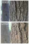
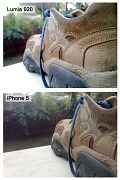
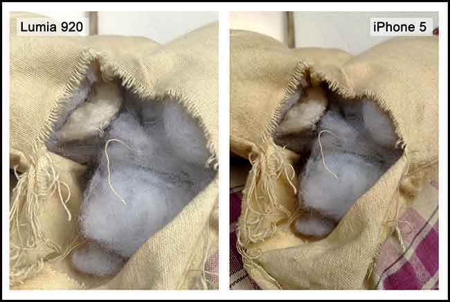
Looking at the images we shot with the Lumia 920, there’s no denying that Nokia has once again done something special with the camera. We shot 80% of our test shots using the appropriate setting (e.g. Closeup setting for macro shots, Backlight setting for shooting subjects that were backlit, etc.,), and with these, the camera performed splendidly. Of course, we had to use the touch shutter for shots that were ‘creatively’ framed, but we worked with it. The low light capabilities of the Lumia 920 are really being raved about, so we did a few tests for ourselves.

When shooting in low light, the shutter speed of the Lumia 920 slows down significantly and the images do come out brighter looking and better exposed than that from the competition, but a closer look reveals something more. When ‘pixel-peeping,’ that is, examining the image at 100%, you realize that there are very aggressive noise reduction algorithms at work, which effectively reduce the level of detail carried by the image. However, if you don’t want to do anything but show off these images on the web, then the Lumia 920 is produces great images even in low light, but we wouldn’t recommend prints larger than 16x12 inches.

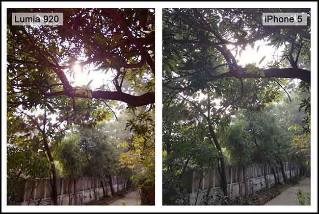
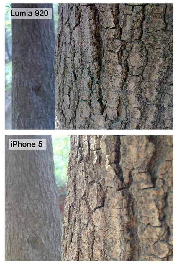
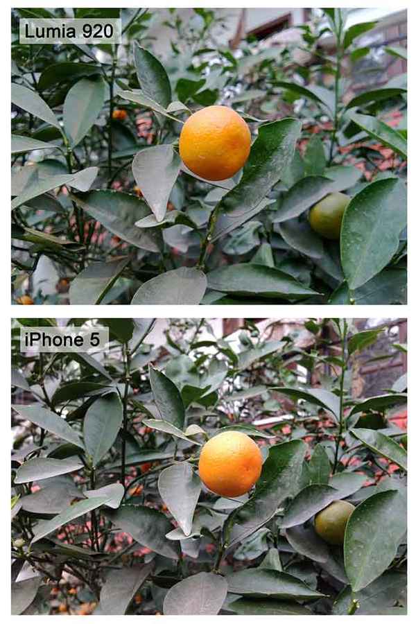
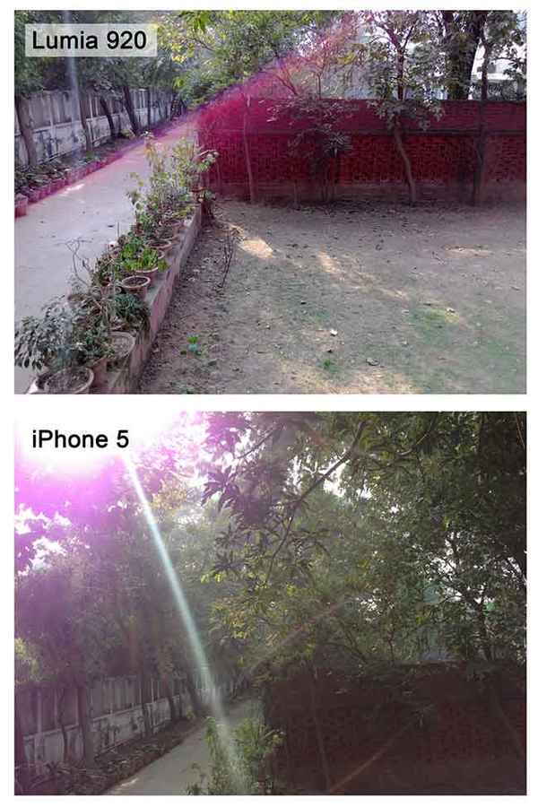
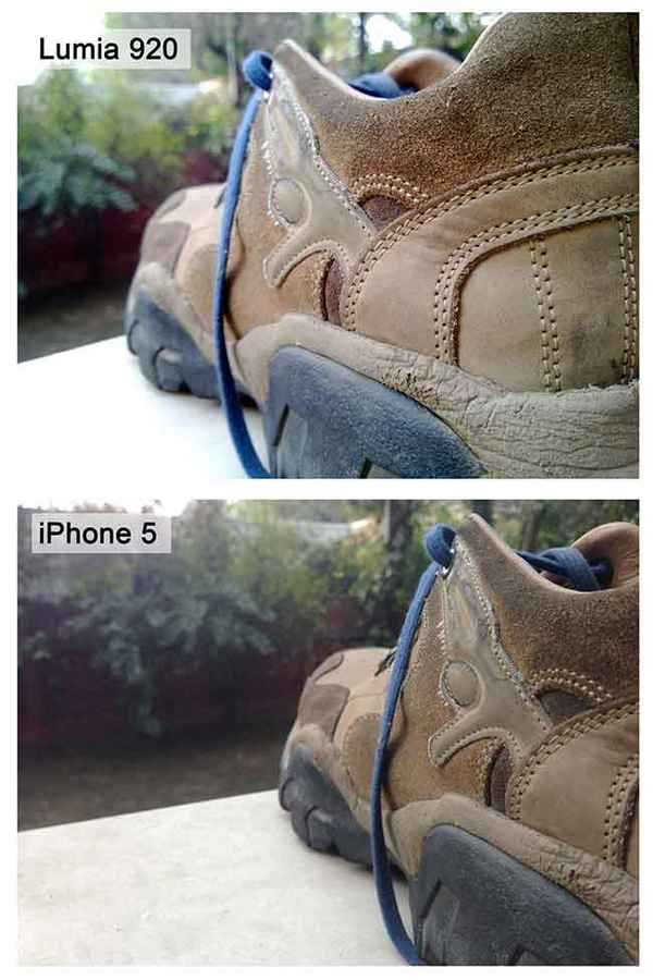
Lumia 920 and iPhone 5 camera comparison (1)
 

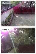
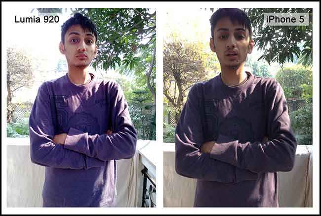
When shooting on auto settings, the camera did a fairly decent job of exposing for the right white balance, but the colours seemed to be a little washed out every now and then. Turns out the reason for that is the Matrix metering being used on the Lumia 920. There are three primary kinds of metering modes – Spot Metering, Center Weighted, and Matrix Metering. While many cameras use Center Weighted as a means to measure light, the Lumia 920 sticks to the Matrix mode which can be a blessing or a boon. It works exceptionally well indoors, but can be unpredictable when shooting outside under the harsh sun, or when shooting a subject with a strong backlight in the frame. Nokia bypasses the backlighting problem by introducing a “Backlight” scene mode, which works rather well, but if the camera is in “Auto” scene mode, it won’t switch to Backlight mode on its own.

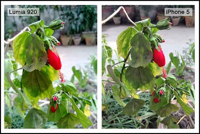
Now the video quality on the Lumia 920 is definitely something to be impressed with. The Optical Image Stabilization works wonderfully and the amount of light being let in through the f/2.0 aperture ensures good quality video. Of course in low light, noise starts to develop quickly in the shadow areas, but the red channel picks up noise almost just as quickly. This affects even point and shoot cameras, so we’re not surprised. While the Nokia Lumia 920 won’t outperform a point and shoot camera, it does offer very stiff competition to the iPhone 5 for images shot in good light, beats the iPhone 5 in low light shots, and definitely trumps the competition as far as video goes.

Lumia 920 and iPhone 5 camera comparison (2)
 

But wait there is more! Nokia has packaged in three virtual lenses that take the experience of shooting still images a notch higher. We have a lens for shooting panoramas, one which is called Smart Shoot that eliminates the “photo-bombing” phenomenon, and an app that lets you create Cinemagraphs. Each of these lenses works pretty well, and we especially love the panorama lens, though it’s a little tricky to use.

Visit page two to read about the Nokia Lumia 920's Hardware, and more...


Hardware

Build and Design: Solid, Premium and Seamless
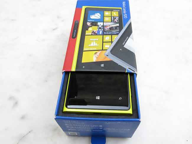
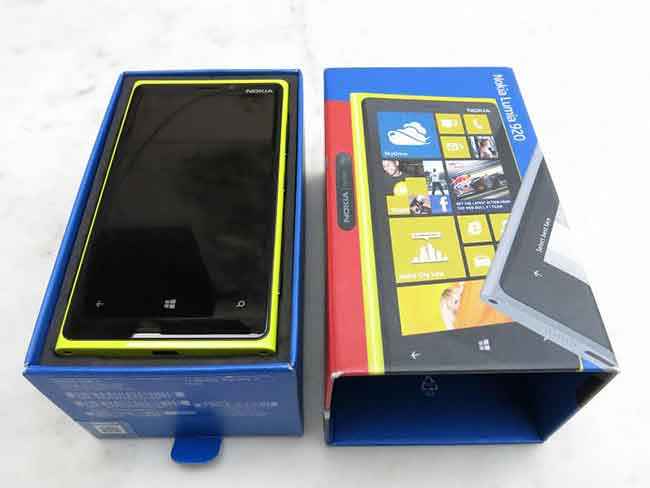
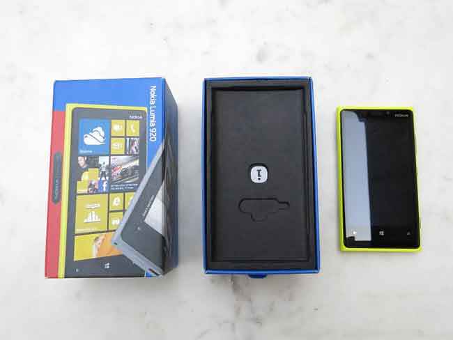
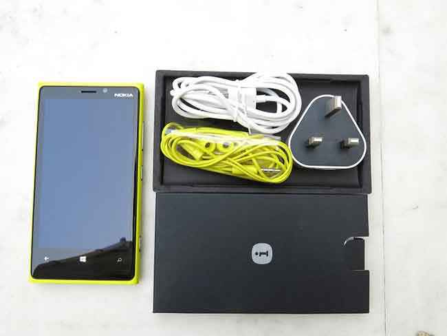
The box that the Lumia 920 ships in shows Nokia’s commitment to sustainable development, as it uses recycled paper for the packaging. Inside the box, you’ll be greeted by the usual suspects, a charger, a thick microUSB cable and a pair of matching Nokia earphones, which come with a total of four sizes of ear-canal tips. The wall charger was something of a concern for us as the review unit did not ship with an standard Indian plug, but instead the UK standard. Retail units will be shipping with the Indian standard.

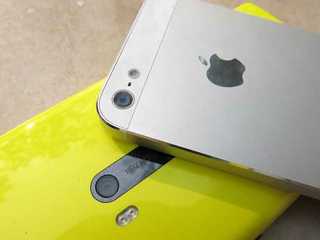
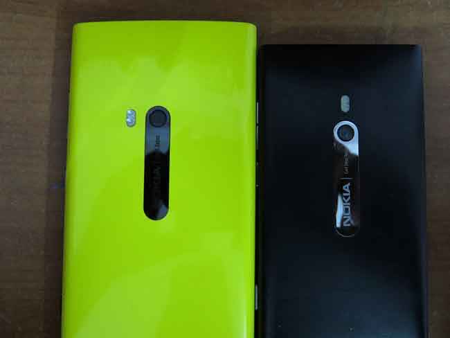
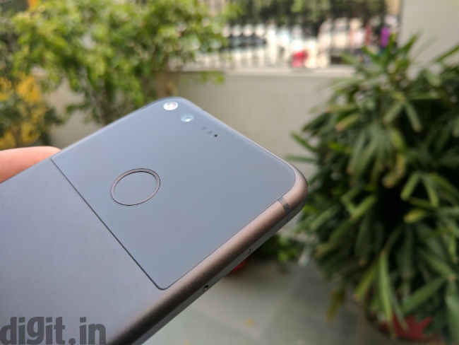
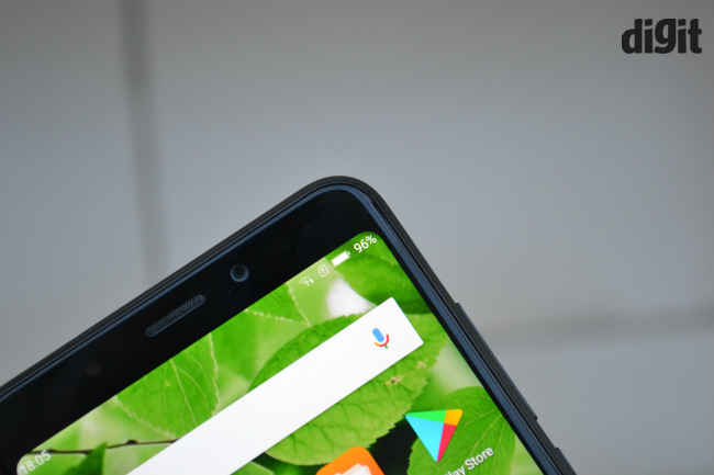
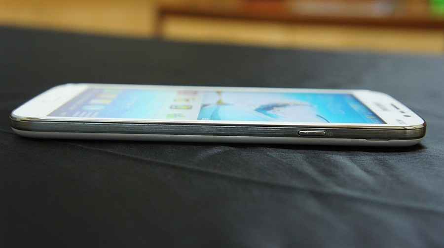
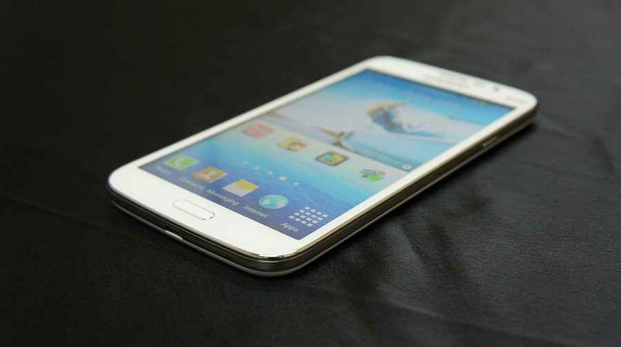
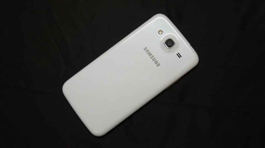
As far as the design of the Lumia 920 goes, Nokia’s decided to stick by the tried and tested. The phone looks mostly identical to the Lumia 900 and the Lumia 800, with a unibody polycarbonate shell, but the finish is glossy instead of matte. The camera sits in the same spot as it did on the previous phones, atop a ceramic zirconium Carl Zeiss/Nokia branded strip. What’s changed is the position of the flash, which has gone from resting above the camera to the side.

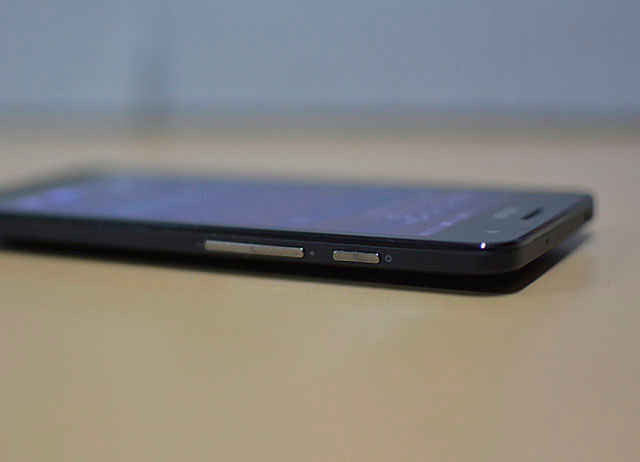
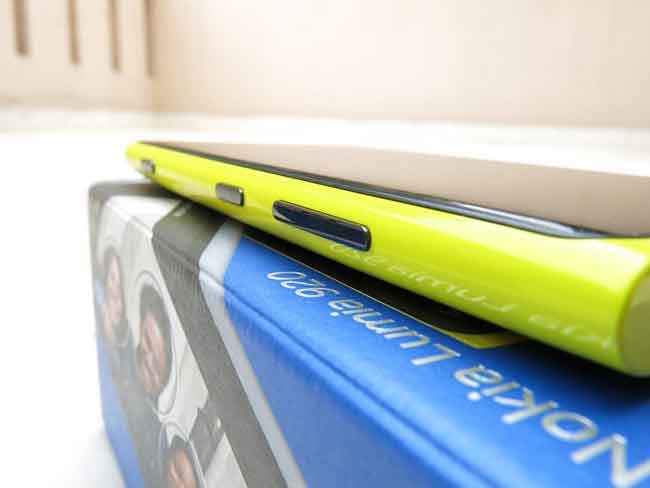
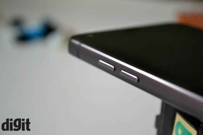
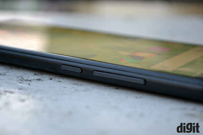
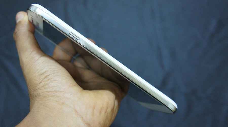
The volume, camera and power rockers are not plastic anymore, but instead made up of ceramic zirconium, which Nokia claims is scratch resistant. So far, the claim stands true, given that the phone has spent significant time rubbing shoulders with keys and coins. The buttons have quite a significant rise, sticking out of the body to make sure you know they’re there, and are easy to press. None of the buttons seemed to be problematic to use, except the camera button, which like we mentioned, requires a slightly harder press than is ideal.

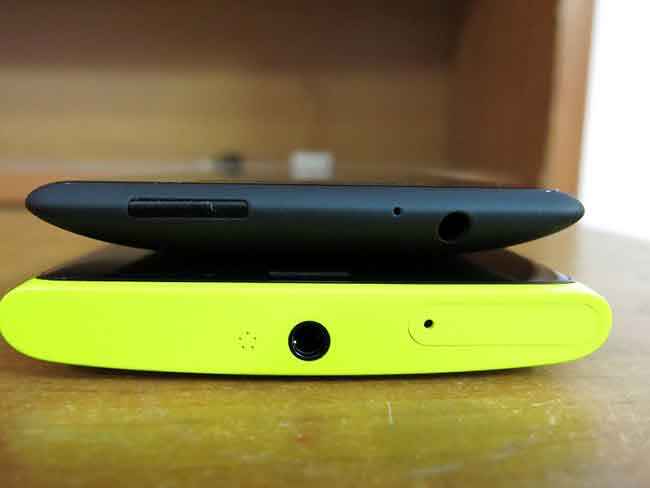
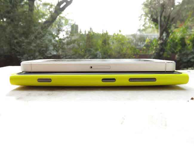
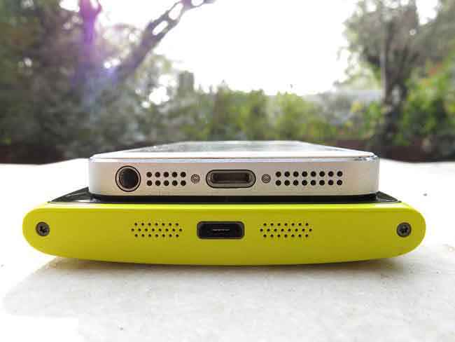
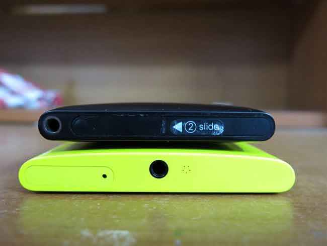
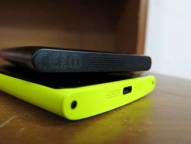
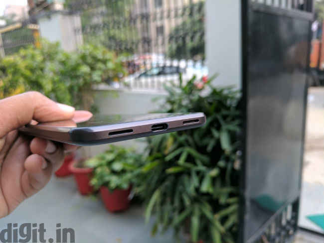
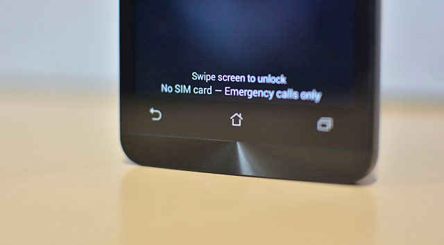
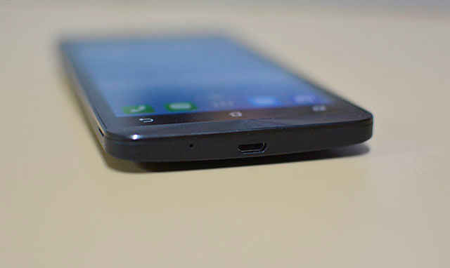
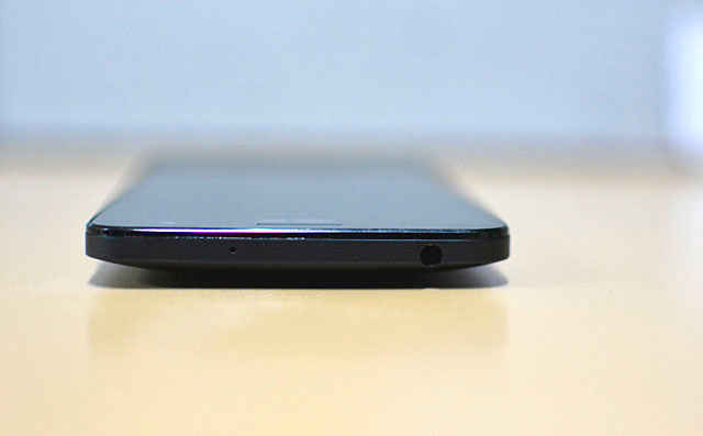
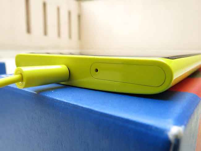
The top and bottom of the Lumia 920 have also received a slight redesign. The top of the phone now does away with any pop-up latches and places the headphone jack dead in the centre with the SIM tray right next to it. The microUSB port gets moves to the bottom, with a set of stereo speakers flanking it on either side.

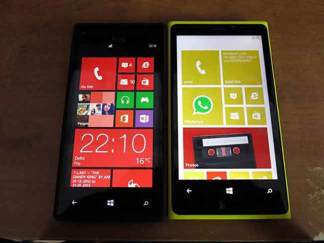
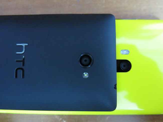
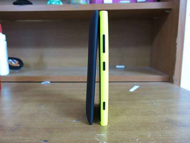
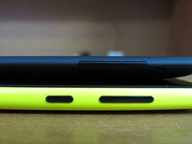
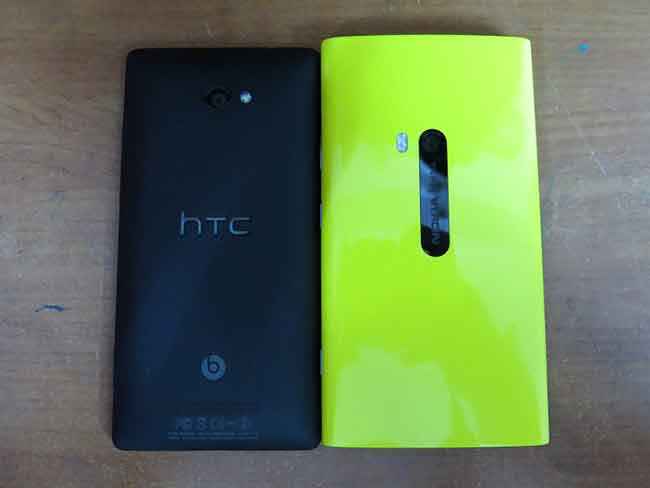
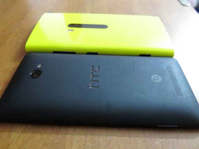
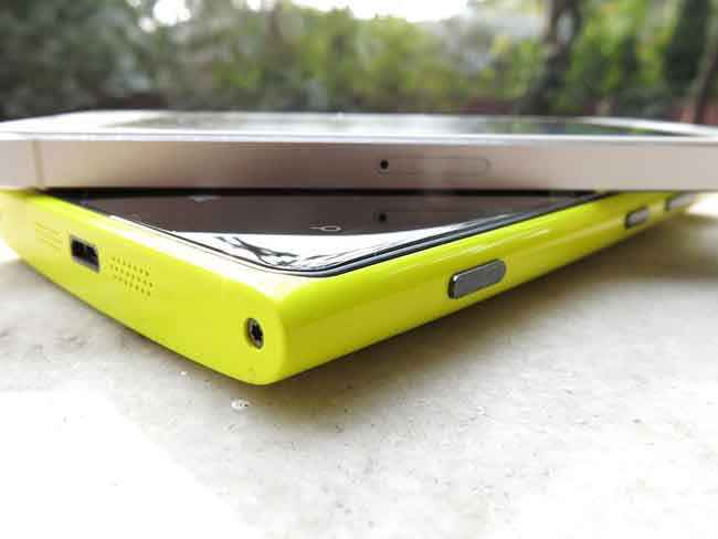
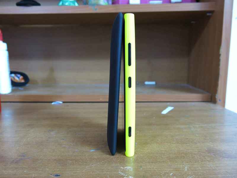
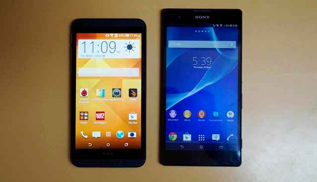
Overall, the construction of the Lumia 920 is incredibly high-end. The curved glass blends beautifully into the body. Many say the phone feels bulky and heavy, especially compared to the HTC Windows Phone 8X, but let us assure you, the two phones are almost identical in thickness. The HTC is deceptive with its thin edges and bulging back, but the Nokia makes no pretence about its size. We've been told that some of the heft is a result of the wireless charging integration, a trade-off that for the better part is worth it, if you ask us.

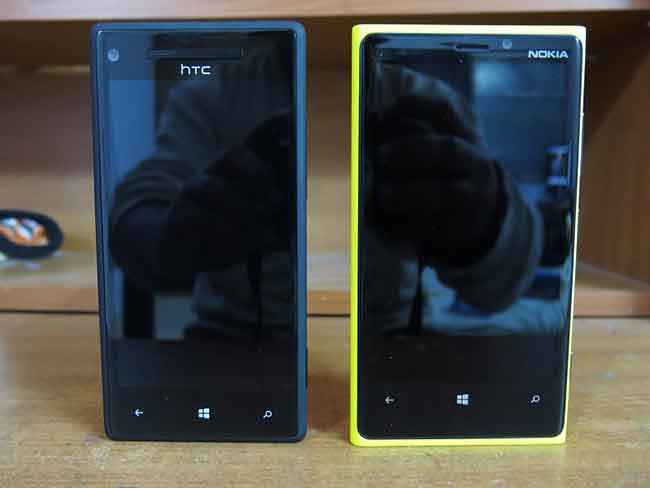
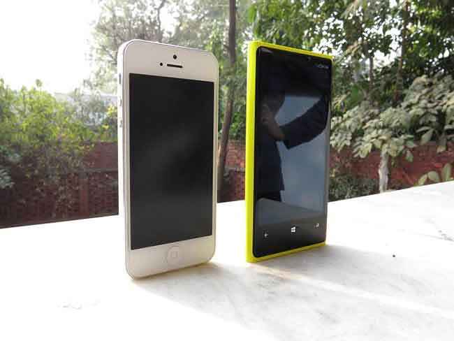
Nokia Lumia 920 and HTC WP8X

The Insides: Old Tech, New Experiences
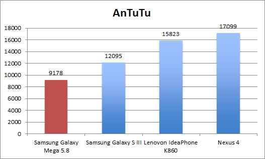
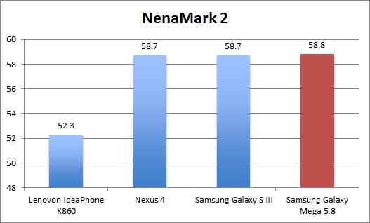
On the inside, the Nokia Lumia 920 packs a very standard set of components. Microsoft has laid the hardware guidelines down pretty strictly, so expecting the Lumia 920 to ship with something extra-ordinary power is a waste. It does, however, draw all power from a Qualcomm Snapdragon S4 Krait dual-core processor clocked at 1.5GHz. 1GB of RAM accompanies the CPU, while all graphic duties are performed by the Adreno 225 GPU. While dual-core CPUs and the Adreno 225 might be something from the yesteryears, if there is anything Microsoft has proven with its Windows Phone OS, it is that it does not need the latest generation hardware to give an incredible user experience, whether it is with general phone use or gameplay. The Apple iPhone 5, LG Nexus 4 and Samsung Galaxy S III all pack higher specc’d GPUs, but the Lumia 920 performs almost as well when it comes to real world usage.

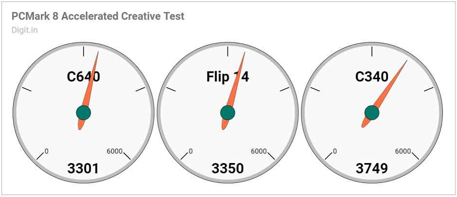
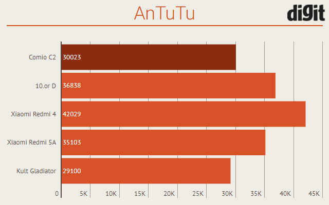
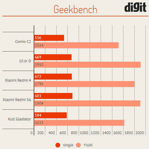
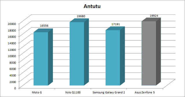
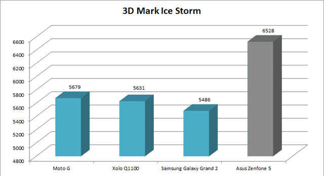
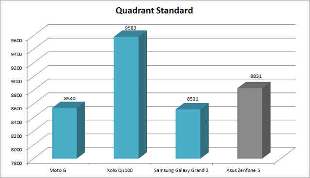
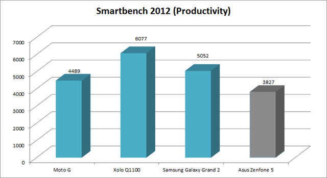
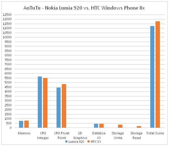
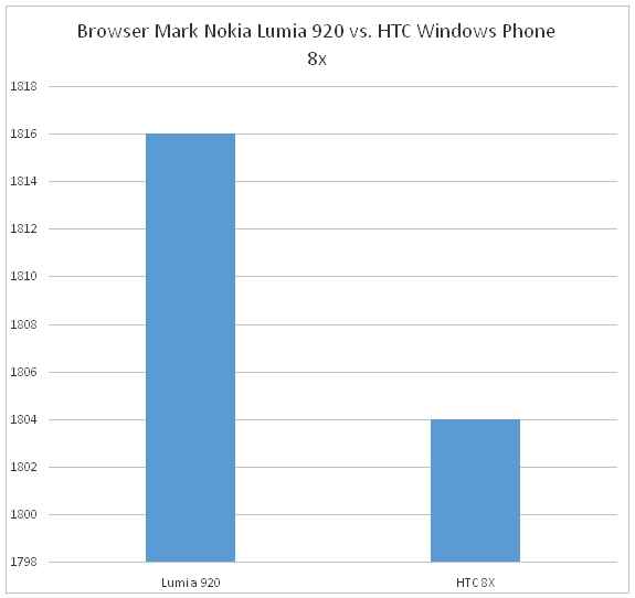
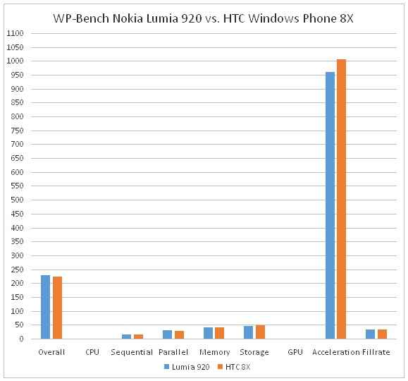
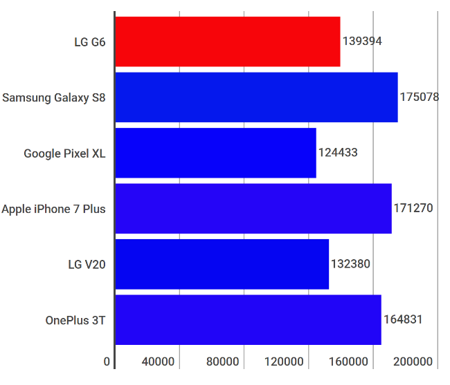
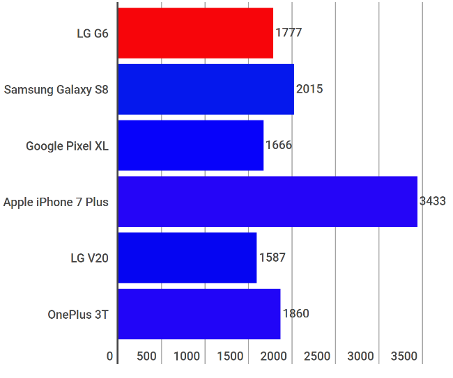
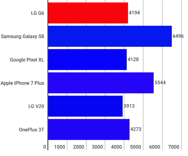
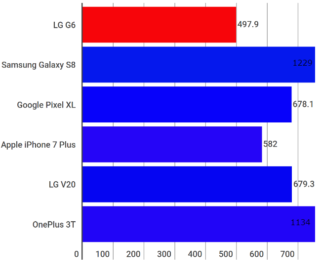
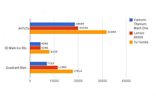
In our AnTuTu, WP-Bench and BrowserMark tests, the Lumia 920 fared better than the HTC Windows Phone 8X in some regards, while losing to it in some. AnTuTu benchmark kept crashing on our Lumia 920 during the GPU test, so we had to disable that. Keeping that aspect out of the equation, we noticed that the performance of the two phones was very closely matched by each other. While the Lumia 920 did better on the CPU tests than the 8X, the HTC flagship had the Nokia phone beat when it came to memory function, albeit by a very small margin. Check out the benchmark results below:

Realistically speaking, we didn’t find any task to be too much for the Lumia 920 to handle. It played our games (Fruit Ninja, Asphalt 5, Final Fantasy XIII) without any lag or jitter. We could type up emails and documents using MS Office. Switching from playing high definition YouTube videos, using the music player, writing messages and emails, we didn’t experience any performance hiccups at all. The Lumia 920 played 1080p HD videos flawlessly as well.

We’ve been pretty cruel with the phone so far, maxing out the entire 32GB (about 29GB user available) with music, photos, high definition videos and apps. Normally, this is the point when one would start seeing the performance slow down in most devices, but the Lumia 920 didn’t show any signs of this. For example, we’d often see some jitter while playing Fruit Ninja on the Lumia 800, but despite the bigger 1280x768 HD resolution screen, the game plays as smooth as the Android and iOS counterparts.

The Display: Tasty Treats for your Vision Balls
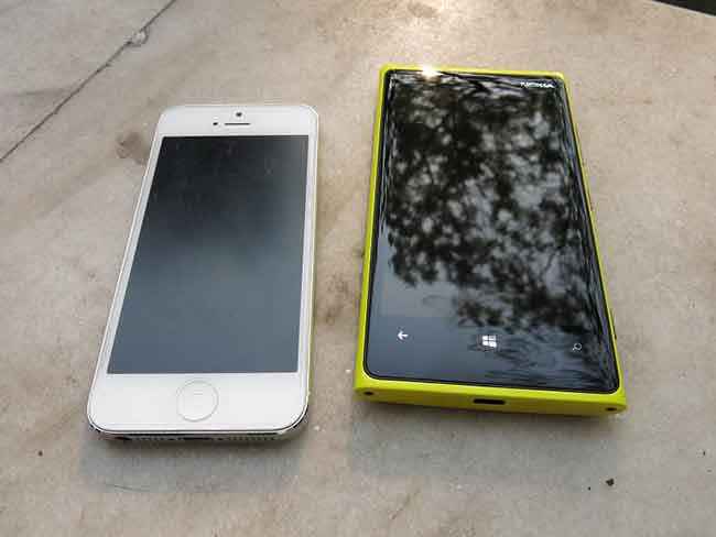
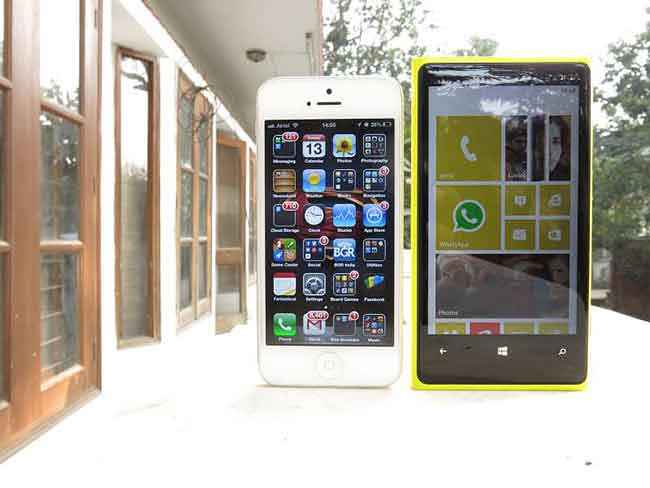
Speaking of the screen, Nokia’s been rather boastful of what they have achieved with the Lumia 920’s display. One thing that will stand out about the ‘HD ’ screen of the Lumia 920 (besides its crispness and vivid colours) is the fact that no matter how quickly you scroll through the screen, the pixels will never tear or blur. Nokia calls this their PureMotion technology and in short, how they’ve managed to do this is by injecting every single pixel with extra energy. Nokia’s even made a really cute animation explaining the whole process and you can watch it right here <embed http://youtu.be/lN-NaHcOeII> . With 1280x768 pixels packed in a 4.5-inch IPS display, the Lumia 920 surpasses the Retina Display of even the iPhone 5, add the PureMotion HD technology to the mix and you have a stunning display, to say the least.

The PureMotion HD technology has also enabled the touchscreen to achieve an unprecedented level of sensitivity, with Nokia boasting that you can use the Lumia 920 with gloves on. Yes, now you don’t have to sacrifice your fingers to frostbite just to be able to use your smartphone. We tried out the feature with a pair of woollen gloves and didn’t face any issues using the phone.

The screen has excellent legibility under the mid-day sun for reading texts and in general, we didn’t face any issues while browsing the web or checking our emails and Facebook. We did, however, notice some loss in colour reproduction with respect to images and video, but turning the brightness all the way up sorted that without any problems.

Audio: Double D is for Dolby
Good performance aside, the Qualcomm Snapdragon S4 Plus processor is also the provider for many great things. Our favourite is the fact that it comes with Dolby Certified sound baked into the SoC. When we got the HTC Windows Phone 8X, we wondered whether we’d be able to give it up because the Beats Audio engine had us hooked (unlike most phones, the 8X has a separate audio processing chip for Beats). However, we were joyfully surprised to see that the Lumia 920 comes not only with Dolby Certification, but also brings a host of equalizer settings, including the ability to create a custom EQ sound. Just to be clear, the audio processing isn’t just in the software; it is being done at the processor level, which ensures a far better output than just software-based processing.

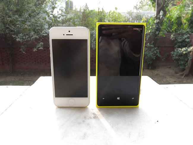
Nokia Lumia 920 and Apple iPhone 5

Wireless Charging: Not So Gimmicky After All
One of the reasons why the Lumia 920 is so thick is the fact that it packs in an inductive coil assembly to allow “wireless charging.” That’s right folks, the Lumia 920 does not need to be plugged into a computer or a wall socket to charge. However, if that is the case then why is Nokia supplying a wall charger and a cable in the box? Well, because the wireless charging pads are “optional accessories,” costing upwards for Rs. 3,000.

Even with these charging pads, the requirement is that the phone must be in contact with them, while the pad itself gets connected to AC power. At the end of the day, the phone does remain tethered to a charging solution, but it’s nice to know that we won’t have to scramble for a microUSB cable at home or work. Just buy two charging pads, one for home and one for office and you’re sorted. It is a bad move on Nokia’s part to not include one in the retail box though, given the premium price they are charging for the Lumia 920.

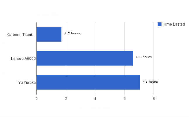
The Lumia 920 packs a 2,000 mAh battery, which lasted us about 9 hours with heavy usage. We were on WhatsApp almost all of the time, along with listening to music. The 9 hour figure also includes about an hour and a half worth of calling time and camera usage worth about 40 photos. Frankly, we end up charging our iPhone every night before going to bed, sometimes even twice a day. So far, the Lumia has managed to hold up an entire day with enough charge left to spill over into the first quarter of the next day. This is with both Wi-Fi and 3G connected. In our opinion, this is quite impressive, given that the incredible display, the Dolby processing and general web-browsing can all be quite power hungry tasks.

Visit page two to read about the Nokia Lumia 920's Software and the Verdict...


Software

The OS: Microsoft's Latest
There have been a few hiccups the OS faced lately, such as the random reboots on the HTC WP8X, some Wi-Fi issues and a lack of a proper notification centre. Microsoft admitted that they ran out of time on the release of WP8, but promised that new features would be coming in the next few months when a major update will be rolled out. Recently, a minor update named Portico rolled out fixing several bugs and thankfully, the Lumia 920 ships with the update preinstalled, so you needn’t freak out if you don’t see any update available upon switching on the phone.

WP8 offers a host of features that set it significantly apart from the competition. The first of these features is of course, the new resizable Live Tiles. Joe Belfiore, Manager of the Windows Phone Program, says that the tiles ensure that if you placed your phone on a table with 10 others, your Windows Phone 8 device will stand out from the rest courtesy true personalization. In our experience, we’ve found it hard to be confused between two WP8 phones as well.

The second essential addition to the OS is a feature called Kids Corner, which is something you would come to love instantly if you have a kid at home. The big-wigs at Redmond are all too aware about the nightmare kids can wreck on the emails and social networking sites with one wrong press. So they created Kids Corner, a feature synonymous with the Guest account on a Windows PC. Once activated, the child cannot exit into the main area of the phone and will have access only to the predefined set of apps, games, music and connectivity. Daddy’s and Mommy’s emails are now safe and so is their Twitter feeds. We found this to be an instant hit with us; given our little tykes are quite a notorious lot.

Microsoft’s also introduced something called Rooms to the contacts section of the OS. Rooms is essentially a way for you to share messages, calendars, photos and notes with contacts you select. For example, we added our close friends to the “Homies” Room because we wanted to plan out a party sometime in the coming days. With Rooms, we could see each other’s calendars and exchange messages and images as a group. This can also work for family members who are trying to co-ordinate grocery shopping or other plans. The best part about Rooms is that you do not need to own a Windows Phone 8 device to be invited to it. Although if you’re an Android or iOS user, you do get lesser functionality, the feature is still quite useful.

Apps: Setting the Lumia 920 apart from its WP8 Brethren
Now Microsoft doesn’t allow its OEM partners to alter the OS in any way, so the only means that a manufacturer can use to make the phone “unique,” is by augmenting the OS with a bunch of apps. On the WP8X, we had HTC’s weather app, which was the only one we found even remotely useful. Nokia on the other hand ships all its WP8 phones with a whole suite of useful applications. For starters, there is Nokia Music Unlimited, which gives you access to Nokia’s entire portfolio of digital media, for free. A Nokia Music Unlimited Subscription code will be messaged to you the first time your Lumia 920 is switched on with a SIM card. Nokia Music also serves up an interesting mix of music based on your input preferences, besides doubling up as a standard music player.

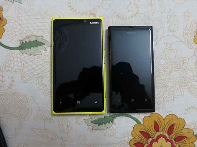
Nokia Lumia 920 and Lumia 800
   

Next we have the Nokia Drive Beta and Nokia Maps, two navigation solutions from the Finnish company. We used both apps to navigate around town and they worked pretty well, but we preferred Nokia Maps over Drive simply because the former shows us live traffic status while the latter didn’t. Anyone who’s a daily commuter would swear by the importance of having real-time traffic updates, especially when on the way to an important appointment. On the other hand, Nokia Drive Beta offers voice guided turn-by-turn navigation, which is pretty cool because you don’t have to constantly keep looking at your phone while driving. We hope that Nokia will update the Drive app soon to also incorporate traffic information, making this a legitimate rival to Google Maps.

There’s also an “App Highlights” app which we feel will be amazing for anyone using Windows Phone 8 for the first time. Nokia has developed the app to give the user a concise list of must-have apps for a brand spanking new handset.

The Lumia 920 integrates rather well with the PC platform as well. If you have Windows 8, then the Windows Phone Companion App will help you transfer music, photos and movies to and from the phone, but that’s pretty much all it does. Don’t expect options like “update phone” or “backup phone” that one might be used to in iOS, as they are not there. We feel the Companion App is rather basic, but what’s good about Windows Phone 8 is that it shows up simply as an external storage device and you can simply copy-paste your data into the respective folders!

Conclusion
The Nokia Lumia 920 is the Windows Phone 8 flagship we’ve wanted, but maybe not the one we’ve deserved. Cheesy Batman puns aside, even though it may not be perfect, the Lumia 920 is a gorgeous phone. The camera isn’t as exceptional as Nokia would have you believe, but it is still quite an amazing camera, easily besting the iPhone 5 in low light situations. The Optical Image Stabilization works well for video, though its performance while shooting photos is slightly disappointing. The lack of apps for the Windows Phone 8 platform is a horse that’s been beaten to death, but honestly it’s not really a deal breaker. Sure, we can’t Instagram crappy photos or edit our photos in Snapseed, but then again we do get a whole lot more instead from the phone in the form of Rooms, Kids Corner, true Dolby processing and a whole lot more. There are also Lumia-exclusive features like true Dolby processing, Nokia Music, Nokia Maps, and others. The bottom line is if you’re in the market for a new high end smartphone, the Lumia 920 should be something you definitely consider.

Nokia Lumia 920 Key Specs, Price and Launch Date

Price:
Release Date: 30 Nov 2012
Variant: 32GB
Market Status: Launched

Key Specs

  • Screen Size Screen Size
    4.5" (768 x 1280)
  • Camera Camera
    8 | 1.3 MP
  • Memory Memory
    32 GB/1 GB
  • Battery Battery
    2000 mAh

Related Reviews

Nokia 5.3 Review

Oppo Reno4 Pro Review

Asus ROG Phone 3 Review

OnePlus Nord Review

OnePlus 8 Pro Review

logo
Swapnil Mathur

Digit's resident camera nerd, (un)official product photographer and the Reviews Editor

Advertisements

Trending Articles

Latest Reviews

view all
Advertisements

Popular Reviews

View All

Nokia Lumia 920

Buy now on amazon 29999

Nokia Lumia 920

Buy now on amazon 29999

Digit caters to the largest community of tech buyers, users and enthusiasts in India. The all new Digit in continues the legacy of Thinkdigit.com as one of the largest portals in India committed to technology users and buyers. Digit is also one of the most trusted names when it comes to technology reviews and buying advice and is home to the Digit Test Lab, India's most proficient center for testing and reviewing technology products.

We are about leadership-the 9.9 kind! Building a leading media company out of India.And,grooming new leaders for this promising industry.

DMCA.com Protection Status

Debt restructuring scheme may soften blow of Covid-19 on books of PSBs

Nissan Z Proto is twin-turbo comfort food - Roadshow
Tesla Battery Day Jeep Grand Wagoneer 2021 Ford Bronco 2021 Ford Bronco pricing 2020 electric vehicles Best car lease deals Best car insurance

Nissan Z Proto is twin-turbo comfort food

After years of rumors, this near-production coupe previews the next Z-Car. With a manual and a twin-turbo V6, it's one for purists.

Listen
- 09:51

Nissan's Z has been the heart of the brand for 50 years, and it's time for something new.

Nissan

On one hand, with everything that's going on, 2020 probably isn't a great time to be introducing a new sports car. From the coronavirus pandemic to the recession to seemingly ceaseless natural disasters, it's proving hard enough to launch any new model this year, let alone one into a shrinking niche segment. And yet, that's what this Nissan Z Proto previews. Making its debut Tuesday, this is the coming seventh chapter in the brand's 50-year Z Car history that kicked off with the now-iconic Datsun 240Z.

On the other hand, this Nissan 370Z Proto may be exactly the sort of upbeat distraction -- if not revelation -- that many driving enthusiasts covet right now. Simultaneously new, yet deeply familiar, think of the Z Proto as a dishful of high-performance comfort food, arriving at a time where we could all use a familiar face and something to look forward to. Ready or not, world, it's time to get excited.

Now playing: Watch this: Nissan Z Proto: The Z Car's next chapter looks fierce...
4:43

The Proto in Nissan 370Z Proto is short for prototype, and that means that the pale-yellow coupe seen here isn't just a pure concept car, it's about 98% of the production model that's expected to debut next year before hitting dealers in 2022. 

I was actually fortunate enough to see the Z Proto briefly in person last October during a trip to Japan. I was sworn to secrecy at the time, and it's been incredibly hard to bite my tongue and not share any impressions until now, nearly a year later. I saw a slightly earlier full-size version of the Z Proto in a courtyard full of other future wonders (which I'm still not allowed to talk about). But even then, the Z wasn't just the center of the display's gravity -- if it weren't an outdoor setting, the Z would've sucked all the air out of the room. Yes, I've got a weak spot for purist sports cars in general, but I was drawn to it like a moth to a flame. This design has real presence.

Nissan Z Proto specs

Despite being unveiled at a ceremony in Yokohama, Japan, and paired with a simulcast celebration livestreamed from the model's annual ZCon fan gathering in Nashville, Tennessee, there aren't a lot of hard numbers to accompany the rollout of this new Z Proto. Right now, Nissan confirms that it's powered by a twin-turbocharged V6 engine whose soul is stirred by a six-speed manual transmission. The company also released basic dimensions, so here's how the Proto stacks up to the current 2020 Nissan 370Z range.

Nissan Z Proto vs. 2020 Nissan 370Z and 370Z Nismo


Nissan Z Proto 2020 Nissan 370Z 2020 Nissan 370Z Nismo
Length 172.5 in 167.5 in 170.5 in
Width 72.8 in 72.6 in 73.6 in
Height 51.6 in 51.8 in 51.8 in
Engine size TBD 3.7 liters 3.7 liters
Engine type Twin-turbo V6 NA V6 NA V6
Power TBD 332 hp 350 hp
Torque TBD 270 lb-ft 276 lb-ft
Transmission 6-speed manual 6-speed manual or 7-speed auto 6-speed manual or 7-speed auto


Nissan Z Proto: A historic design

As you can see, the new Proto maintains the Z's classic long hood and rear-wheel-drive proportions. The Z has an enviable design history, and to expect chief designer Alfonso Albaisa to sign off on something radically different would be to misunderstand how the company feels about this model. As Albaisa told Roadshow during a virtual media briefing, this car is "in the very fibers of our heart, as Nissan, and [designing the new car] is a tremendous responsibility and honor." With the possible exception of the 1990s' Z32 that was something of a technological moonshot conceived during Japan's economic bubble, the Z has remained remarkably consistent in its mission and reach over its five-decade life. The new Z Proto suggests Nissan will seek to maintain that continuity.

Interestingly, at 19 inches in diameter, the prototype's staggered-width wheels are reasonably sized and feature higher sidewalls than you might expect on a modern sports coupe, let alone a show car. Similarly, note the very deliberate inclusion of a six-speed stick-shift and the retention of a manual handbrake. With these details, Nissan is telegraphing that the new Z will be less focused on generating blinding performance figures than it is on forging a bond between car and driver. As the Japanese automaker has its GT-R for fans of jaw-slackening grip and brag-worthy stopwatch numbers, keeping the Z as a more elemental driver's car seems like a smart approach.

If this pearlescent yellow Z Proto's styling feels familiar, that's because it's a melange of design cues lifted from previous Z models. Bookending what feels like a somewhat large and overly square grille opening are a set of LED peepers designed to evoke the original S30 Fairlady Z's iconic sugar-scoop headlamps -- particularly the glass-covered lights of the sought-after Japanese-market 240ZG. Notice how the roofline peaks unusually at its leading edge, tapering from the windshield header on back, just like today's 370Z. Out back, the horizontal LED taillamps echo the Z32 of the '90s. That this Z Proto's styling manages to incorporate all of these historic design cues without seeming overly retro or cobbled together is an accomplishment in itself.

The Z Proto features a roofline that peaks unusually at the windshield header, just like today's 370Z.

Nissan

Nissan Z Proto chassis and turbo power

As for what's underneath that bodywork, Nissan isn't saying, but sources indicate the platform is actually a close relative of the current car's unibody chassis. The 370Z has always been a strong and entertaining handler, but it's never been particularly refined, especially in terms of noise, vibration and harshness. If the new Z is indeed similar to the old Z underneath, it will be interesting to find out what sort of renovations, if any, might be necessary to bring the underlying architecture up to modern standards, including crash-test provisions. It also seems likely that the production Z's electrical system may need to be updated, to cope not only with the increased cabin technologies, but also to jibe with whatever advanced driver-assistance systems Nissan decides to make available.

While the original S30 Fairlady Z featured straight-six power, Nissan doesn't presently have a suitable modern inline-six engine in its portfolio, so it makes sense that the new car will feature V6 motivation. The current 370Z relies on a naturally aspirated 3.7-liter V6, but for the next-generation model, the car is widely expected to downsize in displacement a skosh, adopting a version of Nissan's corporate 3.0-liter twin-turbo V6 as found in the Infiniti Q60 Coupe. As would align with the production model's rumored 400Z name, the engine is expected to target 400 horsepower -- the same output the engine realizes in today's Q60 Red Sport.

If accurate, that'd be a heaping helping more oomph than the 2020 Nissan 370Z's 332 hp and even the higher-performance 370Z Nismo, which offers 350 hp. What's more, forced induction will undoubtedly bring with it substantially more torque at significantly lower revs. (The Q60 Red Sport whips up 350 pound-feet from 1,600 rpm, while the 370Z's 270 lb-ft peak doesn't show up until 5,200 rpm.)

Expect the manual gearbox to be standard equipment, with a conventional paddle-shift automatic gearbox (like the seven-speed unit found in the Red Sport) to be optional.

A driver-focused cabin keeps it simple, but modern touches like a fully digital gauge cluster keep it contemporary.

Nissan

Nissan Z Proto interior is familiar, with better tech

On the inside, the Proto's cabin is more overtly modern than its candy-coated shell, but that's largely a function of the increased presence of screens. Not only is there a larger touchscreen infotainment display in the redesigned dashboard, there's also a 12.3-inch fully digital gauge cluster.

Beyond that, there's a lot that will be familiar to the Z faithful, from the trio of analog gauges atop the dashboard to the simple, round climate controls and mussel-shell-shaped door handles. (If these make it to production, I hope they feel better than the ones in today's Z.) While incorporating new features and conveniences, it looks like Nissan's designers are telegraphing that the production Z will still be a driver's car first and foremost, and that's good news.

The Nissan Z Proto's rear lights hearken back to the mighty Z32 generation of the 1990s.

Nissan

Nissan Z pricing and availability

The production 400Z is expected to be revealed sometime next year, but an actual on-sale timeframe remains fuzzy, as does official pricing. It'll likely be 2022 before new Z Cars hit the street, so it's still very early in the process.

It's worth remembering that today's sports car landscape has changed significantly since the 370Z was unveiled way back in 2008 -- the same year Jay Z and Beyonce tied the knot and President Obama was elected to his first term. Back then, you could still buy a new Honda S2000, a Pontiac Solstice or even one of the last Chrysler Crossfires. The next Z's most natural rival will be the Toyota GR Supra, followed perhaps by V6 versions of Detroit's pony cars. If Nissan produces a lower-power, lower-cost iteration of the seventh-generation Z, it could also perhaps rub shoulders with higher-end versions of the next Subaru BRZ and Toyota 86 twins, which are also due about the same time.

Based on Roadshow's sources, it's likely safe to ballpark that the Z's base price will start with the number 3, undercutting the Toyota GR Supra. There will almost certainly be a not-insignificant upwards price walk from today's surprisingly affordable base 370Z ($31,000 delivered) to reflect the new model's additional power and equipment. That said, expect Nissan's ask to start well shy of the Nismo Z's eye-watering $46,715 window sticker (including $925 delivery fee). A starting price in the neighborhood of $38,000 to $39,000 sounds about right, which would make the Z something of a value play next to the automatic-only GR Supra ($44,000 delivered for the 2021 2.0-liter model, $52,000 for the more-comparable 3.0).

What's old is new again.

Nissan

Nissan 400Z Nismo or Roadster variants?

There have been a few thin rumors about an eventual higher-performance Nismo version of the 400Z, and such a model would be a predictable development for a car that will likely once again carry a longer-than-normal lifecycle. As for a future Z Roadster variant, ironically, that's an open question. It's also probably something I wouldn't bet on hearing more about anytime soon. After all, if today's coupe market is slim, the convertible market is absolutely emaciated.

While Nissan certainly won't have a new Z in dealerships in time to cap off the model line's golden anniversary, this Z Proto is a promising, tasty teaser at a moment when we could all use a break. That goes for Nissan itself, too. Remember, in addition to weathering all the same crises as the rest of us, the automaker has been embroiled in a lamentable CEO-turned-international-fugitive saga, as well as significant financial turmoil.

A new Z can't heal Nissan any more than it can fix the world's problems. If nothing else, however, as a purist's bauble and as a statement of intent for a new sports car, this Nissan Z Proto is a welcome diversion.

Debt restructuring scheme may soften blow of Covid-19 on books of PSBs

LG G6 Review

LG G6 Review

By Prasid Banerjee | Updated May 22 2019
LG G6 Review
DIGIT RATING
76 /100
  • design

    84

  • performance

    77

  • value for money

    73

  • features

    64

User Rating : 4.5/5 Out of 2 Reviews
  • PROS
  • IP68 Certified: Water and Dust proof
  • Ergonomic
  • Nice display
  • CONS
  • Sub-par performance
  • Battery life should be better

Verdict

The LG G6 is a decent flagship, with a functional design and nice camera. It's really an adequate phone as far as flagships are concerned. The only problem is, flagships should be more than just adequate. It doesn't hold a candle to the Galaxy S8, but it has us excited for what the LG V30 will be (if at all there is a V30).

BUY LG G6
Buy now on amazon Out of Stock 21750
Buy now on flipkart Out of Stock 30000

LG G6 detailed review

Over the course of the LG G6 review, I’ve been wondering how I can do this without mentioning the disastrous LG G5 (review). The LG G6 is a whole new phone, and has nothing to do with its predecessor, except in name. It is the second of two 2017 flagships that India has so far, and there are things about this phone that screams “old school veteran”.


That’s not to say the LG G6 has nothing new about it, but it’s a functional approach to flagship smartphones instead of flashy, over the top features and head-turning designs. To be fair, that’s always been LG’s approach to smartphones, but this time it’s done slightly better than the last. With that said, and having failed at not mentioning the G5, here's how the LG G6 fares.

Build and Design

I’ve always been a fan of LG’s unorthodox, but functional approach to designing phones. The LG G4 (review) had leather amidst a sea of metallic devices, while the LG G3 (review) was the one that proved 5.5 inch screens can still be used on compact phones. The LG G5 was a stark failure, but it was still a more “courageous” approach than a missing headphone jack.

On the LG G6, the company is accepting industry standards and doing the best it can while sticking to its philosophies. There’s a glass back that can be slippery when your hands are sweating. A metallic frame runs around the phone, which gives it a sturdy feel. As with the Samsung Galaxy S8 (review), Corning Gorilla Glass 5 on the back of the LG G6 can break, but its metallic frame allows better grip than the competitor’s all-glass design.

The phone and its display have rounded corners, creating a slightly different facade than what we’re used to. Together with the tall and narrow form factor, the LG G6 difficult to miss. It won’t be a head turner, but it won’t be lost in the sea of similarly designed smartphones either.

While we’re on that topic, it’s worth noting that the tall and narrow form factor also helps single-handed usage. I must say the Samsung Galaxy S8 felt even more compact, but combined with a good grip, the LG G6 does feel less precarious (even though it really isn’t). I’m much more comfortable using this phone without a case than I was with the S8.

The dual-camera module rests on the back and looks exactly the same as on the G5. Below it is the fingerprint sensor-cum-home button, while the SIM slot and volume rocker lie on either side.

Overall, the LG G6 is not the phone you’d buy to show off. It has an understated design, but it will impress smartphone purists. To top it all off, it’s IP68 certified too.

Display

Get accustomed to 5.7 inch and above on flagships, because that’s where the future is, or at least that's how it seems. LG has used the same Univisium technology as Samsung. In fact, chronologically speaking, LG was the first to announce 18.5:9 aspect ratio on its flagship. I’ll just direct you to this story to understand what it does.

As mentioned before, it’s a tall and narrow display, which leads to pillarboxing effects on either side (black bars on either side of apps/movies). That happens on almost every app and video that you watch right now, but will hopefully change in future. Regardless, if Univisium allows phones to be compact then I’m all for it.

LG has used a QHD IPS panel on this one, with 564ppi pixel density and excellent colour balance. Touch response is also nice once you’ve removed the screen cover (which comes pre-installed). LG uses Gorilla Glass 3 here (I don’t know why), but while spec-junkies may have a problem with that, it really doesn’t affect touch response or feel. Breakability is also more or less the same, at least in practical usage. That means the screen will break if you drop it on concrete, just like any other phone.

The display does look great, but I would personally prefer better black levels. Contrast and black levels are strikingly lower compared to AMOLED flagships, making one wonder why LG refuses to use its excellent OLED panels on smartphones. Despite the fact that this is a good display, I would have to rate this below the Samsung Galaxy S8, simply because things don't look as strikingly vibrant here. You notice the difference especially when watching darker videos, with a lot of blacks, grey and whites. For the record, the LG G Flex series has made use of the company's OLED panels. 

Performance and UI

We usually have separate sections for performance and software, but in this case they go hand-in-hand. Before you ask, yes the Snapdragon 821 is an older SoC, but it’s neither slow nor incapable. In an earlier article about the Snapdragon 835, I explained how the new SoC is evolutionary instead of revolutionary. I have to agree that a Snapdragon 835 on the spec sheet would have been better, but this isn’t really bad either. 

Having said that, I wish LG did a better job of implementing the 821. My review unit was littered with bugs from the start. Black screens and app crashes were all too common. In fact, the 3D Mark benchmark kept crashing till we uninstalled and reloaded it. Similarly, Facebook's live videos wouldn’t play sometimes, with a “Cannot play video message”. 

While these are just bugs, I also found basic lags and stutters when launching apps or scrolling through interfaces. The LG G6 isn’t a particularly slow phone, but these things mar a flagship experience. Moreover, benchmark results fall drastically once SIM card and mobile networks are turned on, with 15 new apps over those that are already there. That's an ominous sign for any Android phone, since the software will slow it down over time any way.

I’m inclined to put this down to poorly tuned software, because overall performance scores on the LG G6 are just about 10% more than the G5. Given that LG’s UI is pretty much just change for change’s sake, I’m not impressed.


AnTuTu Benchmark


Geekbench 4 Single Core


Geekbench 4 Multi Core


GFXBench Car Chase

While the LG G6 manages heat quite efficiently, the phone isn’t the top flagship for gaming. GPU frequencies remain at about a third of the Adreno 530’s full capacity. Frame rates are adequate, but average results remain quite low. So, the LG G6 is behind competitors like the Galaxy S8 and Google Pixel, in comparative terms.

Adequate really is the best way to define the G6’s performance. It’s just that flagship class performance should be more than that. 

Audio Quality

I’m no audiophile, but the 32-bit Hi-Fi Quad DAC makes a difference in terms of audio quality as long as you have good headphones. With the right headphones (high-end), you’ll enjoy watching movies or listening to music on this phone. Regular audio is loud, and perhaps incrementally better than what we usually get.

Camera

There’s a slight change in the camera this time. The LG G6 has two 13MP sensors on the back and one of these comes with a fisheye lens. The sensor on this camera has been bumped from 8MP to 13MP this time, while the primary sensor drops from 16MP to 13MP. While you’re usually going to use the cameras separately, using same resolution Sony IMX258 sensors allows seamless zooming between the two this time. There's a button on the camera app that lets you switch from the regular camera to fisheye.

Final image quality is great, just as it was last time. Colours are decently balanced, though not completely accurate, while sharpness and detail levels are quite good. Images are good in both low light and well lit conditions, but the camera takes a tad too long to focus in low light conditions. Also, images can appear smeared at times.

LG G6 Camera Samples

The fisheye camera is more useful this time. Higher resolution has helped here, and if you know how to use a fisheye lens, this is the only phone that can give those unique photos.

Overall, the LG G6 has a decent camera, but here again, the Google Pixel (review), Galaxy S8 and iPhone 7s Plus (review) are well ahead. This phone is cheaper than all of them, but perhaps LG can do better.

Google Assistant

Google was at pretty much every launch event at Mobile World Congress this year. So, the Google Assistant doesn’t really make the G6 special. I’ve never been a big fan of the AI assistants any way, just like I didn’t like Bixby on the S8 (which is unfinished at the moment), and I find nothing special here. Frankly speaking, AI assistants are just gimmicks right now. They can answer questions, take voice commands, but fail at the most basic tasks. Perhaps they’ll improve over time, though. After all, Google and company seem hell bent on making them a big deal.

Battery

As per my usage, the LG G6 is more battery efficient than many other flagships. However, that’s still just about adequate performance. The PC Mark test runs for just over 11 hours, while the phone manages to last 14-16 hours on regular usage. That, with about 45 minutes playing games, 15 phone calls, an hour streaming TV shows and some regular social networking, text messages and IMs.

I really wish smartphone makers start focusing on battery life, but that doesn’t seem to be happening. It seems adequate is all we’ll get with flagship smartphones, at least for the time being. It’s not fair, but it doesn’t seem like consumers are raising their voices against this either.

Bottomline

Remember how I said adequate is the word to describe the LG G6? Well, that’s my conclusion after reviewing the device. It is a quintessential LG flagship and does what it’s meant to. It would have been one of my 2017 recommendations had it not been for sub-par performance described above. The LG G6 is a phone for the purist, but LG needs to work out the kinks to really make this worth buying. If this is the first attempt, then I do look forward to the LG V30 (or whatever it’ll be called) during the second half of this year. It seems that’ll be LG’s real flagship this year, if at all there is a LG V30.

LG G6 Key Specs, Price and Launch Date

Price:
Release Date: 09 May 2017
Variant: 32GB , 64GB , 128GB
Market Status: Launched

Key Specs

  • Screen Size Screen Size
    5.7" (1440 x 2880)
  • Camera Camera
    13 & 13 MP | 5 MP
  • Memory Memory
    32GB & 64GB/3 & 4 GB
  • Battery Battery
    3300 mAh

Related Reviews

Nokia 5.3 Review

Oppo Reno4 Pro Review

Asus ROG Phone 3 Review

OnePlus Nord Review

OnePlus 8 Pro Review

logo
Prasid Banerjee

Trying to explain technology to my parents. Failing miserably.

Advertisements

Trending Articles

Latest Reviews

view all
Advertisements

Popular Reviews

View All

LG G6

Buy now on amazon 21750

LG G6

Buy now on amazon 21750

Digit caters to the largest community of tech buyers, users and enthusiasts in India. The all new Digit in continues the legacy of Thinkdigit.com as one of the largest portals in India committed to technology users and buyers. Digit is also one of the most trusted names when it comes to technology reviews and buying advice and is home to the Digit Test Lab, India's most proficient center for testing and reviewing technology products.

We are about leadership-the 9.9 kind! Building a leading media company out of India.And,grooming new leaders for this promising industry.

DMCA.com Protection Status

Debt restructuring scheme may soften blow of Covid-19 on books of PSBs

rG(,F?dg7L@QnYږܞvCQDYXUEy;bODD׉310Y* MnŪ\n'/S5'Ka'ow0OagZ+?QGUi><̋@(`#i2zԃIZ'j8N*v}wdm,dV5TLt OQ=~8J0ǞʦY% r3y6}4ؙa5.Çq]&nQ>g*ecFUNNNC(fUwXLOfZF?E2=Ǎ?؉#=f[e:l POg0l5hgoVNGg/t:T/#5٬~|:b!G?.-şjZ~-Y 6`oj?pT ~<|uV?eULYYԅzRL47i]9z6=ReX8ɦżϑz ygi:RO<տ'qV*SYM7PǩKTzjϏZnJ+PX(G2}.\Wil{Lis{;B ,EukLыH'4FO4 YZ֧K܅K#&e 9qZb7QFX ,"R9߫j>eIizb=yˍ[%@/l>ȳjL(^ mDžQ{(t Ux5\A]+(f*|WPm:^ID,ڍ^8AÃ\ܤee'5(1vZVɛKijqvta2}6n$vucbhc\'hWaqE]}*['<}'QR ~NշOF%LGS + ZI]d6A5G*"jd8$Lfcu֒Mw#uirA|;{?R_( ˣdD6jU> İF5nԋ"|\X6U{K=/ 4:-|RyMlK]v~Q9h@%b׃-l) ԁ:DƩF#MB Lf:rGW4{Kqkm0tPq yAU#l2%I R=fZiR~S#/lß*0`K X?CyZ7c ez@8Y9@w$`9|! uHQ~fDtR9}*mQ cQj$v4WۤK.ɼ.?^+mXR44W 7H*z^bTeKWi=( #$;`P,}Z%U5N=l ë6X;>M%XVQjuᅣ*i9!KBJEͼWCQ 6JZW `vCT:2"osI 3"6n83dʋўo}1}<n.}MSIJ(q+7l m~E*(Mzvݡ5$)r}*ҳ)Rˢz]i8Xq%yXlx '~R>k lH7 #>Fi:Cv7R-2GMoaᐈȦ@ j&A5I%1+ldUPqZy-r[2!4jv)8ms" )Qe6!,]m hpǠ쁂,Qzek^7L&L^"7p!-H$h,iBD1 RjK`bH!8bҋRA?PgJ( h#$UDrӜV@5hguKWefJ?#P#I'L#@Y4q3`9N%ίgv NP2l ѾCǑ>Kf m; :[TK)5r7sğxȃG= 0pC8ԇ^WS"RϞD m}XcO@x }?!9HiaaV8̌7%YrݞI V4{x{v^ώÏq]%]75O pyNvVq"͇R(A9Q_deQ3"RK!coh<; G HNf&T{VAJěRIDFfc{z'}P~wo)KXR>vc'8ەߞiGz}H~xR?ܙCѷr2ׁQ΁AOOuV;r t_dI-ЕAHx-cC{\ ؍}l F778A3Z P]iq?px88u4s8FqweuGxm臟崎gŻM+M) vv.VuOгj0DFN]<2UFZmj>?NtN}h i7<2ۧASɒ@yf*՗U_4#%F0} S?A WP}m,c`nE_YΧ/M4FF=z8>|˃B9vg~gIzqgy[TyZrEo ; `08Bݸ놝UE{y90{(0Q<- :i3 Ӎ6/"w>=HCO> K/'oS@ @ Vnx ߿6;[> p6%_g{߂,yɣzo;ʪZA?_Y B UPu}9&?&꡺+$?5A׹ߴfy{ʓR;jcJ؟?T;V[CcVk DL5(p b!źV\'Ukg~y3?-q-U0bb]vIRxR5^ԛ觝.vCׯkmC5:Pn/o 5iM;lXEy>8<s IB7FxBehgsD=.RB?& )< Oӹͣa9$JH򉩀H^*u-$ uma~?Vz ["#Wy`-!ۛwY&aL$2V?V'1]\`yK_[Y[T]7> ^;y BM D׀e YG_3esgΣ/@|Õyg2 ذQQuz혾"OK<}÷k']mT"?׎ݘgN"_ϕ)Iql4٩z>.ꋠy=p*.l=5oR`NuRi ',3ouSVަ6H4iр"T |qx8H?K;2F <}\&X㨡?<Et B{Z#nSbq8->m-WֆƔ&"[y5_|~>3Zҟ{3{i褠Vm "ʆ {a[[ϰB#iWZ3=g]RV24[Bsr|ZY}ǵfp GwGd #R:XQ(OmaQ]|F k\~^Әȃ?5^±m%6~ =r\7'ƞjՔ]= a;w >Q6&FSt`[κ)eSg:4˺XjuEU+ˎ.EET2|^^iEJplEqgXbdzkM @ rTv"z{kJ/m|Aĺy\*vfoj<mKȌQYANo@QJ hre-Kn _xA[t[ qouȭ#IꗷIb %r` 1tfUS `?4uשk6LMe#LF1lM&;fF˪`3zpml* $1tg_;~=0;>Jeʏ*8;ݾQ8|2Eۖ#]19ӽ>8{ֹSu*gS8šFJV_4Ԡ\ySۢӊ%q je6/i/QKũ,t¢gVts}YcDu芘!{9it˺.&-&ro*Oa*ᴍؼ]qo5O&jsPHGE},iU0 a<X~ްg&{m, Y6'_uʏ"1c zxFCHqy 0`ּ>0{7jSC<2rJ#ȣ&9;͔m ڹjww΃ߚmd>_ ]&uƼ"5h Ev. d="FS?h-͘Bkj;0,VkPl{K K9 OX[FbjAնq#*tI03ד^snjE3%-*{]~}QwzP# ZhR,-9EwJYqVK*ѣ 9 ICo _9efkv}ǟi]Sg(Ⱦ,Q׊$氪-Ai+1BqX%GI5Ǣqap괘c*;)|ic UզAeGV{׿R&aﯰ2JitTAs7LQeeAlG:_~667#l\G+3&Ιs#aַt+5 `VL6ﹽs.y0(=Ӿ_g׿?֕P}\p{>:Ć50l_tnAK^,7uy\;;.0⟓aW7;8^ \{%|7t:mݸm޻޻`47f#]Bwe\_%F[ReLk^j7Zl;M9i^g䗻!/X_"eubўnLGo"ׯ󾊷C'Vo \9.7&ZZ~k&hk۾[@myN.@qjZߦ,(x웗_Z}>/>*?T氣it?|Y7Ɠ3u;-ұ'iN.-=1Cd&û8y&{4y.N޿wq-M>{wq-M>w"Νq;wdxmq=ؙ\N2+QEt7Lit91asbs^ۄ|x^;-N{siJ"-4Sjޙ[¿SrnDosyR촟g/saK<=/ovdK3?tdy0,q9(M$CM˛qKȚ>E[Eɧ9j >,wߒAcRu/Pw4#Q~@ЁQPb%L oI H5]ywo] 0ObnI_vulU^u][@ڒIo*^7Z/B AFBE^x b?UvԧX ՞zj׵Kzwvqڼ(^l,{f<!\Jb#]GsuVc"o 2R[Ad:M߀ju ҃=H"Lf5Xq>EEJ..Ǽ<| >x朎朎F"szDʍ4 /Em$fոyK+Ao* .T_=VOOb CW/kedS_;nז98 Y ''VuZQafq2d3RAV Sf}.0:/G00#$eO(|:J2]χU1ըT'{ۗ.x笚'MplIJuU򢎶,]^ջ%]n-I!MM&|Crոt .E$?+IX[ )F7( s}s2r]`W QZx-Gt LyR*2+89Ϫac8 {M@ܤB7WvlldSL >oRK TlRJ`RیZLsэSE͒WϡABAM[A|ҽ%+:3ͽc}ze e:zΌ|ݛ|qeD][`?ٻ]gU{@ b?{Og j}rXxhuG\ADs]ߗۅ$0vIJp(6Ep $y";<]TXOb q'bJ5yC}h{l2nNd@m`s.Cˁr_q"-o mM+X_a6,q0;;݅\Ӻ$Ru0Fz14[ OJW5>-i`La ԦE/tIa ,{c!n ̀f ~ǹnjY {^^U#ߵ?H:^3ejx&D/֛6_Mk~eW?GI={ߞg-vΦMFRjgҏ_/1PFC,6RjK%;oŃ/x]yܱ(AkUlZur/&qҡ#OOiT qjܓ m"-c:9˦dE3& p 6tCt66NW66[q$oé x +͝ų)j(Y Z eVCaqeV"pFb0+]+e aЪLW'1uqZve 9  t^rYFA@)@ nx 2ع]m_:!oݕ.6esx+ե 9R݆Ѫ\f_KJo]R5PzAD'qKs+'^-0 Y [5|x0J8}+MPR7Odz2۔I3R Rϙk Y/g?GtzK=%uLꜶ.` 2(} hTC p'e2;3_l>Zl\Lmh UM5MΣ96h` Zݱq|q`8UW*\)|h,^BsBd ,EHxPkiwM&`SNȳ"vC bAMP ~DpgZ|HKCOyvQo#7)z^˂oo{FPedx~SseE؉ diq# 8<~xT>yߚ,E#F:x@;%uȘ7I˴s=9Ue>H B] ]$V@td6}epݣ"@swZiXN)9FsXYyhY#n^Z2&M٬s]LcHERRIRt4UaRջ_#??KFrYrQOu1tçQ<M̽g<]i}Nc(t .f=)AlX&ɟR֒@\9cʉ9ON $ҽ$~j*(8'p|ȹkh3*z#W sPG-%0+fL탊\ZD (Ha4 "JrW& 9| cBv?֥D>4||w< p ! a8X %^acv_lLC^ 9n  Ыatp, ~(ct_H7Oq]N> k(N9+^vǂ \h0y)Q{Q 8~N>@!>{Q" .5Uur]Wƈ਄^ZF%xQ+}qK]7K0yЀN@}ϸ:9q5P~6=aEv(O? ROKcԼCǭSsdFyr nCw^>3ہʖvz`@T(/ fNQυS}ej  epE=$6)`и6p` zI^G3†aavzЯR#0"*Ë vkĤ(R@0 x`0F@^Ĕ>;fRDDôp1myC.lP$VbtH"^ J$yP?`< 5?S!M/\dMHKؐ϶g@lwޑ`0q, Z6JgsX 7BBŎq2 LW Հ>M#U= G|AXF'g\eG| @m|LL]MĴi|$؟O{0bȝ=z!J7(re LMOJ瞏}A`۰uL Ufȍhһ@ 0lWδ(-J2XDX,[dp &z3Bz35` 5&,c$S<`f =v8v"m(x ! ӆf"hPaD*DV>,ck%^_?\8=m txrU+(rÔ`0pGJ 0 I4 IE*ε'77ȭ4rYX+6{$ pl'(Ҵ2L QؗuNJ@yB0xԭcb(qx'Cʦ3cY\ms!4`[G07,pc.~ggZ҃O1JlȔ xma}%"F*цnD!q̈nJ0b.ϢmuÚ@a#$P1P/ˢΥ:j n b+HYZfiݘǼIȋ346`&sPqۏDDΡeqY̲C"Z!Nֻf;Bh`}y3= 3t Dqc.iLgC{YfE,"Ū~TN}s]jXCr|=҄(A C#ӎ33QS:/5c9EfFʍ!qm&,:30rD2BE QflOFLBS{H@Z L !ň;q1*,XBYno$a_Q3s0Ö nА9j(]2SY\Hv<7.wD:6&, a!bcKCIo:J9D$`>\!ErMLmSӺDtXa@gޢ fDcoKg\<"!8 _astEi k DK(ry# ,2zii lD d(hbADӓ"RƦa4qnE2D"(Hrz$)H># Q,ǾId>X`ADhɮcF D}ayduHm)lS4Ր,X*0A ǚ0#š*bVo!K8&KeuF'RNsWl(j0xuqLpZ!IAYd7l*D,^j-ŤL38nin/ dgC2akfrlY$4 _85 *bm N#rp_.u`}o<=Y̮xQe~Cչ+=yy jczFale,W8lfI IM"~4j0My؈KҀOcvB#L¾@ 3k0,VdeA7Zl\{;qVk<yc^M) r3xD -d@3liHQSg >sQ~nQըj2\KCLIQb[@ҐsF5l~7CtHbb Tf"Dv}6e2{K`G@֣EC4/Nd@hxǍ" hSEФNE2#wM^{U2A7ƦBd&O[^:F1A玈}]]ٝ70炤'+LLQ]-ZF~06THnbRx݋G`g uz8kOx'C;9 x`o=V/< 9m`@7|-g1 <Pi+E3sd!36 kfLc.C*R _z27)ޘ-}Q&RTȍRX1Ds|$qJ {hLф Q&c[ D?Pt 6>=9ԍZ.$. Dj=>fYqe\ԲTTG6HO!ۈ 1YT>r` 0m4[ȺE= ")3 Àd2BIҌB-!ŵ9Ie|q  s#c`̰_b,G&`'b yif5o@g'틭])#n`z&7OC6GQyY'&0s.yĽ%%nN6B/~ce2[Vߒ ?%uL5mXc6d봜FI9u,16&s : Y'/tSl8>5i8lZ{4f2`UIJ2֡GcgvETN9g]m(&>9b`fq6Yȉ/QsC&|>YpȔ.~z9-nMSݪ3jU(>(>hI3L+ 4*0xlcDumGtD8 _{,"ro#le}ȿO* Hi]HKLb̞n ڱz?bDZqPX!\9%i-+1ϒ#xtoZˇ1TI[aT֡;#TCl8)oTN5RBL]]ZEs.mh>k_ڠhG9uK5+қ7\cs:ӓ3BGrV%u-Uje_j={o$u->C!7ĘP8k$mSVrYed"tL+%J'O#98Ր,(.D,ghԏ-vR }2:+#:yҍj(+E|2,Bbz/Hc&Pb8(ivVIFVo8]O _nHI`@l0gW0CrlBף{䄱@ņ?'q Fg6x/V3ogU2٩76[TbsP10>eL3(g1hޑ;&Q ᆿ(Vb.(}3 M uIg 1$K}0OGȴIeI3l' F~F@|`:Z #g?m'6%l܌ޖZGd< ȚܳtɀcH 8Ґ$W$0X3)"Yh!uD:~DÆA6VPBL$N6A1we(lMo@#1jz(eBc%b#]Ǔg\%^"F rLDؼRJLP ?x&km|FbW 'Y: #M 0vuH@_z %QJ/i>,@96gDZ`/2'gl[mi0>[^xƘU԰ YVǚFDVgn%[#򣐑cCDNT(#NeCv}CCTObpwMnv &y;2 uL,CHyJhRtX`Odmb'˥6ps([b`#!~nb7Rtsƃ:}@IjE$}ZeTj#>-׈H`U#5֛W*Z_UcT>t$V6V ę؈K&YOڲCVK(j}Tc{T*uvpiRM UB`MR [sV-X׍KwJ?GoYD63 xd/gf-xF4FQ[GjnV[؞Cuki94sukκ~ٱ56El( {&kgB =uOLuW%p,@(v>խc{-Rn|Z\_4jխJc.4# I1Mc_YъsA7K7RsF>7sEOy .2> +g`LV2_q=r(7U""#z.'dD|A0YHmL3ȁ闄28S)@l3?tW 'ƽ+ABm kFa9s'bƶ:_k[[rA[_%9^vmWZu+Ng[]">U(_0H&fQ2Ю 鐰H-rm&MP9O_km8PLό]9' ;>Gl :Yrl805l:&kF/2S MGp1&iQzl5d Xlt,.Ǧ4w_r,{9>_ݴ.ȋKR[eM<I$ H 5lEXQ rLs(DMEuK,جq]!I",' !_^!s!gHGkd#v1*(9!<:|@8b0[3\M&9G]omx#ꘞ8a1/pOpP{|g8R:0ps4ʩ4Lv F律Uơّ4m9ᨎL8EB1#;- 7V ڜ)k#$r%L)ͼBO0`T\ek } 8bG,Qh4g`$GOLA" N`ӊ2+LQGN-i[9ouNB.Ÿ/ցD[g~m]|@V {t ty%*|r*it>rIZv>F2L@̵FHGDN9-P {Лēʴ`W<" .ᾠy$Q׈i|_|l/W> N;X)湓gYf,$]$od\>9폸8EVQУMy8ͩM^sg}m Հ'7rgƟdWMPۙZ*!+]$֦ǫPHG= b"&cm;l$ÄƌLRR Nng2N$CR&]*Am\ኛ,KrVP|5=56 cwKk {-yz> ޞB; rq^ϟք"/صdXß l$9Vݪ[mV-.õg(ò%۵Tjm&/;!EsR`tGSfsS[%tj9-q _rYYb )ȏUUnCm|Vl#-*h!qi6c26cӾ.׏П+8K) tPxE`b`C.э{*'lPbJ 3 H 1 Hy53B[dkϔDa=Hc60ȝ͌Un p>4yʩC+aeXEgcγ"3ry)8z4в]C:|1K#nHt&F` 1.φ]Ҕϵ/n(cA0[.bt!21'/ꔅ=4\:ǖ-]VWBtEIWduiuvxS9zGMJzKn Cu'9H/+6rkM(uMR&% *7h3>n}[&V{\^}(|A())'́ ,Rh\/bN5;O~s,8bg~&ALFJj@3L:wx ;Ϧm@6 b[ #,Q:MIӅ4f.ߏ"F;&1?&U!ʜYaI.R ŤWjKV /߱aqR l|:|G r1c㲶OJcɉ%jp4qBFq8xM5aa#YEmP 4V{n%氁r|ݑx4kBg[ĻZ;ue#X88bk∓w![xlqZ!q+m܎fr)XzyoM@I'3g޴aګuUM}b&6iږ[o`gZDxĩ̛=kn%&[9nG,MFmx3FP9@ ?٫r.+n!3oq#`J>g,Ò%'Pr=gY,py˛a~M2<(մd8߷O$gi9y9!9A6"'gc3ԯ[4WzB@Lݗ|r8X 3ICq㬠EXi;NiT0jjnuI.&g/{'OaΖ866ҔֆӘT>f i-NfoؖV1EA:yʹϸ5䢑c|M/t?[$p1+qF,<&:yl *%o@" k&i6E й@c.gy'Ͳ4m#A6+c ʜM{j>mEFB<&IYCƢX5HmFb7ܺ2Ր-?$O>fx;I>H.NȵV}KյMϞlM؋ M69߅[δM7b(QZBU 3 b' IRI[9K9e4W_$_f Jbs(+Ŏg7XQȡYÑC3{v ,(]:Q,H ˦#@Yn);;Ó=R!uOK}W"&W$a-#YՐ Ӽ5R;f'3Vk%)0wAGoF)Y!p1j^tAKS*weуGN+͈ \E*r0G ]3K'~)}ԭF~SilJl&\AG)C<ߤ?虖3nP#oUXKĜ!bcv{Nr_McC/ţؙYjJbP}β!|32^/;7;bmpe+jlb$/xo|h_rJ$B{Vx0G$3ƾMlSGLiN@ޫG%:&;!!Ps4B_WUd6"AFw,9- /2q.cSn,SPnA2$Ts`a 00pyH1 S]|ʸ7L ƥ6b 18xѴdʞrJ?S{ !M3DL:v_Y T%'s/B]Fimnr9T;pdE͆LH2cFpN)" DXR&LRރ"֜'8U`;·Qh Ai+ Ø buuz_h>>bQ~Jh`!=k0"+"ɶEpE6_5O QE;3H✟F4/l-0#xgL9MbG D9V[gS^Mpb[ضr`Qn `8*!̭ctM'-%=^Z&є]vsI ,&սXS$gfoMA #GiϗNqT1.?&EA>i8l~Jh{l9ާ=mXq;]{ tmjG̋"r"{Ȭ-li37^)@}ZhMehBPY8nYZ +t_LͲ'WmYmBDQt A.bw8¢qAQř-{3s0Ch:{r[ۀF pwR4 vO6ϣH] Oآfʬj {@M~|2}ewL3G͘edC}5qՀN KcgI^x>``橜nŸ$i`̽q,Oit._)Z|ͭAICxOӚ;d10%4~F zeHʊJq|IUYHa݇ndɟkN]sA0N!nrQaJ.euc ~#76xPJZ0H ҽ'G r~/V2my:lqQe+i-RDs8\Yo/򈹥ٸmLU YA=kf+Nc IJZ;MgX~̘=bq>tڴS}7O(*I9V_$5TWq骅t:𲤷U84ҸR gfĥpyz"ZeLjiG>臒3w-H >uKzIOfZ]ŢJSuat3z1Rhh.GFo5p6b Ij. "-HJؼ:l1zΉFOkMZ/Җ^F[pĿjwⵖ-=q7~։x|J\,ErwmD8T1ڦ:Yr7UוP -j. lvuE&Ų]TE.*c]=OV|wu'eiD4F3ۣN_1sQuzk=ۣS$8Ip̨~tONS극N8_y!| _>ƌziʲX7R3(&a.$FOrEuVVzG_uvfеGmWTOzR{Rяg].jL]

Debt restructuring scheme may soften blow of Covid-19 on books of PSBs

Sony Xperia T2 Ultra Dual Review

Sony Xperia T2 Ultra Dual Review

By Kunal Khullar | Updated May 22 2019
Sony  Xperia T2 Ultra Dual Review
DIGIT RATING
77 /100
  • design

    66

  • performance

    75

  • value for money

    85

  • features

    83

User Rating : 4/5 Out of 1 Reviews
  • PROS
  • Bright and responsive display
  • Great camera quality
  • Excellent battery backup
  • CONS
  • Glossy finish means less grip and fingerprints all around
  • Too big to operate with one hand
  • Loudspeaker could have been better

Verdict

The Xperia T2 Ultra is a great phablet in the mid-range and offers smart looks, an excellent camera and a decent hardware pacakge. The design is well done although we didn't like the fact that it has a glossy finish as it leads to a lot of fingerprints and smudges. With a 3000mAh battery the phablet even offers long battery life. If you love large screen devices, then the T2 Ultra will not disappoint.

BUY Sony Xperia T2 Ultra Dual
Buy now on flipkart Out of Stock 12990

Sony Xperia T2 Ultra Dual detailed review

Sony did quite well with the Xperia Z Ultra, even though it was quite large at 6.4 inches. Well, now we have another device getting the ‘Ultra’ treatment and Sony has placed it in the mid-range price bracket. The Xperia T2 Ultra is the latest phablet from Sony for the ones who love having a large device at an affordable price point.


SPECIFICATIONS

  • Display: 6 inches IPS panel with 1280x720 resolution (245ppi)
  • Battery: 3000mAh
  • Storage: 8GB
  • Camera:  13MP rear with LED flash, 1.1MP front
  • SoC: Qualcomm Snapdragon 400
  • CPU: 1.4GHz quad-core
  • GPU: Adreno 305
  • RAM: 1GB
  • Operating system: Android 4.3
  • Connectivity: 3G, W-Fi, Bluetooth, Dual-SIM
     

BODY AND DESIGN

The T2 Ultra follows Sony’s straightforward design and looks like a big slab of glass, reminding us of the Xperia Z Ultra. It is quite large with a 6-inch display, although it manages to have a slim profile with thickness of just 7.7mm. One-hand operations are just impossible on the large display, although there is a one hand operation mode through which you can access the notification bar from the bottom of the display rather than the top. The display is however quite responsive and readability under the sun is surprisingly good. Above the display we have the 1.1MP front camera, the Sony logo, the notification LED and a bunch of sensors. There are also two slits on either sides of the display which look like speakers, but they are essentially just for the earpiece and mic.


The back has a plastic finish which is very glossy, which means that it is prone to fingerprints, smudges and also scratches. The device has a uni-body design so the back panel cannot be removed which means that the battery is not user replaceable. Other than that, we have the 13MP camera with an LED flash, an NFC logo pointing out the fact that the device is NFC enabled, and a large speaker grill at the bottom.


The left side has the microUSB port and the microSD card slot covered with a protective flap. The right side has the 3.5mm stereo jack, two microSIM card slots which are again protected by a plastic flap, the round power/lock key which is now on every Sony smartphone, the volume control keys and the camera shutter key. The bottom and the top edges are clean and empty. The two SIM slots contain flimsy trays to put in your SIM cards, one has to be really careful with them as they feel very fragile and losing them would mean that you need to buy them from Sony.


The T2 Ultra has a simple looking design and Sony, like always, hasn’t compromised on the finishing or on the materials used. However, we didn’t like the fact that the whole device has a glossy feel which leads to less of a grip on the device and, to be honest, the device is just too big.


Compared to the HTC Desire 816, the Xperia T2 Ultra is quite big

UI AND PERFORMANCE

Running on Android 4.3 Jelly Bean, the Xperia T2 Ultra has Sony’s familiar Timescape/Xperia UI. We personally love the UI as it isn’t heavy on customization and runs smooth. You do get the option of Xperia themes and a bunch of wallpapers to personalise the look on the phablet. The phablet also comes with all the standard Sony goodies like Bravia Mobile engine 2, Sony Select, Socialife News, PlayStation Mobile, Walkman, xLoud, Clear Phase, and, of course the Stamina mode. The homescreens also rotate if you have your auto-rotate display mode on, which makes it convenient to use the phablet in landscape mode.


The OS is quite stable and everything works well. All apps, even the memory hungry ones, didn’t show any signs of crashing or lagging. The only issue we found was that using the phablet with one hand is painful. Day to day performance and user experience was great and we were quite satisfied with how the T2 Ultra got the job done.

Running on a Snapdragon 400 chipset, the T2 Ultra is not a power house when it comes to the performance department, although it does feature decent hardware. The benchmark results showed that phablet is a bit slower than its direct competitor, the HTC Desire 816.

Benchmark

Nexus 5

Xolo Q3000

Samsung Galaxy Grand 2

HTC Desire 816

Sony Xperia T2 Ultra

Quadrant Standard

8098

5718

8521

13110

9345

Antutu

25262

15485

17191

20721

19412

Smartbench 2012 (Productivity)

5016

4486

5052

6326

5925

3D Mark Ice Storm

Maxed out

3604

5486

5876

5674

Graphics intensive tasks like playing full HD videos and gaming is handled well thanks to the Adreno 305 GPU. All high-end games that require a lot of power, ran seamlessly and didn’t give us any issues. And with such a large display, it was a joy to watch videos and play games.

Playing music is a charm on the Walkman app as the audio enhancement settings on almost all Sony smartphones is brilliant. However, we weren’t impressed with the quality of the loudspeaker as the volume was very low. Audio output via the stereo jack is impressive and quite crisp.

The battery backup is excellent on the T2 Ultra as we managed to get a loss of just 10% after playing a full HD movie for one hour. This equates to 10 hours of non-stop video playback. On a day-to-day usage the phablet can easily give you a full day charge and if you add the power saving stamina mode, you can get about 2 days of battery backup.

CAMERA

For a sub-25k smartphone, the T2 Ultra comes with an excellent 13MP camera. The app is fast, there isn’t a lot of shutter lag and the focusing is quite smooth. You get all the nice new features that we have seen on the Xperia Z1 and Z1 Compact including modes like Superior Auto, Manual, Social Live, Timeshift Burst, AR Effect, Pictures Effects (filters), Sweep Panorama, Background defocus and more which are downloadable from the Play Store. You also get a bunch of scene modes, all of which work on the highest resolution, unlike the Z1 and Z1 Compact where they could only be used at 8MP resolution.

Pictures in well-lit conditions come out quite well although the auto-white balance is not too accurate. Colours and contrast is well balanced and even the noise is well under control. When shooting in low light, pictures aren’t all that grainy but there is some loss in details. Overall we were quite happy with the camera capabilities.

Check out some camera samples (click on images to open them in new window):

 
Shot in outdoor lighting conditions
 
Taken with flash (left) and without flash (right)

Shot in low light

CONCLUSION

The Xperia T2 Ultra is too big for our taste, but it won’t disappoint those who crave for a large screened device. For the price it is being offered, you get a great camera, good display quality, and a decent performance package. If you want an extra bump in performance, try the HTC Desire 816 or if you fancy other brands, try the Samsung Galaxy Grand 2 or even the Moto X if screen size is not your priority. 

Sony Xperia T2 Ultra Dual Key Specs, Price and Launch Date

Price: ₹22465
Release Date: 08 Jun 2014
Variant: 8GB
Market Status: Launched

Key Specs

  • Screen Size Screen Size
    6" (720 x 1280)
  • Camera Camera
    13 | 1.1 MP
  • Memory Memory
    8 GB/1 GB
  • Battery Battery
    3000 mAh
logo
Kunal Khullar

Advertisements

Trending Articles

Latest Reviews

view all
Advertisements

Sony Xperia T2 Ultra Dual

Buy now on flipkart 12990

Sony Xperia T2 Ultra Dual

Buy now on flipkart 12990

Digit caters to the largest community of tech buyers, users and enthusiasts in India. The all new Digit in continues the legacy of Thinkdigit.com as one of the largest portals in India committed to technology users and buyers. Digit is also one of the most trusted names when it comes to technology reviews and buying advice and is home to the Digit Test Lab, India's most proficient center for testing and reviewing technology products.

We are about leadership-the 9.9 kind! Building a leading media company out of India.And,grooming new leaders for this promising industry.

DMCA.com Protection Status

Debt restructuring scheme may soften blow of Covid-19 on books of PSBs

Corsair Crystal 680X Review

Corsair Crystal 680X Review

By Abhijit Dey | Updated Nov 04 2019
Corsair Crystal 680X Review
DIGIT RATING
73 /100
  • design

    74

  • performance

    86

  • value for money

    55

  • features

    69

  • PROS
  • Superior build quality
  • Pre-installed lighting and fan hub
  • CONS
  • Expensive

Verdict

The Corsair Crystal 680X is expensive. Considering everything it offers including the insane build quality, features and the wonderful thermal performance, the price is too high to consider. Of course, as an enthusiast builder, you might already be loaded since this isn’t a case one would buy for regular or gaming purposes. The inclusion of the Corsair Lighting Node PRO does try to justify the high price to an extent and although it is necessary to illuminate the fans, it automatically turns the case into a smart case where the other fans can also be connected and controlled using iCUE. Hardly any compromise has been made in terms of build quality, except on the storage device trays. Apart from those, the rest of the components inside are sturdy. Because of the dual-chamber layout, we spent less time routing cables and searching for the best loops. It also gives more volume to the motherboard compartment and allows room for extra intake if the existing one isn’t enough.

BUY Corsair Crystal 680X
Price 27999

Corsair Crystal 680X detailed review

Corsair scaled up the tiny Crystal 280X PC case to give us the Crystal 680X. What looks like a cousin to the Corsair Air 740, the internals are quite similar since it follows the dual-chamber design. In one compartment, the main components attached to the motherboard are installed whereas in the other, your storage devices and PSU is installed. Not only does this make the build process easier, but also contributes to better airflow potential. We received the black variant of the Crystal 680X and here’s what we think about it.


corsair crystal 680x

corsair crystal 680x

Technical specifications

Motherboard form factor: Mini-ITX, Micro-ATX, ATX, E-ATX
Power supply standard: ATX standard (max. length of 225mm)
I/O ports: 2x USB 3.0, 2x USB 3.1 Gen-2 Type-C, 1x microphone, 1x headphone
Drive bays: 3 x 3.5-inch HDD, 4 x 2.5-inch SSD
Cooling support: 3 x 120mm (front), 2 x 140mm (front), 2 x 120mm (top), 2 x 140mm (top), 1 x 120mm (rear)
Radiator support: Up to 280/360mm (front), up to 240/280mm (top), up to 120mm (rear)
Clearances: CPU cooler - 180mm, Graphics card - 330mm
Dimensions (H x W x D): 423mm x 344mm x 505mm

Exteriors of the Corsair Crystal 680X

As already mentioned earlier, the Crystal 680X is a bigger version of the Crystal 280X. There are three tempered glass panels around the case. All these panels are removable although the front panel takes slightly more time. The side glass has a hinged mechanism, so it’s easier to access your components quickly. It can also be removed using the screw holding it to the case on the top hinge. All the glass panels have a faint black tint to them.

corsair crystal 680x

You will find dust filters everywhere except on the top that stays open all the time. If the user chooses not to install fans on the top panel, then you don’t have any option to close it off. Although you can lower the gap between the top glass panel and the case, it still isn’t enough to keep the dust out. It would have been better if Corsair had included a dust filter to shut it off.

corsair crystal 680x

corsair crystal 680x

corsair crystal 680x

Keeping up with the advances in ports, the 680X packs a USB 3.1 Gen-2 Type-C port on the front along with two USB 3.0, headphone/microphone ports and power and reset buttons. The only problem ports present on top of cases become easy targets for dust to collect and eventually start malfunctioning.

corsair crystal 680x

Inside of the Corsair Crystal 680X

Corsair has ensured almost every part of the Crystal 680X delivers immense build quality. At the time of writing this review, the case scored the highest in build quality compared to all the previous cases we’ve tested recently. They have gone with thick gauge steel plates inside for the motherboard and fan mounting plates, where some manufacturers tend to cut costs. You will be able to notice the bulk of the system when picked up, a good sign of high build quality.

corsair crystal 680x

corsair crystal 680x

However, we found the HDD and SSD trays to be incredibly delicate. The build quality of the main body of the case is on one extreme whereas the plastic trays are on the other. It’s similar to the one we found in the Air 740 and looks like Corsair hasn’t really upgraded durability here.

corsair crystal 680x

Three Corsair LL120 RGB intake fans are pre-installed on the front panel. They're installed on fan mount that can be removed for easy installation.

corsair crystal 680x

The fans connect to the Corsair Lighting Node PRO allowing illumination and speed control using Corsair’s iCUE software. You can change the addressable LEDs on the fans individually according to your preferences.

corsair crystal 680x

A dual-chamber layout works well to separate the components and give you less of a headache when you’re building a system. The HDD and SSD trays don’t require any tools to install the storage devices. Cable management is implemented well and we were able to quickly build our test rig into it. There are enough tie points to route your cables to every component and enough room to stow away the extra PSU cables.

corsair crystal 680x

Testing methodology

To check how the case performs out of the box, we test it with the pre-installed fans. For a better idea of our testing process, head over to our review of the Corsair Obsidian 500D. In the second part of our testing, we installed two 120mm fans at the bottom panel and then installed two more on the top panel. This configuration ensured we got a better idea of the case’s cooling capability apart from the default setting.

corsair crystal 680x

Our testing configuration is as follows:
CPU: Intel Core i7-4960X
Motherboard: ASRock X79 Extreme9
Graphics card: Sapphire Radeon HD 7790
CPU Cooler: Noctua NH-L9x65
RAM: Corsair Dominator 2x8GB DDR3 (16GB)
HDD: WD Red 2TB
SSD: SanDisk Extreme II (240GB)
Power supply: Antec HCP-1000 Platinum

Thermal performance

The Crystal 680X keeps things cool quite brilliantly. After sitting idle for 15 minutes, the Intel Core i7-4960X came down to 34 degrees Celsius while the Radeon HD 7790 settled at 34 degrees. Do note that the case comes with three intake and one exhaust fan, so such low temperatures weren’t surprising. When we put the system on load, the CPU reached 51 degrees and the GPU touched 69 degrees. The CPU temperature seemed to be lower than our usual records, so we repeated the tests again and found almost the same with little variance.

corsair crystal 680x

corsair crystal 680x

To determine whether the case can do better with more fans, we populated the remaining slots that included the bottom panel as intake and top panel for exhaust. While extra did make some difference to the GPU temperatures, we didn’t notice much of a change in the CPU temperatures. Another observation was that whether we occupied the top panel or not, the temperatures didn’t change much considerably. Only notable difference was the impact of the bottom intake fans that reduced the maximum temperature of the GPU by three to four degrees.

corsair crystal 680x

corsair crystal 680x

corsair crystal 680X

corsair crystal 680x

We can certainly say that you won’t really need extra fans for cooling. As for aesthetics, the three front panel fans are already illuminated with RGB lighting. You might want to replace the exhaust with an RGB fan to complete the look.

Corsair Crystal 680X Key Specs, Price and Launch Date

Price: ₹27999
Release Date: 23 Mar 2019
Variant: None
Market Status: Launched
logo
Abhijit Dey

A Star Wars fan and sci-fi enthusiast. When I'm not playing games on my PC, I usually lurk around the Internet, mostly on Reddit.

Advertisements

Trending Articles

Latest Reviews

view all
Advertisements

Corsair Crystal 680X

Price : ₹27999

Corsair Crystal 680X

Price : ₹27999

Digit caters to the largest community of tech buyers, users and enthusiasts in India. The all new Digit in continues the legacy of Thinkdigit.com as one of the largest portals in India committed to technology users and buyers. Digit is also one of the most trusted names when it comes to technology reviews and buying advice and is home to the Digit Test Lab, India's most proficient center for testing and reviewing technology products.

We are about leadership-the 9.9 kind! Building a leading media company out of India.And,grooming new leaders for this promising industry.

DMCA.com Protection Status

Debt restructuring scheme may soften blow of Covid-19 on books of PSBs

Asus ZenWatch 2 W1501Q Review

Asus ZenWatch 2 W1501Q Review

By Prasid Banerjee | Updated May 22 2019
Asus ZenWatch 2 W1501Q Review
DIGIT RATING
79 /100
  • design

    83

  • performance

    65

  • value for money

    94

  • features

    83

  • PROS
  • Inexpensive
  • Premium design
  • Two-day battery life
  • CONS
  • Android Wear isn't intuitive enough
  • Display doesn't respond to gestures well

Verdict

At Rs. 11,999, the Asus Zenwatch 2 is easily the most value-for-money smartwatch to buy today. While smartwatches in general have a long way to go before it'll really be useful, if your heart's set on buying a smartwatch, the Zenwatch 2 is definitely worth a shot.

BUY Asus ZenWatch 2 W1501Q
Buy now on amazon Available 7990
Buy now on flipkart Out of Stock 13900

Asus ZenWatch 2 W1501Q detailed review

They say, if it ain’t broke, don’t fix it. That’s exactly what Asus seems to be doing with the Asus Zenwatch 2. In its second generation, the Taiwanese company has added finishing touches to a product that was already good. In doing so, it has made a better product, but one that doesn’t address most of the problems existing in smartwatches today. What works in Asus’ favour, however, is the fact that it has been able to keep the price in check, while adding some features worth appreciating. The Asus Zenwatch 2 may be the most value for money smartwatch to buy right now, at least for the enthusiasts.


Build and Design

The Asus Zenwatch 2 sports a square-ish dial, similar to the Apple Watch, but with much thicker bezels than that device. These bezels and the plastic back cover are my only issues with the Zenwatch’s design. Of course, looks are subjective to the user, but there’s no denying that the metal on the Zenwatch feels premium enough for a smartwatch that costs Rs. 11,999. If you thought the Moto 360 (2nd Gen) looked premium, then the Asus Zenwatch is right up there.

It weighs 60 grams, which makes it light enough to wear throughout the day. In comparison, the Apple Watch weighs 50 grams, while the Samsung Gear S2 is slightly lighter at 47 grams. If you’ve used any of these smartwatches in the past, then the Zenwatch’s weight shouldn’t be an issue. It’s nowhere as heavy as the Titan Juxt.

Overall, if you’re looking for an inexpensive but premiumly-designed smartwatch, then the Asus Zenwatch 2 should do the trick. The device is also IP67 certified, which means that water splashes is not a problem. However, I’d still advise keeping the leather straps away from the water.

Display

The Asus Zenwatch 2 has a 1.63-inch AMOLED display with a 320x320-pixel resolution. This gives it a 278ppi pixel density. There’s also the Zenwatch 2 WI502Q variant that has a 1.45-inch 280x280 pixel resolution. The former is the one we’re talking about here.

While the thick bezels may not seem like much of an issue with the Zenwatch, you really realise its effect when you turn the display on. With slimmer bezels, this watch would have looked better and the watch faces would have emulated analog watches more closely. The pixel density is good enough, though it is not as high as the Samsung Gear S2. Each time I turned the display on, I couldn’t help but notice the thick bezels conflicting with the appearance.

Customisations

The strap on the Asus Zenwatch 2 is held on using an interlock, which allows you to easily change bands when you want to. In addition, one of its biggest strengths is in the fact that most of the watch faces can be customised. You can add battery levels, step counters and more to the watch face, and Asus' Zenwatch Manager app allows you to add all these customisations and retrieve data from the watch. You can also use the Peek mode to get notifications at a glance when the Ambient Display feature is turned on.

Performance

On the performance front, the Snapdragon 400 SoC on the Asus Zenwatch 2 is quite responsive, but the problem with Android Wear remains in the fact that it isn’t intuitive enough. Using touch and voice to navigate around a watch feels cumbersome at times, and in the two weeks that I’ve spent with the watch, I haven’t actually wanted to reply to messages from the watch even once. Asus has done well to add the hardware button on the side, which turns the display on and off, but it may have made the watch too dependent on it.

My biggest quibble with the Zenwatch 2 was the fact that the display wouldn’t come on when I flicked my wrist. It’s not a problem with the gesture recognition technology, since wrist gestures on the Zenwatch 2 that allow you to scroll through notifications work fine. That said, the wrist gestures need you to flick your wrist away and towards yourself in one fast motion, which feels weird when you have to do them while you’re outside.

The Zenwatch 2 also lacks a heart rate sensor, which is a big difference between this watch and its competitors. In addition, it depends on a pedometer for step tracking and formulates the count of burnt calories based on that, which means that if you're looking for a fitness-oriented device, this isn't really ideal. There is also a motion sensor that helps a bit and adds sleep tracking features, but the two together don't make this the best smartwatch for fitness enthusiasts. 

Watch Video

Battery

Perhaps the strongest aspect of the Zenwatch 2 is its battery life. At reasonable brightness and with ambient display turned off, the Zenwatch 2 lasts for a full 48 hours on full charge. It’s not ideal battery life, but more than what smartwatches like the Moto 360, Samsung Gear S2, LG Watch Urbane and Apple Watch can offer. The unit I reviewed has a 400mAh battery, so the battery life may be shorter on the WI502Q variant, which has a 300mAh battery.

Bottomline

If your heart is set on buying a smartwatch, then the Asus Zenwatch 2 is easily the most value-for-money smartwatch in the market right now. It gives performance similar to any other Android Wear smartwatch, and combined with good looks and battery life, beats the competition, it makes for a very good deal, and at Rs. 11,999, it is also the cheapest amongst the mainstream smartwatches from global brands at the moment. There's still a long way to go for smartwatches in general, but the Zenwatch 2 ranks amongst the best right now.

Asus ZenWatch 2 W1501Q Key Specs, Price and Launch Date

Price:
Release Date: 19 Jan 2016
Market Status: Launched

Key Specs

  • Type Type
    NA
  • Power (Battery,mAh) Power (Battery,mAh)
    400 mAh
  • Compatible OS Compatible OS
    Android
  • Water Resistant Water Resistant
    yes
logo
Prasid Banerjee

Trying to explain technology to my parents. Failing miserably.

Advertisements

Trending Articles

Latest Reviews

view all
Advertisements

Asus ZenWatch 2 W1501Q

Asus ZenWatch 2 W1501Q

Digit caters to the largest community of tech buyers, users and enthusiasts in India. The all new Digit in continues the legacy of Thinkdigit.com as one of the largest portals in India committed to technology users and buyers. Digit is also one of the most trusted names when it comes to technology reviews and buying advice and is home to the Digit Test Lab, India's most proficient center for testing and reviewing technology products.

We are about leadership-the 9.9 kind! Building a leading media company out of India.And,grooming new leaders for this promising industry.

DMCA.com Protection Status

Debt restructuring scheme may soften blow of Covid-19 on books of PSBs

Karbonn Titanium Mach One S310 Review

Karbonn Titanium Mach One S310 Review

By Prasid Banerjee | Updated May 22 2019
Karbonn Titanium Mach One S310 Review
DIGIT RATING
60 /100
  • design

    52

  • performance

    53

  • value for money

    72

  • features

    74

  • PROS
  • Satisfactory design
  • CONS
  • Horrible battery life
  • Below par performance
  • Average camera

Verdict

There’s a reason why simply copying a design is not enough to make a good smartphone. There’s a lot that goes into making devices today and the Titanium Mach One is one of the worst that we’ve seen so far. So, with all of the above in mind, if you were planning to buy this smartphone, then don’t. You have other, much better options in the Lenovo A6000 and even the newly launched Moto E, which is coming to India soon.

BUY Karbonn Titanium Mach One S310
Buy now on flipkart Out of Stock 4399

Karbonn Titanium Mach One S310 detailed review

Over the years, there have been many smartphone makers that have been ‘inspired’ by Apple’s design philosophy for the iPhone. Samsung was when it started its Android smartphone business and most recently, Lenovo has was too, with the Sisley S90 smartphone. Indian manufacturers have been inspired as well, with Karbonn perhaps being the most recent of the lot. We’re talking about the Karbonn Titanium Mach One of course.


The phone draws a lot of ‘inspiration’ from Apple’s iPhone 6 design, but is available at a tenth of the iPhone’s price. Of course, that means no metal on the phone and only the look has been drawn from the iPhone. Unfortunately though, whenever Apple has talked about design, it has also talked about performance and features along with it. Looks alone is never enough for a smartphone, or any gadget for that matter. Let us explain why.

Build and Design

The Titanium Mach One doesn’t leave much to complain about in the design department. It is not as thin as the iPhone 6, but the rounded edges, make it feel good in the hand and it is sufficiently light. That said, if you're expecting an exact replica, then this isn't it. It's a replica that fits the Rs. 6,990 price tag.

The overall build quality is satisfactory for a budget device and the dimensions are just enough to make it comfortable to hold. Of course, if you’re expecting an iPhone-like finish then you’ll be disappointed. It’s a reasonably well built device for its price range, but doesn’t have the high-end finishing of the iPhone 6. This is best visible in the bottom speaker grills, which lack the finesse and look more like holes dug into the body forcibly.

Karbonn Titanium Mach One (Left), iPhone 6 (right)

The design elements will not give you much to complain about, except that the plastic textured back attracts a lot of dust, which is bad, especially for the white version of the phone. Moreover, it is somewhat of a fingerprint magnet, which is another issue. Overall though, it's a pleasing design, even if not an original one.

Display

The 4.7 inch 720p display on the Mach One is good enough in terms of general appearance. It lacks the premium feel when you touch it though and is quite fingerprint intensive. It feels sticky and low grade. Also, the display is quite dim, enough to be a problem when using the phone in bright sunlight, especially when coupled with fingerprints after long term usage. Overall, the display can be considered passable at best..

Karbonn hasn’t changed much in terms of the UI. The interface on the Mach One is essentially stock Android, with a swipe to the right function to unlock, some minor changes to the app drawer and a clear all button in the task manager. There’s nothing worth mentioning on the UI front.

Performance

The Titanium Mach One runs on a 1.3 GHz MediaTek quad-core SoC, which doesn’t match up to its competition. The device is well behind the Lenovo A6000, let along the likes of the Yu Yureka and Xiaomi Redmi Note. The benchmark scores for the device is below the Lenovo A6000 and much behind the slightly higher priced Yu Yureka.

Battery

While the Titanium Mach One was weak in other areas, it’s biggest weakness lies in the battery life. Simply put, the battery doesn’t last long enough to run a two hour long 1080p movie completely. In our battery test, the phone lasted just 1.7 hours, which is the lowest score we’ve ever got.

Camera

The camera also is below par, taking average shots in good light conditions, while low light shots were very weak. The auto focus on the device is slow compared to its competitors and images often lack proper focus.

Bottomline

There’s a reason why simply copying a design is not enough to make a good smartphone. There’s a lot that goes into making devices today and the Titanium Mach One is one of the worst that we’ve seen so far. So, with all of the above in mind, if you were planning to buy this smartphone, then don’t. You have other, much better options in the Lenovo A6000 and even the newly launched Moto E, which is coming to India soon.

Karbonn Titanium Mach One S310 Key Specs, Price and Launch Date

Price:
Release Date: 26 Feb 2015
Variant: 8GB
Market Status: Launched

Key Specs

  • Screen Size Screen Size
    4.7" (720 x 1280)
  • Camera Camera
    8 | 5 MP
  • Memory Memory
    8 GB/1 GB
  • Battery Battery
    1800 mAh
logo
Prasid Banerjee

Trying to explain technology to my parents. Failing miserably.

Advertisements

Trending Articles

Latest Reviews

view all
Advertisements

Karbonn Titanium Mach One S310

Buy now on flipkart 4399

Karbonn Titanium Mach One S310

Buy now on flipkart 4399

Digit caters to the largest community of tech buyers, users and enthusiasts in India. The all new Digit in continues the legacy of Thinkdigit.com as one of the largest portals in India committed to technology users and buyers. Digit is also one of the most trusted names when it comes to technology reviews and buying advice and is home to the Digit Test Lab, India's most proficient center for testing and reviewing technology products.

We are about leadership-the 9.9 kind! Building a leading media company out of India.And,grooming new leaders for this promising industry.

DMCA.com Protection Status

Debt restructuring scheme may soften blow of Covid-19 on books of PSBs

Fujifilm X-A5 Review

Fujifilm X-A5 Review

By Swapnil Mathur | Updated Nov 04 2019
Fujifilm X-A5 Review
DIGIT RATING
73 /100
  • design

    72

  • performance

    75

  • value for money

    75

  • features

    70

  • PROS
  • Good high ISO performance
  • Light and easy to use
  • Good battery life
  • CONS
  • Kit lens focusses slowly
  • Burst mode not very fast
  • AF tracking unreliable

Verdict

The Fujifilm X-A5 is an able-bodied camera for any beginner, but you'd be better off buying just the body and pairing it with another Fuji lens, perhaps the 18-55mm f/2.8-4.0 since the kit lens that comes with the camera is extremely slow to focus

BUY Fujifilm X-A5
Price 47999

Fujifilm X-A5 detailed review

Fujifilm has been a strong player in the mirrorless camera game for quite some time, sticking to their guns with the APS-C sensor format. While the company has the X-Pro2 and the X-T2 designed for the more professional photographer, the company is bringing some of the features that make its mirrorless cameras stand apart to the more budget-friendly X-A5. The camera with a kit lens costs less than Rs 50,000, but does it deliver the kind of performance you’d expect from a Fuji mirrorless? We find out.


Build and Design

Fujifilm sent over a pink coloured X-A5 for review and it was an instant hit with the team here at Digit. For one thing, cameras generally tend to sport the usual black or silver colour and it was nice to see Fuji add some colour into the mix of things. The pink cladding feels nice to the touch while the silver base of the camera has a mildly textured finish. The buttons happen to be made of plastic and there are no pretences about it. The top has the usual exposure compensation dial, something we’ve seen other manufacturers also reproduce on their cameras. Most of the controls, however, lie on the back of the camera, where you have a total of 9 buttons neatly arranged in a small area. Additionally, there is a vertical dial embedded in the thumb-rest for changing aperture or shutter speed values.

There are two very interesting aspects of the Fujifilm X-A5. The first is the 3-inch touch-sensitive display. You can flip the screen 180-degrees upwards, making it sit on top of the camera. This makes it very easy to shoot selfies and even shoot videos if need be. However, if you have an external microphone mounted on the hot-shoe, chances are it might make contact with the display. The second interesting aspect of the X-A5’s design is the pop-up flash. The flash uses a dual hinge design, allowing for the actual flash tube to be pointed upwards if need be, for diffused lighting. The flash can be engaged by pressing a button that sits on the left side of the camera.

The build quality of the Fujifilm X-A5 is pretty solid for a camera that’s not from the premium segment.

Performance

The Fujifilm X-A5 features a 24-megapixel APS-C sensor, but it isn’t the company’s signature X-Trans sensor. The sensor has an adequately fast readout speed allowing for up to 6 frames per second burst mode. The camera has an ISO range of ISO200-12800 with a boosted range of ISO100-51200. This is a fairly standard feature set for a mirrorless camera in this price range. Our review unit came paired with Fuji’s XC15-45mm f/3.5-5.6 OIS PZ, which is the weakest point in this whole scenario. I’ll get to that in a short bit.

The testing of the camera began with taking photos of a standard test scene which delivered clean images up to ISO 3200. The RAW files started to show some luminance and chroma noise at ISO6400, which is still a decent performance from a camera with a crop sensor. The highest you can push the ISO (natively) is ISO 12,800, at which point, the noise is definitely noticeable. You can see all the full-resolution ISO samples in our Flickr Gallery.


ISO 1600


ISO 3200


ISO 6400


ISO 12800

While the test samples showed promise, it isn’t till the camera is put to use in daily situations that we come to know of its true capabilities. What was evident right off the bat is that even though the Fujifilm X-A5 doesn’t have an X-Trans sensor, you still get the great colours their sensors are known for. You get all the film-simulation filters such as Astia, Provia, Pro Neg etc, so you can choose the look for each of your images. The colours right out of the camera are actually very pleasing, but what really stands out is the excellent dynamic range the camera exhibits. You may not think that the dynamic range isn’t that great, but if you do shoot in RAW, you can easily pull out 4 stops of detail either way (2 stops highlight and 2 stops shadow). The detail in the images coming right out of the sensor is also pretty impressive.


Photo purposely underexposed by 2 stops


Above photo boosted by 2 stops and edited

The weak point in the performance of the camera is the kit lens which has a focal length of 18-55mm (35mm equivalent) with a variable aperture of f/3.5-5.6. The variable aperture acts as a severely limiting factor when shooting in low light, especially if you’ve got the lens extended to the telephoto end. That’s when the lens is at its smallest aperture, severely limiting the light coming in. This will force you to raise the ISO. I ended up having to raise the ISO to as high as ISO3200 and it didn’t make much of a difference to image quality. Yes, it did warrant a much slower shutter speed, making the whole situation far less ideal for taking portraits or shooting moving objects. However, what you won’t be disappointed with is the autofocus which works fairly reliably in almost all situations. The only problems is that the kit lens that comes with the X-A5 is a very slow and noisy lens to focus, so trying to shoot fast moving objects is out of the question. What the lens-camera combo can do, however, is focus accurately on subjects that are still or aren't moving fast and erratically (like my hyper labrador). 

When it comes to the image quality, the X-A5 definitely delivers on all accounts, but the kit lens will let you down in the way of missed shots due to slow focusing.

More full resolution images in our Flickr Gallery

Bottomline

Overall, the Fujifilm X-A5 left me pretty impressed. It takes great photos and the autofocus works reliably and the touchscreen is fairly easy to use as well. I wouldn’t recommend going above ISO 3200 for photos, and even when shooting at that high an ISO, exposing to the right will be absolutely critical. Additionally, you would be better off buying a prime lens to go with this camera as the kit lens will definitely limit you when shooting in low light.

Fujifilm X-A5 Key Specs, Price and Launch Date

Price: ₹47999
Release Date: 14 Sep 2018
Variant: None
Market Status: Launched

Key Specs

  • Resolution Resolution
    NA
  • Shutter Speed Shutter Speed
    NA
  • ISO ISO
    NA
  • Optical Zoom Optical Zoom
    NA
logo
Swapnil Mathur

Digit's resident camera nerd, (un)official product photographer and the Reviews Editor

Advertisements

Trending Articles

Latest Reviews

view all
Advertisements

Fujifilm X-A5

Price : ₹47999

Fujifilm X-A5

Price : ₹47999

Digit caters to the largest community of tech buyers, users and enthusiasts in India. The all new Digit in continues the legacy of Thinkdigit.com as one of the largest portals in India committed to technology users and buyers. Digit is also one of the most trusted names when it comes to technology reviews and buying advice and is home to the Digit Test Lab, India's most proficient center for testing and reviewing technology products.

We are about leadership-the 9.9 kind! Building a leading media company out of India.And,grooming new leaders for this promising industry.

DMCA.com Protection Status

Debt restructuring scheme may soften blow of Covid-19 on books of PSBs

Zebronics Zeb Peace Review

Zebronics Zeb Peace Review

By Arnab Mukherjee | Updated Nov 04 2019
Zebronics Zeb Peace Review
DIGIT RATING
61 /100
  • design

    56

  • performance

    72

  • value for money

    64

  • features

    53

  • PROS
  • Good overall audio
  • Ergonomic design
  • CONS
  • Shrill at max volume
  • Glossy finish

Verdict

The Zeb Peace makes a strong case for budget true wireless earbuds by offering a balanced, well-rounded audio performance that scores equally well across the frequency spectrum unless overexerted. The build does fall short but doesn’t provide any major reasons for you to not pick the Zeb Peace as your first entry-level true wireless earphone.

BUY Zebronics Zeb Peace
Price 3999

Zebronics Zeb Peace detailed review

It is easy to go all out and throw the latest technology into a pair of true wireless earbuds and call them state of the art, price no bar. It is an entirely different ballgame to offer a quality true wireless experience at roughly the tenth of the price of the aforementioned state of the art experience. Zebronics has taken a shot at the latter with the Zeb Peace true wireless earphones, offering them at Rs. 3999 at the time of writing this, yet managing some impressive feats during our review.


In the box, this is what you get

Design and Features

Truth be told, the Zeb Peace does cut a couple of corners in its build. The tiny capsule that doubles up as the charging case looks glossy and cheap right out of the box, and don’t even get us started on its affinity for fingerprints and dirt. We had a particularly hard time keeping this one clean for a shoot, so don’t throw it in your pockets or a bag expecting it to come out spotless.

However, you’ll be doing a lot of that. The capsule is one of the most compact pieces we’ve encountered among budget and expensive true wireless earbuds, which can go a long way in ensuring that you carry it when you’re going to the gym or a run.

The Zebronics branding at the front is not too eye-catching but could be more subtle. A micro-USB port at the back is how you charge the case, which in turn charges the pods when they’re housed inside. The box snaps shut with magnets, which is also great to avoid it accidentally opening up and letting the pods out. Two LEDs in blue at the front let you know the charge left in the case, while three red LEDs light up when you connect it to a power source.

The pods themselves are pretty tiny and fit snug into the case. At 4 grams each, it’s easy to forget they’re there once you put them on.

In fact, the whole package doesn’t weigh more than a standard golf ball. However, that doesn’t mean you’ll have to worry about the earbuds falling out without you realising. The driver enclosure is built ergonomically to fit into the grooves of your ear, and the angled tips provide a secure, immersive fit. Try out the additional ear tips in the box until you find the right one. The earpods themselves have a glossy finish save for the buttons, which are matte. LEDs on each pod indicates the connectivity and battery status.

The buttons on each pod serve multiple functions like accepting calls, controlling playback and firing up voice assistants. They require a hard press to be operated, which can be a problem considering that you’d be pressing into your ear canal. It might be a bit much to expect swipe-based controls at this price but the buttons could be placed in a better way. Zebronics doesn’t provide an official IP rating for these buds but does claim that they’re splash proof, so we’re probably looking at an IPX4 here. This, combined with the ergonomic design and the grip of the buds themselves, makes the Zeb Peace an ideal budget gym companion. But how good does it sound?

Performance

With a pair of 6mm drivers operating at 16ohms impedance, the sound on the Zeb Peace goes beyond what you would expect. If you don’t expect these to sound too great, you’re not alone. However, we were pleasantly surprised by the audio that these buds push for most of the time.

The bass on the Zeb Peace is what starts the deviation from the usual. It sounds controlled, regulated without any sign of bloating whatsoever. If you’re expecting some amount of seismic activity with these, you might as well look for a different option. On the other hand, if you’re expecting tracks things like the background bass chorus-loop Uptown Funk to sound natural, without losing its vocal essence, you won’t be disappointed. It even manages to create a decent soundstage on Hunter by Bjork.

A hint of roll off does show up when these earbuds are pushed on the highs but stick the volume to about 70% of the maximum, and you should be able to avoid anything unpleasant. We tried to blast Centuries at max volume on these, which was a bad idea, but not the worst one we’ve had with budget true wireless earbuds. Vocals are also quite accurately handled by the Zeb Peace.

They offer a decent amount of passive isolation, even in noisy situations like daily commute in Mumbai. This could be really important for those looking for a compact, portable daily driver. Call quality is also great, with the only limitation being that it’s only pushed to the left earbud. The connectivity is a bit complex. You need to pair the buds together before pairing the combination to a smartphone. However, once that happens, the connectivity is fairly stable.

Verdict

The Zeb Peace from Zebronics is affordable, even though it’s not the cheapest pair of true wireless earphones you can get. However, that brings on the additional responsibility of performing above average than the most and the Zeb Peace does not fail to do that. We had quite a good time listening to our favourite tracks in the gym as well as during commute, which speaks of the earphones’ isolation and energy. Battery life is sub-par, the build could be better, but the audio performance carries both of these shortcomings into success. If we were asked to recommend one particular pair of true wireless earbuds from the budget segment, this would be it.

Zebronics Zeb Peace Key Specs, Price and Launch Date

Price: ₹3999
Release Date: 08 Mar 2019
Variant: None
Market Status: Launched

Key Specs

  • Playback Time Playback Time
    NA
  • Frequency Range Frequency Range
    NA
  • Channels Channels
    NA
  • Dimensions Dimensions
    NA
logo
Arnab Mukherjee

Advertisements

Trending Articles

Latest Reviews

view all
Advertisements

Zebronics Zeb Peace

Price : ₹3999

Zebronics Zeb Peace

Price : ₹3999

Digit caters to the largest community of tech buyers, users and enthusiasts in India. The all new Digit in continues the legacy of Thinkdigit.com as one of the largest portals in India committed to technology users and buyers. Digit is also one of the most trusted names when it comes to technology reviews and buying advice and is home to the Digit Test Lab, India's most proficient center for testing and reviewing technology products.

We are about leadership-the 9.9 kind! Building a leading media company out of India.And,grooming new leaders for this promising industry.

DMCA.com Protection Status

Debt restructuring scheme may soften blow of Covid-19 on books of PSBs

Onida 43 Inches Full HD Smart IPS LED TV(Fire TV Edition) Review

Onida 43 Inches Full HD Smart IPS LED TV(Fire TV Edition) Review

Sameer Mitha   |  20 Mar 2020
DIGIT RATING
70 /100
  • design

    71

  • performance

    69

  • value for money

    70

  • features

    70

  • PROS
  • Smooth and easy to use UI
  • Good picture quality from the panel
  • Good connectivity options
  • CONS
  • Lackluster speakers
  • Long pressing the home button for picture & sound settings isn’t ideal.

Verdict

The Onida 43-inch Full HD Smart TV – Fire TV Edition brings with it a good panel for watching content and the built-in Fire TV UI makes it one of the best UI’s on a TV at this price point. It is a good TV for watching movies, TV shows, and gaming. Where it lacks is with the quality of built-in speakers, which are poor. Thankfully, you can connect an external device for audio using Bluetooth, 3.5mm, optical or even ARC. If you are looking for a 43-inch smart TV under Rs 25,000 you can definitely consider this one.

BUY Onida 43 Inches Full HD Smart IPS LED TV(Fire TV Edition)
Buy now on amazon Available 23249

Onida 43 Inches Full HD Smart IPS LED TV(Fire TV Edition) detailed review

If someone is looking for a TV on a budget of Rs 20,000 to Rs 25,000 and is ok with the 43-inch screen size, there are a lot of options to choose from. We have TVs in this price available form Xiaomi, TCL, Cloudwakler, iFFALCON, Thompson and many more. Some of these TVs run on Android TV, others on AOSP. Even the ones on Android TV don't necessarily support Prime Videos and Netflix in some cases. Today we have a TV from Onida. Yes, if you were a kid in the 1990s, then this brand name should immediately remind you of the devil that would appear in the Onida TV commercials. The brand is still alive and today we have with us the Onida 43-inch Full HD Smart IPS LED TV – Fire TV Edition. For the first time, we have a TV that comes with the Fire TV built into it. It also comes with an Alexa enabled voice remote control. Is it the best budget smart TV out there? Read on to find out. 

KEY SPECIFICATIONS AT A GLANCE

Panel Size: 43-inch (also available in 32-inches)
Panel Type: IPS 
Panel Resolution: 1920 x 1080 Full HD
Panel Refresh Rate: 60Hz
HDR 10 support: No
Dolby Vision Support: No
HDMI Ports: 3
USB Ports: 1
Bluetooth: Yes
Wi-Fi: Yes
Ethernet: Yes
Speakers: 2 x 8W
RAM: 1GB
Built-in storage: 4.17 user available GB
OS: Fire TV
Price: Rs 22,000

BUILD AND DESIGN

Speaking of the design, the TV looks like any other TV we have seen in this price range and this screen size. It is simple, has a plastic shell and when kept on a table, stands on two ordinary plastic feet. The feet are outward-facing and hold the TV well in place. The outward-facing design of the TV’s feet gives you enough place to keep a soundbar or a gaming console, or set-top-box below it without hampering the viewing experience. Traditionally, the feet of the TV held the TV using two screws per foot. In the case of this TV, we have one screw per foot. At first, I thought this could lead to a stability issue but after having set up the TV I realized that it held the TV well in place. 

The TV is surrounded by black plastic glossy borders, again, something we are very used to at this price point. One thing we aren't used to is the fact that you don't need to point the remote control at the IR receiver of the TV (apart from when you need to switch the TV on and off). The only other TV to do this is the Xiaomi TV and the fact that I can point the remote control in any direction and control the TV is a blessing. But more on that when we talk about the remote control. The build of the Onida TV is traditional and sturdy and the design would let it get lost in the crowd. 

PORTS AND CONNECTIVITY

When it comes to connectivity, the Onida Fire TV Edition has 3 HDMI ports, 1 USB port, Optical, and headphones out on the side. HDMI 1 is ARC enabled. On the back, it has the ethernet port, composite in and antenna port. We would like to see 2 USB ports at this price point, but considering we are not recommending a streaming device like the Fire TV stick with this TV for obvious reasons, we’ll let the 1 USB port slide. The TV supports Bluetooth as well. Overall, we are happy with the connectivity options provided with the TV. 

REMOTE CONTROL

It truly is a treat to use this remote control. It is just like the Fire TV remote control, but it controls everything about your TV and brings with it hotkeys for services like Netflix, Prime Videos, Zee 5 and Sony Liv. Looking at this remote will definitely remind you of the Fire TV remote control. At the top, you have the power button below which rests above the voice button. You then have the back, home and a menu button below which rests the navigation buttons and the select buttons. Next up are playback controls below which we have the volume rocker mute button and a dedicated button to control your analogue (antenna) TV. Lastly, we have the OTT hotkeys. I wish the Zee5 and SonyLiv hotkeys were programmable to whatever OTT or app one wants. This would have made it quite the perfect remote control. Since I don't use these 2 services personally, I’d repurpose them to Hotstar and YouTube. But then again, this is just me nitpicking at the remote control. Its functionality is superfluid when using the TV. The remote control is well built, easy to use and anyone that has used a Fire TV stick in the past will feel right at home here. 

DISPLAY PANEL AND PICTURE QUALITY

The Display Panel on the Onida TV Fire Edition is an IPS panel and has a 1080p resolution. The TV does not boast of HDR and honestly, it works well in the TVs favour as the picture quality overall is quite good. Let's delve deeper. 

1080P CONTENT

Since the TV has a 1080p resolution, all the content we use as a part of our 4K testing is available in HD or FHD on this TV. So kicking things off with Altered Carbon, Season 1 Episode 7 the warehouse fight scene is one that has details better than what we have seen on budget HDR TVs. From the chinks and details in the protagonist's armour to the brightness of the room, everything appears clear. Sure, we have some niggles with the contrast and saturation but changing the preset from Standard to Dynamic helped. Even in a show like the Grand Tour Season 1 Episode 1 where you have a lot of cars driving through the desert, there was really good colour reproduction and details in every scene. Even the skin tones look natural and detailed. 

Even a show like Our Planet season 1 episode 1 the opening, where there is a lush forest with sun rays passing through the trees like God rays looks detailed and rich. Sure, the contrast isn’t what we have seen on some higher-end TVs but the fact that we are comparing this to a more expensive TV to explain its quality is a testament to how nice the picture looks. Even fast-paced content like Mission: Impossible’s fight sequences looks immersive on this TV. Thankfully, there is no artificial smoothing or a motion flow setting on the TV and the action in movies looks just like it should. 

GAMING

When it comes to gaming, the TV does have a dedicated game mode and switching to this does help reduce input lag a bit. We played some Assassins Creed Odyssey on this TV and the game looks nice. From the lush open world to the close-up combat and even the animation details of the characters were good enough to immerse us. We also played some Forza Horizon 4 on this TV and the winter weather looked chilly with white snow and the cockpit view from the Ferrari we were driving in the game had enough detail to make us feel it was a simulation. If gaming is something you will do using a PS4 or an Xbox One, then this TV should be fine for your needs. Overall, the picture quality of the TV is definitely worth considering. It has nice colour saturation, good details and enough control over the settings to get content to look just the way you like it. 

BUILT-IN SERVICES AND UI

The TV is running on the Fire TV OS and it is almost identical to the UI you get on the Fire TV stick. From the home screen to the settings and even the app store, everything is the same as the Fire TV stick, including the fluidity with which it works. The UI barely lagged or hung, making me feel as though there was a Fire TV stick connected to the TV. It was only when I wanted to delve into the TV settings did I remind myself that there was no external device connected to it. Apart from changing things like the source, controlling picture settings, this TVs UI is identical to the Fire TV stick. One thing to note is that the Apple TV+ app is available on the Fire TV stick but isn't available on this TV. 

Another thing to note is that if you want to change the picture or sound settings, there is no menu button on the remote control. You have to long-press the home button and only when you let go does a small menu popup on the bottom right of the screen to give you access to picture settings, sound settings, info and more.  This may not be something that is known upfront and it would have been nice if a settings button was present on the remote control itself.

Coming to smart services, you get an Alexa enabled remote control. You could press the voice button on the remote control and say things like “Play Stranger Things from Netflix” and the TV will launch the app, and start the show. You could also say things like “play the Cyberpunk trailer from YouTube” and it will give you the search result in the YouTube app. It is even possible for you to say “HDMI 2” and the TV will switch sources. If you have smart home appliances that work with Alexa, then you can control those as well. Overall, the UI is the strongest element of this TV and not only distinguishes itself from its peers but makes it a great TV for the cord-cutting generation that wants a great performing TV on a budget, as far as picture quality and UI is concerned. 

AUDIO 

If there is one place the TV lacks and lacks hard, it is with the audio output from the built-in speakers. It is appalling and is only acceptable for watching the news. Changing audio presets doesn't change much and when you fire up a movie or a TV show, you are left wanting more. Thankfully, the TV supports Bluetooth, so you can literally connect a Bluetooth speaker or a pair of Bluetooth headphones to this TV to get a better audio experience. If you have a pair of speakers or a soundbar, you can connect it to the TV via 3.5mm cable or optical or ARC to get better audio output from the TV. As impressive as the TV is with its picture and UI, the audio performance is equally bad. 

BOTTOM LINE

If it weren't for the lacklustre audio performance of the TV I’d go all out and say this is one of the best TVs you can get in the 20k-25k price point. But if you can invest in speakers, then yes, for the features, UI and most importantly, the picture quality, this is a damn good TV. It has a smooth, easy to use UI, good picture quality and ample connectivity options. Where it lacks is with the audio. If you still have doubts in your mind about this TV, you can check out the Mi LED Smart TV 4X (43-inch) variant. We haven't reviewed this Mi TV, but on paper, it is one of the few to give the Onida TV a run for its money. 

Onida 43 Inches Full HD Smart IPS LED TV(Fire TV Edition) Key Specs, Price and Launch Date

Price:
Release Date: 20 Dec 2019
Variant: None
Market Status: Launched

Key Specs

  • Screen Size (inch) Screen Size (inch)
    42.5 Inches
  • Display Type Display Type
    IPS
  • Smart Tv Smart Tv
    led
  • Screen Resolution Screen Resolution
    Full HD
logo
Sameer Mitha

Sameer Mitha lives for gaming and technology is his muse. When he isn’t busy playing with gadgets or video games he delves into the world of fantasy novels.

Advertisements

Trending Articles

Latest Reviews

view all
Advertisements

Onida 43 Inches Full HD Smart IPS LED TV(Fire TV Edition)

Onida 43 Inches Full HD Smart IPS LED TV(Fire TV Edition)

Digit caters to the largest community of tech buyers, users and enthusiasts in India. The all new Digit in continues the legacy of Thinkdigit.com as one of the largest portals in India committed to technology users and buyers. Digit is also one of the most trusted names when it comes to technology reviews and buying advice and is home to the Digit Test Lab, India's most proficient center for testing and reviewing technology products.

We are about leadership-the 9.9 kind! Building a leading media company out of India.And,grooming new leaders for this promising industry.

DMCA.com Protection Status

Debt restructuring scheme may soften blow of Covid-19 on books of PSBs

Micromax Canvas Infinity Review

Micromax Canvas Infinity Review

By Hardik Singh | Updated May 22 2019
Micromax Canvas Infinity Review
DIGIT RATING
65 /100
  • design

    68

  • performance

    54

  • value for money

    65

  • features

    74

  • PROS
  • Good looks
  • Dependable battery life
  • Both cameras are good
  • Decent build
  • CONS
  • UI is bad

Verdict

The Micromax Canvas Infinity is now the best looking smartphone under 10k, and it has an excellent camera to boot. If Micromax can solve the UI issues, this is a phone worth buying.

BUY Micromax Canvas Infinity
Buy now on amazon Available 5997
Buy now on flipkart Available 7050

Micromax Canvas Infinity detailed review

Until last month, all budget smartphones looked pretty much the same. LG broke that cycle with the Q6. The phone brought the most desirable design feature from the company’s flagship, called the Full Vision display, to a more affordable segment. While the LG Q6 looks good, its performance isn't great. Now though, there is a new smartphone on the block from Micromax, offering similar design at an even more affordable price, and it is called the Micromax Canvas Infinity. The phone packs decent hardware and is a potent contender in its category. However, there is more to discuss.


Display and UI
The Canvas Infinity is all about its display, so let’s begin with that. The phone features an edge-to-edge display with an aspect ratio of 18:9, similar to the one we saw earlier on the LG Q6. While the IPS LCD is bright enough for all kinds of lighting conditions, the 1440 x 720p resolution does look a little stretched out on the 5.7-inch display. The display also has a slightly cooler colour tone and does not look as good (side-by-side) to similarly priced phones in its category. 

NOTE: While our original test unit had a dead pixel on the display, the issue is not there on the new unit sent to us by Micromax. That said, there’s still minor light bleeding and the UI issues concerning privacy have not been addressed. The bugs in the UI though have been fixed, and there were no crashes this time. We also didn’t have to restart the new unit frequently. 

Our test unit also had some minor light bleeding issues, along with one dead pixel. However, assuming that this was just an issue with our test unit, I can say that Micromax has done a decent job of bringing this kind of display to the sub-10K segment, albeit with some flaws.

The UI on the other hand is a total disaster in my books. Instead of using the simpler stock interface, which Micromax has used on previous phones, we have a custom skin running on top of Android 7.1.2 Nougat. The whole UI is ridiculously buggy and makes the phone freeze from time to time. All pre-installed apps ask for critical permissions to manage your phone calls, contacts, camera, etc. For example, the camera app requires permission to make calls, which should not be required in the first place. I’ve flagged this in earlier Micromax phones as well, but the company seems to be continuing with it any way. 

If the UI wasn't enough of an annoyance, you also have apps such as the “App center”, and “system update”, that keep populating your notification panel, suggesting apps and showing adverts. These apps already take critical permissions from you (mentioned earlier) as soon as you turn on the phone for the first time. You can’t uninstall them and at best you can block all notifications. Micromax has also added a theme manager called “Personalise” to the UI, that is literally empty. Overall, it seems the UI is just put in place for advertising purposes and in the process has left out some essential things, like baking the critical permissions in the UI itself.

Build and Design
The Canvas Infinity is essentially a budget smartphone and it feels like one for the most part. Micromax has used an old school approach to build quality here. While the back is made of metal, it is actually just a metal plate on top of a plastic holder, and the entire rear housing can be removed to reveal a removable battery. Further, instead of SIM trays, you get access to dedicated SIM slots under the back, along with a dedicated microSD card slot, which supports upto 128GB. Now, some people may like the removable back and battery solution, but some may criticize it as well. From a fair bit use, I think that Micromax has done a good enough job and the phone seems sturdy enough.

The beautiful 5.7-inch display uses 2.5D curved glass on top, but no oleophobic coating, which makes it quite resistive to swipes. However, the new taller stance and slimmer bezels around the display results in a more compact overall footprint. This means the device is easier to use in one hand, even with that large display. 

Performance
The Micromax Canvas Infinity features an older Qualcomm Snapdragon 425 SoC, which seems out of place in the budget segment in 2017. However, Micromax has done a decent job by eking out most of the processing power from it. While the erratic UI takes the shine out of the phone's performance by giving the user a sluggish UI, the phone does a really good job with gaming. I tested games like Asphalt 8 and Vainglory, which are both graphically intensive games and neither felt unresponsive. I did see an occasional frame drop or two, but that is about it, and quite acceptable from budget devices. What’s not acceptable is that day-to-day performance is not very smooth and even common apps like Facebook, SMS or even the camera sometimes take a couple of seconds to load. The phone is equally laggy when switching between apps, which again seems like the UI’s doing.

In terms of calling quality, the Micromax Canvas Infinity stands at par with most budget phones out there. The earpiece is aptly loud and the so is rear mounted single speaker. Audio quality via the headphones on the other hand isn't particularly amazing. It is flat and not loud enough.

Battery life
After further testing I stand by the initial impression about the battery life of the device. The 2900mAh battery, 720p screen resolution and a not so powerful SoC, combine to provide a day's worth of battery life and should be sufficient for most people. However, if you are a mobile gaming enthusiast, or like to stream a lot of movies on your device, you may want to carry a power bank around. I didn't observe any heating issues. The phone does get a little warm while charging and during gaming, but nothing that would be described as uncomfortable or extraordinary.

Camera
While the performance of the phone is marred by its UI, the two cameras on the phone do a really commendable job. The 13MP rear camera on the device is one of the best we have seen in this category. It captures decent details and the colour saturation is almost accurate. Like any other budget camera phone, the Infinity doesn’t excel in low light. In such conditions, images tend to turn a bit grainy, but the phone manages to retain most of the subject details and colours without compromising on overall quality. You also have a Super pixel mode, which actually doubles the image size of the same subject and the intent here is to add more details. It’s not very useful and I’d recommend sticking to images clicked via the normal mode.

The front facing 16MP camera does an even better job. It captures decent amount of details and has close to source colour reproduction. It doesn’t soften skin tones, which is something we have seen from many other selfie-centric devices. However, you do have a beauty mode if you like to alter the skin tone or smoothen blemishes. The camera app features a portrait mode, which works with a slight lag and produces unnatural blur. Nevertheless, it will make for some dramatic photos for sharing on social media. Micromax’s software is limited to one person though, meaning if you try to click a selfie with a friend on portrait mode, the software may blur your friend’s face. The portrait mode is available for both front and rear cameras.

(L-R) Normal mode, beauty mode

Single subject portrait mode

Two subjects in portrait mode

Overall, I think Micromax has done a good job, bringing decent camera quality to the budget segment. I would have loved the camera more, if it could take back to back images without a pause.

Bottomline
The Micromax Canvas Infinity simply put is a good smartphone, marred only by a frustrating UI. If Micromax could get rid of the UI, we might have a really good sub-10K competitor in our hands. The phone has the looks, offers good battery life, stable gaming performance and the two cameras are most likely the best set of shooters you would find in the sub-10K smartphone category. If Micromax’s replacement review unit can solve the display issues, this phone is indeed recommendable.

How it compares
The sub-10K smartphone segment is a tough place to be. Phones like the Xiaomi Redmi range or the Lenovo K6 Power have reaffirmed their worth time and time again and still remain at the top of the category. However, the Micromax Canvas Infinity puts up a fair challenge and is better is some aspects, including the camera. I also believe that the Infinity is now the best looking phone under 10000. The performance and UI need some work, but if you can live with a slightly slow phone, the Canvas Infinity should serve you well. It has excellent cameras, good performance and a 18:9 display.

Micromax Canvas Infinity Key Specs, Price and Launch Date

Price:
Release Date: 22 Aug 2017
Variant: 32GB
Market Status: Launched

Key Specs

  • Screen Size Screen Size
    5.7" (720 X 1440)
  • Camera Camera
    13 | 16 MP
  • Memory Memory
    32 GB/3 GB
  • Battery Battery
    2980 mAh
logo
Hardik Singh

Light at the top, this odd looking creature lives under the heavy medication of video games.

Advertisements

Trending Articles

Latest Reviews

view all
Advertisements

Micromax Canvas Infinity

Micromax Canvas Infinity

Digit caters to the largest community of tech buyers, users and enthusiasts in India. The all new Digit in continues the legacy of Thinkdigit.com as one of the largest portals in India committed to technology users and buyers. Digit is also one of the most trusted names when it comes to technology reviews and buying advice and is home to the Digit Test Lab, India's most proficient center for testing and reviewing technology products.

We are about leadership-the 9.9 kind! Building a leading media company out of India.And,grooming new leaders for this promising industry.

DMCA.com Protection Status

Debt restructuring scheme may soften blow of Covid-19 on books of PSBs

Asus ZenBook S Review

Asus ZenBook S Review

By Vignesh Giridharan | Updated May 22 2019
Asus ZenBook S Review
DIGIT RATING
71 /100
  • design

    86

  • performance

    69

  • value for money

    50

  • features

    81

  • PROS
  • ErgoLift hinge increases comfort
  • Great performance
  • Comfortable typing experience
  • CONS
  • USB-C connectivity only
  • Poor battery life
  • Core i7 runs hot

Verdict

The Asus ZenBook S is a slim and stylish Ultrabook that’s high on performance and ergonomics but limited on port availability and battery life. It’s the laptop to get if you have no problems living the dongle life.

BUY Asus ZenBook S
Buy now on flipkart Out of Stock 82990

Asus ZenBook S detailed review

You walk into a coffee shop and shake hands with your client. You pull your recently bought Asus ZenBook S out of its sleeve along with your trusty wireless mouse only to realise there’s no place to plug it in.  All you see are three USB Type-C ports and one 3.5mm audio jack; that’s a little more than what the Samsung Galaxy S9 in your pocket has. You chuckle in amusement and tell your client you’re connecting the included dongle for the mouse’s receiver because “this device belongs in the future.”


Your client forces a smile but in reality thinks your otherwise slim and sexy laptop looks positively ridiculous with a rectangular tail hanging from its side for the sake of a USB mouse receiver. “Consider buying a Bluetooth mouse,” remarks your client as you both chit-chat after the meeting is over. “It’s the only elegant way to connect a mouse to that thing now I’m afraid.”

Build and Design

It becomes clear the minute you open the lid of the ZenBook S that its design isn’t one you’d call regular. To begin with, the ZenBook S feels like a sharp meat cleaver in the hands because that’s how slim it is. At 1.29 centimetres, the ZenBook S is half a centimetre slimmer than the original Apple MacBook Air. Set the ZenBook S on a table and open the lid—you’ll find that the rear end of the keyboard rises in height with it, creating a forward tilt of 5.5 degrees for easier typing. According to Asus, that’s the ErgoLift hinge at work.

The Asus ZenBook S uses an all-metal unibody construction. The lid has the Asus Zen series’ signature concentric-circles pattern on it, which feels grippy to hold and carry around. The laptop can be opened with a single finger, although some effort is required to separate the lid from the base at first. The area below the keyboard feels comfortable for resting your palms while typing. The rise created by the ErgoLift hinge definitely goes some way in increasing overall typing comfort. At 1.05 kilogrammes, the ZenBook S feels very lightweight in the hands. All in all, build and design on the ZenBook S is right up there on top.

Display, Audio, and IO

The Asus ZenBook S’ display is a 13.3-inch Full HD LED-backlit unit with an aspect ratio of 16:9. Asus has chosen to keep the surface glossy even though the screen beneath it is not a touchscreen panel. This causes light to reflect off the surface in some angles, which is an acceptable trade-off for better aesthetics. Speaking of angles, the display hinge folds back to a maximum of 145 degrees. It’s definitely enough for working in odd positions but there are times you’ll catch yourself wishing it could go completely flat.

According to Asus, the ZenBook S’ display is capable of reproducing 100 percent of the colours in the sRGB colour scale. According to our test however, it covers 96 percent of the colours in the sRGB colour scale and 74 percent of the colours in the Adobe RGB colour scale. Colours appear rich and full while working and watching movies on the ZenBook S. The screen’s maximum brightness of 237 LUX is sufficient for working in most indoor and outdoor areas. Asus touts the laptop’s high screen-to-body ratio of 85 percent, which becomes apparent when you open the lid. The bezels on the side of the laptop measure a positive 5.9mm. The 178-degree horizontal viewing angle is sufficient for most working positions. All things considered, the ZenBook S’ display is definitely top-grade.

Audio from the ZenBook S’ two down-firing speakers is crisp and high on volume. Bass output, considering the laptop is only an Ultrabook, is substantially rich. There’s enough thump and depth while playing bass-heavy tracks like Ini Kamoze’s Here Comes the Hotstepper and Leonard Cohen’s A Thousand Kisses Deep. Vocals and instruments like trumpets and violins sound full and controlled with no or few noticeable signs of distortion. Sound from the Harman Kardon-certified speakers do threaten to tear when the volume is turned all the way up to max but it’s still rather rare.

Ports on the Asus ZenBook S can be counted on the fingers of a single hand: three USB Type-C ports (of which two are Thunderbolt 3, and one is USB 3.1) and a 3.5mm audio jack for headsets. The laptop is simply too slim to accommodate even a single USB-A port, leave alone an HDMI port and card reader slots. To make amends for the lack of ports, Asus has included a “Mini Dock” with the ZenBook S. When connected, the tiny matchbox-sized rectangle gives you access to one USB-A port, an HDMI port, and a USB-C port. If you’re the type of user who regularly uses USB-A ports, you’ll want to look away from the ZenBook S. But if you think you can make do with just USB-Cs or live the ‘dongle life’, then you should have no qualms with the Asus ZenBook S’ port setup.

Keyboard and Touchpad

The first thing you’ll notice about the Asus ZenBook S’ keyboard is that the keycaps are really large, which is great because it gives you enough real estate to strike the keys and little chance to miss hitting a key. The surprising thing about the ZenBook S’ keyboard is that the keys offer sufficient travel (1.2mm of it to be precise) despite the slimness of the base. Keystrokes happen with a gratifying clickety-clack, making typing, for the most part, an easy affair on the ZenBook S. The three-stage backlighting on the keyboard lights the keys up in a warm off-white colour against the blue-black background, making it easy on the eyes when typing at night. The colour matches the warmth of the screen when Windows’ Night Light feature is turned on.

I do have a couple of grouses with the keyboard design though. First, the power button is placed right next to the delete key at the end of the top-most row, which does not bode well for those who correct their typing a lot. Second, there are no dedicated keys for Home, End, Page Up, and Page Down functions, which knocks some points off for this otherwise efficient keyboard. Finally, I wish the arrow keys were larger. All things considered, typing on the Asus ZenBook S is a pleasurable experience.

The touchpad on the ZenBook S is undoubtedly a modern precision unit, which means multi-finger taps and swipes can be customised using Windows Settings. Movements are smooth and brisk on the matte-finish touchpad. Clicks are soft, precise, and happen with ample feedback. If anything, the size of the touchpad itself could have been larger. The ZenBook S’ touchpad integrates a square fingerprint sensor on the top right corner that works swiftly and precisely while logging in.

Performance

The Asus ZenBook S sells in a single variant in India that packs an eighth-generation Intel Core i7-8550U CPU, 16GB of RAM, and a 512GB Toshiba NVMe solid-state drive. Graphics is handled by an Intel UHD Graphics 620 integrated GPU. With all of this in its spec sheet, the Asus ZenBook S scored rather well on our benchmark tests. In PCMark 8’s Accelerated Creative test, the ZenBook S outscored the Microsoft Surface Book by 74 points. With its integrated GPU, it scraped through video benchmark tests with very average scores. The ZenBook S showed off its speedy storage device by scoring 753 megabytes per second on CrystalDiskMark’s sequential read test and 523 megabytes per second on CrystalDiskMark’s sequential write test.

In the real world, performance is very much up to the mark on the ZenBook S. With an ample 16GB of RAM, I was able to open and switch between over a dozen applications across multiple virtual desktops on the review unit. Writing while playing music on iTunes, installing a benchmark application, browsing on numerous instances of Chrome, and downloading updates for a game on Steam happened  simultaneously without any trouble on the laptop. There were a couple of instances when the laptop froze and showed a Blue Screen of Death before restarting but I’ll chalk that up to software glitches.

It’s not just good that the ErgoLift hinge on the ZenBook S raises the base of the laptop from the user’s lap but necessary because the Intel inside runs hot. During app installations and video playback, the temperature of the CPU package climbs to a threatening 80 degrees Celsius. This warms up the keyboard more than one would expect, making typing and resting the fingers on the keycaps somewhat uncomfortable. For the most part though, heat is very much bearable on this thin and light. Performance, on the whole, is top-class on the ZenBook S. It’s great for somebody who wants style, compactness, and outright crunching power from their laptop. It’s for somebody who spends hours on applications like Chrome, Word, PowerPoint, and Outlook but not on video-intensive applications like Adobe Photoshop.

Battery

For a laptop whose body has been designed for a life on the go, the battery doesn’t last very long. This is probably because there isn’t too much of it inside the ZenBook’s slim and compact base. On our battery benchmark test, the ZenBook S lasted 3 hours, 48 minutes on a single charge, which, frankly, is on the lower side. In comparison, the Microsoft Surface Book lasted 4 hours, 12 minutes during the test.

During everyday use, things seem worse, because the battery on the review unit plummeted from 54 percent to 19 percent after just an hour of browsing and music playback through earphones. With the music turned off and just a couple of boring documents open, the battery fell from full to 75 percent in 1 hour, 45 minutes. Charging from near zero to full took about two hours. On an average, expect the battery on the ZenBook S to last about four hours on a single charge and no more.

Bottom line

In more ways than one, the Asus ZenBook S reminds me of a motorcycle Honda launched some ten years ago as a more fashionable alternative to one of its top-selling commuter motorcycles in India. It was called the CBF Stunner and was aimed at those who preferred style over substance. The Asus ZenBook S is something like that—as a lifestyle product that’s also high on performance, the ZenBook S nails  it but as a thin and light that offers value and battery life, it falls short.

The Asus ZenBook S is for you if you want a slim and stylish Ultrabook that’s got enough power for business and play, provided you don’t mind the below-average battery life and its forever-conjoined dongle called the Mini Dock. All this comes at a rather steep price of Rs 1,29,990.

Asus ZenBook S Key Specs, Price and Launch Date

Price:
Release Date: 16 Aug 2018
Variant: None
Market Status: Launched

Key Specs

  • OS OS
    Windows 10 Home
  • Display Display
    13.3" (1920x1080)
  • Processor Processor
    Intel Core i7 | 1.8 GHz
  • Memory Memory
    512 GB SSD/16GB DDR3
logo
Vignesh Giridharan

Progressively identifies more with the term ‘legacy device’ as time marches on.

Advertisements

Trending Articles

Latest Reviews

view all
Advertisements

Asus ZenBook S

Buy now on flipkart 82990

Asus ZenBook S

Buy now on flipkart 82990

Digit caters to the largest community of tech buyers, users and enthusiasts in India. The all new Digit in continues the legacy of Thinkdigit.com as one of the largest portals in India committed to technology users and buyers. Digit is also one of the most trusted names when it comes to technology reviews and buying advice and is home to the Digit Test Lab, India's most proficient center for testing and reviewing technology products.

We are about leadership-the 9.9 kind! Building a leading media company out of India.And,grooming new leaders for this promising industry.

DMCA.com Protection Status

Debt restructuring scheme may soften blow of Covid-19 on books of PSBs

Apple MacBook Pro 16-inch Review

Apple MacBook Pro 16-inch Review

Swapnil Mathur   |  02 Mar 2020
DIGIT RATING
84 /100
  • design

    84

  • performance

    88

  • value for money

    78

  • features

    86

  • PROS
  • Impressive performance, thermal throttling is well controlled
  • The 16-inch display offers excellent colour reproduction
  • Impressive battery life
  • CONS
  • No SD Card slot
  • Keyboard should have had more travel
  • VFX artists might need more than 16GB RAM

Verdict

The 16-inch MacBook Pro has been designed from the ground up, showing ample evidence that Apple has been listening to its creative professionals. It has a bigger, 16:10 display with a higher resolution panel capable of producing both sRGB and DCI-P3 colour profiles accurately. Perhaps the most impressive is the reworking of the thermals, which allows the Core i9-9880H to run at its higher clock speeds for longer, leading to impressive performance, especially under prolonged, sustained loads such as exporting hundreds of super-high-resolution RAW files to JPEG using Adobe Lightroom. For film-makers, FCP X leverages Intel's Quick Sync and the T2 chip to yield impressively video editing and noticeably fast export times, even with 4K files. The new machine manages to tick off all the necessary boxes for creative professionals, making it super easy to recommend.

BUY Apple MacBook Pro 16-inch
Buy now on amazon Available 184990
Buy now on flipkart Available 224990

Apple MacBook Pro 16-inch detailed review

The MacBook Pro 16-inch has some pretty big shoes to fill, those of the 17-inch MacBook Pro which Apple discontinued back in 2012. The laptop had been rumoured for a very long time, with many people looking forward to it being real. Well, the laptop is finally here and we’ve been putting it through its paces in our labs to see whether the wait was worth it.

Performance

The review unit of the MacBook Pro that we received is powered by a 9th generation Intel Core i9-9880H processor. This eight-core CPU has a rated TDP of 45W, a base clock of 2.3GHz and a boost clock of 4.8GHz. In addition to the processor, there is also the AMD Radeon Pro 5500M discrete graphics with 4GB of GDDR6 memory along with 1TB storage and 16GB DDR4 RAM. This configuration currently costs Rs 2,39,990 and is available off the shelf at various Apple authorized retailers both online and offline.

There aren’t a lot of benchmarks available for MacOS, but the few that do test the system’s performance tell a very promising story. On GeekBench 5, the MacBook Pro racks up a score of 1032 for single-core and 6355 for multi-core performance. On Cinebench 20, the MacBook Pro scores 3155 points for the CPU and on Cinebench 15, the scores are 1279cb for the CPU and 114.2fps for OpenCL. The scores by themselves don’t mean much, but where the 16-inch MacBook Pro really flexes its hardware is with respect to creative workloads. We benchmarked the machine using FCP X, Adobe’s suite of apps for photo editing, video editing and even some VFX work.

Sidecar allows the use of an iPad as a second screen

Photo Editing

We loaded up a few hundred RAW files from a Nikon D850 onto the MacBook Pro’s internal drive to see how the machine would handle the load when processing them in Lightroom. The 45-megapixel RAW files are large enough to bring most systems to a crawl, not just in the develop module, but also while exporting them to disk. We run the export in batches of 50 files, 100 files and 500 files. On the first run of 50 files, the MacBook Pro manages to complete the process in 1 minute 16 seconds, while 100 RAW files took 2 minutes and 41 seconds. The monstrous task of exporting 500 high-resolution RAW files to JPG in full quality was completed by the machine in 12 minutes and 48 seconds. For comparison sake, the Dell XPS 15 powered by the Core i9-9980HK processor and sporting 32GB of DDR4 RAM completed the same export cycle in 1 minute 7 seconds, 2 minutes 4 seconds and 19 minutes and 46 seconds for the 50,100 and 500 file export respectively. Interestingly, the XPS 15 is faster to export the 50 and 100 RAW files but falls terribly behind in the 500 file export task. On the MacBook Pro, we noted that during all export sessions in Adobe Lightroom, the clock speeds on the MacBook Pro didn’t drop from the advertised speeds. The single-core boost clock as recorded by Intel Power Gadget stayed between 4.4GHz – 4.8GHz while all other 7 cores operated at an average of 2.3GHz, peaking occasionally at 3.0GHz. The main takeaway from this exercise is that the i9-9880 on the MacBook Pro did not throttle, even when put under full, sustained load for a prolonged period of time.

Exporting a number of 45megapixel RAW files

Video Editing

Apple’s products are extremely popular amongst the video community, so it is only natural to test out the new MacBook Pro 16-inch within that environment. On the 16-inch MacBook Pro, users not only get to leverage Intel’s QuickSync technology, but also the dedicated T2 chip’s video encode-decode capabilities. We used both FCP X and Adobe Premiere for this leg of our testing. We loaded up a project in both the video editors. The project was a 5-minute timeline consisting of footage shot in 4K. We ensured to apply the same transitions and LUT files to the project so as to make the two versions identical. It took FCP X a little over 5 minutes to export the 5-minute 41-second 4K video to a 4K, H.264 file and 3 minutes 26 seconds to render the same project in 1080p. Premiere Pro took 14 minutes to export the same project out in 4K, H.264 and 8 minutes 14 seconds to do the same in 1080p. Interesting. All necessary files were stored on the MacBook Pro’s internal 1TB drive for the fastest read/write performance.

We observed that the difference in export times was attributed to the CPU clock speeds. FCP X while exporting video hits the processor with a sustained, but lower load so as to not push it to its TJ-Max, allowing it to sustain its boost clock for longer. Premiere on the other hand slams all eight cores with all its demand, resulting in the CPU throttling in under a minute. In fact, during the render process from Premiere, we noted the CPU clocks dropping as low as 1.8GHz on all cores! This was consistent behaviour regardless of whether the render engine was Metal, OpenGL (deprecated) or Software. And yes, switching to Adobe Media Encoder didn’t improve render times either.  

Where things look better for Premiere Pro however was when the same file was encoded in the H.265 container. When exporting the same file in 4K and 1080p, but using the H.265 codec, the export times matched that of FCP X, so it could just be an issue with the way Premiere is handling the h.264 codec. While render behaviour may have been a concern on Premiere, the fault lies with the program and not with the hardware. The hardware on the MacBook Pro is powerful enough to be able to scrub through a 4K timeline without having to lower the preview quality or generate proxies. That’s quite an impressive feat, especially if you’re a Premiere Pro user.

It is obvious that the best way to squeeze the most out of the MacBook Pro’s hardware is to use Apple’s own suite of editing tools. However, Adobe or even DaVinci users need not lose heart. Adobe’s slow render performance for H.264 encodes can easily be fixed through a software update, since its only a matter of how Premiere loads its operations onto the CPU. We’ve seen Adobe Lightroom do the same thing, by intelligently loading the CPU, Lightroom maintained the Core i9’s boost clock for a lot longer, allowing the machine to have impressively fast render times.

Display

The Apple MacBook Pro features a 16-inch display with a 16:10 aspect ratio. Compared to the 15-inch model, you end up with “more screen” both horizontally and vertically, more so vertically. Personally, I’m a big fan of the 16:10 aspect ratio as it allows more tools in my editing software to be visible at the same time. The display has a resolution of 3072X1920, with a refresh rate of 60Hz and 100 per cent DCI-P3 coverage. The display clocked a maximum brightness of 485 lux on our lux meter. The display maintains the consistency in brightness across all four corners, with our lux meter recording the same brightness in all four corners and the centre.

Right out of the box, the display is calibrated to accurately display the sRGB colour gamut, with switching to DCI-P3 being rather simple. Apple allows users to change the display colour profile from the display settings option, but, if you’re someone who deals with multiple colour spaces Apple has an elegant solution.

While most content in the world still exists in the sRGB colour space, for content creators who are working with 10-bit colour (HDR) video, there’s a big relief. When working on an HDR project in FCP, you can switch between sRGB and P3 colour spaces in the FCP preview window with a single shortcut. While the shortcut only works in FCP, the implementation behind it is what’s impressive. You can work in the P3 colour space, without switching the colour space of the entire system. On a Windows-based machine, you have to change the entire system’s colour space before your editing software can display the colours properly, causing colours everywhere else to be displayed wrong. Apple’s MacOS allows for the display properties to be defined on a per-application basis, which makes it super convenient to work with mixed colour spaces.

The 16-inch display with 3072x1920 resolution is colour-accurate in the sRGB colour space

Needless to say, the display on the 16-inch MacBook Pro is not only versatile but also offers enough in terms of colour gamut, brightness and real estate for most creators to be adequately comfortable with. The only thing that could have made the display better is a matte coating, even though the glossy display does a good job of suppressing reflections.

Keyboard, Trackpad and Touchbar

One of the biggest criticisms of Apple’s laptops in the last few years has been the negligible travel on their keyboards. With the new MacBook Pro, Apple seeks to address that concern. The new keys have not only more travel (1mm) but also new scissor switches. These are the same switches that are used in the Magic Keyboard. The new keyboard is definitely more comfortable to type on, but the keys are still very soft and don’t offer enough feedback. They definitely take some getting used to, even if you’re coming from an older MacBook. The arrow keys have also had their placement changed, going back to an inverted-T layout which was something users had been asking for.

The TouchBar has also been redesigned, with the escape key and power button being separated from it. Its definitely nice to have a dedicated escape key as it comes in handy when you need to force close an application, but the TouchBar won’t give you the option.

Lastly, there’s the glorious trackpad. Apple’s laptops hands down have the best trackpads in the business and with the new 16-inch MacBook Pro, it only gets better. All movement and gestures are recognized flawlessly, and each click delivers firm feedback. It also helps that the trackpad on the new MacBook Pro is larger too, making tasks like video and photo editing feasible.

Sound

The speakers on the new MacBook Pro are definitely another impressive thing about this new laptop. Not only are they loud, but they’re also very clear, even at their loudest. Each speaker grille hides a pair of tweeters and a sub-woofer, for a total of 6 speakers. The sub-woofers employ force cancellation, a method through which the vibrations generated by each sub-woofer is cancelled out by those of the other. This leads to slightly deeper bass, all without any noticeable rattle. While the experience may not be audiophile-grade, the speakers offer very impressive stereo separation (for content that’s been mastered properly), which tends to be most obvious while watching movies. Regardless of the genre of movies, the speakers will deliver good, clear and loud sound.

Each side of the MacBook Pro houses a set of tweeters and a sub-woofer for great, immersive sound

Battery Life

Apple’s computers have always had a good track record with it comes to battery life and the new 16-inch MacBook Pro continues that tradition. Packing a 100Whr battery, Apple’s flagship laptop lasted 7 hours and 41 minutes of normal, office use. This includes browsing the web and writing plenty of stories, with only a single, 30-minute instance of Photoshop thrown in. The brightness of the display was set to 60 per cent and no accessory was connected to any of the four Thunderbolt 3 ports. For a high-performance laptop, this is a number that impresses like no other and good luck finding any faults with it.

Conclusion

The 16-inch MacBook Pro isn’t a simple refresh. It feels more like a laptop that Apple created from the ground-up. It addresses most of the concerns put forth by the creative community; that of performance, a bigger and better display, improved keyboard and even better speakers. What the new MacBook Pro could have benefitted from was maybe an addition Thunderbolt port (or two). The lack of an SD Card lot is problematic, and Apple’s insistence on not bringing this little slot back is frankly, perplexing.

Everything said and done, the new 16-inch MacBook Pro ticks almost all the right boxes when it comes to a powerful edit machine. There’s nothing on the Windows side of things that is as slim as the 16-inch MacBook Pro that also offers a similar hardware spec. We have the Dell XPS 15, but the 4K OLED panel is a terrible choice for creative professionals and the IPS LCD panel variant of the laptop is powered by an Intel Core i7 processor and just 8GB of RAM. Then there’s the Asus ZenBook Pro Duo, which does come with overkill hardware (Intel Core i9-9980HK, 32GB RAM and Nvidia RTX 2060), but again, the OLED display is problematic, with the IPS LCD variant only being available in the Core i7 flavour. 

Apple MacBook Pro 16-inch Key Specs, Price and Launch Date

Price:
Release Date: 29 Feb 2020
Variant: None
Market Status: Launched

Key Specs

  • OS OS
    Ios
  • Display Display
    16" (3072 X 1920)
  • Processor Processor
    Intel Core i9 | NA
  • Memory Memory
    1 TB NA/16 GBGB DDR4
logo
Swapnil Mathur

Digit's resident camera nerd, (un)official product photographer and the Reviews Editor

Advertisements

Trending Articles

Latest Reviews

view all
Advertisements

Apple MacBook Pro 16-inch

Apple MacBook Pro 16-inch

Digit caters to the largest community of tech buyers, users and enthusiasts in India. The all new Digit in continues the legacy of Thinkdigit.com as one of the largest portals in India committed to technology users and buyers. Digit is also one of the most trusted names when it comes to technology reviews and buying advice and is home to the Digit Test Lab, India's most proficient center for testing and reviewing technology products.

We are about leadership-the 9.9 kind! Building a leading media company out of India.And,grooming new leaders for this promising industry.

DMCA.com Protection Status

Debt restructuring scheme may soften blow of Covid-19 on books of PSBs

Sony Bravia A8F TV 55-inch Review

Sony Bravia A8F TV 55-inch Review

By Sameer Mitha | Updated May 22 2019
Sony Bravia A8F TV 55-inch Review
  • PROS
  • Well built
  • Fantastic movie viewing experience
  • 4K gaming is a treat
  • Good sound output
  • CONS
  • Remote control needs to evolve
  • Android TV OS needs to improve
  • Same performance and specs as the A1
  • OLED panels in general are quite reflective

Verdict

The Sony A8F is the A1 in a new form factor. The TV has fantastic picture quality and the sound is good too. Movie watchers and gamers alike will truly enjoy consuming content on this TV. However, Android as a UI needs a lot of refinement and the remote control needs to be redefined to be slicker taking cues from the Apple TV remote and the LG Magic remote. If you are looking to pick up an OLED in 2018 then the A8F can definitely be one to consider.

BUY Sony Bravia A8F TV 55-inch
Price 329900

Sony Bravia A8F TV 55-inch detailed review

Sony showed off the A8F OLED at CES 2018 and the only discernible difference between the A1 OLED and A8F was the stand. If you log on to Sony India’s website and compare the specifications of the 2 TV’s, then you will see that under the hood they are powered by Sony’s flagship technology that we saw in 2017 and literally, the only thing that has changed is the stand. Is it still a TV to consider? Read on and find out!


Key Specifications

Panel Size: 55-inch (available in 65-inch as well)
Panel Type: OLED
Panel Resolution: 3840 x 2160 - 4K
Panel Refresh Rate: 60Hz
HDR 10 support: Yes
Dolby Vision Support: Yes
Weight (with stand): 22kgs (28kgs for the 65-inch)
HDMI Ports: 4
USB Ports: 3
Bluetooth: Yes, 4.1
Wi-Fi: Yes
Ethernet: Yes
Speakers: Acoustic Surface (Actuator + Subwoofer)
Built-in storage: 16GB
Price: Rs 249990 for 55-inch & Rs 359990 for 65-inch

Build and design

The design of the Sony A8F oozes premium. For the duration of the review we had the TV on its table top stand. The stand has a small footprint which means that when you place it on a small table, it will hold. There is only one major drawback of putting the TV on a table stand and this may be a deal breaker for some. If you are one that has a soundbar or keep your Blu-ray player, gaming console or anything that stands 3-inches tall, you will hamper the viewing experience of the TV as there is no space between the stand and the TV. It all sits flush. If you have a tabletop where nothing but the TV will sit, then you can consider putting it on a tablet. Otherwise I recommend wall mounting the TV.

Most of the connectivity options are at the back of the TV. There you have the Ethernet port, RF port, 3 HDMI ports (of which port 3 is for HDMI ARC), one USB port Optical audio port and the antenna port. On the side you have the Composite video input, 1 HDMI input, two USB ports, IR blaster port and the headphones out. The connectivity options are plentiful.  

A good thing about the TV is the cable management at the back. If you are one that is finicky about the cable management, then there are panels which cover the back and help you route the cable neatly. With good cable management, all you will see on your wall/table top is the TV. The bezels surrounding the TV are thin and the LED light at the bottom of the TV can be turned off to give you one of the most immersive viewing experience.

Overall, the build quality of the TV is top-notch, and its design is slim minimalist and ideal for a home entertainment setup. Unlike the A1 OLED TV, the A8F doesn’t have the picture frame incline and I think that’s a good thing.

Display panel and picture quality

The panel on the A8F is the same as it was on the A1 OLED TV. So, the picture performance that you are getting is the same as 2017. Now, this isn’t a bad thing at all as the performance of the A1 OLED was one of the best and continues to be so. The TV boasts of  4K resolution and supports Dolby Vision. Thanks to the Netflix app on the TV, you can enjoy all your content in glorious 4K and Dolby Vision. If you have the 4K Apple TV, you have a fantastic screen to enjoy content from that device. Thanks to the OLED panel, you get some of the best colours, deepest possible blacks and the most vivid visuals we have seen on a TV. The only downside is that the panel is reflective. This isn’t a problem with the Sony TV, it’s a problem with all OLED TVs available in the market. So, if you have a light source behind you when watching the TV, you will be able to see it in the panel. Let’s break down the performance of the TV further.

4K HDR

The beauty of an OLED TV is its ability to produce infinite contrast ratio, true blacks and deep colours and all of it is there in the Sony A8F. Watching Netflix through the built-in apps gave us access to Dolby Vision content and it looked breathtaking. Daredevil Season 2 episode 3 staircase fight sequences were detailed. The 4K HDR library on Netflix and Prime Videos in India is limited, but what is there is an absolute treat. The Grand Tour Season 1 episode 1 where you have many cars driving through the desert is a site to behold on this TV. If you are going to consume 4K HDR content from a very good source, then this TV will be an awesome experience. Since the TV supports Prime Videos and Netflix through the Android UI, we didn’t need to resort to our Xbox One X to check out 4K content on streaming services.

1080p content

A large catalogue of Netflix and Prime Videos content in India is in 1080p. From Spider-Man Homecoming to John Wick and a lot more we enjoyed a lot of movies on this TV. The Red Circle fight sequence from John Wick looked stellar which is a testament to the upscaling capabilities of the TV. The Red Circle fight scene has a lot of Red’s, Blue’s and darkness thrown into the mix and it looks fantastic.

Before we move to gaming there is one thing you should know. The HDMI 2 and 3 ports aren’t set to HDMI 2.0 full bandwidth by default. I highly recommend going into the settings and enabling them to make the most of the 4K HDR devices you will connect to the TV. This could be devices like the Apple TV 4K, Xbox One X, PS4 Pro or NVIDIA Shield.

Gaming

We played our standard suite of test games using a PS4 Pro and Xbox One X on the TV. These games range from Battlefield 1 to Uncharted: The Lost Legacy, God of War, Gears of War 4, Forza Horizon 3 and more. If you have access to the 4K capable consoles, then you are in for a treat. We played a lot of God of War on the Mi TV 4 and switching to the Sony A8F shows the difference between a 40k TV and a Rs 3.4 lakh TV. Don’t think the Mi TV 4 is bad. Not at all. It is just that with an OLED panel, the visual elements of the game will show you things you haven’t seen before. The same can be said for the red storm sequence in Gears 4.

Audio

Speaking of sound, the Sony A8F has the same acoustic surface we saw on the A1 OLED. This makes the entire screen the speaker. Two actuators behind the TV vibrate the screen to create sound. The TV also has a subwoofer at the back for low frequencies. The audio from the TV is as good as it was on the A1. The beauty of the system is that if a character is talking on the left of the screen, then that’s where the sound will come from. It gives quite a wholistic sound experience especially when you consider that these are the built-in speakers of a TV. This effect is well pronounced when watching a movie. Alas, there is no surround experience and for that you will have to invest in a home theatre for that, but the TV does have fairly impressive stereo separation.

Remote control

If there is one department where the TV lacks (actually, there are two, but more on the second later) it is with the remote control. It’s the same remote control that was present with Sony’s 2016 flagships. This is 2018. The remote is functional and gives you access to all possible inputs and shortcuts. You have dedicated playback controls that work with all streaming apps. You have a shortcut for Netflix and not any other streaming service. If you see how LG and Samsung have their motion enabled remotes, minimalistic, stylish and convenient to use, then Sony’s remote feels outdated. Its functional for sure, but it doesn’t look like something from 2018.

UI

The UI is another department where the TV needs an overhaul. Technically, this isn’t Sony’s fault, but Google’s since Sony is running on stock Android TV UI. Boot up the home screen and you will see some of the most useless YouTube recommendations right on top. There are two separate lines for apps and the settings are right at the bottom. If you take a look at LG’s Web OS on TVs you will realize what a neat TV UI needs to look like.

Another downer to the UI is that it is slow, which on a Rs 3 lakh TV is unacceptable. There were moments when I pressed the action menu button and had to wait for more than 10 seconds for the menu to appear on the screen.

It’s good that the TV works on Android giving you access to a large library of apps, built-in Chromecast and the ability to sideload apps if needed.

The remote control of the TV has voice recognition which works as well as the Google Assistant on the smartphones and is one of the most useful features on the TV.

Bottom Line

The Sony A8F is some exquisite old wine in a fancy new bottle i.e., the A1 in a new form factor. That isn’t to say that it’s a bad TV. It’s just that if you are looking to pick up an OLED from Sony, there’s no reason to consider this over the A1, if you already own the A1. For newcomers, the 55-inch Sony A8F is available for Rs 2,49,990 and the 65-inch variant is available at Rs 3,59,990. The A1 on on the other hand sells for Rs 3,59,990 for the 55-inch and Rs 4,59,990 for the 65-inch. What is worth considering is that Sony showed off the X1 Ultimate processor at CES 2018. The X1 Ultimate is capable of object-based processing. It will be very interesting to see a Sony TV powered by the X1 Ultimate. Until then, if you are looking to pick up a flagship OLED, you can definitely consider the A8F.

Sony Bravia A8F TV 55-inch Key Specs, Price and Launch Date

Price: ₹329900
Release Date: 29 Jun 2018
Variant: None
Market Status: Launched

Key Specs

  • Screen Size (inch) Screen Size (inch)
    55
  • Display Type Display Type
    4K HDR OLED
  • Smart Tv Smart Tv
    Smart TV
  • Screen Resolution Screen Resolution
    NA
logo
Sameer Mitha

Sameer Mitha lives for gaming and technology is his muse. When he isn’t busy playing with gadgets or video games he delves into the world of fantasy novels.

Advertisements

Trending Articles

Latest Reviews

view all
Advertisements

Sony Bravia A8F TV 55-inch

Price : ₹329900

Sony Bravia A8F TV 55-inch

Price : ₹329900

Digit caters to the largest community of tech buyers, users and enthusiasts in India. The all new Digit in continues the legacy of Thinkdigit.com as one of the largest portals in India committed to technology users and buyers. Digit is also one of the most trusted names when it comes to technology reviews and buying advice and is home to the Digit Test Lab, India's most proficient center for testing and reviewing technology products.

We are about leadership-the 9.9 kind! Building a leading media company out of India.And,grooming new leaders for this promising industry.

DMCA.com Protection Status

Debt restructuring scheme may soften blow of Covid-19 on books of PSBs

Samsung Galaxy Mega 5.8 Review

Samsung Galaxy Mega 5.8 Review

By Sameer Mitha | Updated May 22 2019
Samsung Galaxy Mega 5.8 Review
  • PROS
  • Good camera
  • Smooth interface
  • Slew of Samsung preloaded apps
  • CONS
  • Lacklustre display
  • Low performance when compared to other phones in the same price range
  • Lags during heavy gaming

Verdict

It's difficult to recommend the Galaxy Mega 5.8. To start with you get better specifications from the Huawei Ascend Mate for the same price. Sure, the Mega 5.8 has a good camera; works well as a phone, and features Samsung shenanigans. However, the display and build of the device feel lacklustre when compared to the competition. If you want a device with a really large display that isn't the Galaxy Note II, you should consider the Galaxy Mega 6.3 or the Ascend Mate. If you want a powerhouse of a smartphone for Rs. 25K, there are better options out there.

BUY Samsung Galaxy Mega 5.8
Buy now on flipkart Out of Stock 12500

Samsung Galaxy Mega 5.8 detailed review

Once upon a time, in the dawn of the smartphone era, around 2010, a 3.5-inch device was considered to be the ideal size for a smartphone and there were talks of what the Dell Streak could and couldn’t do as the next-gen smartphone.
Fast forward to 2013, and the generation of the smartphone-tablet hybrid has made its presence felt. We have the 5-inch screen size dominating the smartphone market, and of course, larger phablets ranging all the way to the 7-inch tablets which give you the ability to make calls – how times have changed!


Samsung was the first company to make a successful large display smartphone, with the original Galaxy Note. The company recently showcased two new phablets in India – the Samsung Galaxy Mega 5.8, which boasts of a 5.8-display, and the Mega 6.3, which has a 6.3-inch display. Today, we have the Galaxy Mega 5.8 for review. Is the device worth considering as your next big smartphone?

At a Glance
In two words – it’s big. You have the 5.8-inch display with a qHD resolution. It runs on Android 4.2 Jelly Bean straight out of the box skinned with Samsung’s TouchWiz UI. It has the same plastic feel and slightly curvy design found on all other Samsung Galaxy smartphones like the S III, S4, Note II and more.

Here is a quick look at the specifications of the Samsung Galaxy Mega 5.8 when compared to the competing smartphones in the same price range.

Models
Samsung Galaxy Mega 5.8
Huawei Ascend Mate
Lenovo IdeaPhone K860
Thickness
9mm
9.9mm
9.6mm
Weight
182 grams
198 grams
193.5 grams
Display Size
5.8-inches
6.1-inches
5-inches
Display Resolution
960x540
1280x720
1280x720
PPI
190
241
294
OS
Android 4.2
Android 4.1
Android 4.0
Skin
TouchWiz UI
Emotion UI
Yes
Builtin storage
8GB
2GB
8GB
Expandable storage
up to 64GB via a microSD card
up to 32GB via a microSD card
Processor cores
2
4
4
Processor clock speed
1.4GHz
1.5GHz
1.4GHz
RAM
1.5GB
2GB
1GB
Rear camera front camera
8MP
8MP
8MP
Battery
2600mAh
4050mAh
2250mAh
Price
Rs. 24,900
Rs. 24,900
Rs. 18,490

From the specifications table it is evident that if a big screen device is what you desire, then the Huawei Ascend Mate is the device for you when compared to the Galaxy Mega 5.8, on paper at least.

Design
Staying true to the Samsung tradition, the Galaxy Mega 5.8 has the same look and feel as the Note II, but in a 5.8-inch form factor. You have the front facing camera above the display along with the one physical home button and capacitive menu and back buttons on its either side.

The rear of the Galaxy Mega 5.8 has the camera along with an LED flash and the speaker all kept next to each other. Rip out the rear panel and you have access to the battery along with the two SIM card slots and the microSD card slot. The bottom of the smartphone has the microSD card slot where as the top has the headphones jack. The left of the Mega 5.8 has the volume rocker and the right has the power button; a pretty standard button layout.

In terms of its design, the Mega 5.8 has the standard look and feel that we have come to know from Samsung devices. The biggest difference is that it is really big. It was uncomfortable carrying the smartphone in my jeans pocket and I found myself carrying it in my hand more than in my pocket. Whether the size of the Galaxy Mega 5.8 is too big for you to use as a phone is something very subjective. We have seen people use it comfortably but a majority of people agree that it is a little too big to be used as a phone.

User Interface
Staying true to Samsung tradition, you have the standard TouchWiz UI overlaying the Android OS on the Mega 5.8. The smartphone comes preloaded with a bunch of apps such as the S Memo, S Planner, S Translator, S Voice, S Travel and the Samsung App store, a bunch of features that we have started seeing on Samsung devices from the days of the S II and the Note II. Since the display is large, you also have access to single-hand operation features such as keypad and in-call buttons, calculator and more.

The Mega 5.8 also has Smart Stay, the ability of the display to remain on so long as you are looking at it. Frankly, this feature feels like a gimmick. I’m not saying that it doesn’t work. But I do have an issue with it. To start with I wear glasses, and with glasses on, the Smart Stay doesn’t work. And when I remove my glasses, well I am as blind as a bat so what’s the point?

Put simply, the UI is something that we have seen on a plethora of Samsung devices and that is a good thing. If you are a part of the Samsung ecosystem or like using Samsung smartphones or are moving from one Samsung device to another, you will like the familiar territory.

Performance
Since the smartphone is priced at Rs. 24,900, let us take a look and see how it compares to other devices in the same price range such as the Nexus 4, Samsung Galaxy S III and the Lenovo IdeaPhone K860.

As you can see from the scores, the Galaxy Mega 5.8 doesn’t have the best benchmark scores. If a device with raw horsepower is something that you are looking for then there are better options available at the same price range.

Starting with the response of the Mega 5.8’s touchscreen, we’ll have to say it is very good. The interface is smooth and responsive. Browsing the Internet, playing games, and generally anything to do with navigating the touchscreen is a good experience.

The keyboard on the Samsung Galaxy Mega 5.8 is good too. You have the standard QWERTY keyboard with access to numbers above it. The keyboard is good and well laid out for two hand use and there is also the mode where you can squeeze the keyboard for single hand use, be it navigating websites, texting or just plain typing, the keyboard is nice and well responsive.

The 5.8-inch display has a 960x540 pixel resolution giving it 190ppi pixel density. The display has good viewing angles, but you do have some rough edges, with the general impression of a relatively low resolution display, when compared to most modern displays. When we saw the smartphone for the first time, we saw it next to the 6.3-inch Galaxy Mega, and that device has an extremely crisp display. We have also seen the Huawei Ascend Mate, which has a 720p 6.1-inch display and that looks way better than what we have on the Mega 5.8. We do wish the display resolution of the smartphone were better and this is one place where the Mega 5.8 truly fails.

Speaking of games, all of them worked on the Mega 5.8, but the likes of Dead Trigger stuttered with the slightest increase of tension onscreen and the lag is quite noticeable. Angry Birds Star Wars, Subway Surfers, Words With Friends and more ran quite smoothly and it was a treat playing the games. Graphically intense games however will stutter.

Moving to the calling capability of the Samsung Galaxy Mega 5.8, put simply, it is good; no complaints with the quality. Since the smartphone has a 5.8-inch display, which is bigger than the Note II, it may be a bit uncomfortable for some to use on a day-to-day basis. Holding such a big phone to your ear will be difficult and uncomfortable for some. If you are one who doesn’t mind a big device, then you shouldn’t have any complain with the size of the device.

The camera on the Galaxy Mega 5.8 comes with a bunch of shooting modes such as auto, sports, panorama, sound and shot (This mode adds a few seconds of background sound with the image), best face, continuous shot, best face and beauty face. Phew! That’s a lot of modes. Coming down to the actual performance of the camera it is good, but there are better options out there for the same price range. In outdoor conditions where the lighting is extremely good, you get some really beautiful shots. Indoors however, there is loss of detail especially if you blow the image up to its actual size.

Natively the Samsung Galaxy Mega 5.8 recognised MP4 without any issues. It refused to recognise AVI and it recognized the video in the MKV videos but not the audio. You can however run all the audio and video formats on the device through third party apps.

In terms of its battery life, the Samsung Galaxy Mega 5.8 has enough juice to get you through the average day, especially if you consider the size of the display. Sure, if you keep the brightness high and leave smart screen on, then the consumption of battery will be fast. In our continuous video playback test, the smartphone lasted for a little over 7 hours with the brightness on full as well as the volume. The Wi-Fi too was on.

Bottom Line
It’s difficult to recommend the Galaxy Mega 5.8. To start with you get better specifications from the Huawei Ascend Mate for the same price. Sure, the Mega 5.8 has a good camera; works well as a phone, and features Samsung shenanigans. However, the display and build of the device feel lacklustre when compared to the competition. If you want a device with a really large display that isn’t the Galaxy Note II, you should consider the Galaxy Mega 6.3 or the Ascend Mate. If you want a powerhouse of a smartphone for Rs. 25K, there are better options out there.

Samsung Galaxy Mega 5.8 Key Specs, Price and Launch Date

Price: ₹24900
Release Date: 11 Apr 2013
Variant: 8GB
Market Status: Launched

Key Specs

  • Screen Size Screen Size
    5.8" (540 x 960)
  • Camera Camera
    8 | 1.9 MP
  • Memory Memory
    8 GB/1.5 GB
  • Battery Battery
    2600 mAh
logo
Sameer Mitha

Sameer Mitha lives for gaming and technology is his muse. When he isn’t busy playing with gadgets or video games he delves into the world of fantasy novels.

Advertisements

Trending Articles

Latest Reviews

view all
Advertisements

Samsung Galaxy Mega 5.8

Buy now on flipkart 12500

Samsung Galaxy Mega 5.8

Buy now on flipkart 12500

Digit caters to the largest community of tech buyers, users and enthusiasts in India. The all new Digit in continues the legacy of Thinkdigit.com as one of the largest portals in India committed to technology users and buyers. Digit is also one of the most trusted names when it comes to technology reviews and buying advice and is home to the Digit Test Lab, India's most proficient center for testing and reviewing technology products.

We are about leadership-the 9.9 kind! Building a leading media company out of India.And,grooming new leaders for this promising industry.

DMCA.com Protection Status

Debt restructuring scheme may soften blow of Covid-19 on books of PSBs

Oppo N1 16GB Review

Oppo N1 16GB Review

By Kunal Khullar | Updated May 22 2019
Oppo N1 16GB Review
DIGIT RATING
80 /100
  • design

    80

  • performance

    80

  • value for money

    70

  • features

    80

User Rating : 3/5 Out of 2 Reviews
  • PROS
  • Great performance
  • Innovative design
  • Rotatable camera
  • Various gestures make the UI interesting
  • CONS
  • Too large and bulky
  • Very highly priced
  • After sale support could be an issue

Verdict

The Oppo N1 does impress us with its performance and innovative features, but unfortunately it is a bit too costly. Also, it is quite large to use as an everyday handset with its 5.9 inch display. If you love large sized devices and have the moolah to splurge, then the Oppo N1 will not disappoint you at all.

BUY Oppo N1 16GB
Buy now on amazon Available 32990

Oppo N1 16GB detailed review

Oppo is another Chinese smartphone maker which has entered the Indian market in the hope to expand its business. The company launched its flagship smartphone the N1 which has quite an innovative design and sports some impressive hardware. It technically falls in the phablet category but surprisingly it comes with the Snapdragon 600 processor rather than the 800. And with a price tag of almost Rs. 40,000 it certainly seems an overpriced handset.

Specifications

Before we begin our review, here is a quick look at the specifications of the Oppo N1.


  • Display: 5.9 inches IPS panel with 1920x1080 resolution (373ppi)
  • Battery: 3610mAh (non-removable)
  • Storage: 16GB, no expandable storage
  • Camera: 13MP rotating camera with dual-LED flash
  • SoC: Qualcomm Snapdragon 600
  • CPU: 1.7GHz quad-core
  • GPU: Adreno 320
  • RAM: 2GB
  • Operating system: Android 4.2.2 with Color OS UI
  • Connectivity: 3G, W-Fi, Bluetooth, NFC
  • Weight: 213gms


Build and design

The Oppo N1 is all about design and we just loved it. It has an all plastic body and the design is actually well made which gives a premium feel. It is very huge and working with one hand just gets difficult. It has a large 5.9 inch display with a full HD resolution and viewing angles on the phablet are pretty decent. Colours do wash out a bit at certain angles but it isn’t a huge issue. The brightness levels were impressive as the display managed to visible even under harsh sunlight. Below the display are the three Android navigation capacitive buttons. Above the display are the earpiece and the light and proximity sensors inside the small rotatable portion which we will talk about later.

The right side has the power/lock key and also the volume control keys which are slightly in an awkward lowered position. The right side only has the microSIM slot which can be opened with an ejecting tool. The top is all empty leaving the speaker grill, the microUSB port and the 3.5mm headphones jack all fitting at the bottom. This actually wasn’t a good idea because if you hold the handset in landscape mode to watch videos or play games, your hand directly covers up the speaker.

The back is all sealed and has the shiny Oppo logo under which is a small square section which is touch sensitive and lets you swipe into your menus, gallery and more. The feature is called O-Touch which can be activated or deactivated through the notification bar toggles.

So we come back to the top rotatable part of the phablet whose back part has the 13MP camera module with dual-LED flash and the front part, as we mentioned above, has the earpiece and the usual sensors. This small section can be rotated and you can use the same camera as a front camera to take selfies or just make video calls. It’s quite an innovative design that actually works well.

Overall we loved how Oppo has been very thorough with the design philosophy of the N1, although we were put off with the huge size of the handset.

The handset comes with a nice wireless shutter release remote called the O-click. The O-Click lets you remotely operate camera on the N1 using Bluetooth. And in case you misplace the N1 (which is highly unlikely due to its humungous size) you can use the O-Click to locate it, as it can trigger an alarm that will go off on the smartphone.


OS

There are two versions of Oppo N1, one that runs on Android 4.2.2 with a custom UI called Color OS and the other running on CyanogenMod. Oppo has currently launched the former one in India. The UI layer comes with a bunch of slick gestures, nice customizable themes, icons, widgets and live wallpapers. The layer makes the OS lag a bit, but we didn’t face any big issues on the overall performance.


The N1 comes with a very neat gesture feature which is activated by pulling down the notification bar from the left side. A large section is opened where you can draw your gestures to open apps or just control your music player. The gestures are customizable and we were quite impressed by how neatly this feature works.

Another gesture feature is the O-Touch which allows you to swipe and scroll through the menus, homescreens, settings and gallery by simply swiping your finger on the small touch sensitive section on the back. It is useful and reduces the effort to use two hands, but we noticed that keeping the feature on led to unwanted scrolling on the phablet as your hand constantly touches the touch sensitive area on the back.

Apart from the basic set of apps, Oppo has added a bunch of useful apps. For example there is a Guest Mode where you can lock your multimedia content and your contacts with a password in case you don’t want you other people to snoop into your device. There is also a Holiday mode which allows you to mute unwanted calls and messages.

The OS is pretty sturdy and apart from the slight hiccups here and there, the experience on the Oppo N1 was flawless.

Performance

The Oppo N1 doesn’t have the fastest processor and it is rather disappointing to see that the huge device is powered by a Snapdragon 600 which is clocked 1.7Ghz with four cores along with an Adreno 320 GPU and 2GB of RAM. Still it manages to churn out some amazing numbers in the benchmark tests and it reached scores almost as good as the Nexus 5 which has the Snapdragon 800 SoC.

Check out the scores below:


Gaming was a joy on the N1 as the huge 5.9inch display gave us enough real estate to enjoy all kinds of games. We got hooked playing Asphalt 8 and loved the way it handled almost every high end game including Dead Trigger 2, FIFA 14 and Real Racing 3. Perfect device for gaming enthusiasts.

There is huge 3610mAh battery on the N1 and our battery tests revealed that after a full 100% charge, it can run a 1080p HD video for 11 hours straight. This is quite impressive as it beats a number of tablet devices in terms of battery life.

Camera and multimedia

Yes there is a 13MP camera with dual-LED flash and yes you can rotate it to take high-res selfies. But is the camera actually good? Well we weren’t awe-struck by its performance but it is one of best cameras on a smartphone that we have tested. The colours, contrast and sharpness are relatively decent and the camera manages to focus well although it isn’t very fast. There is a bit of shutter lag and honestly we expected a bit more out of a phablet worth Rs.40,000.

The rotating feature works very well and taking pictures of yourself has never been so easy. When you rotate the camera towards yourself, the mechanism doesn’t stop at 90 degrees, it rather goes slightly further down making a comfortable angle.

The camera can capture full HD videos at 1080p and the quality was quite impressive and even the recorded audio was crisp.

You can check out some of the camera samples below. (Click to enlarge)


The music player manages to play MP3s well and we liked the user interface on the music player. Strangely we couldn’t find any equalizer settings on it.


The video player is simple and managed smooth playback of all formats, although seeking forward or backwards does make the video player get stuck for a couple of seconds.


Conclusion

Oppo has made a really good effort with the N1. Apart from the huge design, we were very disappointed with the price tag it comes with. At Rs.40,000 you would expect the fastest processor and a stutter free OS, but sadly you don’t. The Google Nexus 5 gives you a much healthier spec sheet at a much lower price. For that matter, even the Sony Xperia Z1 is a better option with the waterproof feature which is an added novelty.

So there you go. Great performance, some innovative design and features but not so great price and a huge design. One would definitely have to be over the top to go for this deal.

Oppo N1 16GB Key Specs, Price and Launch Date

Price:
Release Date: 16 Sep 2013
Variant: 16GB
Market Status: Launched

Key Specs

  • Screen Size Screen Size
    5.9" (1080 x 1920)
  • Camera Camera
    13 | N/A MP
  • Memory Memory
    16 GB/2 GB
  • Battery Battery
    3610 mAh
logo
Kunal Khullar

Advertisements

Trending Articles

Latest Reviews

view all
Advertisements

Oppo N1 16GB

Oppo N1 16GB

Digit caters to the largest community of tech buyers, users and enthusiasts in India. The all new Digit in continues the legacy of Thinkdigit.com as one of the largest portals in India committed to technology users and buyers. Digit is also one of the most trusted names when it comes to technology reviews and buying advice and is home to the Digit Test Lab, India's most proficient center for testing and reviewing technology products.

We are about leadership-the 9.9 kind! Building a leading media company out of India.And,grooming new leaders for this promising industry.

DMCA.com Protection Status

Debt restructuring scheme may soften blow of Covid-19 on books of PSBs

Huawei Honor 9 Lite 4GB Review

Huawei Honor 9 Lite 4GB Review

By Subhrojit Mallick | Updated May 22 2019
Huawei Honor 9 Lite 4GB Review
DIGIT RATING
76 /100
  • design

    76

  • performance

    82

  • value for money

    60

  • features

    81

  • PROS
  • Premium Design
  • Latest Android
  • Full HD+ Display
  • CONS
  • Scratch-prone build
  • Unimpressive camera
  • Heavy UI

Verdict

As the year drew to a close, a British anthology series premiered another season of exploring and contemplating the many facets of technology and how they impact our lives. I was reeling off a binge-watch of the season when the Honor 9 Lite dropped (cautiously) in my hands.  The name of the series, Black Mirror, essentially means, “the reflection of an unlit computer screen”, and when I noticed the all-glass design of the phone, the whole essence of the phrase became more apparent. Honor’s latest offering is all-glass-everywhere, perfected in a way that when the tall screen turned off, I was left rethinking my life as I saw myself. 

Essentially, the Honor 9 Lite is an stunningly good looking phone, but that’s about it. Everything else about the phone is more or less mediocre and something that you would expect from mid-range phones anyway. The new glass design and the quad cameras seems to be just ticks on a checklist to set itself apart from the rest. And while it does manage to grab attention from curious onlookers, you will be left disappointed when actually using the phone as a daily driver. 

BUY Huawei Honor 9 Lite 4GB
Buy now on flipkart Out of Stock 8499

Huawei Honor 9 Lite 4GB detailed review

There are phones that are practical, and then there are phones that just grab eyeballs without living up to the expectation they set. Take the Google Pixel 2 and the iPhone X in the premium range for example. The Pixel 2 does not boast of a modern design. It’s quite retro in the way it’s built, as compared to the revolutionary iPhone X which comes in an all-glass body. Between the two, the latter will definitely grab more attention than the former, but at the same time, the Pixel 2 will edge out the iPhone in terms of value for money. 


A similar conundrum is now raging in the mid-range segment, now that the Honor 9 Lite is out in the market. It looks like it was carved from a piece of glass which gives a premium feel to the phone. It actually feels quite underpriced for the materials used. But then there are phones like the Lenovo K8 Plus which may have copious amount of plastic in the body, but does the job it’s made to do.

We received the 4GB/64GB storage variant and In our review of the Honor 9 Lite, we come to the conclusion that looks are not everything. It’s the overall package, and a consistent performance that makes all the difference.

Design

The Honor 9 Lite is an exquisitely crafted smartphone. There’s glass everywhere. Front, back, around the edges. It is so well made that it feels more like an artifact than a device you would use daily. The glass-enclosed design will remind you of the older Honor 8, but this one feels more compact thanks to the 5.6-inch Univisium display housed in a 6-inch body. There’s more screen real estate because of the 18:9 aspect ratio. 

Phones are no stranger to glass designs. Before the metal unibody design took over phones, glass was used to set premium phones apart from the rest. Phones with glass bodies have a snug and smooth hand feel, but they are also prone to damage. It is primarily because of that reason that manufacturers switched to aluminium bodies that gave phones the longevity glass couldn’t. Yet, more recently, glass made a comeback, not because phones needed to look better, but for wireless charging. It was an acceptable trade-off. But the Honor 9 Lite, despite having an all-glass body does not have wireless charging. So it’s safe to assume, Honor’s choice to use glass was for aesthetics only. And in that regard, the phone just oozes a premium feel. But is the glass durable enough to withstand the daily wear and tear phones tend to go through? 

Well, Honor certainly thinks the phone can withstand shocks and scratches. But I wasn’t convinced. Honor claims it has used a 12-layer coating on the glass and a special nano-optical film on top to prevent scratches. Less than a week of using the phone, I had two deep scratches at the back of the phone which was probably caused by the house-keys I was carrying in my pocket along with the phone. 

The Honor 9 Lite is a phone that looks stunning, but if you intend to use it as your daily driver, you will have to slap a case on the back of it. What’s the point of having a stunning design if you can’t flaunt it to the world? 

Nevertheless, the phone itself is quite compact compared to other offerings in its price range. In fact, the dimensions are similar to Honor’s other offerings — The Honor 9i and the Honor 7X. In fact, the Honor 9 Lite is much smaller compared to the two. It’s not completely bezel-less though as there are distinct borders around the edges and thick upper and lower chins. At the back, the dual camera unit is housed on the top left corner while the fingerprint sensor sits in the upper central coloumn. The power and volume rockers are on the right edge and they are quite responsive and clicky. The phone also relies on a micro-USB port to charge and that’s a bummer. 

In a sense, the Honor 9 Lite is a culmination of all the design cues from the company since the Honor 9i launched in India. Honor has perfected the colour offerings as well and the 9 Lite comes in three beautifully crafted colours — Saphire Blue,  Glacier Gray, and Midnight Black. 

Display

Taller, 18:9 displays are now a common sight in smartphones. It took surprisingly less time for the technology to trickle down to lower price segments but 2017 saw phones across a broad price range launch with the new display formats. The Honor 9 Lite is the fourth offering from Honor in India featuring the 18:9 display. For one, because of its proprietary chipset, the Honor 9i is one of the few mid-range phones to offer an FHD+ (2160x1080p) resolution. That means, the phone packs a lot more pixels in the 5.6-inch panel than most, making photos and videos look vibrant and full of colours. 

The display also didn’t have the cool blueish tint that other Honor phones have. In fact, I found the Honor 9 Lite’s display has a more accurate white point. You can play around with the colour temperature though and Honor also gives you the option to dial down the resolution to 720p if required. 

Yet, one of the major problems the display will face is incompatibility with apps. Not all content is calibrated for taller displays, yet. So some Android games like Injustice 2 will have menus cropped when you go full-screen, although Netflix and YouTube should work fine. 

The display had a measured luminescence rating of 570 nits which is quite good for the price. Although, because this is an IPS LCD panel, you won’t get the deep contrasts on the Honor 9 Lite. As a result, while the brightness is enough to be legible under direct sunlight, content might seem a little bland.  

Performance

As a subsidiary of Huawei, Honor devices have the honour (get it?) to use the company’s proprietary chipsets. The Honor 9 Lite is no exception. But weirdly enough, all the newly launched mid-range phones by Honor are powered by the same chipset — The HiSilicon Kirin 659.  Like the Honor 7X and the Honor 9i, the Honor 8 Lite too is offered in 3GB and 4GB RAM variants with 32GB and 64GB of storage respectively. Even weirder is the margin of difference the three phones had on benchmark tests. While there wasn’t much separating the phones on AnTuTu or Geekbench 4, 3D Mark, which calculates graphical prowess of the phone, gave drastically low scores. 

After scratching our heads for sometime, we figured it could be that the chipset’s drivers are not optimised for Vulcan API which is enabled by default on Android Oreo.  Futuremark notes on its website that “devices that shipped with early Vulkan drivers may have performance and stability issues in this test. Vulkan performance can be much lower than expected and the test can crash on devices with underdeveloped Vulkan drivers.” 

Nevertheless, real world usage will show no difference. The phone did not slow down even after opening a lot of apps in one go. There are also no drops in framerates while playing games like Asphalt 8: Nitro and loading times are impressive. The phone feels faster for its price of Rs 14,999 and that speaks a lot for mid-range phones where the raw performance is not always the priority. 

The phone is also optimised to run quite fast. It takes around 35 seconds to boot which is commendable and the fingerprint sensor works blazing fast. Overall, we felt the phone is quite fast for the price it retails for, and that should be an encouraging sign of the phones to come this year. 

  
Camera

The highlight of the Honor 9 Lite is its Quad-camera setup. Honor has done this overkill before with the Honor 9i and now, it has trickled down the novelty to a price where dual cameras are just starting to come in. There are two cameras on the front, and two at the back. On both sides, the primary camera is of 13-megapixel resolution and there is an additional 2-megapixel sensor to capture depth information. The twin cameras on both sides are mostly for portrait mode. Yes, portrait mode is present on both the front and the rear camera. But based on what we saw, the cameras are not that impressive. They do take quality images under perfect light, but it’s not that consistent. 

Under direct sunlight, the colours are somewhat faded and whitened out. You will notice the blue sky has become white around the edges while in the center, the saturation is way too low. Yes, it was a rare blue sky on a cold winter afternoon in Delhi that day. 

If you take photos against harsh sunlight, expect a loss in focus and soft-touches to objects. What’s commendable though is the lack of shadows in the photo under such tricky lighting. 

The whitening effect of the camera becomes more prominent in the photo above. The walls should have a yellowish glow considering its peak afternoon outside and the white balance is always warmer in such situations. But the phone whitewashes the walls to an even whiter shade than it should, for aesthetics? 

Having said that, under indoor lighting, the camera can reproduce vibrant and punchy colours, which is what Honor’s cameras are famous for. Even then, we faced some difficulty to bring objects into focus. A quick shot will most likely be out of focus. It is only when you spend some time composing the shot will you get decent results. 

Low light shots are as you would expect from a mid-range phone. Noisy, and lacking in detail. Also, it takes significantly more time to focus and then some more time to process the photo after shooting. But the end result isn’t as impressive. There is some amount of noise reduction and sharpening that happens, but you won’t make out finer details from a photo taken under low light. 

As for the portrait mode, the Honor 9 Lite will aggressively blur the background, so much so, that the main object in focus sometimes loses detail. The portrait mode also makes photos overexposed which is never a good thing. 

The story of the front camera is also the same. There is the same odd whitening effect prevalent in selfies, even more so, because of the beautify effects. The portrait mode from the front camera has the same issue of overexposing the shot. 

To be honest, the camera is better than what phones at that price offer, but if you are buying the phone simply for the camera, it’s better to think again. 


Software 

A phone that’s coming out in the beginning of 2018 shouldn’t come with anything less than the latest version of Android, and the Honor 9 Lite doesn’t disappoint in that regard. The phone comes with EMUI 8.0 based on Android 8.0 Oreo out of the box even when new phones launching in January are still running older versions of Android. 

Having said that, the interface is nowhere near as light as stock Android. It’s still faster than the previous EMUI 5.0 as the new version takes advantage of the lightweight nature of Android Oreo. It has also cut down on some system animations and now the UI feels much smoother. That could also be because the Honor 9 Lite uses the F2FS (Flash-based files storage) system that prevents the phone from slowing down over time apart from increasing app loading times. 

The UI offers a new way to navigate the phone using a navigation dock. It’s like an on-screen trackball that allow users to go back, go to the homescreen or hit the recents menu. It’s quite nifty for one-handed use. 

There are a bunch of pre-loaded apps including a second Gallery App, a separate mail and music app, and the likes, which may make sense in the Chinese market (where the phone originally launched), but in India, it’s just taking up precious space. Apart from these, you get the usual Honor suite of apps. 

There are a couple of India-centric features on the phone as well — Paytm is integrated in the software and there is a dedicated bike mode that prevents the phone from buzzing while you are riding. 

Android Oreo also brings new features like picture-in-picture, deeper notification management and more. 

Latest Android is always welcome on a phone, but considering how heavily customised the interface is, it’s remains to be seen whether future updates will be rolled out in time. 

Battery

The Honor 9 Lite sports a 3,000mAh battery which is just about enough to last you through the day. The phone lasted around 7 hours on PC Mark’s battery test which is commendable. We also used the phone like a daily driver with generous amounts of social media browsing, playing YouTube videos, and browsing the web apart from half an hour of gaming and copious use of the camera to take photos. 

The phone uses a micro-USB port to charge which is disappointing considering how the USB Type-C is fast becoming the convention across devices. There is support for fast charging and “smart battery saving”technology which essentially monitors active apps running in the background, manage screen-timeout and location settings to extend the battery life. 

How it compares? 

The Honor 9 Lite will score full marks in terms of design but lose out on durability. It will impress with the number of cameras on the body, but will disappoint with the image quality. The phone will again feel fast and smooth, but Honor’s track record of providing timely updates is questionable. However, for the price of Rs 14,999, the Lenovo K8 Plus is also a good option to keep in mind. It may not have the attractive design of the Honor 9 Lite, but it more than makes up for it in terms of performance and camera quality. The higher variant of the Honor 9 Lite will go up against the Xiaomi Mi A1 and its own Honor 7X. Between the three, it will come down to the interface you are used to, the most and the build quality. 4GB of RAM should more than compensate for the heavily modded EMUI interface and take it at par with the Mi A1. 

Huawei Honor 9 Lite 4GB Key Specs, Price and Launch Date

Price:
Release Date: 17 Jan 2018
Variant: 64GB
Market Status: Launched

Key Specs

  • Screen Size Screen Size
    5.65" (1080 x 2160)
  • Camera Camera
    13 + 2 MP | 13 + 2 MP
  • Memory Memory
    32GB/4 GB
  • Battery Battery
    3000 mAh
logo
Subhrojit Mallick

Eats smartphones for breakfast.

Advertisements

Trending Articles

Latest Reviews

view all
Advertisements

Huawei Honor 9 Lite 4GB

Buy now on flipkart 8499

Huawei Honor 9 Lite 4GB

Buy now on flipkart 8499

Digit caters to the largest community of tech buyers, users and enthusiasts in India. The all new Digit in continues the legacy of Thinkdigit.com as one of the largest portals in India committed to technology users and buyers. Digit is also one of the most trusted names when it comes to technology reviews and buying advice and is home to the Digit Test Lab, India's most proficient center for testing and reviewing technology products.

We are about leadership-the 9.9 kind! Building a leading media company out of India.And,grooming new leaders for this promising industry.

DMCA.com Protection Status

Debt restructuring scheme may soften blow of Covid-19 on books of PSBs

Microsoft Lumia 640 Dual SIM Review

Microsoft Lumia 640 Dual SIM Review

By Hardik Singh | Updated May 22 2019
Microsoft Lumia 640 Dual SIM Review
  • PROS
  • Nice display
  • Good rear camera
  • Sturdy build
  • CONS
  • Windows lack good third party apps
  • Performance is average

Verdict

The Microsoft Lumia 640 is a decent attempt by the company, but it falters in the face of stiff competition from more affordable Android counterparts. An inferior hardware package combined with an underdeveloped app ecosystem make this phone just another option for the budget buyer. Maybe the upcoming Windows 10 update will bring some new life to the Lumia range but till then the Lumia 640 is only meant for Windows Phone loyalists.

BUY Microsoft Lumia 640 Dual SIM
Buy now on amazon Out of Stock 5600
Buy now on flipkart Out of Stock 7999

Microsoft Lumia 640 Dual SIM detailed review

Microsoft's Lumia series hasn't seen any major success but at least they are trying to compete, unlike Blackberry. Microsoft are now releasing new phones more often. The company is also trying to bank on its upcoming operating system, Windows 10, to lure in customers. The latest Lumia twins 640 and 640XL bring the same promise. While the Lumia 640XL did not live up to our expectations, will the Lumia 640 offer a better experience? Let's find out.


Typical Lumia build
Lumia phones have always offered good build quality as far back as I remember. The Microsoft Lumia 640XL was a well built phone and so is its smaller brother. Both phones share the same polycarbonate shell material making the phone sturdy for its price. The matte black one I reviewed is preferable to other glossy coloured backs the phone comes in. However, the phone does pick up fingerprints very easily and requires a wipe every now and then. Overall I am pleased by the design and build quality of the phone and hope to see similar or better build quality from other manufacturers of budget phones.

Display and UI
Like its build quality, the 5-inch IPS LCD doesn't disappoint. The clear black display really works, providing vivid and saturated colours across the panel. The screen has a resolution of 1280 x 720 pixels which takes the ppi count very near to the 300 mark (294 ppi). The display also gets Gorilla Glass 3 protection and is crisp enough for whatever content you want to view, wherever you want to view it but I still felt that it was slightly dimmer than expected.

Coming to the UI, you won’t be able to tell instantly which version of Windows it runs but that’s how Windows is. However, the new 8.1 Denim update that the Lumia 640 runs has brought some good changes like the Glance screen which, in addition to showing a clock, adds support for notifications as well. The tile based UI still runs smooth as ever. I really appreciate how all Windows Phones across the price chart offer the same level of smoothness in the way their UI works. However, I will say it again that the lack of quality third party or even native apps still hurts the OS. Maybe the upcoming Windows 10 will have a solution for this problem.

Performance
The Microsoft Lumia 640 is not a performer since it relies on an upgraded Qualcomm Snapdragon 400 SoC, which falls short on performance when compared to newer SoCs like the Snapdragon 615 or the 410, but is still enough to make the core UI and apps runs smoothly. Lumia phones, specifically in the budget segment, have never been about performance and setting benchmarks but neither can any Android counterpart offer such a smooth UI in the budget segment. In essence, the Lumia 640 will run all applications available in the Windows Store, albeit with slower load times.

In-call quality and signal reception are just short of excellent. The audio quality is also good whether you plug in headphones or just play music via the back speaker. 

Camera and Battery
The camera has been a sweet spot for Lumia phones in the past and the Lumia 640 is no different. Just like its sibling, the Lumia 640 XL, the Lumia 640 also boasts a good camera but instead of the 13MP sensor we saw on the 640XL, it's satisfied with an 8MP one. So, the pictures taken by the Lumia 640 are not as good as the Lumia 640XL but are good enough considering its price. Photos shot by the 640 show accurate colour reproduction and saturation. Dynamic range is also respectable which puts it very close to the 8MP camera we saw on the Xiaomi Redmi 2.


Microsoft Lumia 640


I found the 2500mAh battery pack on the Lumia 640 quite impressive because it easily lasted me a day of normal usage without any hiccups. That said I could have gotten more out of the battery if I would have turned the Glance screen off. In our video loop test the Lumia 640 recorded a 12% drop in an hour of screen on time at full brightness. This combined with my real world usage boils down to 7-8 hours of usage which is good enough.

Bottomline
The Lumia 640 is a decent attempt from Microsoft in the budget segment. It tries to put up a fight against the budget segment Android smartphones but loses out mostly because it can't offer the same performance as lower priced Android phones like the Yu Yureka and the Xiaomi Redmi 2. Microsoft’s upcoming Windows 10 update could save the day when it comes out in due time and with the right features but till then, the Lumia 640 is only meant for Windows Phone lovers or first time smartphone buyers.

Microsoft Lumia 640 Dual SIM Key Specs, Price and Launch Date

Price:
Release Date: 13 Jul 2015
Variant: 8GB
Market Status: Launched

Key Specs

  • Screen Size Screen Size
    5" (720 x 1280)
  • Camera Camera
    8 | 0.9 MP
  • Memory Memory
    8 GB/1 GB
  • Battery Battery
    2500 mAh
logo
Hardik Singh

Light at the top, this odd looking creature lives under the heavy medication of video games.

Advertisements

Trending Articles

Latest Reviews

view all
Advertisements

Microsoft Lumia 640 Dual SIM

Buy now on amazon 5600

Microsoft Lumia 640 Dual SIM

Buy now on amazon 5600

Digit caters to the largest community of tech buyers, users and enthusiasts in India. The all new Digit in continues the legacy of Thinkdigit.com as one of the largest portals in India committed to technology users and buyers. Digit is also one of the most trusted names when it comes to technology reviews and buying advice and is home to the Digit Test Lab, India's most proficient center for testing and reviewing technology products.

We are about leadership-the 9.9 kind! Building a leading media company out of India.And,grooming new leaders for this promising industry.

DMCA.com Protection Status

Debt restructuring scheme may soften blow of Covid-19 on books of PSBs

METZ 55 Inch 4K UHD Smart Android OLED TV (M55S9A) Review
METZ 55 Inch 4K UHD Smart  Android OLED TV (M55S9A) Review

METZ 55 Inch 4K UHD Smart Android OLED TV (M55S9A) Review

Sameer Mitha   |  26 Dec 2019
DIGIT RATING
73 /100
  • design

    85

  • performance

    75

  • value for money

    59

  • features

    71

  • PROS
  • Fantastic picture quality
  • Good picture presets
  • Attractive design
  • CONS
  • No picture settings controls when watching content from the built-in apps.
  • Burn-in on OLED TVs is still an issue.
  • Buggy Google Assistant performance from the remote control.

Verdict

If only….. If only the TV were cheaper or didn't have the small niggles we faced with it, it would be easy to recommend. But with TVs like the LG B9 adding more features at a cheaper street price, recommending the Metz OLED TV becomes difficult. The Metz OLED TV has a good display, smooth UI attractive design and decent audio output for a TV. What works against it is the lack of picture controls when consuming content from the native apps and small bugs we faced with the UI. 

BUY METZ 55 Inch 4K UHD Smart Android OLED TV (M55S9A)
Buy now on amazon Out of Stock 119999

METZ 55 Inch 4K UHD Smart Android OLED TV (M55S9A) detailed review

There was a time when OLEDs would cost an arm and a leg. But with the advances in technology, an OLED can be your for about Rs 1,00,000, if you know where to look. Another thing to keep in mind is that OLED TVs in India are available from LG, Sony and Panasonic. In 2019, we saw German TV maker Metz enter the Indian market. The company brought its portfolio of TVs including an OLED TV. The OLED has an introductory price of Rs 99,999 making it the first OLED TV in India to be priced under Rs 1,00,000 albeit, with a single rupee. After the introductory price, the Metz OLED TV is priced at Rs 1,19,999. Is it worth the investment?

Key Specifications

Panel Size: 55-inch 
Panel Type: OLED
Panel Resolution: 3840 x 2160 - 4K
HDR 10 support: Yes
Dolby Vision Support: No
Weight: 20.7kgs
HDMI Ports: 3
USB Ports: 3
Bluetooth: Yes
Wi-Fi: Yes
Ethernet: Yes
Speakers: 20W 
Price: Rs 1,19,999 (introductory price was Rs 99,999)

Build and design

The Metz OLED TV has a design that reminds me a lot of the Sony Bravia A1. The Bravia A1 had a picture frame design where the TV leaned back on the table just like a picture frame. The Metz OLED has a similar design. It has a kickstand at the back and when you place the TV on a table, you may think that it tilts back a little too far for a comfortable viewing experience. Know that this isn’t the case as viewing angle isn’t a problem when it comes to OLED TVs. However, do know that the base of the TV is flush with the table so you may have to rethink your set-top-box placement or soundbar placement when putting the TV on a tabletop. 

The speakers of the TV are below the panel, front-facing and are covered with fabric. The panel is extremely slim and the TV does get a little fat towards the bottom, but that's because all the internals are housed there. When it comes to the display, there are almost no bezels around it, giving you an immersive experience. There is a white light that glows below the Metz logo when the TV is on, but it is not distracting. You can control the illumination of the logo if you like from the settings of the TV.

Overall, the build of the TV is premium, the panel is slim and the picture frame design is nice. 

Ports and connectivity

When it comes to connectivity options, the TV has one HDMI port and two USB ports on the side. These ports are hidden behind a flap, which is nice, as it preserves the aesthetic appeal of the TV. The rest of the connectivity options are at the back. On the back, we have the AV input, LAN port, two HDMI ports, optical audio port, service port and the antenna port. Overall, three HDMI ports is fine but we do wish that there were a headphone port or a stereo audio (white and red) port as well for connectivity to an external device. At least there is ARC for your home theatre connectivity needs in HDMI port 1. 

Display Panel & Picture Quality

Since the TV has an OLED panel, we can expect some of the best picture performance. The Metz OLED TV supports 4K, HDR 10 but does not support Dolby Vision. Know that when you use an OLED panel, you are getting some of the best picture quality. Before we tell you how sublime the content looked on this display, let's get the worst out of the way. We noticed a burn-in like picture retention on the display. However, this was only visible when there is a uniform grey colour on the screen and it happened only on this particular colour. This first came to notice when we fired up the Play Store and opened the search option which turns the entire display grey. After that, we fired up the display tester app on our Android smartphone and cast the screen to the TV. Lo and behold, on the uniform grey colour, we saw the logo again. This was the Netflix logo and the “x” logo which pops up in the update section of the Google Play Store. It's one of those things that if you don't know where it is, you will miss it, but once you know where it is, it will really stick out. 

Having said that, we’d like to reiterate that we only saw this on a grey background. For the rest of our experience with the TV, it was not visible. So let's break down the picture performance of this TV with our standard slew of tests. 

4K HDR

The TV has access to the Play Store so you do have access to apps like Hotstar, and other streaming services. The TV also supports Netflix but sadly there is no native app for Prime Videos. You can of course “cast” prime video content to the TV from your smartphone as Prime Videos now supports Chromecast and the TV has Chromecast built-in. 

The beauty of the OLED TV is its ability to produce infinite contrast ratio, true blacks and deep colours. All this holds true and works well on the Metz OLED TV. Watching Netflix through the built-in apps gave us access to HDR content and it looked breathtaking. Altered Carbon Season 1 Episode 7’s fight sequence is rich in details, with nice highlights and key details clearly visible in dark corners. The muzzle flash in the slow-motion sequence here is absolutely immersing. The Grand Tour Season 1 Episode 1, where you have many cars driving through the desert is a sight to behold. Even the incredibly dark Game of Thrones Season 8 Episode 3, was visible on this TV.

In the midst of enjoying content from the built-in streaming apps, one pressing problem came to my attention. You can't access any of the picture settings when you are in an app like Netflix or Hotstar. So, if you want to change the picture mode or the audio mode, pressing the menu button does absolutely nothing. This is a big downer and a problem for those that want to tinker with the picture and audio settings when consuming content from the native app. In OLED TVs from Sony or LG, this is not a problem at all as accessing the settings when consuming content from the native app is a just a button away. The Metz TV does produce good looking content from the get-go but not having the ability to control the settings is a bummer. 

1080p content

A large catalogue of Netflix, Prime Videos, Hotstar and more content in India is in 1080p. From Game of Thrones to John Wick, Mission:Impossible and even Spider-Man: Into the Spider-Verse and more, 1080p content looks good. Sure, if you play 4K HDR content in its fullest capacity and immediately switch to 1080p and sit a mere 4-5 feet away from the TV, you will be able to tell the difference. But from a 6 to 8 foot viewing distance, the TV can reproduce full HD and 720p content quite beautifully. We played a lot of HD and FHD content from YouTube and it played back extremely well on the TV.

Gaming

Moving on to gaming, we used our Xbox One X to game on the TV. We were able to play games in 4K and HDR when supported and the experience is overall very good. From a game like Forza Horizon which has lush environments in HDR to Gears 5 which is our new benchmark for 4K HDR console gaming, the experience was very good. It was in the dark sequences that we realized that the peak brightness of the TV isn't as high as the LG C9 (read our review here), but it is by no means disappointing. If you game on this TV, know that you will have an enjoyable experience. The game mode setting of the TV isn't in the picture preset. So remember to switch on game mode from the settings to get the best experience. 

Gaming on the TV is fun but considering the price of Rs 1,19,999, there is one thing to consider. The LG B9 is available at a street price of Rs 1,15,000 approx. The LG B9 supports HDMI 2.1 on all four HDMI ports making it not only future proof but compatible with Variable Refresh Rate, a feature present on the Xbox One X and future gaming consoles. The B9 also supports NVIDIA G-Sync, which is another feature to consider. 

Audio

The audio from TVs is generally disappointing but that isn't the case here. The speakers are front-firing which always helps and there is clear channel separation especially when watching action content like a plane flying across the screen or two people at the end of the screens talking to one another. This helps add to the immersion of watching content on the display. Even at 30 percent volume, the TV is decently loud, making the audio great for everyday viewing. For the immersion in the heat of battle or to truly feel the screams in a movie like A Quiet Place, you will want to invest in a sound system. But considering what's on offer here, it is pretty good.

Remote Control

Coming to the remote control, its traditional and functional in design. You have the standard layout of buttons with the number pad on the top, D-Pad with menu controls in the middle with the volume, playback and channel controls towards the bottom. The oddest placement is the mute button. It is right on the top of the remote control and is hard to reach with one hand. It should have been at the bottom, closer to the volume controls. 

With functionality, the buttons are clicky but the downside is that you have to point the remote in the direction of the TV for the controls to work. Also, pressing the Google Assistant button on the remote control sent the TV into pairing mode and nothing happened after that. The TV kept saying, “searching for Bluetooth device” with no other prompt what to do with the remote control. 

These small niggles make the product lack refinement and it gets harder to call it a value for money proposition at the asking price. 

Software and UI

The Metz OLED TV runs on Android TV 8 out of the box and the overall UI is smooth and responsive. The grid layout is nice, presenting content first and the stock UI makes the TV easy to navigate. Overall, if you’ve used an Android TV-powered smart TV in the past, you will feel right at home here. Unlike Sony, which has customized the UI in their flagship Android TVs, Metz has kept it stock and we are OK with it. Overall, we are happy with the UI, apart from the fact that you can't control picture presets when consuming content from streaming services that are installed on the TV.

Bottom line

If only….. If only the TV were cheaper or didn't have the small niggles we faced with it, it would be easy to recommend. But with TVs like the LG B9 adding more features at a cheaper street price, recommending the Metz OLED TV becomes a little difficult. The Metz TV has a good display, smooth UI attractive design and decent audio output for a TV. What works against it is the lack of picture controls when consuming content from the native apps and small bugs we faced with the UI. TVs like the LG B9 bring with it HDMI 2.1 which means you have access to eARC, VRR and more.

METZ 55 Inch 4K UHD Smart Android OLED TV (M55S9A) Key Specs, Price and Launch Date

Price:
Release Date: 18 Dec 2019
Variant: None
Market Status: Launched

Key Specs

  • Screen Size (inch) Screen Size (inch)
    55
  • Display Type Display Type
    OLED
  • Smart Tv Smart Tv
    Smart TV
  • Screen Resolution Screen Resolution
    3840x2160
logo
Sameer Mitha

Sameer Mitha lives for gaming and technology is his muse. When he isn’t busy playing with gadgets or video games he delves into the world of fantasy novels.

Advertisements

Trending Articles

Latest Reviews

view all
Advertisements

METZ 55 Inch 4K UHD Smart Android OLED TV (M55S9A)

Buy now on amazon 119999

METZ 55 Inch 4K UHD Smart Android OLED TV (M55S9A)

Buy now on amazon 119999

Digit caters to the largest community of tech buyers, users and enthusiasts in India. The all new Digit in continues the legacy of Thinkdigit.com as one of the largest portals in India committed to technology users and buyers. Digit is also one of the most trusted names when it comes to technology reviews and buying advice and is home to the Digit Test Lab, India's most proficient center for testing and reviewing technology products.

We are about leadership-the 9.9 kind! Building a leading media company out of India.And,grooming new leaders for this promising industry.

DMCA.com Protection Status