Top news

Visakhapatnam espionage case: NIA arrests man with suspected links to Pakistan’s ISI from Godhra

The accused, Imran Giteli (37), a cloth merchant, was picked up from his home with the help of local police.

By: Express News Service | Vadodara | September 16, 2020 6:03:33 am
Visakhapatnam espionage case, NIA probe, Pakistan ISI link, Godhra kand, Indian express newsA statement from the NIA stated, "Investigation has revealed that arrested accused Giteli Imran was associated with Pakistani spies and agents under the guise of cross-border cloth trade." (Representational)

The National Investigation Agency (NIA) on Monday night arrested a key accused in the Visakhapatnam espionage case from the Polan Bazaar area of Godhra town in Panchmahals district of Gujarat, for his alleged links with the Pakistani spy agency ISI. The accused, Imran Giteli (37), a cloth merchant, was picked up from his home with the help of local police.

A statement from the NIA stated, “Investigation has revealed that arrested accused Giteli Imran was associated with Pakistani spies and agents under the guise of cross-border cloth trade. As per the directions of Pakistan-based spies, he deposited money into the bank accounts of Indian Navy personnel at regular intervals in lieu of sensitive and classified data provided by them.”

The release further stated that the case, registered under sections of the Indian Penal Code, the Unlawful Activities (Prevention) Act and the Official Secrets Act, relates to an international espionage racket in which Pakistan-based spies recruited agents in India for collecting sensitive and classified information regarding locations or movements of Indian naval ships and submarines, and other Defence establishments.

The NIA has also seized digital devices and incriminating documents during the search conducted at the house of Giteli, the release said.

According to the investigators, Giteli used to source garments from Pakistan and sell them in Godhra, particularly. “He also used to drive an auto rickshaw in Godhra and was involved in gambling locally,” a police officer from Godhra said.

Giteli’s family in Godhra, comprising his parents, wife and four children are unaware about his links with the ISI, the police officer claimed.

The officer added, “It was NIA’s operation and the local police provided them the support they needed. Giteli had been under watch for his other anti-social activities like gambling. He is known to have much influence back in Pakistan because his extended family lives there and he has business connections as well. Many people from the town, who have families stranded across the border, are known to approach him for help and he would get their work done.”

Investigation carried out by the central agency had revealed that a few Navy personnel came in contact with Pakistani agents through social media platforms. They shared classified information for which money was deposited into their bank accounts through ISI’s Indian associates who had business interests in Pakistan, NIA has said in its release.

The release further said that the NIA officials are investigating the alleged link of Giteli in routing money into the accounts of Defence personnel, who had passed on sensitive information to Pakistan. The central agency had already filed a chargesheet against 14 accused in June this year in connection with the case.

📣 The Indian Express is now on Telegram. Click here to join our channel (@indianexpress) and stay updated with the latest headlines

For all the latest India News, download Indian Express App.

0 Comment(s) *
* The moderation of comments is automated and not cleared manually by indianexpress.com.
Advertisement
Live Blog

    Best of Express

    Advertisement

    Must Read

    Advertisement

    Buzzing Now

    Advertisement

    Visakhapatnam espionage case: NIA arrests man with suspected links to Pakistan’s ISI from Godhra

    Asus ZenFone 2 (2GB RAM) ZE550ML Review

    Asus ZenFone 2 (2GB RAM) ZE550ML Review

    By Prasid Banerjee | Updated May 22 2019
    Asus ZenFone 2 (2GB RAM) ZE550ML Review
    DIGIT RATING
    78 /100
    • design

      83

    • performance

      86

    • value for money

      67

    • features

      77

    • PROS
    • Best in class performance
    • Sturdy build
    • Doesn't heat up easily
    • CONS
    • Average camera
    • Battery life could have been better

    Verdict

    It's quite surprising that Asus is not making efforts to push the 2GB RAM variant of the Zenfone 2. The device, with its new Intel processor, performs better than any other sub-15k smartphone, and though the phone has a few weaknesses, it's without a doubt the best buy below 15k right now as long as you don't mind the generous form factor.

    BUY Asus ZenFone 2 (2GB RAM) ZE550ML
    Buy now on flipkart Out of Stock 6999

    Asus ZenFone 2 (2GB RAM) ZE550ML detailed review

    When you announce a smartphone with 4GB of RAM, you’ve got the intrigue angle right. Every one has been interested in the Asus Zenfone 2, buyers and reviewers alike. The 4GB RAM variant of the device though, has overshadowed what could be the more important variant of the Zenfone 2, the one with 2GB of RAM.


    Why you ask? Because the 2GB variant competes in a very difficult market segment, and against perhaps the toughest competitor, Xiaomi. The 1080p, 2GB variant of the Zenfone 2 costs Rs. 14,999, putting it squarely in competition with the Mi 4i. That said, in a price sensitive market, the extra two thousand bucks leaves a lot of ground to cover. So, the question that remains is, does the Zenfone 2 justify the extra cost?

    Before we get to that, let’s take a moment to look at what’s actually different in this Zenfone 2 compared to the variant with 4GB of RAM. The display, battery size and camera all remain the same, so you can read about those elements in our other review of the Asus Zenfone 2. What changes here is the processor, a 1.8GHz Intel Atom Z3560 SoC is fitted in this one, along with 2GB of RAM.

    Performance

    Like it’s older brother, with its 4GB RAM, the real hero of the 2GB variant of the Zenfone 2 is its performance. While the CPU performs at somewhere between the Snapdragon 800 and 801, the GPU is at the OnePlus One level. What does this mean? If you’re a big mobile gamer, then this is the best phone you can buy in the sub-15k segment today.

    Zenfone 2 2GB Performance | Create infographics


    The Zenfone 2 has a PowerVR G6430 GPU. If that sounds familiar, it’s because Apple used this same GPU on the iPhone 5S. Now that doesn’t automatically mean that the Zenfone 2 is as good a gaming performer as the iPhone 5S, but it gets closer than any other phone worth 15k.

    Performance wise, the phone is far ahead of the Xiaomi Mi4i, or indeed, any other smartphone in the sub-15k segment. In terms of benchmarks, the Zenfone 2 racks up double the performance of the Mi4i. The extra four cores on the Mi4i, allow it to offer slightly better multi-core performance on benchmarks, but the Zenfone 2 overshadows the Mi4i in real world performance because of less intense heating issues.

    Battery

    The battery performance is a tricky part in the 2GB Zenfone 2 variant. The Intel Atom Z3560 SoC seems to be heavily optimised for video performance, allowing it to last up to 20 hours in video tests. In more real world simulations though, the Zenfone 2 actually comes out behind the Xiaomi Mi4i. If you’re using this as your daily driver, then you’ll have to make good use of the power saver modes in order to get the phone to last you a full day. At best, the Zenfone 2 can give you 10-12 hours of battery life without using any of the battery saver modes.

    Zenfone 2 2GB Battery | Create infographics


    Even when you’re using the battery saver modes, over extended periods of gaming, the Zenfone 2 will drop about 15% battery over 15 minutes of gaming. What it won’t do in that time though is heat up abnormally and hence, performance won't take a hit because of throttling. Also, the version we're talking about here has a 1080p display, so the battery life should be a little better for the 720p version.

    Bottomline

    The Asus Zenfone 2 provides the one thing that the Xiaomi Mi4i lacks, which is the performance, while it is not as good in camera quality. As a consumer, this makes the decision quite simple. If you’re looking for best in class performance, then the Zenfone 2 is the one to go for. It is important to note that while the Zenfone 2’s camera is not as good as the Xiaomi Mi4i, it can still take some respectable photos in proper light conditions.

    In terms of overall value for money, the Zenfone 2 seems to be the better smartphone as compared to the Xiaomi Mi4i. While both phones have their strengths and weaknesses, the Zenfone 2’s camera and battery life are both respectable, which means that combined with its performance, this is the best phone to buy in the sub-15k smartphone segment right now.

    Buy Asus Zenfone 2 (2 Gb) on Flipkart at Rs. 12,999

    Asus ZenFone 2 (2GB RAM) ZE550ML Key Specs, Price and Launch Date

    Price: ₹14999
    Release Date: 28 May 2015
    Variant: 16GB
    Market Status: Launched

    Key Specs

    • Screen Size Screen Size
      5.5" (1080 x 1920)
    • Camera Camera
      13 | N/A MP
    • Memory Memory
      16 GB/2 GB
    • Battery Battery
      3000 mAh

    Related Reviews

    Nokia 5.3 Review

    Oppo Reno4 Pro Review

    Asus ROG Phone 3 Review

    OnePlus Nord Review

    OnePlus 8 Pro Review

    logo
    Prasid Banerjee

    Trying to explain technology to my parents. Failing miserably.

    Advertisements

    Trending Articles

    Latest Reviews

    view all
    Advertisements

    Popular Reviews

    View All

    Asus ZenFone 2 (2GB RAM) ZE550ML

    Buy now on flipkart 6999

    Asus ZenFone 2 (2GB RAM) ZE550ML

    Buy now on flipkart 6999

    Digit caters to the largest community of tech buyers, users and enthusiasts in India. The all new Digit in continues the legacy of Thinkdigit.com as one of the largest portals in India committed to technology users and buyers. Digit is also one of the most trusted names when it comes to technology reviews and buying advice and is home to the Digit Test Lab, India's most proficient center for testing and reviewing technology products.

    We are about leadership-the 9.9 kind! Building a leading media company out of India.And,grooming new leaders for this promising industry.

    DMCA.com Protection Status

    Visakhapatnam espionage case: NIA arrests man with suspected links to Pakistan’s ISI from Godhra

    Nextbit Robin Review

    Nextbit Robin Review

    By Prasid Banerjee | Updated May 22 2019
    Nextbit Robin Review
    DIGIT RATING
    65 /100
    • design

      70

    • performance

      66

    • value for money

      40

    • features

      79

    User Rating : 4/5 Out of 1 Reviews
    • PROS
    • Unique looks
    • CONS
    • No control over cloud storage
    • Sub-par camera
    • Average battery life

    Verdict

    The Nextbit Robin wants to solve a very real problem, but the execution is quite poor. Combined with the fact that the Robin has a sub-par camera, an average display and mediocre performance, there's really no reason to buy this device. It's basically a very unique-looking phone, which has nothing else really going for it.

    BUY Nextbit Robin
    Buy now on amazon Out of Stock 16999
    Buy now on flipkart Out of Stock 19999

    Nextbit Robin detailed review

    I think we can all unanimously agree that storage is an issue with smartphones. Planned obsolescence, that we often speak of, has a lot to do with 16GB storage on your devices, and there are few companies really trying to solve that issue. Nextbit is one of them. The company boasts of the world’s first "cloud first" device, called the Nextbit Robin. The goal is to solve all your storage issues by using the cloud. But, you know what? My mother always told me not to trust strangers. Here’s what I mean.


    The Nextbit Smart Cloud: Smart, not functional

    Having cloud storage is good, especially if you can upload all your apps on to it. It really could become a one-stop solution to all the storage issues that you may have. There’s a big problem, though: Why should I trust Nextbit with all my data? It’s a new company, and there are big names from the tech world running it, but that gives me no reason to trust them, does it?

    Nevertheless, the answer to that question really differs from person to person. What bothers me is how the cloud has been executed on the Robin. Why do I have no control over what is supposed to be my personal cloud space? The Nextbit Robin has something the company calls Smart Storage. It’s basically an algorithm that decides how you will use the space on your phone.

    There’s something inherently wrong about that idea. After all, it’s my phone, and since I paid for it, I should be able to decide how my storage is assigned. Instead, on the Robin, the phone will decide how much free space you’re going to have. The smart algorithm monitors your usage and backs up apps that you don’t use, on to the Nextbit Cloud. Seems good, right?

    Where things fall apart is when you realise that you have no control over the storage. All you can do is tell the phone to not backup an app by “pinning” it. To do this, you simply swipe down on the app icon, and a small tick mark appears to confirm that the app has been pinned. However, you can’t choose to move an app to cloud when you want, neither can you choose to move particular files from your phone to cloud, when you need or want. You’re entirely at Robin’s mercy.

    So, imagine you have just a little space left. You can’t choose to free up a few gigs of space by manually moving stuff to the Nextbit Cloud. If at that point, the Smart Algorithm decides that it can move only 1GB of apps and data to the cloud, that’s all you’ll have, and you can’t transfer the stray HD movie rip that you were planning to carry around on your phone for the three-hour flight.

    Also, you can’t access the cloud from anywhere but your phone, giving me another reason why I would prefer storing photos, videos and files on Google Drive, instead of the Nextbit Cloud. It gives me continuity across various devices.

    Further, Nextbit allows you to pull anything down from the cloud, whenever you want. When an app has been backed up to the cloud, it’ll appear as a greyish icon on your screen. You can simply tap this to pull it back down from the cloud. Good luck doing this, when a heavy game has been backed up. You can set the Robin to 'never backup', unless it’s connected to WiFi. But, if you need an app or some data when you’re out and about, your mobile data will take a beating. For heavy apps, say a game, you’ll almost always be dependent on WiFi.

    In India, data over WiFi is also expensive, and unlimited connections are far and few. This means that both your FUP limit on WiFi and mobile data face oblivion if you buy the Robin. It’s meant for the few niche users who have the fastest WiFi connections and unlimited data to burn through.

    Lastly, the only way to check what’s on the cloud is through the Settings menu. You get 100GB of cloud space when you buy the device, which shows up under Smart Storage in Settings. Here, you can tap on Smart Storage and check what’s on the cloud. Over the past weeks, the Robin has apparently backed up 1.8GB of media content and 13MB of photos and videos on to the cloud. That’s all I know, and I have no idea whether there are photos that are yet to be backed up, whether the phone will start pulling data the minute it gets on WiFi, or for that matter, anything at all.

    To be clear, there are four LEDs on the back, with the cloud icon above them. These will light up when the Robin is backing up data. In the week or so that I’ve spent with the Robin, never have I once seen them light up, when I checked. Yet, the phone has backed up data, which means that putting the lights on the front would have been a better idea, since my phone is almost always face-up.

    Build and Design: Worthy of the awards

    What’s really worth appreciating about the Robin is its design. This is plastic done right. My review unit has blue and white colours, with blue on the front, and white on a major portion of the back. It’s a smooth, seamless design that’s pleasant to look at, and is unique, even. Scott Croyle, ex-SVP of Design at HTC, heads the design department at Nextbit, and the speaker grilles on the front show the Taiwanese company’s influence. The USB-C port at the bottom and headphone jack on the top fit seamlessly into the design. The Robin is a looker, and the Red Dot award that it won for design is well deserved.

    Having said that, this is not an ergonomic device. The Robin has a 5.2-inch display, and it’s too big in comparison to a Nexus 5X or Samsung Galaxy S7. The sharp edges dig into your hand, and the phone is even slippery at times. When pressing the fingerprint sensor, which is built into the power on/off button on the side, you have to press hard. To maintain the smooth body of the phone, the button is indented on the side, making it difficult to press. The Sony Xperia Z5, which also had a fingerprint sensor on the side, didn’t feel this way.

    Overall, though, I’m sold on the Robin’s unique looks. OEMs rarely try innovating on the design front today, and Nextbit has got a lot of it right.

    Display: Nothing exceptional

    There’s little to talk about here. The 1080p display on the Nextbit Robin has good blacks, and is pleasant enough to look at. It’s a tad washed out, but nothing worth complaining about. At Rs. 19,999, it works.

    UI: Needs more thought

    The UI on the Robin is designed around its USP, the cloud. I’m not very fond of the way folders are created, with three apps from each folder stacked on top of each other as representation. It makes the screen look more cluttered, and if you’re not fine with it, there’s a round, purple button that gives you access to Pinned Apps, Archived Apps and All Apps. In doing so, you’ll see a vertical list of apps, which is cumbersome to scroll through. There’s also no Search within these menus.


    Apps like Contacts, Calculator, Gallery etc. can’t be pushed to the cloud, and other changes to the UI are more or less cosmetic. The phone runs on Android Marshmallow.

    Performance: Just about fine

    The Nextbit Robin runs on the Snapdragon 808, which is the SoC running on the Nexus 5X. You shouldn’t expect the same performance, though. The Nextbit Robin is fast enough and works well, but there are slight lags, and app load times are high for heavy games. It’s not the smoothest performer out there, and the Lenovo Vibe x3 was much more fluid.

    The Robin also tends to heat up quite easily, but not abnormally, considering the weather nowadays.

    Camera: Uninspiring

    The Robin comes with a 13MP rear camera, which takes sub-standard shots. Irrespective of light, photos look desaturated, and it doesn't do very well with details, either. All of this gets even more exaggerated under low light. The camera is also slow to focus, and often fails to focus when shooting with close-up subjects. This makes it even more uninspiring.

       
    These images are representational. Please click here for the full sized camera samples. 

    The quality of images should have been better, but there's a good chance that the cloud has something to do with the lack of quality. High quality photos are larger in size, which would mean more cloud space would be required to store them.

    Battery: Not enough

    The Nextbit Robin has a 2680mAh battery, which lasts for about seven hours on heavy usage. With 100% charge at 9am, I played games on the phone for 45 minutes, followed by five phone calls, 30 minutes of browsing and constant text messaging. With this usage, the device lasted me till 4pm, when the battery dropped to 15%. The display was on auto adjustment mode throughout this exercise.

    The Robin supports Qualcomm’s Quick Charge 2.0 technology, but a compatible adapter isn’t included in the box. You’ll only get the USB-C cable, which is a bummer. Also, my unit refused to charge often, which should be an issue specific to my review device.

    Botttomline: Just an idea

    Nextbit has a noble idea of solving your storage issues, but the Robin isn’t the phone to do that. It’s functional as a phone, but there’s no real reason to buy it, especially in the Indian market, which is hard pressed for data availability all the time. Perhaps, some software implementation to allow backing up of apps on to an SD card would have been a better idea, or even a 64GB/128GB phone may have worked. It has a sub-par camera, it's not very powerful and the display is nothing worth exclaiming. In essence, it's a very well-designed phone that fails to live up to its main USP. The Nexus 5X, Lenovo Vibe x3 and Xiaomi Mi 5 are all better phones to buy.

    Nextbit Robin Key Specs, Price and Launch Date

    Price:
    Release Date: 24 May 2016
    Variant: 32GB
    Market Status: Launched

    Key Specs

    • Screen Size Screen Size
      5.2" (1080 x 1920)
    • Camera Camera
      13 | 5 MP
    • Memory Memory
      32 GB/3 GB
    • Battery Battery
      2680 mAh

    Related Reviews

    Nokia 5.3 Review

    Oppo Reno4 Pro Review

    Asus ROG Phone 3 Review

    OnePlus Nord Review

    OnePlus 8 Pro Review

    logo
    Prasid Banerjee

    Trying to explain technology to my parents. Failing miserably.

    Advertisements

    Trending Articles

    Latest Reviews

    view all
    Advertisements

    Popular Reviews

    View All

    Nextbit Robin

    Buy now on amazon 16999

    Nextbit Robin

    Buy now on amazon 16999

    Digit caters to the largest community of tech buyers, users and enthusiasts in India. The all new Digit in continues the legacy of Thinkdigit.com as one of the largest portals in India committed to technology users and buyers. Digit is also one of the most trusted names when it comes to technology reviews and buying advice and is home to the Digit Test Lab, India's most proficient center for testing and reviewing technology products.

    We are about leadership-the 9.9 kind! Building a leading media company out of India.And,grooming new leaders for this promising industry.

    DMCA.com Protection Status

    Visakhapatnam espionage case: NIA arrests man with suspected links to Pakistan’s ISI from Godhra

    Amazon Echo Show 5 Review
    Amazon Echo Show 5 Review

    Amazon Echo Show 5 Review

    Vignesh Giridharan   |  26 Aug 2019
    DIGIT RATING
    60 /100
    • design

      54

    • performance

      66

    • value for money

      50

    • features

      72

    • PROS
    • Debossed button markings helpful in the dark
    • Friendly lightweight form factor
    • Physical shutter for camera
    • CONS
    • Display has limited viewing angle
    • Not a Zigbee-enabled smart home hub
    • Sports only two mics, making you shout

    Verdict

    The Amazon Echo Show 5 is a cute, friendly bedside Alexa device for those who don't care for a bigger or better display, speaker, and camera. It's an ideal beginner's smart display.

    BUY Amazon Echo Show 5
    Buy now on amazon Out of Stock 7999

    Amazon Echo Show 5 detailed review

    The Amazon Echo Show has come quite a way since the launch of the first model back in June 2017. The first-generation Echo Show looked like a miniaturised rear-projection television with its 7-inch touchscreen display and white border. Sadly, it never made it to India. Over a year later, Amazon updated it with a second-generation model, which is the current model. It has a 10.1-inch touchscreen display with speakers now placed on the side. It’s available in black and white colour options and costs Rs 22,999. And now, we have the Amazon Echo Show 5.

    The new smart display’s name is quite self-explanatory. If there’s already a 10-inch smart display called the Echo Show, it’s easy to work out that the Echo Show 5 is a smaller version of that. With Google’s Nest Hub on its way to India, the Echo Show 5 is suddenly a very relevant product in the smart speaker/smart display market. At Rs 8,999, the Echo Show 5 is less than half the price of its bigger brother. But does that mean half the features? Let’s find out.

    Audio Quality and Response

    The Amazon Echo Show 5 is not for the audiophile. The device sports a single 1.65-inch full-range speaker driver on the inside, which is good for the occasional tune and endless Alexa question-response exchanges but not for active music listening. The tiny driver inside tends to emphasise low frequencies, making Alexa sound more muffled (or maybe even older, if your imagination is as fertile as mine) than she is on other Echo devices. Fortunately, the Echo Show 5 comes with a 3.5mm audio jack for audio line-out, which means you can hook the device up to your own set of speakers. The volume of sound emanating from the mono speaker inside is sufficient for a listening radius of around 6 metres but you may find yourself turning it all the way up more often than not.

    Amazon has blessed its newest smart display with two microphones above the screen, which is the fewest I’ve seen so far on any Echo device. In comparison, the larger Echo Show has eight microphones in total and the second-gen Echo Plus, seven. Does this reduction in the number of mics make Alexa hard of hearing? Definitely! The Echo Show 5 lights up and listens to you if you call Alexa from say, a four-metre radius. Anything farther and you have to shout to get her attention. Understandably, this responsiveness decreases with an increase in music volume. In summary, the Echo Show 5 is a device you want to keep close to you. You can call out to Amazon Alexa easily if you keep the device next to your bed or armchair but you will have some trouble interacting with it from afar.

    Setup

    Echo devices are not the easiest to set up, especially older non-display models like the second-generation Echo. Connecting to a Wi-Fi network on the Echo speaker was particularly a pain when we reviewed the speaker last year. You can read more about that here. The Echo Show 5, on the other hand, is surprisingly easy to set up. To get started, all you have to do is empty the contents of the blue box, find the Echo Show 5 and its charger and connect the two. Then find a suitable place for your new smart display and connect the other end of the charger cable to a nearby power socket. Ensure the location you’ve chosen is well within Wi-Fi range.

    Within seconds you should see the Amazon logo followed by the blue Echo logo on the display. In about thirty seconds, you’ll be asked to select the default language. English India is the first option in the list. You’ll then be asked to choose a Wi-Fi network for the Echo Show 5 to use. An on-screen split keyboard lets you input passwords. Finally, you’ll have to register the device to an Amazon account. If you don’t have one, you’ll have to visit amazon.in to create one; you can’t create one on the device. This, I imagine, will be a bit of a nuisance for first-time Amazon users but, to be fair, who doesn’t have an Amazon account these days?

    After signing in, you’ll be asked to set the local time zone and a preferred name for the device (this helps you identify your Echo devices if you have more than one registered to the same account). After that, you’ll be forced to watch a mandatory introduction video about the device. The only way to skip it is by dragging the playback slider all the way to the end. In less than a minute after that, you should see the home screen. It’s the one with a big digital clock in the middle of the screen. In summary, the setup process on the Echo Show 5 is rather easy.

    Display

    The display on the new Amazon Echo Show 5 is as big as that of say, a OnePlus 5. From the front, the Echo Show 5 looks like a tilted smartphone with curved edges and thick bezels. The display is an LCD touchscreen panel with a resolution of 960 x 480 pixels. In comparison, the larger Echo Show has a 10.1-inch display with a resolution of 1280 x 800 pixels. While the Echo Show’s display feels too large for its user interface, the Echo Show 5’s display seems appropriate. Text is readable from a distance of about one and a half metres from the display.

    In terms of touch response and finger feel, the Echo Show 5’s display is similar to that of the Echo Show, which is decent but not great. Quite a bit of touch latency can be observed while using the device for everyday tasks like setting an alarm but it’s not really a big bother. The max brightness is sufficient for well-lit rooms and there’s an automatic brightness adjustment feature on offer, which is turned on by default. The only problem is that the lowest brightness setting is still so bright that it can blind you if you wake up in the middle of the night. Also, when the surrounding is dark, the Echo Show 5 appears to turn on some sort of virtual display dimmer, which gives the entire screen a bluish tinge, the colour one tries to avoid at night time in the interest of better sleep. 

    If there’s anything wrong with it, it’s the highly limited viewing angle of the display. If the Echo Show 5 is placed on a nightstand just next to the bed with its back against the wall, it can be hard to tell what the display reads from the nearest pillow. At an angle close to 170 degrees from the display, you’ll struggle even to tell the time. By default, the display dims itself at night and the clock’s customisable background turns dark blue—almost colourless actually.

    Features and User Interface

    The features list of the Echo Show 5 is largely identical to that of the larger Echo Show. But there are a couple of things missing in the new entrant. For example, the Echo Show 5 is not a Zigbee-enabled smart home hub. That means you won’t be able to control Zigbee-powered home devices such as light bulbs, locks, switches, plugs, etc. using your new smart display. If you plan to get one master Amazon Alexa device to power your new smart home, the Echo Show 5 isn’t for you. Consider the bigger Echo Show or Echo Plus. Read its review here.

    Apart from the obvious difference in display size and resolution, there are two other differences. While the Echo Show sports a 5MP camera, the Echo Show 5 sports only a 1MP camera. If you plan to video-call using your next Echo device extensively, this limitation is something to bear in mind. The other difference is in speaker size. The Echo Show 5 comes with a single 1.65-inch speaker driver. In comparison, the Echo Show is home to two 10W speaker drivers with a passive bass radiator. In addition, it employs Dolby sound processing to produce sound that fills the room. So, if you’re expecting impressive audio quality from your Echo device, the Echo Show 5 isn’t for you.

    The user interface on the Echo Show 5 is fairly simple to use although it could have been simpler. Swiping down from the top edge shows you recent notifications along with a few useful shortcuts, like brightness controls, DND, and Settings. Swiping left from the right edge gives you access to recently used actions and more shortcuts. From here, you can access sections like Music, Routines, Alarms, etc. The Communicate feature lets you talk to other known Echo users and broadcast a message on other connected Echo devices. For example, you can ask your children to come downstairs for dinner if you have more than one Echo device connected to the same home network.

    Let’s not forget that, like all Echo devices, the Echo Show 5 is powered by Amazon Alexa, the popular virtual assistant. Saying the wake word “Alexa” activates the assistant after which you can ask a question and expect a response. Additionally, you can add more “skills” to Alexa using the Amazon Alexa smartphone app. For example, you could add the Uber skill using the app, which allows Alexa to book a taxi for you when the command is given. Home screen elements like the clock and background are customisable in Settings. When idle, the home screen shows you top news stories and commands to try with Alexa. Sometimes, the tips shown are bogus; in my experience, saying, “Alexa, play 90s Tamil songs” often results in the response, “Sorry, I could not find any 90s Tamil songs.”

    Design and Build

    If the second-gen Echo Show had a baby, it would be the Echo Show 5. Instead of mindlessly miniaturising the big Show, Amazon has made it a wide-body device while reducing the height and depth. In its current form factor, the Echo Show 5 is a portable, almost pocketable device. With a view of its rear three quarters, the Echo Show 5 should remind you of an old CRT display but a really tiny one. Its overall size and appearance is, to say the least, very agreeable. Like its brethren, the Echo Show 5 comes packaged in a light blue box. Inside the box, you get the speaker, power cable, and some documentation.

    The Echo Show 5 is built as well as its bigger brother, which is definitely a good thing. The thick frame around the display is made of solid-state matte plastic and the speaker section behind it is wrapped in fabric. The bottom surface gets a non-slip rubber pad to keep the device in place. At 410g, the Echo Show 5 is considerably lighter than the Echo Show, which is a whopping 1,765g. While the bigger Show is heavy and ungainly in the hands, the Echo Show 5 is just the opposite. The Echo Show 5 sports just the right form factor and appearance for a smart display of its price.

    On the back, the Amazon Echo Show 5 has a proprietary round-pin power port, a microUSB port, and a 3.5mm jack for audio line-out. What that means is that the device can be connected to a larger speaker set (or a pair of headphones) using an aux cable. The purpose of the microUSB port, however, remains a mystery. Some say it’s reserved for specialised enterprise experiences and that a typical home user would not be able to take advantage of it. In any case, Amazon could have thrown in a full-size USB-A port for charging devices like, say, a smartwatch or a smartphone.

    Above the display, the Echo Show 5 sports three buttons: volume up, volume down, and mics/camera on/off. All three buttons sport debossed signs on the top surface, making volume control in the dark a piece of cake. Interestingly, the larger Echo Show lacks this. In addition, the Echo Show 5 comes with a feature its bigger brother doesn’t: a physical sliding shutter for the camera. Even though there’s a mics/camera on/off button that glows red when the device is muted, there’s nothing like a movable physical shutter to give you that ultimate feeling of safety and privacy. The physical camera shutter comes with a visual indicator to tell if it’s enabled, which is a neat touch.

    Bottom Line

    The Amazon Echo Show costs Rs 22,999 but the smaller Echo Show 5 costs Rs 8,999, which is less than half the price of the former. But that does not mean you end up getting only half the features. You get the same ‘smart display’ type of device but in a smaller form factor but with reduced precision and sophistication. For example, the display is smaller, the camera is low-res, there's no inbuilt hub, and the speaker inside isn't as good. But it's still a legit Echo Show device nonetheless. 

    In fact, you get some features on the smaller Echo Show 5 that you don't with the original second-gen model. For example, there's that all-important physical shutter for the camera, which is a simple but essential feature on smart displays. The debossed markings on the buttons make it friendly for bedside placement too. All things considered, the Amazon Echo Show 5 is for those who want a smart display from Amazon but don't care that the speaker or display or camera isn't as good. In other words, it's the device that gives you the licence to say during a lighthearted tech discussion, “Why, I have one of those Echo Show things myself.”

    Reviewer’s Notes

    I’ve personally found the Echo Show too big and bulky, making the Echo Show 5 look all the more pleasantly compact.

    While the Echo Show is powered by an Intel Atom x5-Z8350 14nm processor with 2MB cache, the smaller Echo Show 5 is powered by a MediaTek MT 8163 platform with a Quad-core ARM-A53 processor.

    Amazon Echo Show 5 Key Specs, Price and Launch Date

    Price:
    Release Date: 20 Aug 2019
    Variant: None
    Market Status: Launched
    logo
    Vignesh Giridharan

    Progressively identifies more with the term ‘legacy device’ as time marches on.

    Advertisements

    Trending Articles

    Latest Reviews

    view all
    Advertisements

    Amazon Echo Show 5

    Buy now on amazon 7999

    Amazon Echo Show 5

    Buy now on amazon 7999

    Digit caters to the largest community of tech buyers, users and enthusiasts in India. The all new Digit in continues the legacy of Thinkdigit.com as one of the largest portals in India committed to technology users and buyers. Digit is also one of the most trusted names when it comes to technology reviews and buying advice and is home to the Digit Test Lab, India's most proficient center for testing and reviewing technology products.

    We are about leadership-the 9.9 kind! Building a leading media company out of India.And,grooming new leaders for this promising industry.

    DMCA.com Protection Status

    Visakhapatnam espionage case: NIA arrests man with suspected links to Pakistan’s ISI from Godhra

    Motorola Moto G6 64GB Review

    Motorola Moto G6 64GB Review

    By Subhrojit Mallick | Updated May 22 2019
    Motorola Moto G6 64GB Review
    • PROS
    • Premium glass design
    • Near stock Android experience
    • Fast charging
    • CONS
    • Sluggish camera
    • Entry-level performance
    • Mediocre display

    Verdict

    The Moto G6 is a stark departure from the ethos the Moto G lineup of phones stood for. It's a start of a new era where the Moto G6 looks the part of a high-performing high-end smartphone. But once you get past the shiny, new design, it’s essentially an entry-level performer with a sluggish camera. 

    BUY Motorola Moto G6 64GB
    Buy now on amazon Available 14990
    Buy now on flipkart Available 20000

    Motorola Moto G6 64GB detailed review

    Lenovo’s Moto G lineup of phones have evolved with the changing times. Every time a new feature or a trend started making waves within the market, the Moto G lineup would have it. The range was introduced back in 2013 when Moto was owned by Google has been the bread and butter of the company, especially in markets like India. The Moto G series also had some astonishingly future-forward features like water resistance, a distinct design, dual cameras and more. In fact, the Moto G series was refreshed twice last year to accommodate the latest trending features. So it shouldn’t be surprising that I was expecting the same from the Moto G6 this year.


    The Moto G6 was introduced back in April in Brazil and is slowly making its way Eastwards with phased rollouts in UK, and now in India. In India, the Moto G series has always been quite popular and during its initial days, they were very much the best-sellers. Then came the Xiaomi and Honor smartphones that started offering big bang for the buck. The mid-range segment is now dominated by them and their offerings are taken as the benchmark.

    The Moto G6, in comparison does come off quite weak, especially when you see the price tag the phone carries in India. The 3Gb RAM/32GB storage version of the phone is prices at Rs 13,999, while the 4GB RAM/64GB storage variant costs Rs 15,999. But then again, Moto phones have always relied on lighter stock Android which doesn’t require that much firepower. The focus this year is on the design and the camera, but are they enough for the Moto G6 to take on the champions of the mid-range? We find out.

    Design

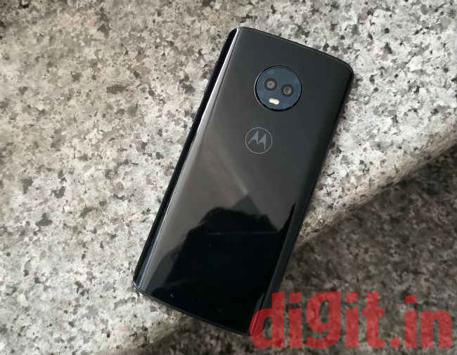
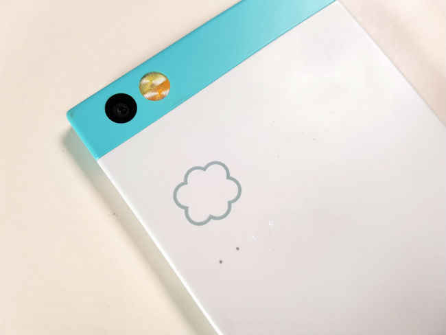
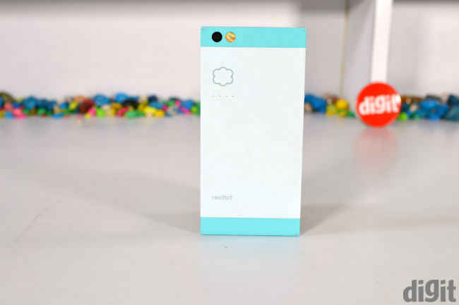
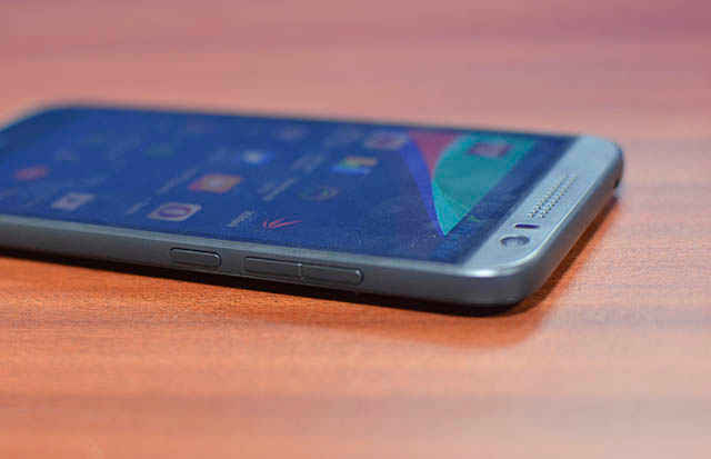
    The first dramatic change I noticed is the stunning glass design. Moto phones have gone from using a polycarbonate shell to full metal bodies to now an all-glass design. The Moto G6 takes cues from the more expensive Moto X4 and sports a 3D glass back with a similar sheen. We received the Indigo Black variant that has a dark blue tinge to the glass. It’s very subtle and goes a long way in making the phone feel premium. However, most people who buy mid-range phones want them to last longer. A phone made of glass isn’t very durable even if there is Gorilla Glass 3 on the front and the back. The glass sandwich is held together by an aluminium frame polished to give a chrome finish. It complements the design pretty well. The Moto G6 is also splash-proof. The company didn’t share the IP rating though, so you might have to be a little careful around water.

    The rear edges curve ever so gently (that uncannily feels a lot like the Galaxy S7) and makes holding the phone quite comfortable, but more than that, it’s the thinner form factor that makes this one of the most ergonomic phones in its price range. The signature curved corners also help with the grip, although the glass back tends to get a bit slippery and smudges easily.

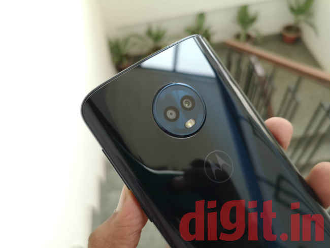
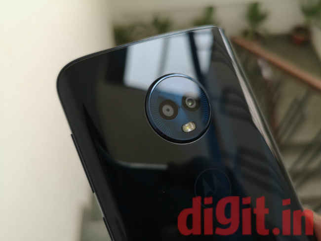
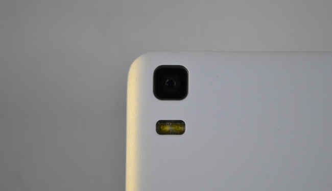
    Particularly interesting is the attention paid to the camera bump. Camera bumps are never pretty, but if ever there was one, it would be the way Moto has been handling it. The one on the Moto G6 has the watch dial-like design that actually makes me hate the bump less. It still comes in the way when you place the phone on a flat surface though.  

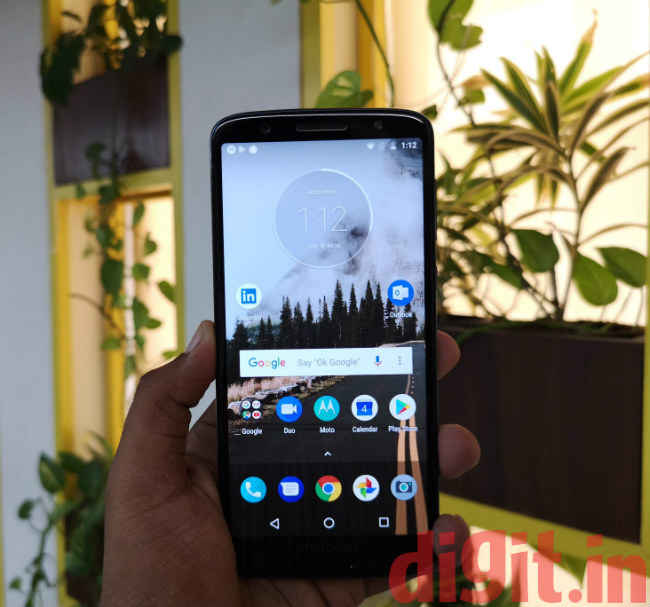
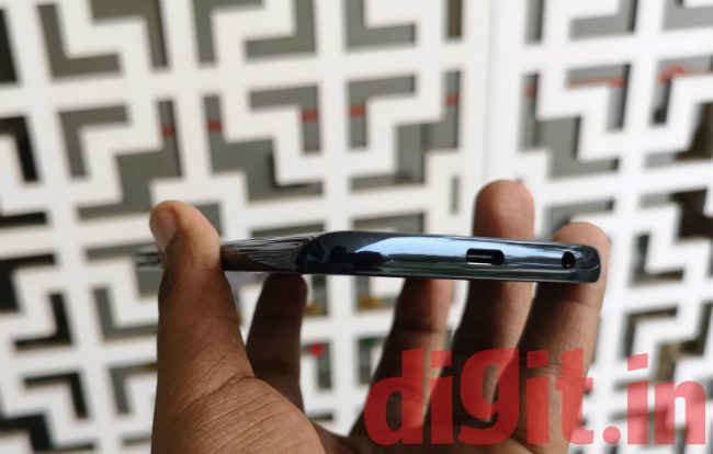
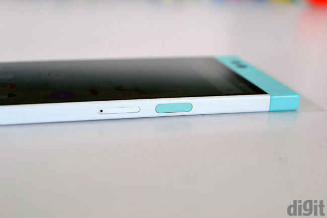
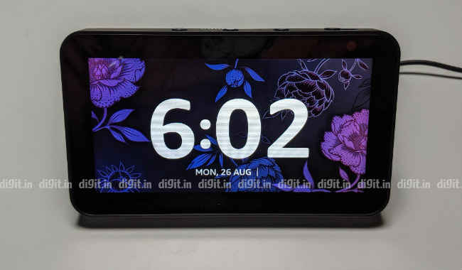
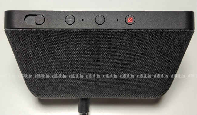
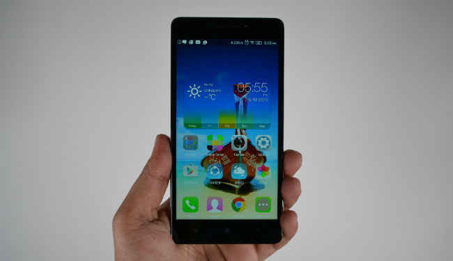
    Turn the phone around and you will find the screen now takes up most of the real estate. The new display size allows the phone to have more screen without increasing the size of the phone. In fact, the Moto G6 feels almost as compact as the Galaxy S9. There’s still some bezels around the edges though, especially at the top and the bottom. Below the display is the home button, which has the fingerprint sensor embedded in it. There are no on-screen navigation keys. The home button supports gestures which are quite fluid and it’s easy to get used to. On top of the display is the front camera along with a selfie flash. It’s good to see the Moto G6 leading the way with a USB-Type C port and thankfully, the 3.5mm headphone jack is retained so you can use your old headphones with it. The power key has a striated texture that helps distinguish it from the volume rockers, both of which are at the right edge of the device.

    The Moto G6 is the most well-crafted phone in the history of the lineup. It feels premium right from the moment you hold it. The glass design may not be of much use, but it sure does make the phone look beautiful. I’ll give Moto that.

    Display

    Yet another place where you will see a dramatic change is the display. The Moto G6 is the first phone by Moto to feature the new univisium display. The company is playing catchup here. While the Moto G5s last year introduced dual cameras to the lineup, the taller 18:9 display took its time to arrive. The 5.7-inch IPS LCD display is good for watching content and reading text. It takes up 75.4 percent of the body up front, which isn’t exactly the screen-to-body ratio other phones at that price are offering. But that doesn’t really come in the way. What’s impressive is the slim profile of the phone thanks to the taller display which helps in typing with one hand and improving the ergonomics overall.

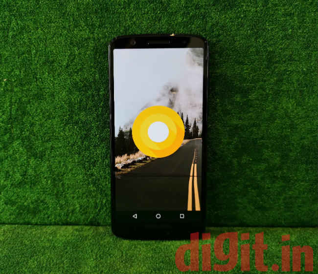
    There’s no notch thankfully. Moto has just embraced the taller display, so the company hasn’t yet reached the stage to offer a notch. It might just skip it altogether if a better solution is found. Moto’s parent company, Lenovo is teasing a completely bezel-less phone with no notch or a lower chin, which is definitely a sign of good things to come.

    But coming back to the G6, the screen is just about usable. While Moto has worked hard on the design, the display leaves a lot to be desired. Even though there’s more real estate that can be used, the colours are quite dull as compared to other phones at its price. There is also a bit of a lag in the touchscreen. Swipes and flicks take a split second longer to register, which is quite annoying.

    While the higher touch latency doesn’t really come in the way of performing regular tasks like typing a text or browsing social media, it does become apparent while playing games like PubG Mobile. It’s also a struggle to view content under direct sunlight as the IPS LCD panel isn’t conducive to high peak brightness like AMOLED panels does.

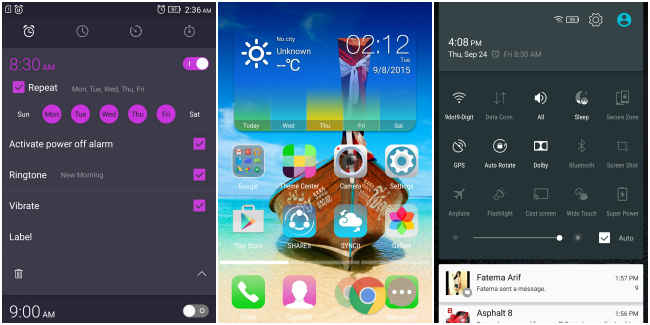
    The Moto G6 has the always-on display as well. This is despite having an IPS-LCD panel. The feature is optimised to an extent that it doesn’t impact the battery life of the phone by much. There are now proximity sensors on all the four corners of the phone that can detect even the smaller nudge or a wave over the screen, and once it does, the screen lights up dimly to show the time and notifications. The feature was exclusive to the Moto X and the Moto Z phones earlier, but has now trickled down to the G series. It works quite well and is in line with the company’s ongoing campaign of encouraging phone-life balance. Moto’s explanation of offering the feature is that it will encourage people to unlock their phones much lesser to check for notifications. In fact, you can also interact with the notification straight from the always-on screen without even unlocking the phone.

    Performance

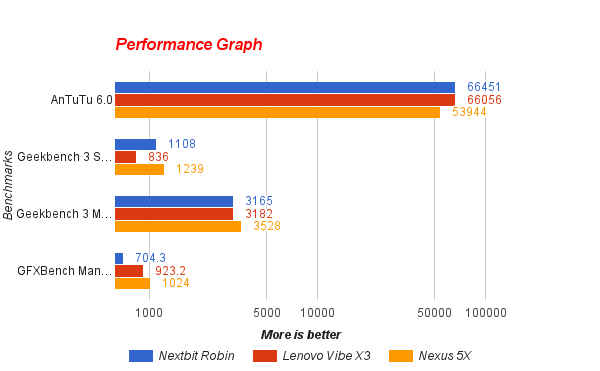
    The Moto G6 is powered by a Qualcomm Snapdragon 450 chipset coupled with up to 4GB of RAM and 64GB of storage. There’s also a 3GB/32GB variant of the phone. We received the higher variant for review. The Moto G phones were never the performance workhorse, but they atleast rocked mid-range hardware. The Moto G6 thus feels like a downgrade as the Snapdragon 450 is an entry-level processor. But don’t let its positioning fool you. This chipset punches above its weight. The Snapdragon 450 has the same microarchitecture as the Snapdragon 625 with around 10 percent less performance. The SD450 has an octa-core CPU and also manufactured on a 14nm FinFET process, clocked at 1.8GHz. While the power efficiency remains the same as its mid-range sibling, the max speed is a little less.

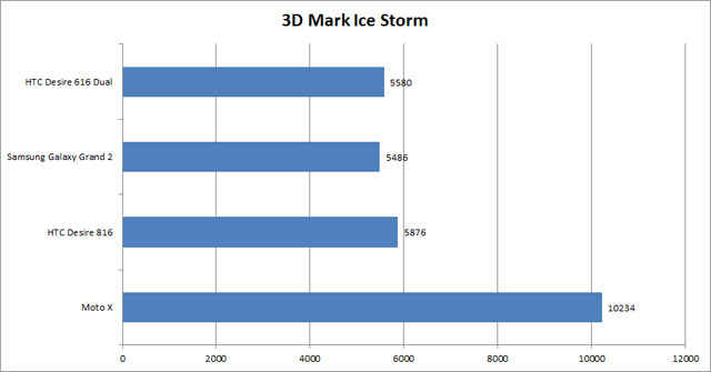
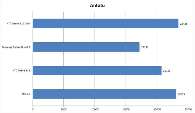
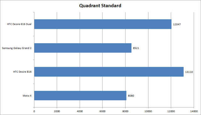
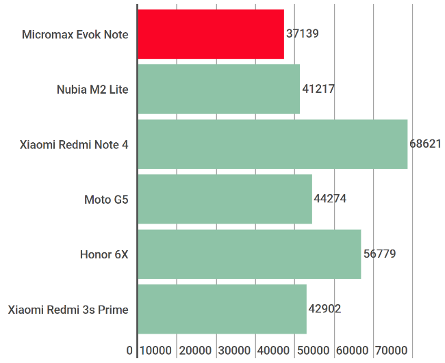
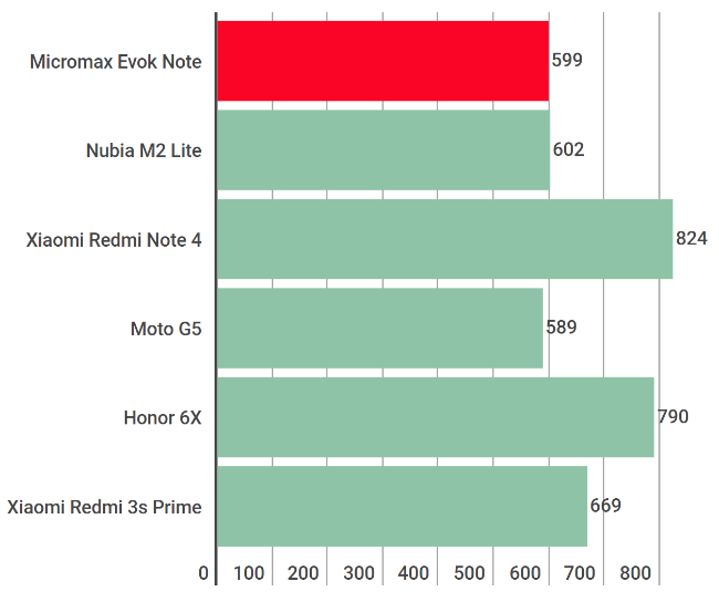
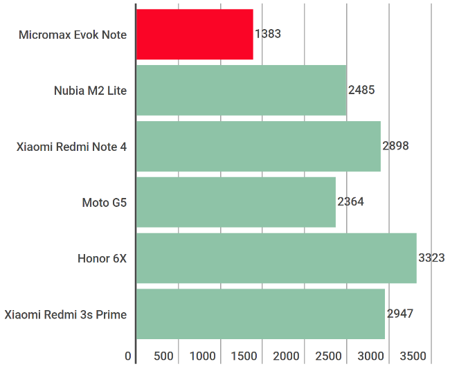
    Benchmark reports will also drive that point home. On Geekbench Single Core, the Moto G6 scored 744 points while on the multi-core test, it scored 3888. On AnTuTu 7.0, it scored 72230 while on 3DMark Slingshot test, the G6 got a score of 796. All these scores are in line with other smartphones running the Snapdragon 450 chipset, and a little lower than phones powered by Snapdragon 625. Needless to say, the Moto G6 underperforms massively (on paper) in comparison to the Xiaomi Redmi Note 5 Pro (review), which is around the same price as the Moto G6.

    The 4GB RAM variant had 38 percent free RAM available after a regular work day. The 64GB storage is also quite adequate as I found around 70 percent storage remaining free after installing the essential apps.

    Then again, synthetic benchmarks state only one part of the story. Moto claims the entry-level chipset is enough to give a smooth user experience. And for the most part, the claim stands true. Using the phone is pretty seamless. There’s no unnecessary heavy animation or duplication of apps. The regular apps like Facebook, Instagram, Chrome and the like do take a little time to launch (as compared to phones in that price range), but the in-app experience is quite smooth. Gaming, as pointed before, can be an issue. There were occasional frame drops while playing PubG Mobile, which is anyway a graphics-intensive game.

    The phone does heat up a bit. Nothing alarming, but you can feel the temperature at the back. That’s mostly because the glass back traps the heat in between and is a common issue with most glass-back phones.

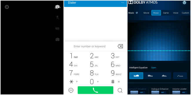
    The Moto G6 relies on a near-stock Android interface with nifty additions that go a long way in improving the experience. Most of these have trickled down from the flagship Moto Z2 Force and the Moto X4. There’s the three-finger screenshot, twist to launch the camera, chop twice for flashlight and more. All of them work without a hitch. There’s Moto Voice which can launch apps straight from the lockscreen. It complements the Google Assistant quite well.

    The Moto G6 also brings in face unlock. It’s an additional way to unlock the phone, unlike other phones that only relies on facial recognition. For the most part, it works. Just not as snappy as the OnePlus 6, or the Redmi Note 5 Pro. But it does work in the dark. Just don’t expect it to be as secure as the fingerprint sensor though, as it only relies on the front camera to recognise your face.

    Camera

    While the design of the Moto G6 is the most visible upgrade, the camera at the back also received a lot of love from Moto. The G6 takes after the G5s with the dual camera unit at the back. This time, the secondary camera is used for depth sensing to leverage the portrait mode. The G6 has a 12-megapixel primary sensor with f/1.8 aperture along with a 5-megapixel depth sensor with f/2.2 aperture. Together, the twin cameras offer the portrait mode and couple of nifty features which seem innovative on paper, but in actual usage, seem quite gimmicky.

    First the basics. The Moto G6 can reproduce colours quite well, under ample lighting. Whether indoor or outdoors, if the light is right, chances are, you’ll get a well-lit, well-balanced photo. There’s a tinge of oversaturation though, but that only goes to make the photo look better on the smaller display.

    The dynamic range is also quite good. Details lost in the shadows are brought up with ease, although it’d be unrealistic to expect flagship-level performance here. But in the mid-range segment, it’s quite well. Compared to the Redmi Note 5 Pro, which also has a great camera, the Moto G6’s photos seem much more vibrant and colourful.

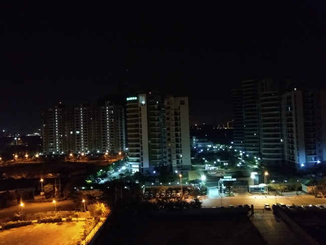
    Under low-light, the camera at the back can take some impressive photos, considering the hardware limitations. When shot with the auto mode, the exposure is kept low and the noise at a minimum. As a result, the photo may not come quite illuminated, but it gets the details right. The samples below will explain a lot more.

    All that said, the G6 has the same shutter lag issue we faced with the Moto X4 earlier this year. Perhaps it’s the entry-level processor or a buggy camera app, but the shutter takes a split second longer to respond, which can prove irksome when taking quick shot, or when the subject is only momentarily available to shoot. The shutter lag increases with the decrease in light and you’ll have to have a steady hand to take a good shot.

    The front camera is more interesting. The 16-megapixel selfie shooter relies on pixel binning, which is a feature used by flagship phones mostly. It essentially combines the pixels in the sensor to form larger pixels that can absorb and accommodate more light. The resulting image is much brighter, with a lot more details under low light. The selfies under daylight are also commendable and are more true to source than other selfie-centric phones. There’s an LED flash up front as well, but you’re better off keeping it off.

    While the Moto G6 camera does the basics right, the weakness starts showing when you try out the wackier features. The portrait mode has inconsistent blurring and often creates an artificial effect. There’s a cutout feature that can help you superimpose an image against another background. The results look extremely amateurish and I was afraid of being trolled online had I posted a photo using that feature. There’s the spot colour option that pops the colour from everything but the subject of your choosing, but here too, the application needs more work. It’s nowhere near the finesse Google Photos offer. The text scanner though works fine, although it takes some time to detect the text from a photo. There’s face filters as well, which should be fun when used among friends.

    Other than that, you get slow-motion video and time-lapse that works as well as it should considering the hardware. Nothing much to crib here. The Moto G6 camera would have been pretty much perfect had the shutter-lag issue was not there. But oh well, nothing’s perfect in this world.

    Battery

    While most other mid-rangers max out the battery capacity these days, the Moto G6 keeps things modest with a 3,000mAh battery. It just about lasts a work day and not more than that. While using the phone as a daily driver, I would use it to take calls, reply to messages, listen to music, browse social media and theinternet. I also took a lot of photos while testing. All that drained the battery to under 10 percent by evening.

    Thankfully, Moto bundles a 15W TurboCharger that can deliver enough power for the rest of the day under 15 minutes.

    The battery capacity isn't anywhere close to what the market leaders offer. It's just about functional, like the rest of the things the Moto G6 offers. There are other more long-lasting devices out there.

    Bottomline

    The Moto G6 is just about functional and somewhat reliable. It's premium glass design will let it stand out amidst the usual unibody designs, but that's just about it. In its quest to look different, Moto missed the mark in making the G6 as powerful as the not-so-good looking phones that boasts more firepower. A mid-range phone buyer is looking for a phone with a high value for money. The Moto G lineup of phones were known for giving a good bang for the buck. But while the Moto G6 can be sit amidst the new shiny flagships, looking all pretty, but value for money it is not.

    Motorola Moto G6 64GB Key Specs, Price and Launch Date

    Price:
    Release Date: 04 Jun 2018
    Variant: 32GB , 64GB
    Market Status: Launched

    Key Specs

    • Screen Size Screen Size
      5.7" (1080 x 2160)
    • Camera Camera
      12 + 5 MP | 8 MP
    • Memory Memory
      64GB/4 GB
    • Battery Battery
      3000 mAh

    Related Reviews

    Nokia 5.3 Review

    Oppo Reno4 Pro Review

    Asus ROG Phone 3 Review

    OnePlus Nord Review

    OnePlus 8 Pro Review

    logo
    Subhrojit Mallick

    Eats smartphones for breakfast.

    Advertisements

    Trending Articles

    Latest Reviews

    view all
    Advertisements

    Popular Reviews

    View All

    Motorola Moto G6 64GB

    Motorola Moto G6 64GB

    Digit caters to the largest community of tech buyers, users and enthusiasts in India. The all new Digit in continues the legacy of Thinkdigit.com as one of the largest portals in India committed to technology users and buyers. Digit is also one of the most trusted names when it comes to technology reviews and buying advice and is home to the Digit Test Lab, India's most proficient center for testing and reviewing technology products.

    We are about leadership-the 9.9 kind! Building a leading media company out of India.And,grooming new leaders for this promising industry.

    DMCA.com Protection Status

    Visakhapatnam espionage case: NIA arrests man with suspected links to Pakistan’s ISI from Godhra

    HTC Desire 616 Dual SIM Review

    HTC Desire 616 Dual SIM Review

    By Kunal Khullar | Updated May 22 2019
    HTC Desire 616 Dual SIM Review
    DIGIT RATING
    71 /100
    • design

      70

    • performance

      65

    • value for money

      76

    • features

      75

    User Rating : 4.3333333333333/5 Out of 3 Reviews
    • PROS
    • Smooth and stable UI performance
    • Octa-core processor at an affordable price
    • Camera quality is quite good in its class
    • CONS
    • Glossy back panel
    • Low internal memory
    • Battery backup could have been better

    Verdict

    The Desire 616 is a good looking handset, and with an octa-core processor it sounds impressive as well. But would you really consider something that provides a similar performance experience which is available on other devices in the same price range? The MediaTek processor isn't super powerful but it does provide enough power to give you a lag free experience on the device. The smartphone does have its ups and downs and there isn't any major feature that would make us recommend this handset to the mass. 

    BUY HTC Desire 616 Dual SIM
    Buy now on flipkart Out of Stock 5999
    Buy now on amazon Out of Stock 7999

    HTC Desire 616 Dual SIM detailed review

    HTC has realized that it cannot just survive on high end devices and we have seen a number of low priced smartphones from the Taiwanese OEM. The company announced the Desire 616, its first octa-core equipped smartphone, this month in India and we take it for spin to see if HTC has made the right decision in fitting in an 8-core MediaTek processor.


    SPECIFICATIONS

    ​​

    BUILD AND DESIGN

    The Desire 616 looks and feels like a younger brother to the Desire 816. Even HTC claims that the sole purpose of the Desire 616 is to be an affordable version of the 816 which offers similar performance capabilities. Up front the Desire 616 is a chic looking smartphone with a 5-inch 720p display which somehow looks good only when the brightness is above 50%. Viewing angles are very good and colours remain intact. HTC has removed the capacitive touch buttons and has gone for on-screen navigation keys. Above the display there is a large speaker like grill but surprisingly it is the earpiece. Next to it we have some sensors and the front 2MP camera.


    The handset has a glossy back panel which leads to a lot of fingerprints and smudges. The back also houses the 8MP camera with an LED flash, HTC branding and the loudspeaker. Underneath the back panel, you get a regular sized and a micro SIM card slot along with the 2000mAH battery.


    The design and feel of the smartphone is quite good, although we weren’t a fan of the glossy back panel as it reduces your grip and attracts fingerprints and smudges which makes the back look dull.

    The Desire 616 does maintain HTC’s good design philosophy, although it is clearly visible that the company is trying to bring in smartphones made out of low-cost material without having to compromise on the overall design and build quality.

    UI AND PERFORMANCE

    The smartphone runs on Android 4.2.2 with a custom HTC launcher which we have seen on other low end HTC devices including the Desire 516, 310 and 210. The launcher just includes HTC’s news and social media aggregator app BlinkFeed as one of the homescreens and some custom HTC icons and menu drawer. Other than that, everything is stock Android. The UI is very stable and we didn’t notice any lags or any crashes.  

    This is HTC’s first handset with an octa-core SoC with 1GB of RAM and the fluidity of the UI makes its evident that it is powerful enough to provide a lag-free experience. Although being a MediaTek chipset we had our doubts about the battery efficiency as well as heating issues and our concerns turned into reality because just 10-15 minutes of gameplay in Dead Trigger 2 stressed the SoC and it started to heat up the device. We also carried out our standard battery test where after playing a full HD video for 1 hour led to a loss of 25% in battery which is again a bit disappointing.

    Keeping the heating issues aside, the chipset performs well in benchmark tests. It managed to get scores which were very close to the Moto X and better than the Samsung Galaxy Grand 2 which has now fallen in the same price segment. However it is amusing to see that a low to mid-range smartphone with an octa-core processor gives you a similar performance experience that you could get on a similar priced quad-core or even a dual-core processor equipped smartphone.


    The performance and day to day task management feels great on the Desire 616 but we were put off by the fact that the MediaTek processor heats up when put under stress and also doesn’t manage the battery all that well.

    CAMERA

    There is an 8MP snapper on the Desire 616 along with the 2MP front camera for taking selfies and making video calls. The primary camera performs well and is quite good on sharpness and colour reproduction. Under broad daylight, you will be happy with your pictures as the focusing and shutter speeds are up to the mark. Moving to shadows and low light conditions will leave you with grainy and shaky pictures.

    The camera app has a stock Android UI thus you get basic settings and a few tweaking options here and there.

    Click on images to enlarge:


    In the video department you do get the option to shoot at 1080p resolution and videos come out quite smooth. If you like the occasional photo shooting spree, the camera on the Desire 616 won’t disappoint and it is probably one of the finest in its class.                                                                                                                              

    CONCLUSION

    If you think that an octa-core processor is superior to other processors with a lesser number of cores then you are mistaken. Nobody needs so many cores on a smartphone as it is quite pointless. The hardware on the Desire 616 is stable and as good as smartphones like the Moto X and the Galaxy Grand 2 and with a price tag of Rs. 16,990 it does sound like a bargain. However it will definitely heat up more and give slightly less battery backup than the above mentioned.

    HTC Desire 616 Dual SIM Key Specs, Price and Launch Date

    Price:
    Release Date: 24 Jul 2014
    Variant: 4GB
    Market Status: Launched

    Key Specs

    • Screen Size Screen Size
      5" (720 x 1280)
    • Camera Camera
      8 | 2 MP
    • Memory Memory
      4 GB/1 GB
    • Battery Battery
      2000 mAh

    Related Reviews

    Nokia 5.3 Review

    Oppo Reno4 Pro Review

    Asus ROG Phone 3 Review

    OnePlus Nord Review

    OnePlus 8 Pro Review

    logo
    Kunal Khullar

    Advertisements

    Trending Articles

    Latest Reviews

    view all
    Advertisements

    Popular Reviews

    View All

    HTC Desire 616 Dual SIM

    Buy now on flipkart 5999

    HTC Desire 616 Dual SIM

    Buy now on flipkart 5999

    Digit caters to the largest community of tech buyers, users and enthusiasts in India. The all new Digit in continues the legacy of Thinkdigit.com as one of the largest portals in India committed to technology users and buyers. Digit is also one of the most trusted names when it comes to technology reviews and buying advice and is home to the Digit Test Lab, India's most proficient center for testing and reviewing technology products.

    We are about leadership-the 9.9 kind! Building a leading media company out of India.And,grooming new leaders for this promising industry.

    DMCA.com Protection Status

    Visakhapatnam espionage case: NIA arrests man with suspected links to Pakistan’s ISI from Godhra

    Lenovo K3 Note Review

    Lenovo K3 Note Review

    By Souvik Das | Updated May 22 2019
    Lenovo K3 Note Review
    DIGIT RATING
    75 /100
    • design

      72

    • performance

      84

    • value for money

      58

    • features

      86

    User Rating : 1.25/5 Out of 4 Reviews
    • PROS
    • Good display colours
    • Slim form, good to hold
    • Smooth browsing and messaging experience
    • Decent native audio
    • CONS
    • Throttled gaming performance
    • No backlight on buttons

    Verdict

    The Lenovo K3 Note is one of those devices that really gets its essentials correct. In terms of everyday usage, its competence is unquestionable. It has a good display, very good audio output, a decent camera unit, and possibly the best performance in terms of lightweight usage that any smartphone within the sub-10k budget segment has to offer. The only place where it misses out is the below-par gaming performance. If your priority is for a smoothly-functioning Android smartphone which will see you through the day’s essentials without breaking a sweat and saving some battery too, the Lenovo K3 Note is your phone. Alternatively, the Meizu M2 Note makes for a better device at the same price point, giving similar or better performance, along with featuring a better display and camera.

    BUY Lenovo K3 Note
    Buy now on amazon Available 13000
    Buy now on flipkart Out of Stock 7999

    Lenovo K3 Note detailed review

    The Lenovo K3 Note has generated a considerable amount of popularity in the smartphone market. The K3 Note comes in a neat, standard packaging. Lenovo has not tried to make its device look alluring, but it somewhat works in its favour. The unassuming facade gives way for the K3 Note to be a well-functioning device that is adept at doing what a smartphone is meant to, without any frills. Does it live up to its initial impression?


    BUILD and DESIGN
    As mentioned before, there is nothing exceptional about the Lenovo K3 Note’s design. It doesn’t overbear its 5.5-inch screen size, it is reasonably thin at 8mm, the 3.5mm audio port and the microUSB/charging port are at the top, and the volume rocker and power/unlock button to the right side. There is no metal on its outer casing, but it does not feel cheap in terms of overall build and the quality of the plastic used.


    Lenovo K3 Note's build: Not the sturdiest, but still good

    The only big qualm that you will have about the physical aspect of the device is the lack of backlight on the touch function keys. Until you get very used to using the device, maneuvering it in dimly lit or dark environments may get difficult. Yes, the arrangement of the function keys is the standard grouping of multifunction - Home - return (from left to right), which should be of relative help if you happen to have used cellphones with this key arrangement before. Otherwise, this is a considerable setback.

    There are no hot-swappable SIM slots, and both the SIM slots and the microSD expansion slot need to be accessed by opening the back cover. With more smartphones going with the sealed back panel build, the Lenovo K3 Note’s detachable back panel might sit well with a lot of people, who would prefer to have the ability of being able to access the battery pack.


    Back panel: Dual-SIM slots, battery pack and microSD expansion slot

    The build is decent, although other competing smartphones like the Meizu M2 Note feature an outer shell that is sturdier, and better to look at. The Lenovo K3 Note misses glass protection, and although you might make it through a couple of falls with it, we would not be comfortable with letting our smartphone face the world without the screen protection.

    Overall, the Lenovo K3 Note’s outer facade can be called decent, at best. The simplistic approach may work for users who focus on core functionality, and while it does work for us, it misses out on the added bonus that other devices with better looks and stronger builds present.

    DISPLAY and UI
    The Lenovo K3 Note scores high on display quality, and the originality of colours on it. The display is amply bright, with wide viewing angles that do not inflict any colour or hue shift at obtuse angles nearing the 180-degree mark. The only flaw that we could point at with the K3 Note’s display is the reflective outer coating, which makes viewing content on the phone under direct sunlight quite difficult. Nevertheless, the bright display prevents it from becoming unusable, but you might find the reflection of your own head jarring.


    Lenovo K3 Note display: Bright, crisp, but reflective

    In terms of indoor viewing, the Lenovo K3 Note is as good as you can expect. We played a few 1080p films on it, and enjoyed the experience. There is never any hint of interpolation, colours remain true to the source, and the bright screen manages backlight intensity well to not become too sharp on the eye. The 5.5-inch, IPS-panel LCD screen is large enough for viewing movies on the go, and the 1080p resolution ensures smooth playback. The screen occupies 72% of the front panel area, and the bezels are not overbearing. Additionally, touch response is very accurate. We did not experience any missed taps and swipes, and the uber-responsiveness makes for a very handy tool when typing fast or playing games.


    L-R: Alarm, Home screen, Notification panel


    L-R: Camera, Dialer, Audio control panel

    Lenovo has loaded its custom Vibe UI v2.5 on top of Android Lollipop v5.0. There are no separate Home pages/app drawer, and the custom icons are just about good to look at. However, it comes with an extensive amount of pre-loaded applications including Evernote, Asphalt 8, Guvera Music, Skype and Flipkart, along with Lenovo’s own Theme Center, SYNCit and SHAREit. While a number of these applications can be deleted, many are locked. With the amount of apps pre-loaded and the free-flowing graphic animations, there is a heavy load on resources, because of which you will seldom see free memory more than 1100MB. The custom icons are decent to look at, and despite the load on memory resources, most applications run without any lags and stutters.

    PERFORMANCE and BATTERY
    It is here that the Lenovo K3 Note makes most of its money, and almost loses it too. The K3 Note set the benchmark test scores for its category, returning results higher than other devices by a considerable margin. In light of this, looking at its performance in terms of daily applications and services, the K3 Note lives up to its scores. Calling, messaging, browsing, music/video streaming and light gaming is smooth. With extensive usage, playing games like Subway Surfers and Jetpack Joyride seemed to take a slight strain, but there was no other rift between its scores and actual performance.

    One of the biggest selling points of the Lenovo K3 Note is its superior specs-to-price ratio. It runs on a MediaTek MT6752 octa-core chipset clocked at 1.7GHz, along with Mali T760-MP2 GPU, 2GB of LPDDR3 RAM, 16GB of internal storage, and a 3000mAh battery. It features a 13-megapixel OmniVision PureCel OV13850 sensor primary camera with an f/2.0 lens and dual-tone LED flash, and a 5-megapixel front camera. Theoretically, Lenovo has presented the K3 Note as a formidable package, strong enough to ruffle feathers in its own category, and even a few above the 10k price market. In terms of the specs-to-price ratio, the Lenovo K3 Note is among the best, with the likes of Meizu M2 Note, Yu Yureka Plus and the Xiaomi Mi 4i for company.

    Network retention quality is good - there were no drops in call, data or WiFi networks. In-call audio is pristine, and there are no aberrations in incoming audio via the earpiece, and the main microphone. The secondary microphone on the back, while not being the best in terms of noise cancellation and clarity of recorded audio, suffices when you need to make that emergency record, and is actually decent in closed, indoor environments.

    The Lenovo K3 Note’s performance in terms of everyday applications is one of the best in its class. Messaging, internet-based social media applications and services, lightweight games, music streaming, YouTube and the likes work without any glitch. Surfing Facebook and Twitter timelines with simultaneous music playback through Guvera and updating apps in the background did not lead to any stutters, and running multiple applications at the same time, even with relatively low amount of RAM available, did not lead to any difficulty in terms of regular usage. So far, the K3 Note was really impressive.

    Lenovo K3 Note | Create infographics

    The death knell lay in opening the pre-installed Asphalt 8. The K3 Note is meant to get your essentials right, and in process, misses out on optimising gaming performance. After about five minutes into the first race, Asphalt 8 stuttered to the extent that made it unplayable. The same occurred with Marvel: Contest of Champions, which performed even worse, if that was possible. Heavy gaming, on the Lenovo K3 Note, is practically impossible. The maximum that Asphalt 8 remained playable was for 15 minutes, and that too with a large extent of stutters. The best you can do with gaming, or continued photo editing with Adobe Photoshop Express, is for 15 minutes. Photoshop becomes extensively slow, taking long times to apply filters and saving photos to device. The K3 Note, unfortunately, is just not for heavy usage.

    It does pick up with the audio, though. The Lenovo K3 Note packs in a Dolby Atmos audio chip, delivering stellar audio quality within its budget segment. Audio quality through headphones is excellent - put your favourite pair of headphones on, and you will not have a single ounce of disappointment. The speaker on the rear is loud, and surprisingly clear for a cellphone’s native speaker. We played a host of different tracks, ranging from streaming online at 64Kbps, to high fidelity 320Kbps audio tracks from Pink Floyd’s The Wall. Well done, Lenovo. Well done, Dolby. 

    Lenovo K3 Note battery | Create infographics

    While the K3 Note’s battery life is not really commendable, it is not bad, either. On an average day’s usage of making calls, messaging, occasional music playback and about one hour of playing White Tile, the K3 Note returned home with almost 15% of charge left. It does what every smartphone around it is doing - last an entire day. Our battery test returned a battery life of 8 hours and 20 minutes - standard performance. Continued gaming was difficult, but the battery drain was low. The K3 Note drained 11% of the battery in 30 minutes of gaming - decent, considering that most phones discharge the first 20% quite rapidly. As mentioned before, the Lenovo K3 Note is all about getting the essentials correct. It does miss out on high-octane performance, but with the main focus being on users with a utility-centric approach, the K3 Note works just fine.

    CAMERA
    In broad daylight, the Lenovo K3 Note takes decent photographs. Low light photography is not the best around - images often appearing blurry and pixelated. The main issue with low light photography is in the K3 Note’s image stabilisation, which is weak. The shutter, along with the camera application, is fast, light and responsive. Video recording is reasonably smooth, and there is little interpolation unless you shoot fast-moving objects, or pan the camera fast. The front camera is very good in well-lit environment, and decent even in dimly-lit conditions. Video recording with the front-facing camera is also decent, making the overall camera unit of the Lenovo K3 Note a well-performing camera for its price.


    The K3 Note's camera performs well in certain conditions, but fails in low light photography

    Check out photographs taken by the Lenovo K3 Note's camera in the album below:

    View post on imgur.com

    BOTTOMLINE
    The Lenovo K3 Note is one of those devices that really gets its essentials correct. In terms of everyday usage, its competence is unquestionable. It has a good display, very good audio output, a decent camera unit, and possibly the best performance in terms of lightweight usage that any smartphone within the sub-10k budget segment has to offer. The only place where it misses out is the below-par gaming performance. If your priority is for a smoothly-functioning Android smartphone which will see you through the day’s essentials without breaking a sweat and saving some battery too, the Lenovo K3 Note is your phone. Alternatively, the Meizu M2 Note makes for a better device at the same price point, giving similar or better performance, along with featuring a better display and camera.

    Lenovo K3 Note Key Specs, Price and Launch Date

    Price:
    Release Date: 01 Oct 2015
    Variant: 16GB
    Market Status: Launched

    Key Specs

    • Screen Size Screen Size
      5.5" (1080 x 1920)
    • Camera Camera
      13 | 5 MP
    • Memory Memory
      16 GB/2 GB
    • Battery Battery
      3000 mAh

    Related Reviews

    Nokia 5.3 Review

    Oppo Reno4 Pro Review

    Asus ROG Phone 3 Review

    OnePlus Nord Review

    OnePlus 8 Pro Review

    logo
    Souvik Das

    The one that switches between BMWs and Harbour Line Second Class.

    Advertisements

    Trending Articles

    Latest Reviews

    view all
    Advertisements

    Popular Reviews

    View All

    Lenovo K3 Note

    Lenovo K3 Note

    Digit caters to the largest community of tech buyers, users and enthusiasts in India. The all new Digit in continues the legacy of Thinkdigit.com as one of the largest portals in India committed to technology users and buyers. Digit is also one of the most trusted names when it comes to technology reviews and buying advice and is home to the Digit Test Lab, India's most proficient center for testing and reviewing technology products.

    We are about leadership-the 9.9 kind! Building a leading media company out of India.And,grooming new leaders for this promising industry.

    DMCA.com Protection Status

    Visakhapatnam espionage case: NIA arrests man with suspected links to Pakistan’s ISI from Godhra

    Redmi 2 Review

    Redmi 2 Review

    By Prasid Banerjee | Updated May 22 2019
    Redmi 2 Review
    DIGIT RATING
    78 /100
    • design

      83

    • performance

      75

    • value for money

      71

    • features

      79

    • PROS
    • Attractive and compact design
    • Good performance
    • Very good camera
    • CONS
    • Battery life needs work
    • Dim display

    Verdict

    With the Redmi 2, Xiaomi has corrected every shortcoming that the Redmi 1S had and made an altogether better smartphone, which is worth its cost. It's the best budget smartphone you can buy right now.
     

    BUY Redmi 2
    Buy now on amazon Out of Stock 5399
    Buy now on flipkart Out of Stock 5999

    Redmi 2 detailed review

    Incremental innovation is fast becoming an issue in the smartphone market. Be it a flagship or the most inexpensive device, you get the same body, with new interiors and if you're lucky, different button placement (think HTC One M9). That doesn’t mean there's no room for improvement though. Look at Motorola and the new Moto X. The device may have retained the basic design elements from its predecessor, but it’s an improvement in every possible way. The same goes for the Xiaomi Redmi 2.


    While most smartphone makers have to deal with a stiff consumer demand, Xiaomi has it the worst. The company is not only expected to make a good smartphone with the newest hardware, it has to do so at the lowest possible price point. It’s a risky game for Hugo Barra and gang, but I daresay they’re playing it right. In my reviews of the Redmi Note and Redmi 1S, I mentioned that I expect more from this company. The Redmi 2 is close to what I expect.

    Build and Design

    If it ain’t broke, don’t fix it, but if it is broken, you better do so fast. The Redmi 1S was a bulky device, which lacked the ‘above its price grade’ feel that we’ve come to expect with Xiaomi. That’s the first improvement in this new version. The Redmi 2 has a matte-ish finish on the back and is both smaller and lighter than the older device. While the 4.7 inch screen size has been retained, Xiaomi has just made slight changes, which make for a very appealing smartphone. It's not 'above its price grade', but it's close.

    If you’ve seen pictures of the Redmi 2, you would know it looks almost exactly like the Redmi 1S. The design in the Redmi 2 is more refined, correcting everything that the Redmi 1S lacked. It’s not as big as the Lenovo A6000 and isn’t too small, like the Moto E (2nd Gen). It’s a good 15 grams lighter than its predecessor and just sturdy enough to be called a good budget build.

    Display and UI

    Perhaps the only thing that Xiaomi needs to work on is its display brightness. Users often ask how Xiaomi’s devices are inexpensive when they use the same materials as Samsung and Apple. Well, that’s not quite accurate. Xiaomi has often talked about this in fact. While the company’s displays do come from Sharp, Samsung may be buying the best that Sharp can offer, while Xiaomi goes for the second best. At the prices that the company sells its devices for, it’s more than justified. The display on the Redmi 2 also lacks something by way of viewing angles. They’re decent, but not the best.

    What it lacks in brightness and viewing angles though, the Redmi 2 makes up for in sharpness and colour reproduction. Placed next to a Moto E, you can easily see the difference that the higher 720p resolution makes. In addition, the Dragontrail glass provides a premium touch experience that the Lenovo A6000 lacks. Also, it makes the display practically scratchproof.

    Lastly, MiUI 6 is all about appearance and adds a little more to the overall display.

    Performance

    With 1GB RAM and the Snapdragon 410 SoC, the Redmi 2 offers better performance than the Moto E (2nd Gen) and is the same on benchmark scores with the Lenovo A6000. On regular usage, there’s hardly a difference between the three though. If you place the three side by side, the difference in gaming quickly becomes very apparent.

    Performance Graph | Create infographics


    The A6000 suffers from Lenovo’s Vibe UI and its plethora of bloatware, while the Moto E is just downright weaker. The Redmi 2 on the other hand offers performance that is more than satisfactory for a budget device. In fact, what I was pleasantly surprised to see was that the phone was often left with nearly 500MB of free RAM out of the 1GB that it comes with. Why is this good? Because it offers just a little bit better multi tasking.

    I didn’t come across any crashes on the device and the app load times were what I would expect from a phone that costs Rs. 6,999. In a high end game like Asphalt 8 or Marvel: Contest of Champions, the lags and stutters are at a bare minimum. The Marvel game for example uses a lot of data alongside the GPU’s graphics performance. In this, the Redmi 2 sometimes stuttered when running on mobile data. On WiFi, where the connection was more stable, the Redmi 2 performed better. To make it clearer, imagine something between the Micromax Yu Yureka and Asus Zenfone C. That, in my book, is good in this price range.

    The benchmarks on this phone don’t show the difference in the performance well. The Lenovo A6000 and Xiaomi Redmi 2 are very close to each other, while the 3G variant of the new Moto E is far behind.

    Camera

    The only area that Xiaomi hasn’t improved upon is the camera. The 8MP camera on the Redmi 2 is same as its predecessor and maintains the stellar image quality that we had appreciated in that device. The only addition is the camera app from MiUI 6. The focus circle doubles as an exposure controller, which would make a lot of sense for camera enthusiasts and is an useful tool in low light conditions.

    Battery

    Apart from the display, another area where the Redmi 2 is still weak is the battery. Yes, Xiaomi put in a bigger 2200 mAh battery and it lasts longer than the Redmi 1S, but it’s still not as good as I would have liked. On our battery test, the phone lasts 6.6 hours, up an hour from the Redmi 1S, but it’s just at par with the 3G variant of the Moto E (2nd Gen) and the Lenovo A6000. It got me through my work day (which is about 12 hours), but in general, I had to charge it at least twice.

    Battery Graph | Create infographics


    Bottomline

    At Rs. 6,999, the Xiaomi Redmi 2 is the best performer in its price segment right now. The company has improved almost every aspect of the device and added a few new features. The dual-4G element makes it future ready but till 4G becomes really widespread in India, the dual-3G element also adds a bit to the overall value. Except the brand value and service network, in which Motorola is still the leader, there’s really no reason to not go for the Redmi 2. Lenovo had the first mover’s advantage with its A6000, but it will have to give it up to Xiaomi now. Of course, you’ll have to get past Xiaomi’s flash sales for that.

    Buy Redmi 2 on Flipkart at Rs. 6,999

    Redmi 2 Key Specs, Price and Launch Date

    Price:
    Release Date: 13 Jul 2015
    Variant: 8GB
    Market Status: Launched

    Key Specs

    • Screen Size Screen Size
      4.7" (720 x 1280)
    • Camera Camera
      8 | 2 MP
    • Memory Memory
      8 GB/1 GB
    • Battery Battery
      2200 mAh

    Related Reviews

    Nokia 5.3 Review

    Oppo Reno4 Pro Review

    Asus ROG Phone 3 Review

    OnePlus Nord Review

    OnePlus 8 Pro Review

    logo
    Prasid Banerjee

    Trying to explain technology to my parents. Failing miserably.

    Advertisements

    Trending Articles

    Latest Reviews

    view all
    Advertisements

    Popular Reviews

    View All

    Redmi 2

    Buy now on amazon 5399

    Redmi 2

    Buy now on amazon 5399

    Digit caters to the largest community of tech buyers, users and enthusiasts in India. The all new Digit in continues the legacy of Thinkdigit.com as one of the largest portals in India committed to technology users and buyers. Digit is also one of the most trusted names when it comes to technology reviews and buying advice and is home to the Digit Test Lab, India's most proficient center for testing and reviewing technology products.

    We are about leadership-the 9.9 kind! Building a leading media company out of India.And,grooming new leaders for this promising industry.

    DMCA.com Protection Status

    Visakhapatnam espionage case: NIA arrests man with suspected links to Pakistan’s ISI from Godhra

    Samsung Galaxy Note 9 Review

    Samsung Galaxy Note 9 Review

    By Swapnil Mathur | Updated May 22 2019
    Samsung Galaxy Note 9 Review
    DIGIT RATING
    79 /100
    • design

      88

    • performance

      86

    • value for money

      52

    • features

      90

    • PROS
    • Impressive battery life
    • Great camera
    • Class-leading display
    • CONS
    • Not much of an upgrade from Note 8

    Verdict

    The Samsung Galaxy Note 9 feels like a Samsung Galaxy S9+ stuffed into the body of a Note 8. There is an upgraded S-Pen and a bigger battery, but these aren't enough to make the phone feel like a "new" flagship, despite being a top-notch performer.

    BUY Samsung Galaxy Note 9
    Buy now on amazon Available 69999

    Samsung Galaxy Note 9 detailed review

    The Samsung Galaxy Note 9 marks a very important juncture for Samsung for more reasons than one. Firstly, this year’s Note 9 brings very little that’s radically different from the Samsung Galaxy Note 8. There’s, of course, the newer processor, Exynos 9810 and 6GB of RAM, but these feel more like customary, incremental upgrades. In fact, DJ Koh, President and CEO of IT & Mobile Communications Division, Samsung Electronics himself admitted that it was becoming more difficult to make a faster phone every year. In fact, while companies remain bullish about their yearly flagship update cycle, innovation on the components that make a smartphone “amazing” has slowed down significantly. That is the challenge which Samsung had to surmount with the Samsung Galaxy Note 9, so let’s dive into just how much it has to offer above and beyond all its competitors.


    Samsung Galaxy Note 9 Build and Design

    The Samsung Galaxy Note 9 retains the shape of the Note 8 (Review), which is a tall, blocky build with sharper corners in comparison to the Samsung Galaxy S9+. You still get the curved screen though. Holding the Note 9, it feels just a smidge wider than the Note 8. For some time, I thought it was all in my mind, until I looked up the dimensions on Samsung’s official website. Sure enough, the Samsung Galaxy Note 9 has become wider by roughly 1.8mm. The height has also been reduced by a barely noticeable 0.6mm, s overall, the Samsung Galaxy Note 9 does feel a little stalky in comparison to its predecessor. This isn’t a bad thing honestly, given that the Note 8’s design was pretty amazing, to begin with.

    The build and design of the Samsung Galaxy Note 9 continue to be subtle, but reliable. The choice of construction materials continues to be glass held together by a sturdy metal frame. The back has the dual camera module laid out horizontally, but the fingerprint sensor has been moved below the camera unit. The Samsung branding is also present on the back, but the name is etched below the glass layer. The phone is IP68 rated despite having a headphone jack and a housing for the S-Pen. So if the phone gets too dirty due to fingerprints, which it will, you can simply just wash the phone clean. Just don’t use soap.

    Samsung Galaxy Note 9 Display

    Samsung is known to be the industry leader in manufacturing the best OLED displays on smartphones. The Samsung Galaxy Note 9 uses the best display the company has to offer and matches in resolution and features with the Samsung Galaxy S9+ (Review). It has a 6.3-inch Super AMOLED display with a resolution of 1440x2960 putting the pixel density of the display at roughly 513 ppi. The display is slightly tweaked from the one used in the Note 8, being slightly brighter. The display is also HDR Premium certified, capable of playing back HDR10 content. Currently, both Netflix and Amazon Prime Video support streaming of HDR video to the Note 9.

    Samsung offers four display modes you can choose from. The default is Adaptive which makes the display a little on the bluer side and boosts the saturation. There’s AMOLED Video and AMOLED Photo, to represent colours for photos and videos as accurately as possible. The last mode is basic which allows you to tweak the white balance and the RGB balance of the display to your own liking. If you like your colours extra saturated, then you can leave the display on its default setting. If you want maximum accuracy for photo and video watching, you can set the display to AMOLED Photo or Video modes.

    Using the Samsung Galaxy Note 9 outdoors is when you realise the true potential of this display. Under the bright light, the display automatically cranks up the brightness to compensate for the ambient brightness. Interestingly, the phone is able to drive the display higher than the maximum brightness when set to auto than it would if you were to manually push it to the maximum. This is to prevent damage to the display in the event a user was to push the display to maximum brightness and then forget to bring it back down. When the display is boosted to its highest brightness level, the colours fade ever so slightly, but it’s not particularly unpleasant. There’s very little distraction from reflections even in bright light, making the Note 9 a great display inside and out.

    I also used the Samsung Galaxy Note 9 to stream plenty of content from Netflix and Amazon Prime Video. Shows like Altered Carbon and Daredevil look really amazing since they were streaming in HDR. Older shows like House also looked pretty nice, even though some of the earlier episodes aren’t exactly fullHD. The content fills up the screen’s 18:9 aspect ratio beautifully, leaving very little display space as wasted. Content looks beautiful on the Super AMOLED display, whether its videos or photos. Webpages and text look crisp and frankly, there’s not a single fault to be found with the Samsung Galaxy Note 9’s display.

    Samsung Galaxy Note 9 S-Pen

    The Note series has always distinguished itself from Samsung’s other flagships thanks to the S-Pen. This year, all the innovation and “newness” you’d want are all bundled into the S-Pen. Last year, Samsung improved the S-Pen by increasing its sensitivity and bringing a host of new software features. This year, the S-Pen itself has evolved at a hardware level. The S-Pen now features a low power Bluetooth module, enabling it to function as a remote. There’s actually a lot of use for this functionality and its surprising that in today’s selfie-obsessed culture, Samsung didn’t think of this before.

    Probably my most favourite feature of the new S-Pen is that it can be used to trigger the camera. If you’re taking selfies, you no longer have to fumble with the phone to hit the shutter button. The S-Pen makes taking that photo easy. I’ve often ended up accidentally hitting the Bixby button while trying to take selfies (using the volume down key) and it is just frustrating to have the Bixby screen pop-up instead of a photo being taken. It really would have done Samsung a world of good to have gotten rid of the dedicated Bixby button, but I digress. While operating the camera, the button on the S-Pen can be clicked once to take a photo and double tapping it switches the camera. You do have the (limited) option to reconfigure the actions that are executed with the single and double tap of the button.

    The S-Pen also works as a clicker for presentations, allowing you to move from one PowerPoint slide to the next. This feature becomes especially handy if you’re using the phone to project your presentation using a USB-C to HDMI cable, which puts the phone into Dex mode. Yup, this year, Samsung has completely done away with the Samsung Dex dock, and somehow baked all the functionality into the phone itself. It is worth noting that Samsung had just released a new Dex dock at MWC earlier this year.

    Overall, the S-Pen feels like it got some attention from Samsung to make the Note 9 special. While it continues to do everything, you’ve come to expect of it, the ability to also double up as a remote control is pretty awesome and the best thing is, it doesn’t require the phone’s Bluetooth radio to be toggled on. It uses low power Bluetooth, so it barely uses any power and in the time I’ve been testing the Note 9, the stylus hasn’t died on me even once.

    Samsung Galaxy Note 9 Performance and Software

    Evaluating the Samsung Galaxy Note 9’s performance gave me a weird sense of Déjà vu. It is basically the same hardware as the Samsung Galaxy S9+ which we have already reviewed. We get the familiar Exynos 9810 and 6GB of RAM, but there are slight, barely consequential difference in benchmark numbers. For example, in Geekbench Single Core, The Samsung Galaxy Note 9 scored 3758 while the S9+ had scored 3769. Multi-Core results are a little more far apart with the Note 9 scoring 9062 and the S9+ scoring 8938. You can see the various benchmark numbers in the charts below.

    For everything else, that is, gaming or day to day performance, the Samsung Note 9 manages to keep up without breaking a sweat. Long gaming sessions on Asphalt 9 and Injustice 2 were actually rather enjoyable, without any drops in frames. Whether its juggling between multiple Chrome tabs or editing RAW files in Snapseed or putting together a PowerPoint presentation, you’re not going to feel any kinds of slow-down whatsoever. What was even more impressive was just how well Samsung has managed to control the heat issue. The Galaxy Note 9 is supposed to have a “carbon liquid cooling” system on the inside, which as it turns out, does work really well. Despite all the extensive gaming, the phone barely even felt warm. After running AnTuTu’s stress test, which has a reputation of pushing temperatures way into the toasty 45-degree or higher range, failed to push the Note 9’s temperatures into a similar range. Throughout the test, the phone got barely warm, so heat is something that Samsung has managed to keep in check with the Note 9.

    As important as hardware is to smooth performance, software plays an equally important role. Samsung’s OS has come a long way since its TouchWIZ UI days, where the software looked like a cheap version of iOS. Now called Samsung Experience, the custom Android skin running on the Samsung Galaxy Note 9 is extremely refined and feels light-weight. The animations and slick and the UI is very elegant. Unfortunately, if you want to customise the UI like changing the icons, you will need to use a third-party launcher as the functionality is missing from the stock UI. There’s also no way to switch the system theme to a “dark mode” without downloading a theme from Samsung’s own store. Given that the Note 9 has an AMOLED display, a dark theme would have definitely helped improve the already very impressive battery life.

    Surprisingly, Samsung’s Experience UI is something that takes very little to get used to. The system menu is neatly organized and is very intuitive. Even if you’re going to be a first-time Samsung user, it won’t take very long for you to get comfortable in this new skin. Samsung offer some very unique features as part of its software such as Secure Folder and Samsung Pay, all of which rely on Samsung’s Knox platform. Knox is Samsung’s hardware-software solution for offering a secure environment on your smartphone and it does more than just password protect your data.

    Samsung’s flagship experience has become really refined over the years, where we’ve reached a point where it has become to distinguish performance improvements from previous generations. The Samsung Galaxy Note 8 even with its one generation old chipset performs all day-to-day tasks without breaking a sweat. However, the older Note 8 lacks the Note 9’s carbon-based cooling, so it does tend to get warm during heavy loads, but other than that, there’s not a whole lot you’re losing out on in terms of performance.

    Samsung Galaxy Note 9 Camera

    The Samsung Galaxy Note 9’s camera may not offer a whole lot new on paper, but in reality, it may just be one of the best and most reliable smartphone cameras in the market today. It has the same camera hardware as that found on the Samsung Galaxy S9+. For the uninitiated, the Samsung Galaxy Note 9 sports dual 12-megapixel cameras, one with a f/1.5-2.4 wide angle lens and the other with a f/2.4 aperture. Both the Wide angle and the telephoto lenses have optical image stabilization. From a hardware perspective, nothing has changed between the S9+ and the Note 9, and one could say that even between the Note 8 and the Note 9, there isn’t much of a difference in hardware except the mostly pointless dual-aperture system on the wide angle lens. What is new with the Note 9, however, is the software. Samsung has finally jumped onto the intelligence bandwagon, although they refuse to use the words “artificial” or “artificial” in that or any order. Scene recognition automatically applies a mild colour correction to the photo, without making them look bad. The camera also has the ability to warn you about any flaws in the photo such as when you accidentally close your eyes or when the subject moves. Without getting into too many words, let’s just take a look at some camera samples from the Note 9.

    There are some things that about the Note 9’s camera that stand out no matter what you shoot and in which light condition. I always start every camera review with a few photos of my dog, who besides being the best boy, also makes for a great model. Also, the fur allows us to get a good idea of just how much detail is lost when the ISP converts the sensor’s RAW data to JPG. As we can see in the shots below, the detail retention is extremely high, with practically each strand of hair being clearly distinguishable.

    Close up photos of objects also reveal not only very good detail retention, but also demonstrates the effectiveness of the OIS on both the lenses. The colours and contrast are extremely pleasing.

    Landscape photos also turned out surprisingly good, with exposures being beautifully balanced. The HDR algorithm Samsung is using has come a long way since its early days and the Note 9 is proof of that.

    Low light photos from the Note 9 do look good, but sadly lack detail due to aggressive noise reduction. This is expected of any smartphone camera to be honest, but what was impressive regardless was the camera’s ability to focus in any kind of lighting condition.

    Last but not the least, selfies! The Note 9’s front facing camera offers a slightly restricted 26mm focal length. Its fine for a self portrait, but if you want to get a friend in there too, it might be a tight fit. For larger groups, there is the wide selfie mode which is more panoramic in nature than anything else.


    Overall, the Samsung Galaxy Note 9’s camera is every bit the top-notch performer we have come to expect from Samsung. If you’re a frequent traveller who takes a lot of photos, the Samsung Galaxy Note 9 will not disappoint.

    You can see more, full resolution, un-edited photos from the Samsung Galaxy Note 9 in our Flickr Gallery

    Samsung Galaxy Note 9 Battery

    The Samsung Galaxy Note 9 sees the Korean tech giant return with confidence in its battery game. After the explosive failure that was the Note 7, we finally see the Note return to the market with a massive battery. The Samsung Galaxy Note 9 comes with a 4000mAh battery which tops the chart in our PCMark 8 battery test, clocking a very impressive 11 hours and 33 minutes. In daily usage, the phone was easily going strong for a day and a half. Topping up the phone took about 110 minutes, with the first 50 percent charging up in about 40 minutes, the next 40 percent took another 40 minutes and the last 20 percent took about 30 minutes. As for my usage habits, every day there was about an hour of gaming, at least two hours of video playback with audio played through headphones. There was also roughly 3 hours of music playback and 3-4 hours of call time. Besides this, there was also the usual barrage of texting on Whatsapp and extensive, but irregular use of the camera. Honestly, its very hard not to be impressed by the consistent day and a half long battery life of the Note 9.

    Samsung Galaxy Note 9 Bottomline

    The Samsung Galaxy Note 9 is a brilliant device, but then again, so is the Samsung Galaxy S9+ and in fact, so is the Note 8. You don’t get a better display that the other two, because they display on Samsung’s flagship is as good as it can be, for now. In all honesty, the only thing the Note 9 has to itself is the S-Pen which doubles up as a clicker. If you don’t need the S-Pen, you would be better of with the slightly cheaper Samsung Galaxy S9+, which comes in arguably better colours than the Note 9 has to offer. If you have a Note 8, there’s very little reason to upgrade. The Samsung Note 9 is, however, ideal for anyone coming from a flagship of 2 generations ago, or older. It’s performance is reliable, it has a class leading display, a camera that won’t let you down and a battery that lasts longer than other flagships.

    Samsung Galaxy Note 9 Key Specs, Price and Launch Date

    Price:
    Release Date: 24 Aug 2018
    Variant: 128GB , 512GB
    Market Status: Launched

    Key Specs

    • Screen Size Screen Size
      6.4" (1440 x 2960)
    • Camera Camera
      12 + 12 MP | 8 MP
    • Memory Memory
      128 GB/6 GB
    • Battery Battery
      4000 mAh

    Related Reviews

    Nokia 5.3 Review

    Oppo Reno4 Pro Review

    Asus ROG Phone 3 Review

    OnePlus Nord Review

    OnePlus 8 Pro Review

    logo
    Swapnil Mathur

    Digit's resident camera nerd, (un)official product photographer and the Reviews Editor

    Advertisements

    Trending Articles

    Latest Reviews

    view all
    Advertisements

    Popular Reviews

    View All

    Samsung Galaxy Note 9

    Samsung Galaxy Note 9

    Digit caters to the largest community of tech buyers, users and enthusiasts in India. The all new Digit in continues the legacy of Thinkdigit.com as one of the largest portals in India committed to technology users and buyers. Digit is also one of the most trusted names when it comes to technology reviews and buying advice and is home to the Digit Test Lab, India's most proficient center for testing and reviewing technology products.

    We are about leadership-the 9.9 kind! Building a leading media company out of India.And,grooming new leaders for this promising industry.

    DMCA.com Protection Status

    Visakhapatnam espionage case: NIA arrests man with suspected links to Pakistan’s ISI from Godhra

    openSUSE 11.3 Review

    openSUSE 11.3 Review

    By Kshitij Sobti | Updated May 23 2019
    openSUSE 11.3 Review
    BUY openSUSE 11.3

    openSUSE 11.3 detailed review

    openSUSE is one of those few Linux distributions that gives you a choice of desktop environment while you are installing it, and doesn’t treat KDE or Gnome as a primary option. Both environments have equal support from openSUSE and are equally customized. Until a previous version (openSUSE 11.1) the installation would not even have a default desktop environment selected, and you would need to select one of KDE or Gnome before installing. Even now all that has changed is that the option of KDE comes selected by default, to ease the choice for new users. Besides Gnome and KDE, the openSUSE DVD version even offers XFCE, LXDE as an option along with a minimal X Windows environment, or text-mode for servers; all on the same DVD.


    This might not mean much for newcomers to the Linux world; however this does show that openSUSE is all about choice, as much is reflected in this major choice of desktop environments. Additionally the openSUSE website offers many choices for obtaining the linux distro as well, you can choose between two kinds of live CDs, KDE-based or Gnome-based, or you can go for a DVD version without the live OS. Each of these if further available in 32-bit or 64-bit versions and can be downloaded via bittorrent or direct download. For those who want a full selection, the DVD version contains all the desktop environments mentioned above, and a offers a humongous collection of software. There is also a network install version which contains only the openSUSE installer, which downloads packages from the internet and installs them this way you have the latest packages and won’t need to update your system right after install; you can also save bandwidth by only downloading the packages you need instead of a full DVD worth.

    What we tested was the 64-bit DVD version. The DVD version is a full 4.7GB and if you buy openSUSE DVDs from Novell, you get a dual-layer DVD which still doesn’t contain all the software that exists in the repositories! Even so openSUSE includes a broad selection of software in the DVD, and you won’t be heading to the repository to download software anytime soon. You may be tempted to install each and every software you think you might want, however remember that this will impact the installation time a lot, a full install of each and everything (which is pointless because you most certainly won’t need it all) could take hours! It is better instead to install a few applications, and install any others you want after the system is set up, so that you can use it while more applications install. The basic selection that openSUSE installs for KDE or Gnome is sufficient for most purposes as it includes a full range of internet software (browser, email client, chatting application, download manager), desktop manager, office suite, and other commonly used applications that you might need.

    Since openSUSE is a fully open source distro it doesn’t contain any non-open source applications or libraries in the repository. This means limited media playback, and no Flash Player installed by default. All of these are easy to find in repositories though, so you won’t be deprived of media for long. openSUSE does configure a non-OSS repository so you can immediately install any such software right after you are done with the installation. You can also choose to download the add-on non-OSS disc image which contains popular applications. Even so you will need to add a third-party repository such as Packman in order to install the codecs you need to play back your media.

    The version of openSUSE we tested was fresh out of the oven, having released just on 15th July 2010. Unlike many other distributions, the developers of openSUSE try to keep a cycle of 8 months per distribution instead of the usual 6 months. This ensures that each release gets enough time and brings enough new features. However this also means that many cutting edge features which come out after the release of openSUSE won’t make it in the latest version. For example, this version of openSUSE (11.3) comes with KDE 4.4.4 while KDE 4.5 will come out in August. Fortunately openSUSE users will still be able to install KDE 4.5 by configuring the KDE repositories.

    One of the central features of openSUSE is the YAST (Yet Another Setup Tool) a set of graphical tools for configuring your system. This collection of tools can be used to configure both software and hardware. YAST is modular, and only contains configuration wizards / panels for the applications and services you have installed. Another sign of openSUSE's equal treatment of KDE and Gnome is visible in YAST, which comes with both a KDE (Qt) and Gnome (GTK ) interface which respects the paradigm of the environment it runs in.

    Configuring and installing applications and repositories in openSUSE is possibly the simplest of all distros. Thanks to the openSUSE build service, there is a larger amount of software available for openSUSE then there is for many other distros. Such software can be found via a web interface at http://software.opensuse.org and often include simple install links which install the required packages, its dependencies and associated repositories to your computer in just a few clicks. Or you can use the webpin application to search for applications online and install them; unlike the package management system this searches online in other non-configured repositories as well. Adding community repositories is also incredibly simple; a wizard interface guides you through the different kinds of repositories, and even offers an option to download a list of popular community repositories which you can add with ease.

    Gnome in openSUSE comes with a customized interface, which is different from the usual Gnome interface with the menu at a top panel, and task manager at a bottom panel. openSUSE's setup is similar to that of Linux Mint, in that there is only one panel at the bottom which contains both the task manager, system tray, and a menu interface. Unlike traditional menu-based interfaces though, the openSUSE Gnome menu does not contain all your application shortcuts for launching installing software, instead it lists your favourite applications, and launches a separate panel which lists all other installed applications, neatly categorized, and with a search option. This interface is such that either you'll hate it, or you'll love it, fortunately for you this is still Gnome on Linux and you can configure the panels to mimic the kind of interface you like. I for instance liked the interface, but would have preferred it if there was a way to launch applications without closing the panel – like you have Shift Click in Windows.

    openSUSE includes default themes for both KDE and Gnome, however KDE has not gone through the kind of customization for the menu that Gnome has. Although, considering that Novell, the creator of openSUSE is one of the biggest contributors for KDE, you can say that openSUSE is the definitive KDE experience. openSUSE's default KDE theme is similar to the KDE Oxygen theme, and for Gnome, the default theme is Sonar, a dark look with a green tint. One of the annoying things about openSUSE, especially for those who switch between KDE and Gnome is that not only is the interface for YAST different – that much is understandable, and appreciated considering the different environments – but the feature sets are different too. In my experience the Qt version used in KDE comes out as the more powerful in software management at least, while the Gnome interface seems simpler. Of course it is possible to install and use the Qt version in Gnome using the correct command-line parameters, but feature parity would have been better.

    Following the footsteps of Ubuntu, openSUSE now includes an application called SpiderOak – which is currently not open source, and hence only available through the repository – for backing up your data online. The application has a simple user friendly interface, and has clients available for Windows, Mac OS, and other versions of Linux, making it easy to maintain sync. The SpiderOak service is free for storage of up to 2GB, and higher price tiers can be purchased.Overall openSUSE is a good distribution for those computer users who are adept at Windows and want to make a jump to Linux. Newbies might find the abundance of choice a little daunting, but the ease and simplicity of managing (installing / uninstalling / updating) applications, and configuring their system hardware and software will make it a good choice even for them. openSUSE is a good choice for the Linux initiated, or expert as well, as it is a good distro to delve into Linux.

    Click next for the gallery.


    Open SUSE 11.3 screenshot Open SUSE 11.3 screenshot
    Booting from the openSUSE DVD. There is no live OS option in the DVD, for that you are better off with the KDE / Gnome live CDs The theme for openSUSE 11.3 is beautiful! The installer is now loading.
    Open SUSE 11.3 screenshot Open SUSE 11.3 screenshot
     Getting the boring stuff our of the way.  If you already have another Linux OS installed on your computer, the Update option will be available. If you downloaded the non-OSS disc, you can select the first option. Turning off "Automatic Configuration" will leave hardware selection up to you.
    Open SUSE 11.3 screenshot Open SUSE 11.3 screenshot
     openSUSE packs quite a few desktop environments. We selected the KDE option and installed Gnome later on. The openSUSE 11.3 lets you choose between a partition-based or LVM based setup. This might choice is not made very meaningful though. Good thing help is just a click away.
    Open SUSE 11.3 screenshot Open SUSE 11.3 screenshot
     We choose to confugure our software selection. The default way to deal with your software choices is quite simplistic.  You can click on the "Detaiils" button though for... ...a more advanced interface. This is the package manager that you use after the OS is installed, so it is quite powerful.
    Open SUSE 11.3 screenshot Open SUSE 11.3 screenshot
    There packages are well categorized, and the package selection is quite good.  Everything is set up, good to go.
    Open SUSE 11.3 screenshot Open SUSE 11.3 screenshot
    The installer warns you once, before you commit to you installation settings. A luxary some Linux installers don't afford you.  The installer shows three tabs. The first one is a Windows 98-installer-like slideshow of openSUSE's salient features.
    Open SUSE 11.3 screenshot Open SUSE 11.3 screenshot
    The second screen is shows package details as they are installed, with two progress bars. One for the current package, and the other for overall progress.  The third tab shows the release notes, whcih you can read while the OS installs.
    Open SUSE 11.3 screenshot Open SUSE 11.3 screenshot
     The "Automatic Configuration" step, here openSUSE detects you hardware and software configuration and sets up whatever is required.  The installation is now over. The system configuration is being writen to disk.
    Open SUSE 11.3 screenshot Open SUSE 11.3 screenshot
     openSUSE 11.3 has the same loading screen for the OS startup. The welcome screen contains links to popular openSUSE information sources and help.
    Open SUSE 11.3 screenshot Open SUSE 11.3 screenshot
    The openSUSE 11.3 KDE desktop.  The YAST control center makes it incredibly easy to change the most complicated of settings.
    Open SUSE 11.3 screenshot Open SUSE 11.3 screenshot
    Installing the free Fluendo MP3 plugin for media playback on linux. WebPin is an interface for installing applications straight from the web, even from unconfigured repositories.
    Open SUSE 11.3 screenshot Open SUSE 11.3 screenshot
     The repository management system in openSUSE is quite advanced as well... ...and supports many sources of installing applications. 
    Open SUSE 11.3 screenshot Open SUSE 11.3 screenshot
    Commnity repositores is the easiest way to get started with additional software. It is not automatically downloading the list of repositories. Installing an openSUSE community repository is as simple as selecting them and clicking "OK"
    Open SUSE 11.3 screenshot Open SUSE 11.3 screenshot
     It will now automatically configure your repositories... ...and install them to your system.

    openSUSE 11.3 Key Specs, Price and Launch Date

    Release Date: 13 Aug 2010
    Market Status: Launched
    logo
    Kshitij Sobti

    Advertisements

    Trending Articles

    Latest Reviews

    view all
    Advertisements

    openSUSE 11.3

    openSUSE 11.3

    Digit caters to the largest community of tech buyers, users and enthusiasts in India. The all new Digit in continues the legacy of Thinkdigit.com as one of the largest portals in India committed to technology users and buyers. Digit is also one of the most trusted names when it comes to technology reviews and buying advice and is home to the Digit Test Lab, India's most proficient center for testing and reviewing technology products.

    We are about leadership-the 9.9 kind! Building a leading media company out of India.And,grooming new leaders for this promising industry.

    DMCA.com Protection Status

    Visakhapatnam espionage case: NIA arrests man with suspected links to Pakistan’s ISI from Godhra

    Bokaro admin to add more beds for critically ill Covid 19 patients | Ranchi News - Times of India

    Bokaro admin to add more beds for critically ill Covid 19 patients

    Bokaro: The district administration on Tuesday said it will take over the new ANM training school building located on sadar hospital campus to set up a 50-bed Covid centre for critically ill patients.
    Till now, the Bokaro General Hospital (BGH) is the only dedicated Covid-19 hospital in the district for symptomatic patients.
    “We will open a dedicated centre for symptomatic Covid-19 patients at the sadar hospital. The building that will house the centre has been identified and necessary arrangements are being made,” Chas SDO Shashi Prakash Singh said. The district recorded 3,122 cases till Tuesday afternoon, of which 423 were active ones.
    Civil surgeon Dr A K Pathak said: “We are installing at least 50 beds in the first phase at ANM Training School building. We will install ventilators in 5-8 beds, while 20 beds will have an oxygen facility. Only symptomatic cases will be admitted at the new centre. We are trying to make it functional by this month.”
    Doctors said the new facility will take some pressure off BGH. Meanwhile, the administration has also instructed BGH to increase the number of Covid beds.

      Coronavirus outbreak

      Trending Topics

      LATEST VIDEOS

      More from TOI

      Navbharat Times

      Featured Today in Travel

      Get the app

      Visakhapatnam espionage case: NIA arrests man with suspected links to Pakistan’s ISI from Godhra

      Micromax Evok Note Review

      Micromax Evok Note Review

      By Prasid Banerjee | Updated May 22 2019
      Micromax Evok Note Review
      DIGIT RATING
      67 /100
      • design

        67

      • performance

        52

      • value for money

        75

      • features

        76

      • PROS
      • Decent display
      • CONS
      • Poor camera
      • Sub-par performance
      • Intrusive UI

      Verdict

      The Micromax Evok Note is an attempt at making good on the online market, but the phone falls far behind competing smartphones in this price range. Devices like the Xiaomi Redmi 3s Prime, Lenovo K6 Power and Xiaomi Redmi Note 4 (3/32GB) offer better performance, displays, cameras and battery life.

      BUY Micromax Evok Note
      Buy now on flipkart Available 17000

      Micromax Evok Note detailed review

      Indian born consumer electronics firm Micromax has been quite candid recently. The company admitted that the recent influx of Oppo, Vivo and other players led the company to rethink its strategies. And the Micromax Canvas Evok Note is one of two phones that make up Micromax’s new strategy. The Evok Note and Evok Power are created in association with Flipkart, in what both the e-commerce giant and the OEM call a “close partnership”. Micromax says it wants to use Flipkart’s “rich insights” to make products that will appeal to an online buyer base.


      Leading this new thought is the Micromax Evok Note, a phone that looks like many others, but also has distinct Micromax elements to it. Here’s how the Evok Note fared in our review.

      Build and Design

      There’s not much to be said about the design here. The Micromax Evok Note has the same metal-like shell that most budget phones have today. It’s almost a replica of the Xiaomi Redmi Note 3 (review), with a gold/copper-ish colour tone, and a front fingerprint scanner instead of on the back. So, for all intents and purposes, the Micromax Evok Note is a pretty, but regular looking smartphones.

      The power on/off button and volume rocker are on the left, while the speaker grille and micro-USB port are at the bottom. There’s a round camera module that sits flush with the back, and the flash is placed vertically right below it. There’s a hybrid SIM slot on the left side of the device, while the headphone jack lies at the top.

      Display

      If I had to pick the most impressive aspect of this phone, the 5.5 inch FHD display would be it. It’s neither the brightest, nor the most accurate display out there, but viewing angles are good and sunlight visibility is just enough to work with. I watched hours of video on this device, and if you can bring good enough content, the display won’t really disappoint.

      Colour tones are slightly undersaturated, but the display does a decent job overall. Touch performance is also beyond complaints. To be clear, there are far better displays on phones like the Xiaomi Redmi Note 4 or Lenovo K6 Power, but this one is reasonable given the price. Maximum luminance scores of 456 Lux are pretty much around the industry average at this price point.

      UI

      My colleague Hardik Singh reviewed the Micromax Evok Power recently and pointed out a bunch of flaws with that device. Most of those continue here, but I’ll add a few niggles of my own.

      As with earlier devices from Micromax, there are just too many notifications on this phone. The price comparison app, Scandid is pre-loaded onto the device and keeps suggesting phones you can buy. On the flipside, the app tells you to buy phones from Micromax’s competitors too, so it’s not really being biased towards the company. I even got a notification to stop too many notifications, which is simply annoying. Once, while watching Person of Interest on Amazon Prime, the phone randomly gave me a pop-up, thanking me for buying a Micromax phone (this was about two weeks into the review). Micromax has a method to avoid these notifications, by bundling them all into one app. I'm not sure why I need it though, since I can simply turn off notifications for apps I'm not interested in.

      Next, the phone runs on Micromax/Yu’s Steroid Launcher, but that’s only a launcher here. One wonders why Micromax would add overheads on the processor when it could just have used the entire Android on Steroids operating system it designed earlier. You get the AroundYu function, which never really took off for the company, meaning that extra screen remained blank for me throughout the review.

      Lastly, there’s a Secure Vault feature, allowing you to lock private photos and apps where no one but you can reach them. Although I wouldn't trust a device running on a two-year-old OS (Android Marshmallow) to be high on security either. To be fair, Micromax isn't the only one selling phones on Marshmallow still, it's an industry-wide epidemic.

      Performance

      The Micromax Evok Note runs on the MediaTek MT6753 SoC, clocked at 1.3GHz. It’s an octa-core chipset with Cat4 LTE capabilities, and is theoretically at par with the Snapdragon 430 chipset from Qualcomm. If you look at phones in the sub-10k bracket, that’s been the chipset of choice for most OEMs.

      So, the phone is almost at par with competitors, at least as far as raw specifications are concerned. However, it’s nowhere close to a Lenovo K6 Power (review) or Xiaomi Redmi 3s Prime (review) in practical terms. I noticed intermittent lags while navigating around the interface, while Amazon Prime would take quite a while to open. There were stutters while scrolling down the Facebook news feed too, and games returned less than ideal frame rates. For example, Asphalt 8 ran at 25fps at best, which is below ideal. In practical terms, games do feel sluggish and final user experience is well below industry limits today.


      AnTuTu Benchmark


      Geekbench 4 Single Core


      Geekbench 4 Multi Core

      While there were no discernible heating issues, the Micromax Evok Note’s performance feels old school, but not in a good way.

      Camera

      Speaking of old school, the 13MP rear camera on this device took me back to 2014. It’s a decent spec to read on paper, but images come with washed out colours and soft edges. Low light performance is really poor, with pixelated photos, distorted colours and heavy noise. It almost feels like a two-year-old budget camera, and I can even think of phones from that time that would do better.

      Micromax Evok Note

      The focus here seems to have been on delivering the specs, rather than ensuring good quality. The camera on this phone is easily one of the weakest we’ve ever reviewed at Digit.

      Battery

      And while we’re on the topic of specifications, another spec-by-spec match here is the 3950 mAh battery on the Evok Note. Much like other things on this phone, the large battery doesn’t last as long as you’d expect. Moreover, charging times are quite high and there’s no fast charging support either (although no one provides fast charging at this price).

      That said, the phone lasted 6 hours and 46 minutes on the PC Mark battery test, well below some devices with smaller batteries. On general usage, you’ll still get about a work day’s worth of battery, which is fine, but you’d expect more given that this is being sold as a battery beast. I got about two hours worth of battery life while streaming video on mobile networks, while general usage fared to 12 hours at best.

      Bottomline

      With all that said, it’s no surprise that the Micromax Evok Note is not a smartphone we’d recommend. You may not get this screen size, but the Lenovo K6 Power and Xiaomi Redmi 3s Prime are better devices, with better cameras, displays, performance, battery life and user experience. The Xiaomi Redmi Note 4 (3/32GB) would cost you about a thousand bucks more, but it provides much better value than this as well. If you’ve got a higher budget, the Honor 6X should also be within your reach.

      Micromax Evok Note Key Specs, Price and Launch Date

      Price:
      Release Date: 12 Apr 2017
      Variant: 32GB
      Market Status: Launched

      Key Specs

      • Screen Size Screen Size
        5.5" (1080 x 1920)
      • Camera Camera
        13 | 5 MP
      • Memory Memory
        32 GB/3 GB
      • Battery Battery
        4000 mAh

      Related Reviews

      Nokia 5.3 Review

      Oppo Reno4 Pro Review

      Asus ROG Phone 3 Review

      OnePlus Nord Review

      OnePlus 8 Pro Review

      logo
      Prasid Banerjee

      Trying to explain technology to my parents. Failing miserably.

      Advertisements

      Trending Articles

      Latest Reviews

      view all
      Advertisements

      Popular Reviews

      View All

      Micromax Evok Note

      Micromax Evok Note

      Digit caters to the largest community of tech buyers, users and enthusiasts in India. The all new Digit in continues the legacy of Thinkdigit.com as one of the largest portals in India committed to technology users and buyers. Digit is also one of the most trusted names when it comes to technology reviews and buying advice and is home to the Digit Test Lab, India's most proficient center for testing and reviewing technology products.

      We are about leadership-the 9.9 kind! Building a leading media company out of India.And,grooming new leaders for this promising industry.

      DMCA.com Protection Status

      Visakhapatnam espionage case: NIA arrests man with suspected links to Pakistan’s ISI from Godhra

      Some People Are Bad-Mouthing Film Industry, Our Culture Being Defamed: Sanjay Raut

      Some People Are Bad-Mouthing Film Industry, Our Culture Being Defamed: Sanjay Raut

      "Some people are bad-mouthing film industry. It's not only the industry but also our culture-tradition that is being defamed," Sanjay Raut said.

      Some People Are Bad-Mouthing Film Industry, Our Culture Being Defamed: Sanjay Raut

      Sanjay Raut: They say there is a drug racket. Is it not in politics or any other sector? (File)

      New Delhi:

      Shiv Sena MP Sanjay Raut on Tuesday said that some people are "bad-mouthing" the film industry and asserted that it is the responsibility of the government to check the menace of drug packet.

      "Some people are bad-mouthing film industry. It's not only the industry but also our culture-tradition that is being defamed. They say there is a drug racket. Is it not in politics or any other sector? It is the responsibility of government and people to stop it," Mr Raut told ANI.

      Without naming BJP MP Ravi Kishan who had on Monday raised the issue of the use of drugs in the film industry, Samajwadi Party (SP) MP Jaya Bachchan on Tuesday stated that she was "ashamed that yesterday one of our members in the Lok Sabha, who is from the film industry, spoke against it".

      "Just because there are some people, you cannot tarnish the image of the entire industry. I am ashamed that yesterday one of our members in the Lok Sabha, who is from the film industry, spoke against it. It is a shame," she said during the zero hour in Rajya Sabha.

      She stated that people working in the entertainment industry are "flogged" by social media.

      (Except for the headline, this story has not been edited by NDTV staff and is published from a syndicated feed.)