


Is your website doing its job? Are you getting more customers? If not, you’ve got a problem. Maybe it’s a traffic problem. Or a clarity problem. Maybe you’ve changed things up a bit and it’s time to give your website a refresh.
No matter what the problem, I’ve got three changes that will help you get unstuck so you can achieve your goals.
Number 1: Pass the 3-second test
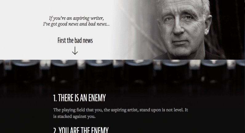
Once a potential customer pulls up your website, you’ve got about three seconds to tell them what it is you do and what’s in it for them. If you don’t relay this information, the user will simply leave. They are busy and want solutions to their problems. Let’s look at a few examples:
This is really important because your brain wants to close story loops. In most cases when you see an email that your brain just tells you to click, a story loop is being used. You want to find out the answer.
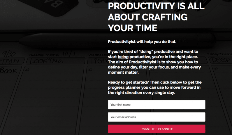
Here’s another example: Mike Vardy’s website Productivityist. The website is all about helping you be more productive by crafting your time. Not only does Mike tell you exactly what the website is about, but he also offers you a planner to help you make progress in exchange for an email address.
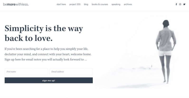
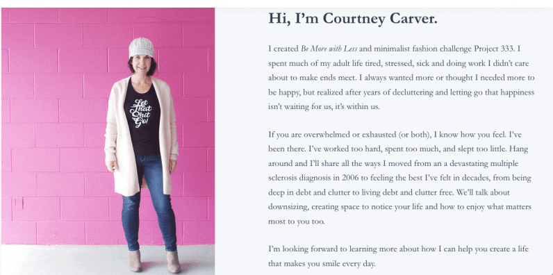
That image used gives a feeling of peace and rest. That’s huge. So many opt-ins don’t have any image at all. Let’s dig a little deeper. Here’s what is next on Courtney’s webpage.
Number 2: Clarity always wins
Some websites try to do it all and contain tons of information. There could be several popups, moving boxes, audio or video, and a plethora of menus with tons of options.
Don’t fall for that trap. It’s not about having a bright, shiny website that has as much information on it as possible. More does not lead to a better user experience. Small changes can make all the difference.
Here’s one example:
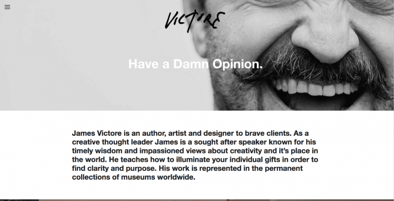
My two tweaks to really give more clarity would be to have author, artist, designer as the subtitle instead of “have a damn opinion.” While that’s a great message, it really doesn’t resonate as much with the first-time guest.
That simple tweak can cut the clutter in the text and give a lot more clarity. Thankfully, James does give some clarity in that little menu in the left corner.
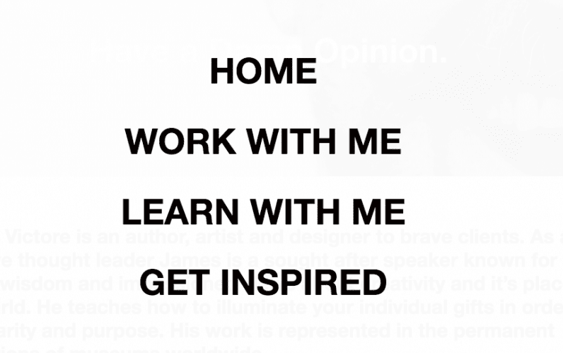
Here are the choices on the menu in the top left corner.
Let’s look at another example.
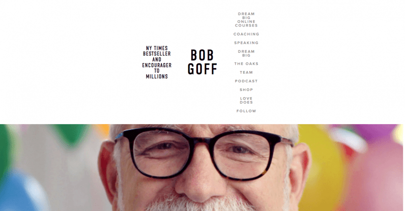
A first time visitor won’t know what The Oaks, Dream Big, or Love Does mean.
A simple tweak of just having four menus listed horizontally would really clear things up. I recommend having Speaking, Coaching, Shop, and Resources as menu items. The resources menu could include things like The Oaks, Team, Podcast, and Dream Big. That would clean up the website and make things clear.
Remember: Less is almost always more when it comes to websites
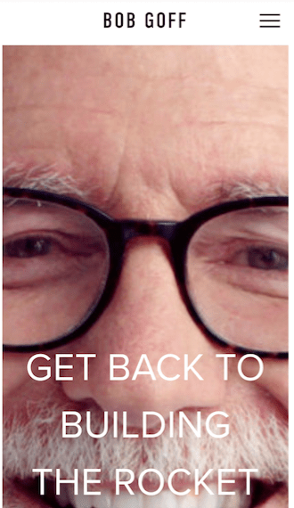
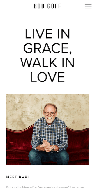
Most views are on mobile devices. In 2019, 58% of site visits were from mobile devices. That’s almost 60% or 3 out of 5 views. Do not overlook this fact. Here’s what I see when I pull up Bob’s website on mobile:
Number 3: The next step
A website needs one goal. Not two goals, not three or more goals. One simple goal: for the end-user to take a specific next step. It could be signing up for your email, booking an appointment, or purchasing a product. Have several products or services? Guide customers to your bestseller.
Let’s look back at the very first example with Steven Pressfield. Steve does a great job with this, just take a look at this call to action on his website. Steven’s bestseller by far is his book War of Art, so he uses an audio mini-course as the feature to get more email subscribers.
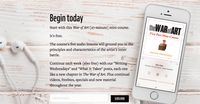
I know it’s very subtle, but these small changes really add up. Best of all, despite asking you to take the next step three times on one screen, this doesn’t come across as pushy to the end-user.
The takeaway
Keep in mind that no matter what your website is about, you’re really in the business of solving problems. It’s important to note that people associate you with one thing. So don’t be afraid to make it super clear what that one thing is. Focus on the end-user, and serve her as well as possible. Once you do that, your customers will keep coming back for more.
This article was originally published by Jim Woods on Better Marketing, a publication providing advice that works and covering digital and social media marketing, tools, and case studies. You can read the original piece here.
Published June 8, 2020 — 06:30 UTC