


A Farmhouse Kitchen for One Cook or a Crowd
See how a designer remade a kitchen and dining area for a homeowner who wanted a relaxed space for herself and guests

The owner of this home outside Vancouver, British Columbia, bought it to downsize and prepare for the future, when she hopes her two grown sons will have families of their own. Designer Jamie Banfield helped the homeowner create a kitchen spacious enough for hosting future grandchildren yet comfortable and cheery for when she’s alone with her two dogs and a cat.
Kitchen at a Glance
Who lives here: A woman and her pets
Location: Township of Langley, outside Vancouver, British Columbia
Size: 300 square feet (28 square meters)
Designer: Jamie Banfield of Jamie Banfield Interior Designs
Who lives here: A woman and her pets
Location: Township of Langley, outside Vancouver, British Columbia
Size: 300 square feet (28 square meters)
Designer: Jamie Banfield of Jamie Banfield Interior Designs
The renovation involved combining the original kitchen with the adjacent dining room (see next photo), effectively doubling the kitchen’s size. To orient yourself to the before and after, take a look at the window seen in this photo. It’s in the same place in the renovated kitchen as it is here.
Here’s the dining room that abutted the kitchen before the renovation. Notice the bump-out on the wall that houses a hutch. The bump-out is where the 30-inch-deep refrigerator now stands.
Banfield likes to ask new clients how they want their renovated spaces to feel. In this case, he asked the homeowner to think about her favorite coffee shop, hotel, store or restaurant — and what qualities she liked about these spaces and how they made her feel. She said she liked spaces that felt built over time, and that they made her feel relaxed. These were the qualities and feel she wanted in her new kitchen. “Comfort and being able to relax was important to the homeowner,” Banfield says.
More specifically, she wanted to not worry about her countertops when her friends set a glass of wine down. She wanted to host dinner parties with mismatched dishes. She wanted her future grandkids to feel comfortable in the kitchen. And she wanted to wash paintbrushes in the kitchen sink.
All this information led Banfield to a relaxed modern farmhouse-style, a look his client wasn’t familiar with before the project but that perfectly fit her wish list.
The new kitchen has an L-shaped layout — the most popular layout for remodeled kitchens, according to Houzz research — which takes advantage of the natural light from the window and the French doors leading to the backyard. As mentioned, the window over the sink is in about the same place as it was before the remodel. Banfield made it bigger and added mullions. The old kitchen stopped where the range is now.
The cabinets have modified Shaker-style fronts with a bevel in the rails and stiles. Banfield chose a dark color (Polo Blue by Benjamin Moore) for the lower cabinets to guard against the wear and tear of pets and future grandkids. He selected a warm, muddy clay (Horizon by Benjamin Moore) for the upper cabinets; warm undertones were important here because cooler grays can appear too cold and stark on Vancouver’s rainy days.
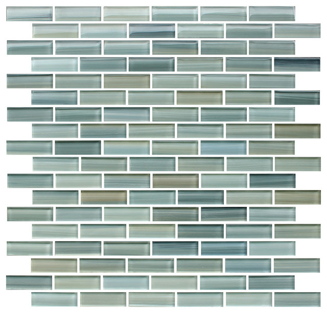
The backsplash tile is from Ann Sacks.
Banfield and the client carefully thought through the flow of the cabinetry storage. The skinny cabinet to the right of the sink is designed to hold cutting boards. To its right, where the kitchen bends, Banfield placed three drawers for pot storage. The top drawers on either side of the range contain utensils and spices.
In the island, Banfield placed a deep single-bowl sink and a microwave. The cabinets closest to the window contain the trash and recycling pullouts. The homeowner uses the other cabinets to hold pots and mixing bowls.
The cabinets have modified Shaker-style fronts with a bevel in the rails and stiles. Banfield chose a dark color (Polo Blue by Benjamin Moore) for the lower cabinets to guard against the wear and tear of pets and future grandkids. He selected a warm, muddy clay (Horizon by Benjamin Moore) for the upper cabinets; warm undertones were important here because cooler grays can appear too cold and stark on Vancouver’s rainy days.
The backsplash tile is from Ann Sacks.
Banfield and the client carefully thought through the flow of the cabinetry storage. The skinny cabinet to the right of the sink is designed to hold cutting boards. To its right, where the kitchen bends, Banfield placed three drawers for pot storage. The top drawers on either side of the range contain utensils and spices.
In the island, Banfield placed a deep single-bowl sink and a microwave. The cabinets closest to the window contain the trash and recycling pullouts. The homeowner uses the other cabinets to hold pots and mixing bowls.
Directly to the left of the main sink is a panel dishwasher, and beside it cabinets where the homeowner stores everyday dishes. The upper cabinets to the left of the range hold vases, stemware, glasses and mugs. The drawers and cabinets to the right of the range house canned and dry goods.
The kitchen island has an engineered quartz (White Attica by Caesarstone) countertop that measures 4 feet, 5 inches by 9 feet, 4 inches. Banfield researched this material to find out how large a slab he could get, rather than designing the island first only to discover that a big enough slab wasn’t offered and the counter would have to have a seam.
He often likes to let pragmatic issues shape his aesthetic approach to a room. For instance, the beams on the ceiling consist of 8-foot-long pieces with metal brackets that hide the seams where the lengths connect; the brackets also work as a design feature. Similarly, the shiplap on the ceiling covered holes and patches made during the removal of the wall between the dining room and kitchen and is also an attractive design element.
Though it’s hard to see in this photo, the island has a 21-inch overhang that creates plenty of space for sitting. Beefy columns support the four island corners and create room for seating on either end, while the chef’s domain is between the island and the range. “If they’ve got six grandkids and they all want to make cookies, they can sit on all sides of the island and not necessarily get in the way,” Banfield says.
The back of the island has 12-inch-deep cabinets for extra storage. Not pictured is a pantry to the right of the fridge, which contains rollout shelves at arm level for heavy appliances.
The flooring is engineered oak in 2-inch-wide planks. Banfield chose a matte oiled finish that helps hide debris from dogs and daily dust, as well as scratches.
Banfield and the client went shopping for kitchen lighting and she fell in love with these glass, brass and black pendants. The glass has a thick ribbed detail.
The range hood is fabricated from cold-rolled steel that has been blackened and sealed with a waxed finish.
The cabinet hardware finish is matte black.
The range hood is fabricated from cold-rolled steel that has been blackened and sealed with a waxed finish.
The cabinet hardware finish is matte black.
The faucets are polished nickel.
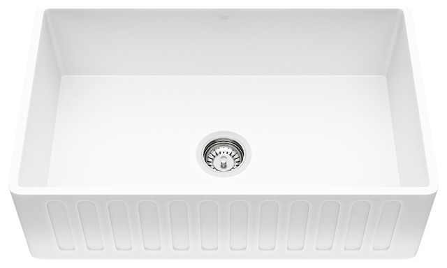
The sink is cast iron with an organic ribbed pattern on the apron that echoes the detailing on the pendants over the island.
The sink is cast iron with an organic ribbed pattern on the apron that echoes the detailing on the pendants over the island.
Comments (25)
See 22 more comments


Dixie