How could there have been any doubt? Why was it even considered that the majestic concrete battleship that is Preston bus station might be demolished? Yet it was, a few years back, to make way for a proposed shopping centre of uncertain viability. Central government, in the face of prolonged and well-made arguments for its listing, hedged and prevaricated until deciding in 2013 that, yes, it was worthy of protection.
Now, as its renovation is completed, it’s plain that the bus station deserves to stand alongside the other robust civic masonry that Preston, like many industrial cities, boasts: the neo-Greek Harris Museum and Art Gallery; the Edwardian baroque Sessions House. It’s also again clear (see, too, the Southbank Centre in London) that the listing of postwar architecture is the last, best defence of public space that the tattered planning system can provide.
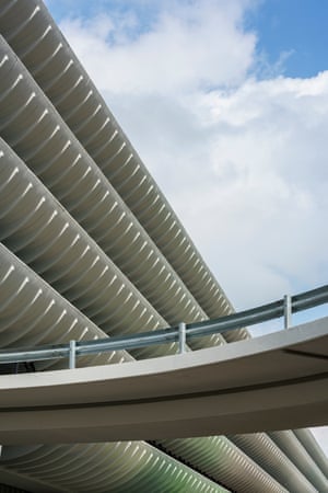
The signature of the bus station, which was completed in 1969 to the designs of the architecture company Building Design Partnership and the engineering firm Ove Arup, is its great long striated form, 190 metres of it, made of curved profiles to the parking decks above the ground-level terminal. These curves are, in truth, somewhat for effect, being add-ons to what could more easily have been a blunt square edge, but it is quite an effect.
It’s simple and memorable, a statement that this mundane but vital building type – a bus station plus car park – could be a thing of pride. It reflects the ambition of its makers that a bus station could have the status of an airport. Like much magnificent architecture, it speaks of a future that never quite arrived: in this case it was expected that Preston’s population would double, as part of an expansion plan that didn’t materialise, but one that the station was intended both to serve and announce.
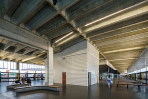
Having made this grand gesture, the design devolves into unexpected shades of subtlety. The seeming monolith of the superstructure (actually made of multiple elements of precast concrete) levitates above a delicate and airy ground level in which play out subtle rhythms of repeating lines – glazing bars, pillars, tiling, benches, the concrete beams. Every eighth recess in the coffered ceiling contains fluorescent tubes, which adds another beat of light and shade.
The building’s length is exploited, as on the exterior, this time to create halls that balance transition and repose, in which the sense of distance given by its deep perspective is offset by good proportions and a high ceiling – to put it less pretentiously, these are good spaces both for catching a bus and waiting for one. The functional decor is given a slightly luxurious quality by a black rubber Pirelli floor, by vertical slivers of yellow and the use of a tropical hardwood, iroko, for handrails and seating.
There is also quality and durability in these finishes, which still do their job after 50 punishing years. Care was taken to make the ceramic wall tiles align and space them such that almost none needed to be cut. There are, finally, flourishes within the generally disciplined composition, with the flying car park ramps making playful doodles at the ends, along with curved, faintly art deco “satellite” structures.
The bus station’s renovation is the work of Lancashire county council, which in 2014 relieved its former owner, Preston city council, of the worry of dealing with its brutalist treasure by buying it off them for £1. The council then decided to invest £35.3m, with the help of funds that might otherwise have gone into building a new station, into remodelling what they had, rearranging the traffic around it and building a “youth zone”, a sports and leisure, alongside.
Where previously there were plazas for the buses on both sides of the building, the council decided to move them all to the side furthest from the city centre, creating a new pedestrianised area, which will make for a friendlier approach to the station than the system of subways that people were originally expected to use. The rearrangement also makes space for the youth zone, which had long been desired for the city but for which the council had had difficulty finding a site.
The council took the bold and now rare step of choosing the architect by an open anonymous competition – in other words, one in which the quality of design counts for more than track record and reputation. At first, this approach didn’t have the desired effect. The winning architect John Puttick, who had only just set up his practice when he won, produced a proposal that was rightly slammed for the way in which the youth zone glommed on to the bus station. What was the point of keeping the bus station, it was asked, if its grand horizontals were interrupted by the new building?
A change of brief and of design followed. The youth zone, due to be completed at the end of 2019, will now take a stepped, zinc-clad shape that, while having a presence of its own, will stand apart from its neighbour. Puttick’s work on the new building, carried out with the close attention of the Twentieth Century Society, is tactful and commonsensical, recycling the iroko as necessary to make new benches and sills, tidying up the signage, using the original typography in new ways, improving the lighting by returning to something like the original scheme.
Some things are necessarily different. At some point in its life the concrete of the curved bands was painted white, which means it’s impossible to return to its original raw state, so it has simply been refreshed. The right notes are sometimes missed, as with some new seating bought off the peg and the details of a new glazed screen. But the overwhelming feeling is of a public facility which, if it were created new now, would have little of the same dignity.
The generosity of the volumes, the precision of the detail and the quality of the surfaces would all be squeezed out by value engineering. So too would those superfluous curves. The intent of the architects, essential to achieving the building’s balance of heft and lightness and the coherence of its composition, would be crowded out by other consultancies. Every spare space would be invaded by retail opportunities.
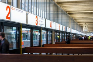
Perhaps the most telling detail is in the signs at the bus stands. The many companies who now operate the lines in and out of Preston wanted these to carry their competing garish graphics. The council insisted that they should simply give the routes’ destinations and numbers. So while the buses themselves look, in their violent liveries, like a confectionery display at a supermarket checkout, the information on the building is all that the user needs to know – what goes where, not the financial coagulations that extract the profit.
The photographer Martin Parr, who published books of his collections of Boring Postcards, included one of Preston bus station. “Largest in Britain”, it said proudly, beneath an image in which double-deckers in uniform municipal blue placidly circulate around the mothership. There is indeed something quaint about the postcard, which would be why Parr put it in his book. But the grace and power of this structure is considerably less boring than the commercial miasma that now engulfs most centres of public transport.